5 top tips to light up your brand in dark markets
How savvy designers can establish brands in restricted markets with a bit of crafty know-how.

Some of the most creative brand building happens in dark markets. But what is a dark market, and why do designers need to know about them?
Put simply, a dark market is an environment that restricts and prohibits the promotion of a product. Take Norway: for many years the country has been a dark market for alcohol. Breweries aren't allowed to advertise their beer in mass media, bars, restaurants or shops.
In the UK, sports sponsorship by alcoholic beverages has long been debated. And we can expect to see more dark markets emerge as human needs evolve and legislation adapts. Think genetically modified meat, for example.
So how do you establish and build a brand when you're restricted from directly communicating with the target audience? Well, if a product can’t be advertised, you have to get creative.
One design agency that knows all about brand-building in dark markets is Bristol-based outfit Taxi, which counts Carlsberg, Smirnoff and market-leading Scandinavian cider Somersby amongst its clients.

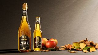
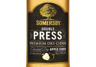
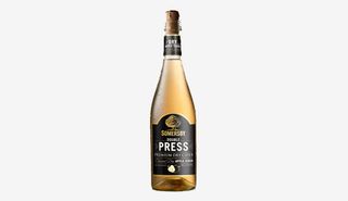
To ensure the Somersby brand could be easily identified in Norway without using the name, Taxi devised the concept of 'Double Press' and created a witty mnemonic to visually describe the name of the drink.
The product's logo features two apples that, when combined, reveal a juice droplet in the overlapping space. This graphic device became a shorthand for the brand, allowing 'Double Press' to clearly communicate its proposition without needing to say a word.
What can you do to make your own clients' brands thrive in dark markets? We asked Taxi's creative partner and founder Spencer Buck for his top tips…
01. Start yesterday!

Let's start with an obvious one first. It's much harder to establish your brand in a dark market unless you're already in it and have a conscious strategy for building strong visual equities for your brand.
02. Make good use of your brand's single-minded mnemonic
For a little bit of fun, close your eyes and visualise:
- A tick on a trainer
- A white ribbon on red
- A dog near a gramophone
Nike, Coca-Cola and HMV are just three examples of businesses that have powerful mnemonics that act as visual shortcuts to their brands. Establishing your brand's visual shortcut in the minds of consumers is vital as part of a brand's dark market survival toolkit. If you don't have one, create one.
03. Have a convincing alibi

You may recall the Marlboro-styled barcode on the back of Ferrari's F1 car, or Jordan F1s Bitten & Hisses branding – both highly creative examples of alibi branding in action. But my favourite of all was the very neat adaptation of Brains' sponsorship of the Welsh Rugby team during a Six Nations match in France.
Due to the tough clampdown on alcohol branding in the country, 'Brains' logo swapped out to 'Brawn' on the chest of the player's shirts – a brilliant thing to do regardless of the law! Another way to look at alibi is to diversify and stretch the brand into new areas – but if you choose to do so – do so with relevance!
Take Davidoff for instance; in markets where they can't advertise their fags they advertise their fragrances instead – fine for a brand that sells 'lifestyle'.
04. Add some 'structure' to your thinking
If blindfolded, chances are you'd instantly recognise an Orangina bottle, Coke bottle, Bibendum doll or Mickey Mouse hat just by feeling it. Brands that have powerful associations to a shape – be that a bottle or an object – also have important elements in their dark market toolkits that can be deployed to represent the brand.
05. Exploit your (secondary) assets
Outside of a brand's name, or even the product itself, distinctive logos, colourways and structures are generally regarded as a brand's 'primary assets'. Secondary assets are usually things like typography, patterns, shapes and tone of voice etc.These are fast becoming increasingly as important.
The most powerful way to use these elements is deploying them various combinations. A proprietary typeface by itself may not be enough, but a typeface on a particular colour can effectively shortcut to the brand – and it's tricky to legislate against (at the moment!).
Liked this? Try these...
- Should designers be worried about AI?
- This graphic designer's price list is priceless
- The ultimate guide to logo design

Thank you for reading 5 articles this month* Join now for unlimited access
Enjoy your first month for just £1 / $1 / €1
*Read 5 free articles per month without a subscription

Join now for unlimited access
Try first month for just £1 / $1 / €1
Get the Creative Bloq Newsletter
Daily design news, reviews, how-tos and more, as picked by the editors.
The Creative Bloq team is made up of a group of design fans, and has changed and evolved since Creative Bloq began back in 2012. The current website team consists of eight full-time members of staff: Editor Georgia Coggan, Deputy Editor Rosie Hilder, Ecommerce Editor Beren Neale, Senior News Editor Daniel Piper, Editor, Digital Art and 3D Ian Dean, Tech Reviews Editor Erlingur Einarsson and Ecommerce Writer Beth Nicholls and Staff Writer Natalie Fear, as well as a roster of freelancers from around the world. The 3D World and ImagineFX magazine teams also pitch in, ensuring that content from 3D World and ImagineFX is represented on Creative Bloq.
