Caramela: innovative packaging for a boutique brand
Mexican studio Anagrama took a lateral approach to creating a new chocolate brand, drawing inspiration from industrial packaging. Check out the results and discover the thinking behind it.

Creating any new confectionery brand is difficult in a crowded marketplace, but creating the packaging design for such a brand is even trickier - particularly if you want to avoid the (literally) chocolate-box approach of traditional products.
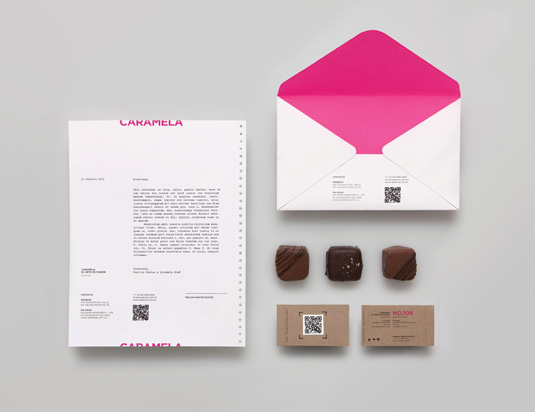
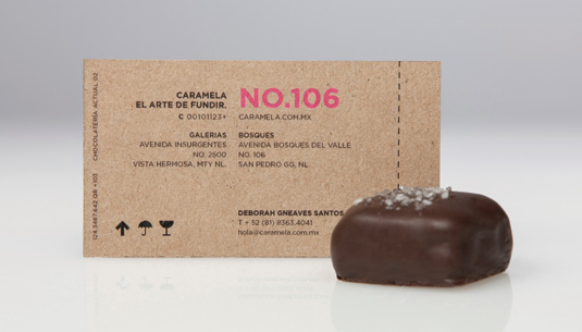
Thus when Mexican studio Anagrama was commissioned to produce the brand identity for new boutique chocolate shop Caramela, it took a more lateral approach. Instead of relying on well-worn tropes, Anagrama looked to Caramela’s home city of Monterrey for inspiration. "We gave it a very industrial feeling in honour of Monterrey's great history," explains Miguel Herrera of Anagrama. "This city differentiates historically for having an industrial golden era in steel manufacturing."
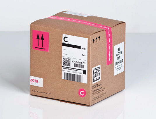
Thus the packaging design was based on industrial packaging systems, with adhesive stickers and identification codes aping the kind of shipping boxes familiar all over the world.
Colour choices

"The colours were already part of the brand proposal we developed," Herrara continues. "We used Pantone 806 C as a highlight, in moderation. We wanted the packaging to look like recycled carton. We wanted to inject an industrial and functional feeling.
"When we adapted the colour and applied it to the stickers, there was a perfect match with packages that looked like they just came out from a production facility ready to be shipped - but with an intended, simple cuteness."
Subtly conceptual

The aim, Herrara says, was to create a design that was eye-catching and different, but also subtly conceptual.
"It doesn’t have to shout out loud 'Monterrey!' with 'El Cerro de la Silla' on it - that's a very well known local landmark. It definitely had to be cool, but based on something substantial and relevant."
Get the Creative Bloq Newsletter
Daily design news, reviews, how-tos and more, as picked by the editors.
Liked this? Read these!
- How to brand a logo: 15 top logo and branding trends for 2012
- The art of print advertising: 40 stunning examples
Have you spied some innovative packaging? Let us know about it in the comments!

Thank you for reading 5 articles this month* Join now for unlimited access
Enjoy your first month for just £1 / $1 / €1
*Read 5 free articles per month without a subscription

Join now for unlimited access
Try first month for just £1 / $1 / €1
The Creative Bloq team is made up of a group of design fans, and has changed and evolved since Creative Bloq began back in 2012. The current website team consists of eight full-time members of staff: Editor Georgia Coggan, Deputy Editor Rosie Hilder, Ecommerce Editor Beren Neale, Senior News Editor Daniel Piper, Editor, Digital Art and 3D Ian Dean, Tech Reviews Editor Erlingur Einarsson, Ecommerce Writer Beth Nicholls and Staff Writer Natalie Fear, as well as a roster of freelancers from around the world. The ImagineFX magazine team also pitch in, ensuring that content from leading digital art publication ImagineFX is represented on Creative Bloq.
