Can you replace a logo with a gesture?
Why Wolff Olins' choice to reduce Virgin Media's logo to a symbol "a child could draw" is a stroke of genius.
Computer Arts' Innovation Special - on sale now - is dedicated to the processes, ideas and technologies that are driving the design industry forward.
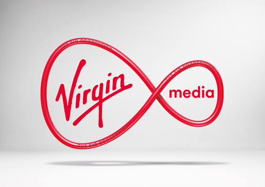
One such example is Wolff Olins' recently unveiled rebrand of Virgin Media - a project that, rather like the agency's work London 2012, has faced its share of criticism.
We asked Chris Moody and Adrian Spooner - creative directors at Wolff Olins and Virgin Media respectively - to reveal more about the innovative thinking behind the project...
What makes the Virgin Media rebrand innovative?
Adrian Spooner: We never thought of it as a rebrand, but an amplification process - making sure Virgin Media was relevant for a new generation of people. We recognised the need for clear guidance, but the brief was to create fewer rules and provide more tools to help our people and agencies supercharge the brand.
Rather than a 'corporate' identity, we set out to create one that could disrupt, and break away from the conventions of a highly competitive (and commoditised) sector. Starting with the Virgin Media attitude, we boiled it down to three words: open minded, fun and generous.
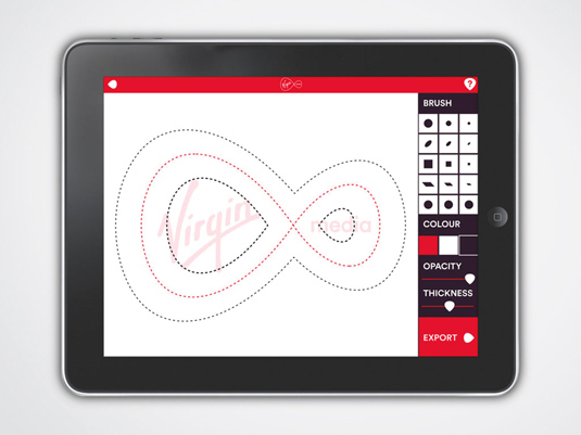
Taking full advantage of all technological advances that had happened in the seven years since launch, we've made use of everything from the latest touch-screen technology to HTML5 and beyond. We knew it had to work hard and be flexible enough to respond to its users and their needs.
How did you go about tailoring the brand to different users?
AM: In everything Virgin Media does there always had to be 'a little bit of us and a little bit of you'. The solution was a scalable expression system that positively invites anarchy. How well Virgin Media knows the audience controls the options for assets like colour, texture, motion, text weight and the volume of its most powerful asset - the tone of voice.
It splits down into three modes of expression:
- Broadcast - Sometimes it’s all about Virgin Media, this is the mode for when we’ve got something to say that we think the world really needs to hear, and when we are at our most red, proud and loud.
- Interact - Sometimes it’s all about the customer; think direct communications such as letters from Virgin. We know who we are speaking to so we can tone it down and personalise it.
- Respond - Sometimes it's in-between, when we know enough about people to make everything a more bespoke and relevant. For example, more access to assets like colour. So if we are talking to Manchester City fans we could even go blue.
We gave the new system a trial run at last year's V Festival using our Respond mode. Not only did we see a significant rise in brand awareness, but we won a Festival award for our brand activation. We've gradually started to roll out the brand, test the water, rather than an full-blown overnight change.

Attempting to trademark a 'gesture' is a pretty bold move - what were the biggest challenges here?
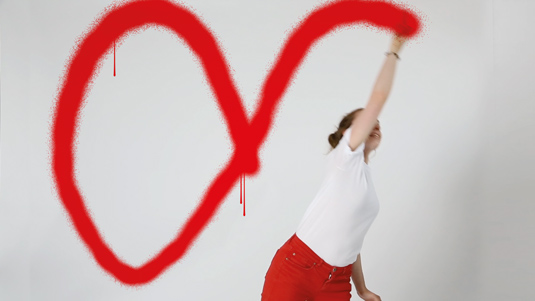
AS: It didn't feel so much of a bold move, because we've actually been doing it for a while. It was more an intuitive progression. Since 2012 we've had a host of talent using our logo as a storytelling device, gesturing it to life at the end of our TV ads.
We feel lucky and pretty unique in having an ownable shape that can be gestured by anyone from a five to an 85-year-old. We're on the start of a journey towards a complete gesture driven identity.
We feel lucky and pretty unique in having an ownable shape that can be gestured by anyone from a five to an 85-year-old
We like the idea of being live and responsive and of use, rather than a traditional monolithic badge stuck in the corner or over the content you want. We've freed it up so people can have a bit more fun. We're currently working on a tool to enable our people and customers to generate their own marks. Now that's super-personalised.
The project received plenty of criticism after the initial reveal of the logo. How do you respond to that?
Chris Moody: Parts of the design industry are still a little logo obsessive, so that's not unexpected. We knew a fixed marque was just one part of a much more interesting story. The simplification of that marque however, was deeply considered as it enabled us to tell more stories with the logo across the scale both statically and in motion.
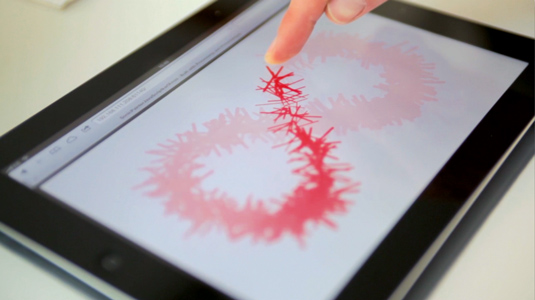
The fact that its design predated Apple's iOS 7 release helps to put it in a bit of context as to what is now required from a brand mark beyond a shiny stamp. The ability to draw it by hand sums that up: we've had kids send us images they've created using the marque, which shows people are enjoying interacting with the brand.
How does the Virgin Media rebrand represent Wolff Olins' forward-thinking approach?
CM: More and more clients need you to work smartly and coherently alongside some existing live assets. To answer these briefs we have to find better ways to work in beta, developing and growing brand assets as we go along.
It's time designers learned to stop being so precious and embrace the opportunity being more agile can bring you. The days when a brand agency could hide away for months on end then dump a guideline document on a clients desk is over.
Wolff Olins' Virgin Media rebrand is one of several groundbreaking projects explored in Computer Arts' Innovation Issue, on sale now in the UK.

Thank you for reading 5 articles this month* Join now for unlimited access
Enjoy your first month for just £1 / $1 / €1
*Read 5 free articles per month without a subscription

Join now for unlimited access
Try first month for just £1 / $1 / €1
Get the Creative Bloq Newsletter
Daily design news, reviews, how-tos and more, as picked by the editors.

Nick has worked with world-class agencies including Wolff Olins, Taxi Studio and Vault49 on brand storytelling, tone of voice and verbal strategy for global brands such as Virgin, TikTok, and Bite Back 2030. Nick launched the Brand Impact Awards in 2013 while editor of Computer Arts, and remains chair of judges. He's written for Creative Bloq on design and branding matters since the site's launch.
