Budweiser beer gets a retro rebrand
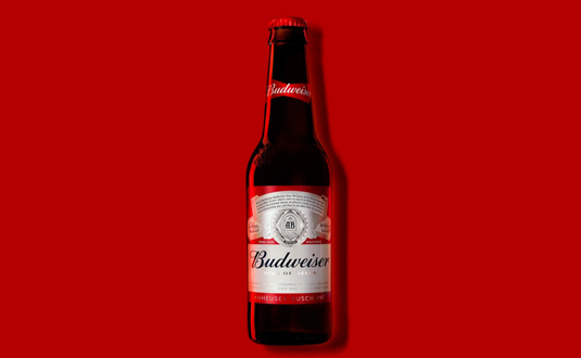
Budweiser goes back to basics with a new logo and branding that celebrates the beer's rich iconography.
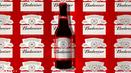
Featuring an iconic logo design since its launch in 1876, American pale lager Budweiser has revealed its latest packaging design which celebrates the best parts of the beer's 140 years in business.
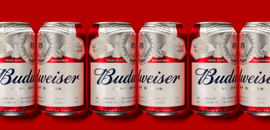
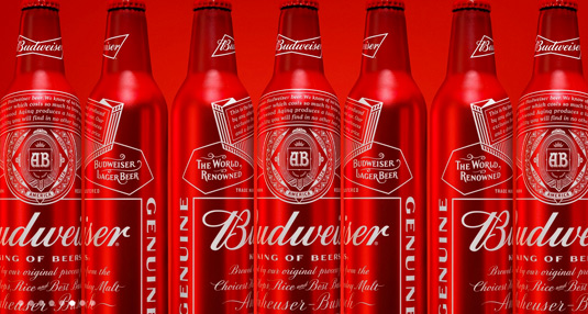
Working with Jones Knowles Ritchie's NYC design team, Budweiser's new decluttered image will keep most of the beer's classic motifs, including the brand's crest, trademark font and red colouring.
Appearing both classic and contemporary at the same, this 13th rebrand in the beer's history is a departure from recent digital designs. "The last hundred years, there were artisans, typographers, art directors, letterers, and everything was done by hand,” says Jones Knowles Ritchie creative director Tosh Hall.
“When the computer came in, a lot of [the brand's design] had been digitized over the years and became like a photocopy of a photocopy, and kind of crunchy and sad," Hall adds.
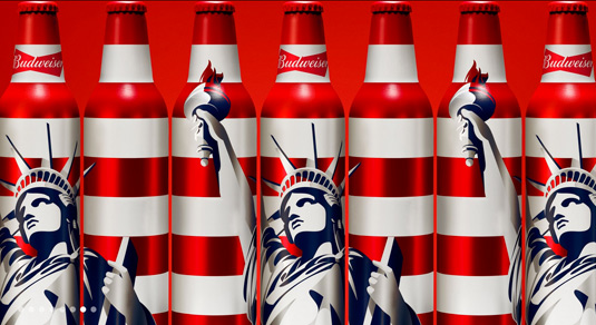
Now armed with a brand identity that reflects the level of detail, care and attention paid to the beer itself, Budweiser will roll out the new image globally over the next few months.

Liked this? Read these!
- The top rebranding trends of 2015
- Bold beer branding packs a punch
- The beer branding revolution of 2015
Get the Creative Bloq Newsletter
Daily design news, reviews, how-tos and more, as picked by the editors.

Thank you for reading 5 articles this month* Join now for unlimited access
Enjoy your first month for just £1 / $1 / €1
*Read 5 free articles per month without a subscription

Join now for unlimited access
Try first month for just £1 / $1 / €1

Dom Carter is a freelance writer who specialises in art and design. Formerly a staff writer for Creative Bloq, his work has also appeared on Creative Boom and in the pages of ImagineFX, Computer Arts, 3D World, and .net. He has been a D&AD New Blood judge, and has a particular interest in picture books.
