Bring a new retail brand to life
Emma Jones shows you how to quickly mock-up multiple applications of a new retail brand
One of the biggest headaches when pulling together a creative presentation for a new brand is deciding how to create multiple applications of the identity, to demonstrate the breadth of the brand before it exists. This often needs to be done very quickly, while still looking slick and realistic. However, spending hours in Photoshop isn’t always feasible or desirable.
Over the course of this tutorial, I’ll demonstrate how to use Illustrator’s Artboard tool to efficiently produce various branded applications for a bookstore and bar named ‘Boozy Books’. I’ll show you how to create seamless Photoshop visuals of a store front, plus tote bags and uniforms using LiveSurface templates, as well as flat visuals of swing tags and in-store display units drawn straight into Illustrator. Keeping everything altogether in one document will make your workflow more efficient, thanks to the flexibility offered by Illustrator and means you can output straight to a multi-page PDF, ready to print or present.
Discover the 20 biggest logo design trends at Creative Bloq.

01 Begin by setting up a landscape Illustrator document with three A4 artboards. Then turn on Rulers (Cmd/Ctrl+R) to start setting up your grid. Select the Artboard tool (Shift+O) and drag and drop guides onto the first artboard. To paste the guides in the same position across all artboards, hold Cmd/Ctrl+X followed by Cmd/ Ctrl+Opt/Alt+Shift+V. Then hit Cmd/Ctrl+Shift+; to lock the guides in place.
02 Now import or create the elements you need to work with, including logo and swatches. The Boozy Books logo and swatch palette used in this tutorial are available in the Resources folder on your disc. You can import the provided swatches by selecting Open Swatch Library in the Swatches panel drop-down menu.
03 The first application I’ll create is a store display unit. Begin by drawing a rectangle for the backboard, then draw a slightly wider but very shallow rectangle on top. Duplicate this and change its colour, then use the Direct Selection tool to pull the top two anchor points up and in to meet the edges of the backboard. Bring the lighter grey shape to the front, then group and duplicate twice before spacing them equally using the Distribute tool, creating a series of shelves.
04 Now add graphics to the display unit – I’ve reversed my logo out of green and used a clipping mask (Cmd/Ctrl+7) so that it bleeds off and made the shelves green to match. Then duplicate the whole thing and reflect it, before adding some copy and silhouetted products onto the shelves. I’ve made the second endcap red to reflect different products, but you can add any graphics you like.
05 The next thing to create is a swing tag for the beer bottles. Start by copying and pasting the logo onto a blank artboard and making it 70mm in diameter. Then add a 7mm circle on top, in the spot where the olive would sit in the glass. Draw another 70mm circle in white and bring the small 7mm circle to the front, punching it out of the white circle using the Pathfinder Minus-Front tool (or hit Cmd/Ctrl+8).
Get the Creative Bloq Newsletter
Daily design news, reviews, how-tos and more, as picked by the editors.
06 Apply a drop shadow to this white shape then select Multiply from the Effects panel to make it transparent. Duplicate the whole thing and flip it to create the reverse of the swing tag. Using the Direct Selection tool, delete the book/glass icon and the inner green circle, so you’re left with just the green border. To leave space for a barcode, draw a placeholder 37.5mm x 27.5mm in size and position it safely within the margins.
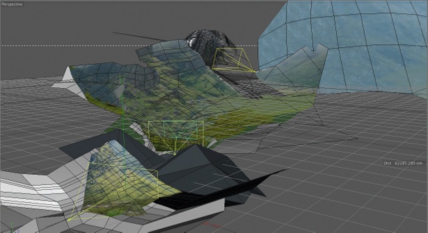
07 The next application will be the store front. To do this I’m using a template from the LiveSurface image library – a resource that makes creating real-world visuals quick and easy. To follow along with this tutorial, we’ve included the Storefront2 template (usually $29 to download). You can find other images including those used later in this tutorial at www.livesurface.com.

Thank you for reading 5 articles this month* Join now for unlimited access
Enjoy your first month for just £1 / $1 / €1
*Read 5 free articles per month without a subscription

Join now for unlimited access
Try first month for just £1 / $1 / €1

The Creative Bloq team is made up of a group of art and design enthusiasts, and has changed and evolved since Creative Bloq began back in 2012. The current website team consists of eight full-time members of staff: Editor Georgia Coggan, Deputy Editor Rosie Hilder, Ecommerce Editor Beren Neale, Senior News Editor Daniel Piper, Editor, Digital Art and 3D Ian Dean, Tech Reviews Editor Erlingur Einarsson, Ecommerce Writer Beth Nicholls and Staff Writer Natalie Fear, as well as a roster of freelancers from around the world. The ImagineFX magazine team also pitch in, ensuring that content from leading digital art publication ImagineFX is represented on Creative Bloq.
