This brewery's rebrand stays true to its roots
Duffy & Partners turned to the landmarks of Saint Paul, Minnesota to give Summit Brewing Company a rich brand refresh.
Minnesota agency Duffy & Partners gave Summit Brewing Company a full rebrand, creating an overall master identity and branding for individual products. This was implemented right across the brand, from trucks to retail displays, bottle labels and merchandise. Nancy Kullas and Joe Duffy of the agency speak about the process.
Having originally started life in someone's garage, Summit Brewing Company's craft beer is now sold in 17 states. The brewery is located in Saint Paul, Minnesota, which is just across the Mississippi River from the sister city of Minneapolis, where we have our design studio. Those twin cities are one metropolitan area and it's a pretty tight community.
Craft beer is really popular in the United States today. Summit has been around since 1986 - there are a lot of new startups in the sector and the client wanted to express its heritage and the fact that it's been doing this for a long time. Summit is extremely creative and wanted to project what it does, and where it does it, through its brand language - there's real artistry in the brand, and we set out to reflect that.
This project was very much about updating Summit's identity while retaining the tremendous brand acumen it had already built up. The audience was familiar with the existing packaging, but we needed to breathe new life into the brand and make it stand apart from all the other craft beers out there fighting for visual dominance. At that point, Summit wasn't getting enough credit for all of its innovation within the marketplace as everything was quite disconnected.
The main challenge was to establish a brand language that would be extensive enough to cover all of the many different product identities. The umbrella identity, or master brand, needed to relate individually to all of the products and project the right personality for each particular recipe and type of beer, while also hanging together effectively as a whole. We wanted people to know, without even seeing the logo, that a design element was coming from the Summit brand.
Studio founder Joe Duffy walks through the Summit rebrand, step by step:
01. Know your craft
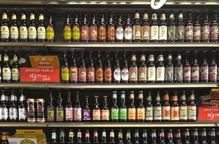
To start with, we looked at the retail environment to see how liquor stores and supermarkets were displaying products in the craft beer category. We also researched the city of Saint Paul, Minnesota, including history and architecture, as the client wanted to focus on its roots.
Get the Creative Bloq Newsletter
Daily design news, reviews, how-tos and more, as picked by the editors.
02. Visual heritage
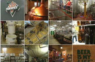
We incorporated our research into a visual brief and we started to think about where the brand had been before. This is a very popular product and we needed to retain some visual elements - we wanted the primary brand identity to reflect Summit's heritage and brand acumen.
03. Design direction
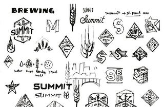
From the visual brief, we created two potential design directions for the client to choose from. The client was very involved in the process and asked for some slight changes, but the general direction remained pretty true to lead designer Ken Sakurai's initial ideas.
04. Colour refresh
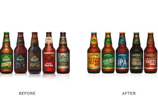
We started with a more muted palette, using familiar colours but pushing them back more. The client asked us to beef it up and make it a bit brighter. We've used colours that are more effective as a complete brand palette but are in the same general range as the old ones.
05. Adding contrast
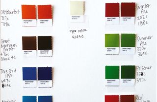
Contrasting colours add more depth and interest, an idea that came about in our first creative meeting. There's a full range of colours on each individual label - primary, complementary and supporting colours - giving them a much more rich and robust feel than the old labels.
06. Landmark labels
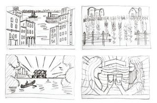
Ken created all of the illustrations. He sketched the landmarks of Saint Paul, including bridges over the Mississippi River, architectural structures and scenes from parks. Once the client had approved the rough designs, he created the final art and then designed each individual label.
07. Combining typefaces
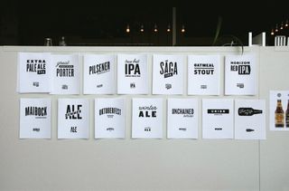
Having presented some logotypes at the beginning of the project, we mostly used the typefaces we came up with at that initial stage. They functioned as a palette of typefaces, which could be combined in a number of different ways to create unique units for the packaging.
08. Packing up
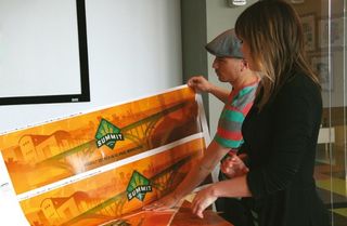
We started with the label design, as well as figuring out how the colour illustration worked. Once that was approved, we adjusted the designs on the different-sized packs, which was a straightforward process, and made sure the individual design elements worked in multiple formats.
09. Into production
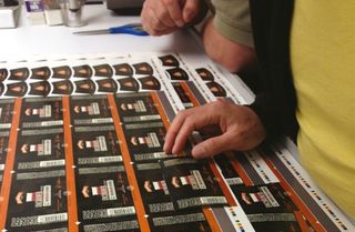
We wrapped up the design phase in June 2013, at which time the production end of the project started. We were very involved with production, assisting with press checks at multiple printing facilities as the various elements were produced in a number of different places.
Words: Nancy Kullas and Joe Duffy
This article originally appeared in Computer Arts issue 225.

Thank you for reading 5 articles this month* Join now for unlimited access
Enjoy your first month for just £1 / $1 / €1
*Read 5 free articles per month without a subscription

Join now for unlimited access
Try first month for just £1 / $1 / €1
The Creative Bloq team is made up of a group of design fans, and has changed and evolved since Creative Bloq began back in 2012. The current website team consists of eight full-time members of staff: Editor Georgia Coggan, Deputy Editor Rosie Hilder, Ecommerce Editor Beren Neale, Senior News Editor Daniel Piper, Editor, Digital Art and 3D Ian Dean, Tech Reviews Editor Erlingur Einarsson, Ecommerce Writer Beth Nicholls and Staff Writer Natalie Fear, as well as a roster of freelancers from around the world. The ImagineFX magazine team also pitch in, ensuring that content from leading digital art publication ImagineFX is represented on Creative Bloq.
