Branding for organic supermarket goes back in time
This branding for a Rotterdam based organic supermarket has a particularly vintage feel to it.
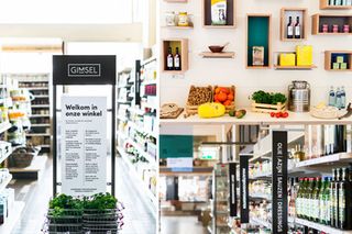
There are a few rules of successful branding that when followed can turn almost any design into an iconic brand. Inspiration for a new brand can come from just about anywhere but you can often find what you're looking for from the past. This project from Netherlands' Studio Beige proves that past is sometimes best.
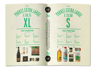
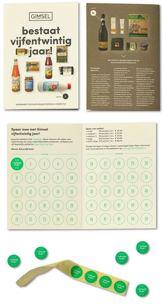
"For 25 years, the Rotterdam based supermarket Gimsel, is selling organic foods and cosmetics to a growing group of customers," they explain. "Studio Beige created a new logo, pay-off, visual and brand identity, signage and website."
The overall look of the branding is particularly vintage, with muted colours and constrasting photography used in the print products. It definitely gives off that 'organic' feel by using a style such as this but do you think the vintage style suits the market?
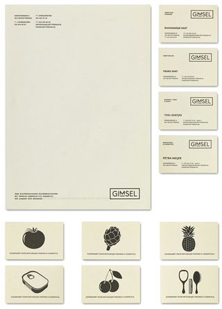
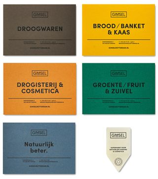
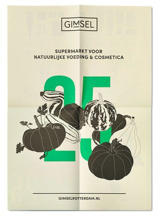
See more inspiring work over on the Studio Beige website.
Do you think this vintage look works? Let us know in the comments box below!

Thank you for reading 5 articles this month* Join now for unlimited access
Enjoy your first month for just £1 / $1 / €1
*Read 5 free articles per month without a subscription

Join now for unlimited access
Try first month for just £1 / $1 / €1
Get the Creative Bloq Newsletter
Daily design news, reviews, how-tos and more, as picked by the editors.

Sammy Maine was a founding member of the Creative Bloq team way back in the early 2010s, working as a Commissioning Editor. Her interests cover graphic design in music and film, illustration and animation. Since departing, Sammy has written for The Guardian, VICE, The Independent & Metro, and currently co-edits the quarterly music journal Gold Flake Paint.