Branding for dim sum bar gets our stamp of approval
This brand identity was inspired by the designer's Far East travel experiences.
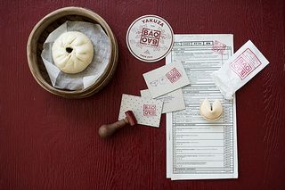
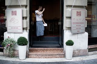
This branding for a new dim sum restaurant had us drooling over the design. "I was inspired from all my Far East travel experiences," explains Hungary based designer Eszter Laki. "I have made a dozen hand drawings during my Asian journey therefore these sketches became a starting point of the interior’s imagery including the dim sum reference drawings which were painted on the wall after projection.
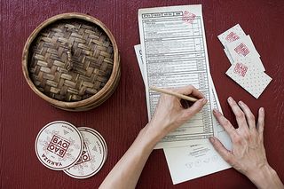
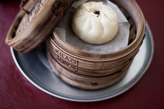
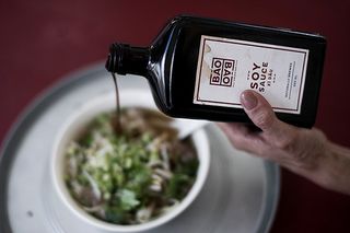
"The cooking processes are indicated on different labels as well, all using a typical neon red tone specifically present in the Vietnamese urban landscapes and hand-painted glazed signs. The origami folded chopstick cases and the bamboo streamer pots wear the same neon red logo which was applied by tampon printing.
"The menu card is from disposable paper on which the guests are able mark their order. There is a farewell surprise – when leaving every guest gets a fortune cookie in which the content is carefully dedicated to the truth whatever it may be." Take a look at some up-close snaps of the branding throughout the restuarant below.

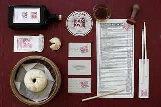
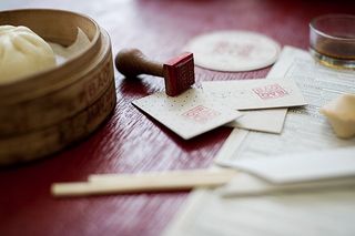
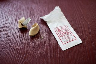


[Photography by Balazs Glodi]
What did you make of this branding? Let us know in the comments box below!

Thank you for reading 5 articles this month* Join now for unlimited access
Enjoy your first month for just £1 / $1 / €1
*Read 5 free articles per month without a subscription

Join now for unlimited access
Try first month for just £1 / $1 / €1
Get the Creative Bloq Newsletter
Daily design news, reviews, how-tos and more, as picked by the editors.
Sammy Maine was a founding member of the Creative Bloq team way back in the early 2010s, working as a Commissioning Editor. Her interests cover graphic design in music and film, illustration and animation. Since departing, Sammy has written for The Guardian, VICE, The Independent & Metro, and currently co-edits the quarterly music journal Gold Flake Paint.
