Bold rebrand for MTV
Moments of intense experience are combined with sound-reactive animation in DixonBaxi's brand identity for Finland's MTV Sub.
MTV Finland is the country's leading commercial media network. As part of a much larger rebrand across all the network's 18 channels, DixonBaxi created an identity system for niche channel MTV Sub, including idents, stings and a new logo.
MTV Sub is one of the free-to-air channels on MTV, Finland's leading commercial media network, aimed at delivering the latest movies and music to a younger Finnish audience. The wider rebranding project involved aligning all of MTV's 18 channels into one cohesive network brand.
For Sub, the client required a full channel strategy and system, as well as on-air, off-air and digital brand worlds, and production of all the assets needed - everything from idents and stings to sound design and language, plus a new logo design, which would all form part of the network family we were creating.
The project as a whole began in March 2013, with the full DixonBaxi team involved. For MTV Sub we had a core team made up of a creative director, design director, two animators, an editor and sound designer.
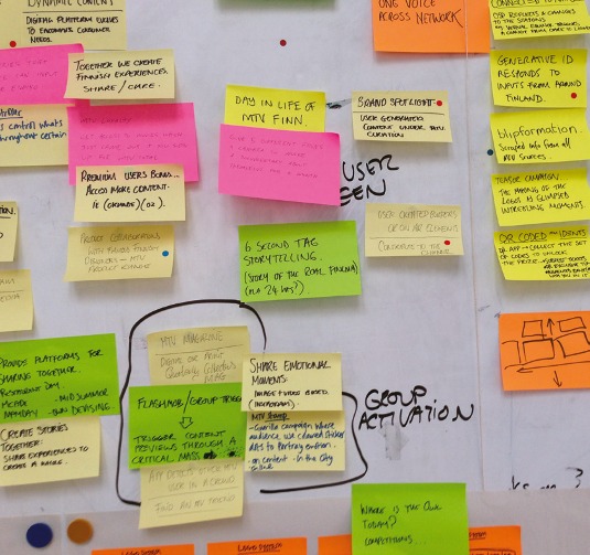
Work in progress
The design process for us begins with big sheets of paper and a bunch of us shooting ideas for how we see the brand coming to life. We decided Sub should be liquid and agile in its delivery of messages and content. We wanted it to be bold, upfront and unapologetic, appealing to its younger audience.
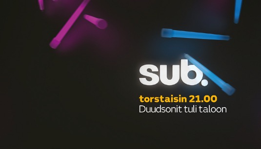
We developed a live action approach to the idents, which we termed 'Sub Condensers'. These were 12-second, blip-sized moments of intense experience. The MTV design team played an important role in shaping the idents for Sub, and of course were key to helping us nail the strategy - especially in terms of the authenticity of the experiences. They way in which the Condensers were edited was really key in establishing the feel of the channel, so we spent time working out the rhythm for each and getting the pace right.
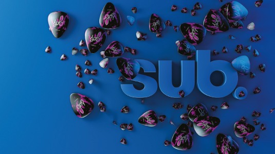
One of the team had been doing some tests of sound-reactive animation which we felt was a perfect approach for the graphic component of the channel, which we termed the 'Sub Sonics'. Each was tied to a live action Condenser, taking one visual component and abstracting it to create highly graphic, vibrant, logo-driven bursts. We wanted each to react in a different way to the audio pumped through it.
Get the Creative Bloq Newsletter
Daily design news, reviews, how-tos and more, as picked by the editors.
The challenges really came when working out how the elements would all fit together. The audio would create random animations that needed to be refined to maintain the authenticity of the approach, and keep things looking stylish. Some of the guys had to learn new animation techniques to bring the Sub Sonics to life.
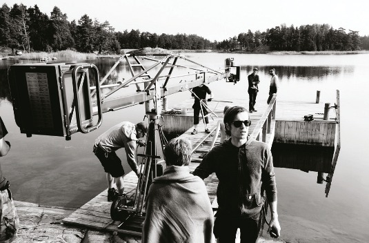
We shot with a Canon C300 for all the live action for the Condensers, and used a mix of Photoshop, After Effects and Cinema 4D for the the rest of the creative process. Edits were done in Final Cut Pro and the animations were ultimately exported to After Effects, all at Full HD. The live action idents also needed to have a strong look, so we referenced inky photos and cross-processed prints to give a dense grade to the images.
For the menu, navigation elements and tune-in messages, we chose FS Emeric with Helvetica Bold Condensed. Always uppercase with short, bold statements, the look of the type system is super-graphic and flat with staccato, on-off binary animation. Three core colours - blue, yellow and grey - created a vibrant palette. We coupled this with crafted type in white lighting on the 3D sections that felt photographic, and live action that was immersive, in the moment, and graded to feel like a magazine fashion shoot.
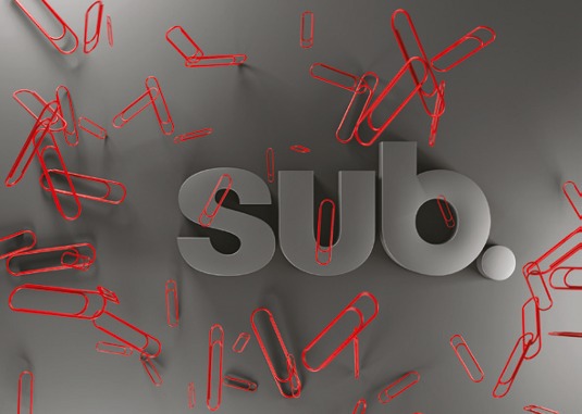
The final deliverables took the form of After Effects project files along with final mastered movies and reference movies of every asset. We provided a style guide within the After Effects projects, and brand guides for on-air, off-air and digital applications, which were implemented by the in-house MTV team.
Conclusion
MTV was really excited by the range and scale of the channel's new identity, especially the tone of voice and attitude, which gave Sub a distinct editorial stance. The number of assets, from graphic type kits to idents, come together to form a highly textured channel which enabled MTV to create much more compelling junctions, messaging and promos.
Collaboration and co-creation with MTV throughout was important to the success of the project. It seems obvious to say that working closely with the client can be a good thing, but when it works well, it ends in great results which they feel part of and proud of, and know how to use and evolve.
Words: Aporva Baxi and Simon Dixon
This article originally appeared in Computer Arts issue 226.

Thank you for reading 5 articles this month* Join now for unlimited access
Enjoy your first month for just £1 / $1 / €1
*Read 5 free articles per month without a subscription

Join now for unlimited access
Try first month for just £1 / $1 / €1

The Creative Bloq team is made up of a group of design fans, and has changed and evolved since Creative Bloq began back in 2012. The current website team consists of eight full-time members of staff: Editor Georgia Coggan, Deputy Editor Rosie Hilder, Ecommerce Editor Beren Neale, Senior News Editor Daniel Piper, Editor, Digital Art and 3D Ian Dean, Tech Reviews Editor Erlingur Einarsson, Ecommerce Writer Beth Nicholls and Staff Writer Natalie Fear, as well as a roster of freelancers from around the world. The ImagineFX magazine team also pitch in, ensuring that content from leading digital art publication ImagineFX is represented on Creative Bloq.
