The biggest logo redesigns of January 2014
We may only be a month into the year but already several companies have refreshed their brand identity. We take a look at five of the biggest.
Whether it's a redesign or an entirely new execution, 2014 has already seen a bunch of great logo designs. Here we take a look at some of the best ones to be released in these few short weeks of January...
- Also read: The definitive guide to logo design
01. Black + Decker

Black + Decker (formerly Black & Decker) gave its logo and branding a new lease of life this month with a fresh modern look. New York-based design agency Lippincott took the reigns for the redesign, ditched the hexagonal nut, swapped out the ampersand for a plus sign, and simplified the whole thing by making the typeface and colour border the same width.

02. Visa

This subtle logo redesign from Visa took place a few weeks ago, with the company changing their usual tag line 'for everyone, everywhere' and evolving it to 'It's everywhere you want to be.' The first external expression of the new platform debuted with a new Olympic-themed television commercial airing in the United States, and then expanding to reach key audiences through variety of other traditional and digital channels in the coming months.
03. Absolut vodka
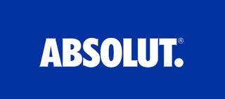
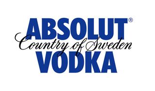
The Absolut Vodka logo hasn't changed massively, but it has changed, now simply reading 'Absolut' followed by a full stop. Leaving the 'Country of Sweden' and 'Vodka' aspects behind, this logo will now be the company's master identity. Global director of Design Strategy at Absolut, Anna Kamjou, said: "The brand has become so iconic that we no longer needed the full three-line logo to convey ourselves."
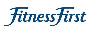
04. Fitness First
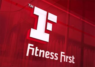
Launching in 1993, gymnasium chain Fitness First has had the same logo for over 20 years - that is, until earlier this month. Twenty of the 80 gyms in the UK have already been introduced to the new logo and branding, which was designed by London based The Clearing. This is the initial phase of a £225-million investment globally to upgrade the company, from branding to training to facilities.
05. Cadillac
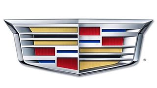
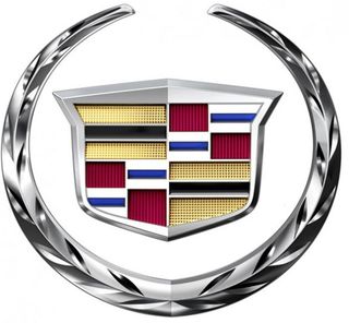
The Cadillac Crest has evolved throughout the decades, always reflected the innovative and advancement in the company's production. The big news in its new redesign is the removal of the wreath in order to present a less stuffy, formal image and help the company to tap into a younger audience than the Florida condo-dwelling retirees that Cadillac is generally associated with.
The company's executive design director Andrew Smith explained, "This new Crest matches the lower, longer, leaner mantra of our current car designs, and reflects the evolution of our Art and Science philosophy." It will appear on vehicles later on this year.
Get the Creative Bloq Newsletter
Daily design news, reviews, how-tos and more, as picked by the editors.
Liked this? Read these!
- The ultimate guide to logo design
- Our favourite web fonts - and they don't cost a penny
- Useful and inspiring flyer templates
Which new logo design do you like best? Let us know in the comments box below!

Thank you for reading 5 articles this month* Join now for unlimited access
Enjoy your first month for just £1 / $1 / €1
*Read 5 free articles per month without a subscription

Join now for unlimited access
Try first month for just £1 / $1 / €1
The Creative Bloq team is made up of a group of design fans, and has changed and evolved since Creative Bloq began back in 2012. The current website team consists of eight full-time members of staff: Editor Georgia Coggan, Deputy Editor Rosie Hilder, Ecommerce Editor Beren Neale, Senior News Editor Daniel Piper, Editor, Digital Art and 3D Ian Dean, Tech Reviews Editor Erlingur Einarsson, Ecommerce Writer Beth Nicholls and Staff Writer Natalie Fear, as well as a roster of freelancers from around the world. The ImagineFX magazine team also pitch in, ensuring that content from leading digital art publication ImagineFX is represented on Creative Bloq.
