The biggest logo designs of April 2014
We take a look back this month's biggest logo designs and redesigns including Netflix and and Indiegogo.
As creatives, we constantly strive to reinterpret the world in new and visually exciting ways. Yet we can also be conservative and often have a knee-jerk reaction to something new.
So, on the day a new logo design is launched for a familiar brand, the first reactions are usually negative. Once some time has passed and the new design has been seen in action, though, it can be a different story. Here we take a look back at the month's biggest new designs and redesigns: with a bit of fresh perspective, what do you think of them now?
01. Netflix

Debuting on the new Orange is the New Black trailer, the latest redesign for Netflix is subtly simpler. Taking away the shadow aspect on the font has allowed the logo design to convey a more modern, minimal feel. But which do you prefer?
02. Indiegogo
As the first and original crowdfunding website, Indiegogo is still a relatively young company, having only launched back in 2008.
"The logo represents the company’s mission to work hand-in-hand with campaigners to democratize finance and give people around the world the power to fund what matters to them," they explain.
To highlight the breadth, depth and reach of its ecosystem, the logo will showcase a different campaign every time the user refreshes the screen.
03. Halifax
A new logo design was unveiled for the Canadian city formerly known as HRM. "Anything different will take you out of your comfort zone. A new logo needs time to germinate and grow on you," said Revolve Inc CEO Phil Otto.
"The strength of our recommended logo is in its simplicity, and its simplicity makes a bold statement," he added.
04. North Korean Space Agency
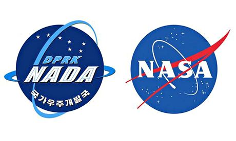
Marking the first anniversary of North Korea's National Aerospace Development Administration, the communist country unveiled this new logo (left), which looks remarkably similar to the iconic NASA logo (right).
05. Florida State
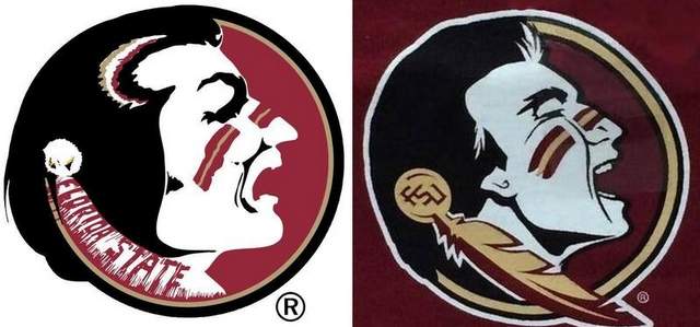
This new logo design for the Florida State football team (right) has caused quite a stir amongst die-hard fans.
Working closely with Nike designers to develop a look that accurately represents the excitement and tradition of today's Seminole football, the aim was to make the team's uniforms even more symbolic of its relationship with the Seminole Tribe of Florida while maintaining its iconic look.
What do you make of this month's new logo designs? Let us know your opinions in the comments below!

Thank you for reading 5 articles this month* Join now for unlimited access
Enjoy your first month for just £1 / $1 / €1
*Read 5 free articles per month without a subscription

Join now for unlimited access
Try first month for just £1 / $1 / €1
Get the Creative Bloq Newsletter
Daily design news, reviews, how-tos and more, as picked by the editors.

Sammy Maine was a founding member of the Creative Bloq team way back in the early 2010s, working as a Commissioning Editor. Her interests cover graphic design in music and film, illustration and animation. Since departing, Sammy has written for The Guardian, VICE, The Independent & Metro, and currently co-edits the quarterly music journal Gold Flake Paint.
