Beautiful packaging for a brand new brewery
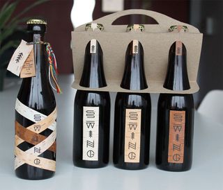
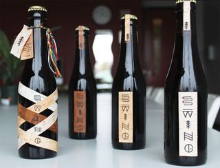
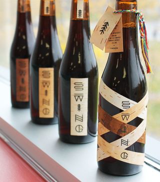
This gorgeous visual identity for a brand new brewery aims to represent the diversity in Quebec culture.

There are rules to successful branding, and they usually involve creating enticing graphics that showcase the company's ethos and products. Canadian designer Simon Langlois has done just that and more with this gorgeous packaging design and branding for a new brewery in Quebec.
"The branding of Swing microbrewery was inspired by Quebec’s cultural, historical, and natural references," Langlois explains. "The shapes of the letters were inspired by Native American petroglyphs considering many Quebecois identity symbols are borrowed from Native American culture.
"The commercial packaging has been specially designed to highlight the bottle. Additionally, the objective was to minimize the amount of cardboard used in order to promote efforts that are deemed eco-friendly," he concludes. We think it's some breathtaking branding.


See more incredible work from Simon Langlois on his website.
What do you think of this branding project? Let us know in the comments box below!

Thank you for reading 5 articles this month* Join now for unlimited access
Enjoy your first month for just £1 / $1 / €1
*Read 5 free articles per month without a subscription

Join now for unlimited access
Try first month for just £1 / $1 / €1
Get the Creative Bloq Newsletter
Daily design news, reviews, how-tos and more, as picked by the editors.
Sammy Maine was a founding member of the Creative Bloq team way back in the early 2010s, working as a Commissioning Editor. Her interests cover graphic design in music and film, illustration and animation. Since departing, Sammy has written for The Guardian, VICE, The Independent & Metro, and currently co-edits the quarterly music journal Gold Flake Paint.
