Barbican brand guidelines pack the power of three
Europe's largest multi-arts and conference venue, the Barbican Centre in London, has a graphic identity and a gorgeous rulebook to go with it.
Branding guidelines aren’t normally the sort of thing to make our hearts skip, but today we’ve been rather besotted by the guidelines for the Barbican’s new visual identity, designed by North and officially launched this week to coincide with AGI Open, the annual international graphic design event which is being held at the Barbican for its inaugural London edition.
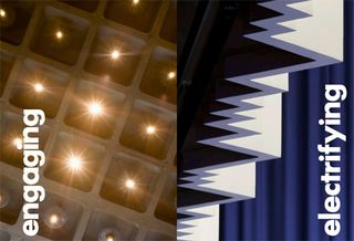
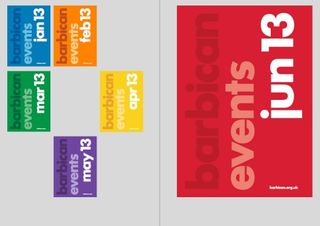
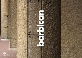
What we love is the simplicity of North’s new visual system for the Barbican, which reduces to three basic elements. There’s a single font: Futura, in a choice of three weights and three sizes. There’s a Barbican wordmark: nearly always used vertically, in three sizes and with multiple positioning possibilities.
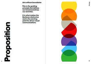
And then there’s the carrier. Descended from the previous Barbican logo, a circle set to bleed off the page, the carrier is a cut-off circle that the guidelines encourage you to experiment with. “Is there a new way you can apply it, position it, repeat it, or use it to represent an idea such as music or movement or the passage of time? Play with flat colour and gradients or place images within it. Don’t be systematic or samey. Explore, experiment.”
There are a few more details to observe, and the guidelines feature 20 pages of best practice examples demonstrating the new branding in use. Best of all, while it’s possible to buy the guidelines as a limited edition book, they’re also available online for free in animated and PDF form. If you’re in need of some proper graphic design inspiration, look no further.


What do you think of the new Barbican identity? Hit the comments!
Get the Creative Bloq Newsletter
Daily design news, reviews, how-tos and more, as picked by the editors.

Thank you for reading 5 articles this month* Join now for unlimited access
Enjoy your first month for just £1 / $1 / €1
*Read 5 free articles per month without a subscription

Join now for unlimited access
Try first month for just £1 / $1 / €1
Jim McCauley is a writer, performer and cat-wrangler who started writing professionally way back in 1995 on PC Format magazine, and has been covering technology-related subjects ever since, whether it's hardware, software or videogames. A chance call in 2005 led to Jim taking charge of Computer Arts' website and developing an interest in the world of graphic design, and eventually led to a move over to the freshly-launched Creative Bloq in 2012. Jim now works as a freelance writer for sites including Creative Bloq, T3 and PetsRadar, specialising in design, technology, wellness and cats, while doing the occasional pantomime and street performance in Bath and designing posters for a local drama group on the side.
