Are traditional brand guidelines still relevant?
Find out why parameters are important as Moving Brands’ Mat Heinl weighs in on the great brand guidelines debate.
Global creative agency Moving Brands has been building flexible brand identities for 15 years. With offices in London, San Francisco and Zurich, the 80-plus team create award-winning branding and design for clients ranging from Coca Cola to Stella McCartney.
Here, CEO Mat Heinl explains why the agency often chooses to give its clients 'parameters' instead of traditional brand guidelines...
What role do traditional brand guidelines have today – are they still relevant?
Different clients require different approaches. It's as simple as that. For some clients, a traditional brand book makes perfect sense – it's probably going to be shared between a small group of people, most of the work might be very graphic design and communication-centered. That's a great delivery mechanism. It's a great artifact; it's got symbolic value.
Other clients might be massively complicated multinationals with teams all over the world – many of whom aren't trained practitioners – with a huge roster of clients. Different languages, cultures, educations, needs and very different understanding about what is and isn't part of the brand or part of the design.

Now, when you're faced with that extreme and every single other alternative in-between, then the question comes back to what's a good delivery mechanism to help the organisation be successful in that area, and what's a good reflection of what that business is about.
It's not just is a guideline good or bad as an object: it's how it helps them, and what it says about the way in which they think about their design and their brand.
So guidelines are right for some brands…
There are some brands that don't need to be messed around with. They just need to be clearly explained, well packaged and produced, with some very straightforward non-ambiguous rules and guidelines around them. But others are very open to principles and interpretation.
Get the Creative Bloq Newsletter
Daily design news, reviews, how-tos and more, as picked by the editors.
And then there are some that are more parameters-based and flexible, but they've got end points – bookends, if you like – so you could never get it wrong, but you can change it depending on what you need.

To me, that's the smart way of thinking about it. If you're binary about this stuff and it's extremely one way or the other, that's not actually how the real world works and that doesn't help clients. If you're too rigid it doesn't help them, and if you're too flexible it doesn't help them.
Can you elaborate?
It's about delivering guidance, rather than guidelines. This [guidance] would be online and accessible by the client, who could distribute whatever assets and principles and guidance they need to whoever they need, wherever they are in the world. Clients can manipulate things within parameters that are relevant for whatever they're trying to build at that particular time.
What kinds of parameters are we talking?
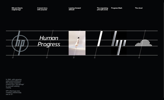
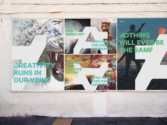
Traditional branding tends to centre around: here's a logo, here are some tone of voice rules and some graphic language that must be adhered to. The alternate on our side would be: here's a symbol and that symbol can change depending on what context it's in, who's it interacting with and so on, and so can the graphic language – but there's a limit to how far you can go with it.
You don't want it to go to the point where it ends up looking like someone else's brand, or it looks wrong or broken but it might be able to express itself quite differently depending on who it's talking to and how it's trying to connect with these people.
How might you set the parameters?
You can use drawing tools, for example, to define some parameters around graphics that we might have created for communications. Let's say the guys are Swisscom – they've got lots of mark-ons to do, where they're talking about some new offerings that they're developing, right?
What they want is for it to immediately feel like Swisscom but they're not necessarily going to invest in a whole new photoshoot and come up with a whole big campaign idea and so on. It's core products – let's say it's new phones they're putting on the market – and they want to put a bunch of ads up in Zurich communicating to people that they've got this new phone that's available now.
The strategy is simple: show the phone with a catchy line, but also make it very graphically recognisable that you can buy it from Swisscom. In that instance, they might say 'We want a textured background and the colours to be very clearly related to Swisscom.'
We've designed the drawing tools that allow them to do that, but it's not the same graphic every single time – so it feels varied and they can adjust the visual based on what photo they're putting in there, and so on.
Even if not everyone notices it, what you get as a viewer is a general impression. It's not rigid or static, but it's coherent. So we build the software – the tools – and they're able to do control and produce their own things, as well as us being able to do it at our end.
What advice would you give for working with parameters?
The key issue if you really want to create something flexible – that's living – then as a creative business you need to understand and be a practitioner in those areas.
The fundamental failing of most branding systems is that you've got people that know one area well and try to dictate into lots of disciplines that they have no ability or experience in, and then it breaks down and the client's left with a system that actually doesn't work.
Words: Julia Sagar
Image: Moving Brands for Blank Digital
Like this? Try these...
- The world's top agencies reveal how they develop new brands
- 4 tips for creating a killer brand strategy
- Check out these 12 magically meticulous design style guides

Thank you for reading 5 articles this month* Join now for unlimited access
Enjoy your first month for just £1 / $1 / €1
*Read 5 free articles per month without a subscription

Join now for unlimited access
Try first month for just £1 / $1 / €1

The Creative Bloq team is made up of a group of design fans, and has changed and evolved since Creative Bloq began back in 2012. The current website team consists of eight full-time members of staff: Editor Georgia Coggan, Deputy Editor Rosie Hilder, Ecommerce Editor Beren Neale, Senior News Editor Daniel Piper, Editor, Digital Art and 3D Ian Dean, Tech Reviews Editor Erlingur Einarsson, Ecommerce Writer Beth Nicholls and Staff Writer Natalie Fear, as well as a roster of freelancers from around the world. The ImagineFX magazine team also pitch in, ensuring that content from leading digital art publication ImagineFX is represented on Creative Bloq.
