You'll love this sleek anthropology-themed branding
Inspiration for this stationery was drawn from the designers' fascination with human behaviour.
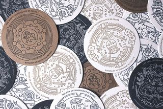
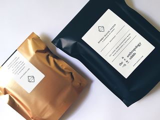
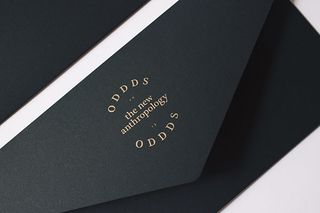
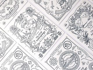
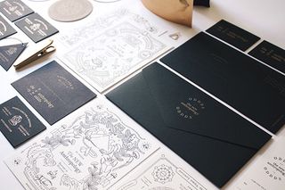
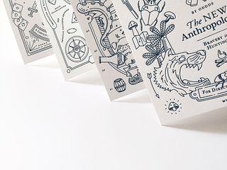
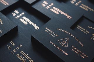
Branding your own design studio or agency is a massive deal. It speaks volumes about your process, your look and your overall ethos. This incredible new rebrand from Singapore based agency Oddds has us in awe of their detail and execution. With stationery, letterpress, matte gold and copper foils, it's certainly a stunner.
"Drawn from inspiration from the designers' fascination of human behaviours and cognitive curiosities, the branding comes with perspectives of the study of humankind, cultures and design; referencing with philosophical values & new thinking," they explain.
"The visual identity ties in around Oddds' beliefs in four stages/themes; Deep Sea Complexity, Bravery in Hunting, Glamour of Illusion and Science of Atmosphere," they continue. "The logo is a serif logotype visibly combines the new thinking theory into the Oddds' brandmark." Take a closer look at the brand assets below.
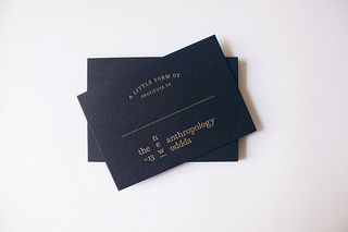
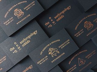
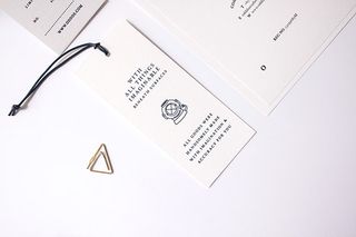
What do you make of this branding project? Let us know in the comments box below!

Thank you for reading 5 articles this month* Join now for unlimited access
Enjoy your first month for just £1 / $1 / €1
*Read 5 free articles per month without a subscription

Join now for unlimited access
Try first month for just £1 / $1 / €1
Get the Creative Bloq Newsletter
Daily design news, reviews, how-tos and more, as picked by the editors.

Sammy Maine was a founding member of the Creative Bloq team way back in the early 2010s, working as a Commissioning Editor. Her interests cover graphic design in music and film, illustration and animation. Since departing, Sammy has written for The Guardian, VICE, The Independent & Metro, and currently co-edits the quarterly music journal Gold Flake Paint.