Anarchic craft beer BrewDog gets a new bottle identity
The cult brewers have changed their look after seven years of the same packaging.
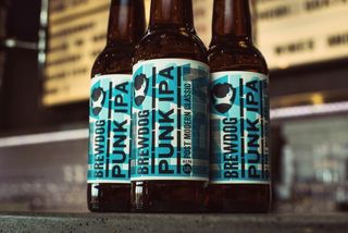
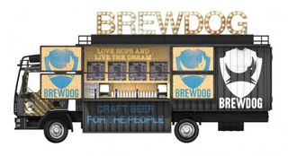
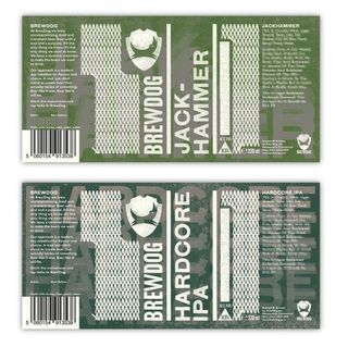
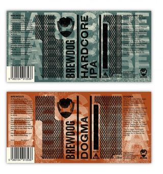
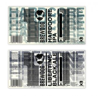
The trend for home breweries and craft beers has led to an explosion of inventive and original beer label designs. Popular Scottish brewery BrewDog have had the same packaging since their beginnings over seven years ago. After customer feedback, they finally decided to create an entirely new design for their bottles.
"We wanted to change because we felt the old labels were no longer quite right for us as a brewery. After seven years we felt they had become a bit too young, a bit neon and a bit tacky," BrewDog explain. "Although they stood out, they did not reflect the craft heart and soul of our beer. This is also not something we have taken lightly or done quickly. We had seven agencies from three different countries pitch us designs and concepts.
"After myself and our team spent time with them, we all felt completely committed to the evolution of the packaging and branding and we all, after a little time, loved the new designs." It's easy to see why, with the simple typography and clever inclusion of 'IPA' in the design.
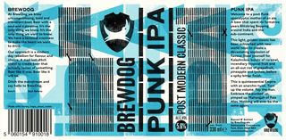
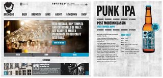
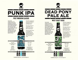
What do you think of the new packaging? Let us know in the comments box below!

Thank you for reading 5 articles this month* Join now for unlimited access
Enjoy your first month for just £1 / $1 / €1
*Read 5 free articles per month without a subscription

Join now for unlimited access
Try first month for just £1 / $1 / €1
Get the Creative Bloq Newsletter
Daily design news, reviews, how-tos and more, as picked by the editors.

Sammy Maine was a founding member of the Creative Bloq team way back in the early 2010s, working as a Commissioning Editor. Her interests cover graphic design in music and film, illustration and animation. Since departing, Sammy has written for The Guardian, VICE, The Independent & Metro, and currently co-edits the quarterly music journal Gold Flake Paint.