America and Australia collide in this brash and brilliant font design
Airline Qantas celebrates its extensive network of services with a new print and motion campaign.
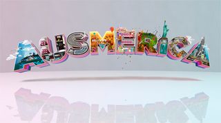
We've seen countries and their flags provide inspiration for a number of projects, including a recent project which saw the world's flags turned into a beautiful new font. This latest project was created for international airline Qantas to celebrate their extensive services.
'Ausmerica' is a new font created by Serial Cut that sees the studio stay true to their bizzare and avant-garde style. "Droga5 came to us with the word 'Ausmerica' - a portmanteau of Australia and America - and asked us to create the lettering, and to fill each letter with a different landmark that would illustrate a journey," said Serial Cut's Sergio del Puerto.
"The creatives told us, 'The first letter should be Sydney, the second should be the interior of the aircraft,' and so on, and we submitted our interpretations." The result is a weirdly wonderful campaign for the airline that will certainly attract attention.
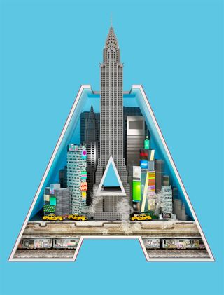
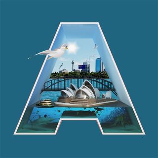


Find out more about the project over on Bernstein & Andriulli.
What do you think about this latest project? Let us know in the comments box below!

Thank you for reading 5 articles this month* Join now for unlimited access
Enjoy your first month for just £1 / $1 / €1
*Read 5 free articles per month without a subscription

Join now for unlimited access
Try first month for just £1 / $1 / €1
Get the Creative Bloq Newsletter
Daily design news, reviews, how-tos and more, as picked by the editors.
Sammy Maine was a founding member of the Creative Bloq team way back in the early 2010s, working as a Commissioning Editor. Her interests cover graphic design in music and film, illustration and animation. Since departing, Sammy has written for The Guardian, VICE, The Independent & Metro, and currently co-edits the quarterly music journal Gold Flake Paint.
