This amazing inflatable rebrand is bursting with fun
Interbrand Australia's identity system for Darling Harbour - including giant rubber duck - really got people talking.
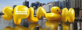
Interbrand Australia was commissioned by SHFA to develop a new brand platform for Sydney's Darling Harbour that would unite the entire precinct experience under one brand. It created a highly innovative identity, including a bespoke balloon typeface, an inflatable wayfinding system and a playful augmented reality app. Interbrand's executive creative director Mike Rigby talks us through the process.
Darling Harbour is one of Australia's most visited destinations, with over 25 million visitors a year. Situated in the heart of Sydney, it's a big, vibrant, colourful place where the city goes to celebrate.
The precinct is owned and operated by Sydney Harbour Foreshore Authority (SHFA), who commissioned us to develop a brand. An in-depth analysis and research phase followed, leading to the development of a new brand platform and activation strategy.
Darling Harbour was awash with many competing brands and messages, so our brief was to unite the precinct under one simple, strong brand identity, while retaining the sense of fun and vibrancy synonymous with the area. Our concept was to create 'the world's most incredible, inflatable, sociable brand'.
Essentially we wanted to design a brand you can squeeze, pinch, bounce and kick around and, most importantly, share with friends and family. Our inflatable design system clearly and simply connects everything in the harbour, from communications to websites, wayfinding and uniforms.
I would like to give huge credit to our client for believing in our ideas and for executing the project so spectacularly. I think it's safe to say not many government departments would consider commissioning 20ft inflatable letters.
01. Starting with a bang
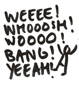
After spending time observing in the precinct, the first useful thing I scribbled down was a stick figure interacting with a list of large onomatopoeic words such as BANNNG! WEEEEE! WOOOSH! Those initial doodles really helped us to capture the right feeling - fun, playful, positive, social.
Get the Creative Bloq Newsletter
Daily design news, reviews, how-tos and more, as picked by the editors.
02. Bring the balloons
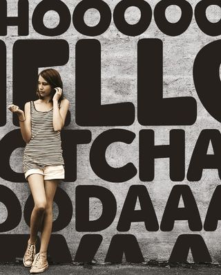
We liked the interaction between the person, the type and the urban setting. We played around with various big, squidgy typefaces before landing on the idea of an inflatable brand. Working alongside our senior motion designer Mike Tosetto, we decided to create a 3D balloon typeface, using Cinema 4D.
03. Playing with 3D type
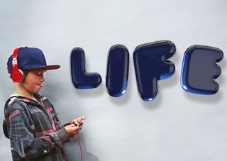
This was our first attempt at a 3D typeface. We imported splines of a modified typeface created in Illustrator and used them as guides. We then applied a Symmetry Object so we only had to work with one side of the balloon, and extruded polygon faces to puff out the shape. However, this gave a solid plastic look.
04. Textures and highlights
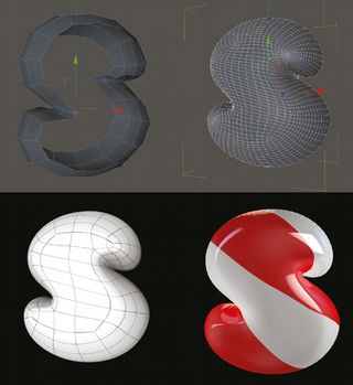
Our next step was to unwrap the UVs for each letter using Headus UVLayout, in order to create the UV maps. This was a necessary step to apply bespoke textures and displacement maps for the ribbed edges of the balloons. We achieved the specular highlights on the balloons by using an HDRI map.
05. Smoothing things out
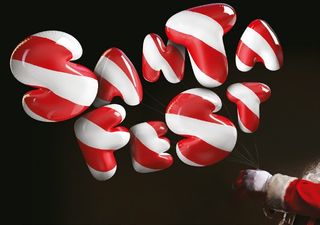
Finally, we applied a HyperNURBS object to smooth off the balloons and then rendered each letter at A4 size. A clever system using Smart Objects was devised in Photoshop so we could create a set of useable assets for designers who have no knowledge of 3D software, so they can easily tweak the letterforms. Simple!
06. Augmented reality
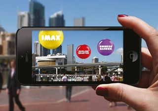
To further bring the experience to life, we developed an interactive app in collaboration with augmented reality specialist, Explore Engage. Within it you can play games, pop balloons to reveal special offers, follow on-screen balloon trails into different areas and send a special 'balloon message' to someone.
07. Taking off
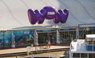
We worked with signage specialist Diadem to develop a wayfinding system that included a 3D modelled balloon typeface, 20ft-high inflatable signage, inflatable street furniture and a giant rubber duck. To launch the brand, we held a flash-mob carnival, featuring samba dancers and a full percussion orchestra.
Words: Mike Rigby
Mike is a multi award winning British designer based between Sydney and New York. This article originally appeared in Computer Arts issue 226.

Thank you for reading 5 articles this month* Join now for unlimited access
Enjoy your first month for just £1 / $1 / €1
*Read 5 free articles per month without a subscription

Join now for unlimited access
Try first month for just £1 / $1 / €1
The Creative Bloq team is made up of a group of design fans, and has changed and evolved since Creative Bloq began back in 2012. The current website team consists of eight full-time members of staff: Editor Georgia Coggan, Deputy Editor Rosie Hilder, Ecommerce Editor Beren Neale, Senior News Editor Daniel Piper, Editor, Digital Art and 3D Ian Dean, Tech Reviews Editor Erlingur Einarsson and Ecommerce Writer Beth Nicholls and Staff Writer Natalie Fear, as well as a roster of freelancers from around the world. The 3D World and ImagineFX magazine teams also pitch in, ensuring that content from 3D World and ImagineFX is represented on Creative Bloq.
