Magical Alice in Wonderland-inspired branding
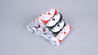
Take a trip down the rabbit hole with this magical Alice in Wonderland inspired packaging and branding.
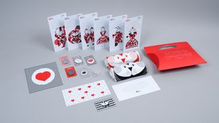
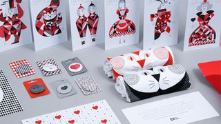
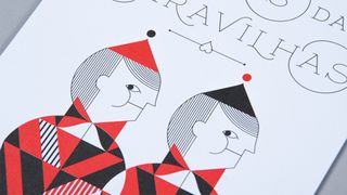
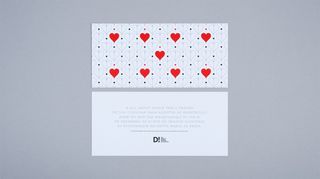
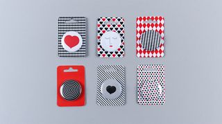
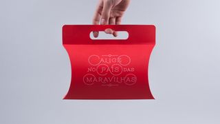
We've seen some outstanding uses of colour in branding over the years and this project from Portuguese agency oraviva! designers incorporates Alice in Wonderland and custom playing card designs into one beautiful branding output.
They came up with the idea of producing visuals with the same richness and graphic detail of those found on traditional playing cards (which play a pivotal role in the Alice story.
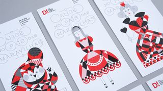
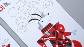
"From this starting point we created several geometric shapes related to the 'cards' theme and combined them with thin, organic lines to create patterns and ultimately some of the main characters of Alice in Wonderland," they explain. "To display the title we used Maximiliano Sproviero's 'erotica capitals', with the line used in the illustrations designed exactly the same width as the letters."
See more inspiring work from oraviva! designers on their website.
What do you make of this branding? Let us know in the comments box below!

Thank you for reading 5 articles this month* Join now for unlimited access
Enjoy your first month for just £1 / $1 / €1
*Read 5 free articles per month without a subscription

Join now for unlimited access
Try first month for just £1 / $1 / €1
Get the Creative Bloq Newsletter
Daily design news, reviews, how-tos and more, as picked by the editors.
Sammy Maine was a founding member of the Creative Bloq team way back in the early 2010s, working as a Commissioning Editor. Her interests cover graphic design in music and film, illustration and animation. Since departing, Sammy has written for The Guardian, VICE, The Independent & Metro, and currently co-edits the quarterly music journal Gold Flake Paint.
