Agency branding brings pastel colours bang up to date
Soap is a new digital agency based in London and this branding separates them from the usual harsh offerings.
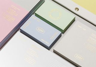
There seems to be a few rules of successful branding - making your company stand out separate from the other competitors is a difficult task but it's by no means impossible. Digital agencies can produce over-thought and harsh offerings in their branding but this creation is as delicate as they come.
Immersed in pastel colours and delightful, embossed gold typography, this spring-like branding was created by Socio Design. "We created a brand story and identity system that represented Soap’s distinct perspective and applied it to both print and digital collateral," they explain.
"The result was a paradoxical brand that reflected Soap’s craftsmanship and tactile work ethic through 1930s industrial insignia, pastel colours and metallic foils." Why would you ever choice between metallics or pastels? We think they look mighty fine side-by-side.
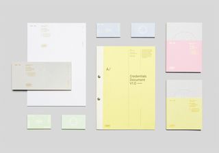
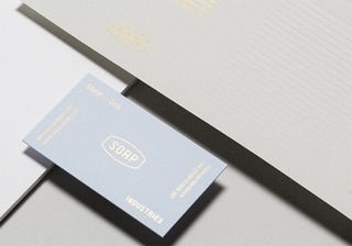
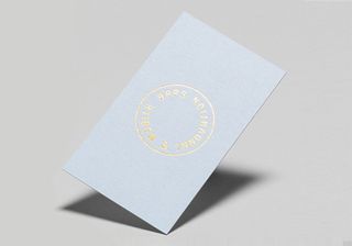
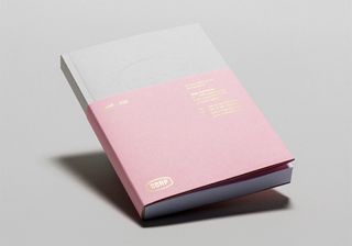
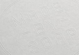
See more gorgeous work over on the Socio Design website.
What did you think of this branding project? Does it work? Let us know in the comments box below!

Thank you for reading 5 articles this month* Join now for unlimited access
Enjoy your first month for just £1 / $1 / €1
*Read 5 free articles per month without a subscription

Join now for unlimited access
Try first month for just £1 / $1 / €1
Get the Creative Bloq Newsletter
Daily design news, reviews, how-tos and more, as picked by the editors.
Sammy Maine was a founding member of the Creative Bloq team way back in the early 2010s, working as a Commissioning Editor. Her interests cover graphic design in music and film, illustration and animation. Since departing, Sammy has written for The Guardian, VICE, The Independent & Metro, and currently co-edits the quarterly music journal Gold Flake Paint.
