50 ways to design better branding
Designing for digital throws up a host of challenges. Our panel of pro designers share their top tips for mastering truly cross-platform branding
26 MAKE IT GREAT AND MAKE IT BASIC

“As tempting as it is to get some nice gradients, highlights and shading involved when developing new logo concepts, these things should really be left until the very end of the design process, advises Mark Boston, senior designer at nerv. “Focus on the logo being great at its most basic level.”
27 VARIANTS ARE VITAL
“A good logo can still have variants for different applications, as long as they’re available to anyone who needs them, with clear usage guidelines,” says Tahninial’s Dan Moat. So, while you must ensure that your logo works at small sizes or in a single colour, this doesn’t necessarily mean you need a single magical version that will be perfectly legible for every possible scenario.
28 PRODUCE BRANDING PACKS
“I have two words for you: ‘branding pack’,” Moat continues. It’s important to put together a very comprehensive branding pack to help clients and avoid any confusion: “Often a client can’t open design files such as an EPS or PSD so they ignore them and give out tiny JPEGs with white backgrounds from their website, claiming they never received anything else.”
29 TONE OF VOICE
As we’ve already iterated, a brand is more than a well-crafted graphic mark. The most memorable brands are identities, with ‘personalities’ that people can relate to as consumers. “Designers need to think beyond the straitjacket of graphic form and consider the full range of elements at their disposal,” explains Christopher Murphy of Monographic. “What tone of voice should be used to express the organisation’s personality? Has content strategy been considered as a part of the mix? If not, should it be?”
30 SMART OBJECTS
Robin Fisher, creative director at nerv, highlights the importance of using smart objects when you’re working on branding projects: “When using the logo in a web design, use smart objects and not rasterised versions of the logo. There’s nothing worse than having a logo created as a rasterised image. It renders it useless when needing to resize, easily change colour or adapt.”
31 START OUT SMALL
“A ‘minimum viable first’ approach serves as a good starting point for creating your identity systems,” says Sam Quayle, designer at Erskine Design. “Begin by creating the smallest, recognisable image or mark that communicates your brand message, principles and story, and progress from there. Not only does this help focus your approach, it also encompasses one of the most important principles in branding – simplification.”
32 DON’T FORGET THE CODE
Advances in technology now enable the precise scaling of your mark. “The SVG format is now better supported by modern browsers, allowing graphics and identities to scale with precision, maintaining their appearance regardless of screen resolution or size,” Quayle continues. “Media queries also empower the modern designer with the means of replacing images and graphics at various screen sizes, offering ultimate flexibility and control over your identity.”
Get the Creative Bloq Newsletter
Daily design news, reviews, how-tos and more, as picked by the editors.
33 EMBRACE DIGITAL FLEXIBILITY

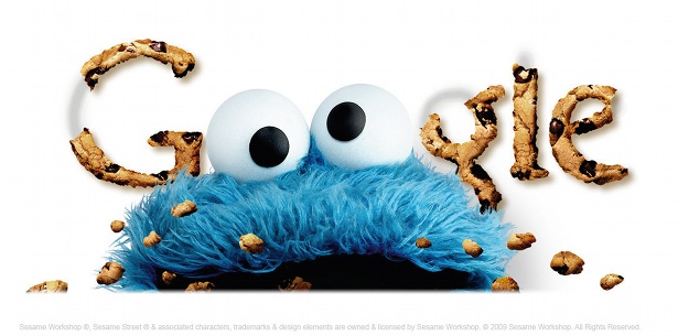
Brands increasingly operate across a variety of media, both online and off, with digital offering up opportunities that push beyond the restrictions of print. “Digital space is fluid, and working intelligently as designers we can embrace this fluidity to deliver brands that constantly excite and surprise,” says Monographic’s Christopher Murphy. “Think of Google’s ‘Doodles’ – each one is different, and every one is instantly recognisable.”
34 CONSUMERS ARE GETTING SAVVIER
As consumers become more familiar with the principles of ‘good design’, the challenges for designers have become more focused. “It’s becoming harder to sell poor-quality products or services through great image building,” adds Quayle. “Rightly, companies are having to focus more on building great products and services for consumers to perceive an intrinsic value in their brand. This is where the great challenges lie.”
35 TYPOGRAPHY AND RENDERING
Think about the typefaces you’ll use and how they display, because on the web typography trumps the logo. “Typography is the main constant,” explains Jamie Neely, creative director at Typecast. “It’s an inverse relationship; as screen resolutions shrink, typography bears more of the branding burden and must convey more of the brand’s personality.” Cond Nast Digital, M&S and ASOS are just a few of the companies making the most of web type today.
36 PLAYFUL DESIGN SYSTEMS
According to Jamie Neely, rigid brand guidelines must be eschewed in favour of playful design systems. “Once it’s online, novices and professionals alike can and will take any part of your visual identity, remix it to their heart’s content and express it in ways you couldn’t imagine,” Neely continues. “So designs need to be flexible enough to hold up to recycling, and that means making sure our systems already contain the raw ingredients for creating better remixes.”
37 UX IS A ‘BRAND’ THING
User experience has become one of the tenets of good web design and is seen by some designers as a technical concern. But not according to Cynan Clucas, managing director at nerv. “As designers, we used to talk to clients about the importance of brand experience,” says Clucas. “Then as website designers, we started to talk to them about the importance of user experience,” he continues. “But very few of us took the time to align the two. User experience is a ‘brand’ thing, not a technical thing.”
38 GUIDELINES FOR ALL FORMS
Keeping brand guidelines up-to-date is a must, and staying on top of different devices and viewports is vital for consistency. “Brand guidelines now have to address multiple devices to ensure the brand remains consistent across all forms of digital media,” Cynan Clucas explains. “The brand story has to work in more and more places.”
39 THINK OF FONTS IN EMS
“When we define typography rules in our brand guidelines, we now include a section specific to body text to define how typefaces render across different browsers,” Clucas continues. And ensuring that brand guidelines include information on how text should be used as body copy is even more important, as text rendering can differ across devices. “We also have to account for rendering text within responsive design and fluid scaling. This means we’re now designing with fonts set to ems rather than pixels, as this enables our designs to be resolution independent.”
40 CONSIDER THE WHOLE
According to Clucas, achieving a strong brand across the breadth of platforms that we have today comes down to keeping it as simple and easily recognisable as possible. “The logo has to work tremendously hard – it needs to be as strong at 16 pixel-squared as it is on the side of a building,” he concludes. “But everything needs to work hard, including the accompanying fonts, colours and imagery, to keep the brand working well as a whole.”
41 USER TEST AND RESEARCH YOUR DESIGN
“If a brand comes down to what people think of a product, service or business then it’s vital that designers get feedback throughout the design process,” says Joe Tuckwell, design director at MoreSoda. And though this may not be at the centre of every designer’s process, as audiences become savvier and more vocal in how they view your brand, including user testing can reap rewards for you. “User testing and design research offers real-world reaction to make sure any element of brand design is aligned to core values,” he explains.
42 COPY IS VITAL
“The messaging that sits alongside a logo is vital to a brand,” continues Tuckwell. And addressing the real-world issues around how people will discover your brand in the first place is also key. “Thanks to the demands of SEO, online copy has to balance the needs of a brand with the realities of online marketing. Write for people, in a tone aligned with your brand, using words that get you found,” he advises.
43 EXPLORE INFINITE OPPORTUNITIES

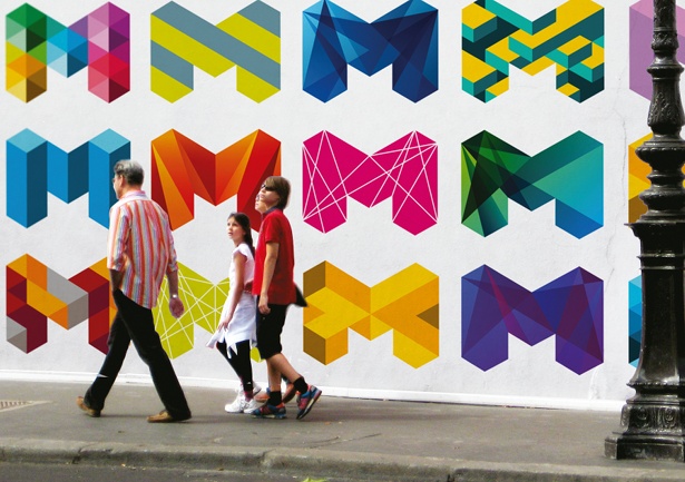
Christopher Murphy of Monographic emphasises the importance of flexibility – and highlights Landor’s rebranding of the city of Melbourne as a dynamic example. Built around the letter ‘M’ in a multitude of forms, it’s a vibrant refresh of a city, he says.
Since implementing its previous identity 15 years previously, the city of Melbourne had accumulated a range of isolated logos for various services, which had become increasingly difficult and costly to manage. Landor was called upon to provide a long-term solution, and began a detailed analysis of the organisation.
“We established early on the idea of a transforming identity; one that could deal with the multiple entities within the brand,” explains Landor creative director Jason Little. “We were also determined to make a really creative visual statement. Every inch of our studio was covered with ‘M’ shapes,” he laughs. “The trick is to make guidelines exactly that – a guide.”
44 REACT TO USERS AND CUSTOMERS
Your brand is what your customers make it, and not what you want it to be. You lose control as soon as it goes into the public domain. Jason Bye, production director at MoreSoda, explains: “A well-considered design that works online will continue to represent your brand as it is spread by your customers through their networks. Providing the correct visual incarnation of your brand is the extent to which you can control what others are able to see. Once online, it’s out of your hands.”
45 NO SUCH THING AS ONE-SIZE-FITS-ALL
“A logo is only one part of a larger language that brands use to identify themselves,” explains Usman Sheikh, design consultant at Contrive Digital. According to Sheikh, it isn’t necessary for the logo a brand uses on their printed literature or on top of their website to translate perfectly into an icon. “Don’t try to create logos with a one-size-fits-all mentality,” he says. “It can be much more effective to create a suite of variations, which cover all executions.”
46 WAIT TO ADD THE COLOUR
“If you’re working with a new identity then try and separate the choice of colour palettes from the actual logo mark,” advises Usman Sheikh. He suggests that it’s best to start off with the simplest rendition – possibly monochrome. “That would firstly give you an idea of what the logo would look like at its absolute simplest, but would also enable the clients to focus on the message and personality that the mark is trying to convey, rather than be blocked out by their colour preferences,” he says.
47 INCREASING UNDERSTANDING
“In addition to seeing a logo and colour scheme, consumers can experience rich retail environments, navigate websites, read editorial content, ‘like’ something on a social network, use mobile apps on the go, play games in their living room; the list goes on,” says Kevin Coffey, principal designer at Nokia. Coffey believes that all of these touch-points should have a brand position. “When intelligently connected to one another they can aggregate and produce an increased understanding of your brand,” he insists.
48 CONTROLLED NARRATIVE
You will never be able to foresee every application of a brand. However, what you can do is create a watertight narrative. “Building a controlled narrative around your brand is a great way to expand it into more of a platform from which you can launch new connected experiences as technology marches forward,” Coffey continues.
49 BE INSPIRED

Another project that Christopher Murphy of Monographic recommends checking out for its sheer flexibility is MIT Media Lab’s visual identity, which conjures up an infinite number of iterations out of a mere three squares. As he explains, it’s a simple idea, which is elegantly executed and neatly echoes MIT Media Lab’s varied lines of enquiry.
50 KNOW THE BETTER LAYOUT
Our last tip is one that every designer should remember, because no matter what platform you’re designing for, layout is layout. “Whether you are looking at an iPad or an annual report, you’re still designing to a grid that reflects a brand,” explains Neil Dennis, business development director at Strawberry Soup. “A knowledge of new technology is nothing without a clear understanding of typography and layout. In essence: whatever the medium, the rules still remain constant.”

Thank you for reading 5 articles this month* Join now for unlimited access
Enjoy your first month for just £1 / $1 / €1
*Read 5 free articles per month without a subscription

Join now for unlimited access
Try first month for just £1 / $1 / €1

The Creative Bloq team is made up of a group of art and design enthusiasts, and has changed and evolved since Creative Bloq began back in 2012. The current website team consists of eight full-time members of staff: Editor Georgia Coggan, Deputy Editor Rosie Hilder, Ecommerce Editor Beren Neale, Senior News Editor Daniel Piper, Editor, Digital Art and 3D Ian Dean, Tech Reviews Editor Erlingur Einarsson, Ecommerce Writer Beth Nicholls and Staff Writer Natalie Fear, as well as a roster of freelancers from around the world. The ImagineFX magazine team also pitch in, ensuring that content from leading digital art publication ImagineFX is represented on Creative Bloq.
