5 top examples of drinks branding done right
From soft drinks to juices to alcohol, these drinks branding projects will quench your thirst for inspiration.
With a huge range of products on offer, branding a drink is more competitive than ever. From craft beers to cold soft drinks, companies are taking branding design into account far more than they have ever done before. Here, we pick five stand out offerings that'll almost certainly quench your thirst for inspiration.
01. Thor
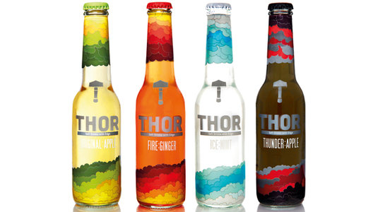
Thor Drinks contacted London-based art director, illustrator and graphic designer Radim Malinic and asked him to design the identity, packaging design and website for the company’s new range of 'soft drinks with edge'. "The brief was wide open," recalls Malinic, who works under the moniker Brand Nu. "I had to brand the main operation as well as the bottle packaging for each flavour."
02. Kurko
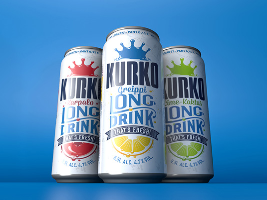
Taxi Studio are one of Europe's top go-to agencies in this sphere. The Bristol-based agency, who spoke at our Brand Impact conference last year, are famed for their work with big name drinks clients. Here they were asked to create a revolutionary redesign that would make the Finnish Kurko 'long drink' brand appear more modern, witty and relevant to both male and female drinkers.
03. Frem
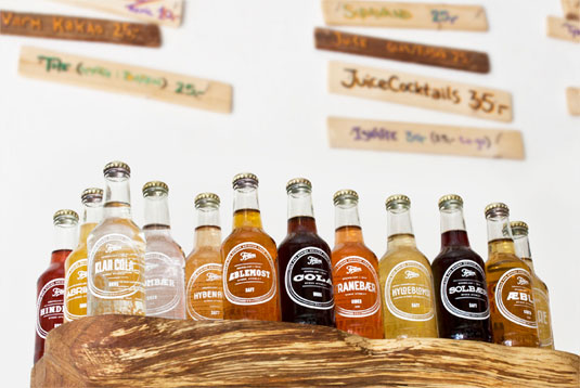
Danish soda brand Frem asked Copenhagen-based graphic designer Jonathan Faust to redesign the identity and packaging of their product but he decided to do things a little differently. Instead of creating an overall design, he created an individual design for each soda flavour. The typography chosen for each flavour is designed to match its unique associations, clichés and shapes when drinking it.
04. Red Bull
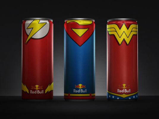
In this conceptual project, the recogniseable tall, slim, silver and blue Red Bull can has been transformed into the colourful uniforms of some of the world's best-loved superheroes. Conceived by New York-based art director Diego Fonseca, who drew inspiration from his favourite comic book characters, there are six designs in total, representing Batman, Wonderwoman, Flash, The Green Lantern, Superman and Aquaman.
05. Stranger & Stranger No. 13
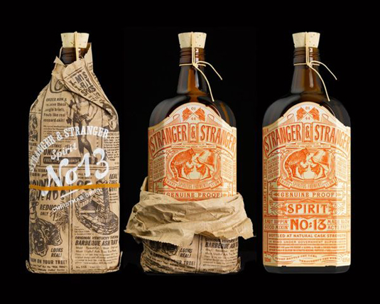
Beverage bottle branding guru Stranger & Stranger designed this limited edition holiday give-away liquor that features one of the most detailed labels you will ever see. The Spirit No 13 label just screams vintage and consists of over 500 words. To top it all off, the bottle is presented wrapped in a specially printed piece of newspaper that gives it what they call a 'moonshine' feel.
Have you seen any inspiring drinks branding? Let us know in the comments box below!
Get the Creative Bloq Newsletter
Daily design news, reviews, how-tos and more, as picked by the editors.

Thank you for reading 5 articles this month* Join now for unlimited access
Enjoy your first month for just £1 / $1 / €1
*Read 5 free articles per month without a subscription

Join now for unlimited access
Try first month for just £1 / $1 / €1

Sammy Maine was a founding member of the Creative Bloq team way back in the early 2010s, working as a Commissioning Editor. Her interests cover graphic design in music and film, illustration and animation. Since departing, Sammy has written for The Guardian, VICE, The Independent & Metro, and currently co-edits the quarterly music journal Gold Flake Paint.
