5 classic beer labels that can't fail to inspire you
These examples of beer branding will have you gasping for a pint, says Stuart Humm, creative director at Coley Porter Bell.
I love beer and I love design. So I am very fortunate to have worked extensively in the beer and spirits category at Coley Porter Bell.
My passion for beer isn't just about drinking it, as I also brew my own. I started with kits (which have massively improved since the ones my Dad brewed from Boots the Chemist in the 70s). I then advanced to extract brewing and more recently all-grain brewing.
In short, I brew my own beer, I am a designer who wears a beard... so here are my top five beer labels.
01. Liberty Ale (Anchor Brewing Co)
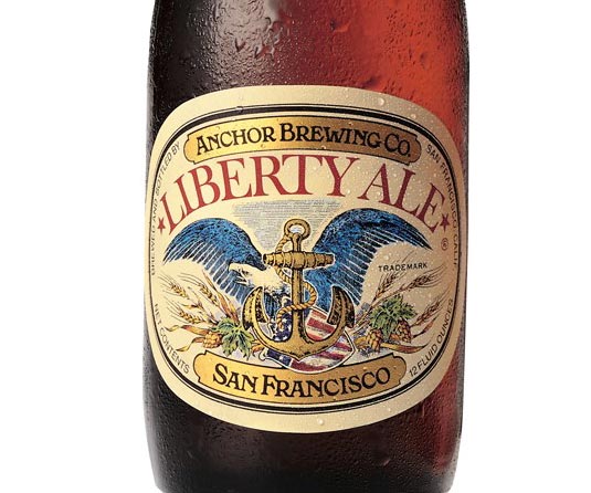
I just love this label; it's a true American classic, an un-designed kind of design.
San Francisco's Liberty ale was created to mark the bicentenary of Paul Revere's historic ride to warn Congress the British Army was coming. Originally designed 40 years ago by Jim Stitt the design has changed little.
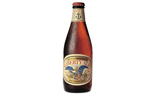
Some muted colours with the addition of the Anchor trademark are the most notable changes, but its soul is still truly intact.
It's a historic label for a historic beer. Full of craft and detail just like the product. And it's got an American Eagle on it.
Get the Creative Bloq Newsletter
Daily design news, reviews, how-tos and more, as picked by the editors.
02. Beck's Live Beyond Labels 2014
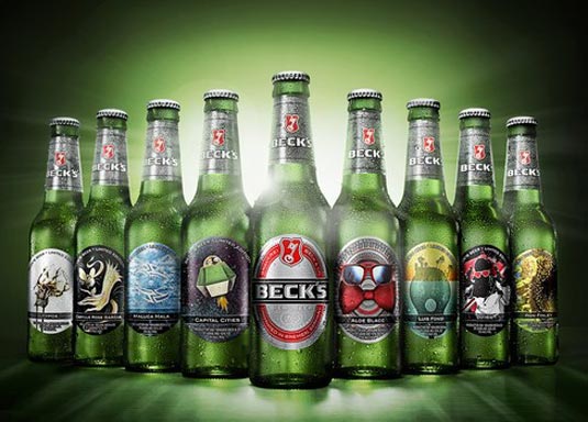
2014 saw the 27th anniversary in the UK for this label campaign from Beck's. These bottles showcase original designs from both emerging and established artists including Andy Warhol, Jeff Koons, Damien Hirst, Yoko Ono, MIA and Kid Cud.
Each summer I eagerly await the release of their latest designs and the pending debate in our studio to who has the best label from that year. The latest studio winner being singer, songwriter Aloe Blacc with a design featuring his trademark bow-tie and glasses.
Fun and fresh limited editions are a great way for established brands to show some creative flair without damaging established brand equity.
03. Sixpence Stout (Tap East)
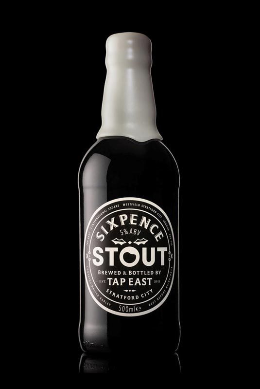
This East London Christmas stout designed by Midday beautifully brings to life the seasonal Christmas pudding flavour of the beer. The indulgent custard inspired wax neck seal is a nice touch, as is the traditional crafted label with its playful modern twist in the typography.
It's a simple design beautifully crafted and the most desirable bottle of stout I've ever seen. Roll on Christmas.
04. Brewdog
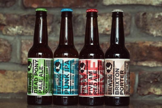
Great beers, great labels. Brewdog updated their branding last year, whilst you could argue that the redesign is less disruptive on shelf and in the chiller, it has maintained the brand's character. The new design swaps a little bit of edge with a little bit of style.
I prefer the redesign; love the layering and the Alan Kitching esque letterpress backgrounds. Loads of character, just like their beer. The labels feel great in the hand, beautifully tactile, you cannot help but rub your finger over the raised type.
The composition, textures and tone of voice of these labels are great, and they fit nicely into the Brewdog's growing brand world.
05. Guinness Porter
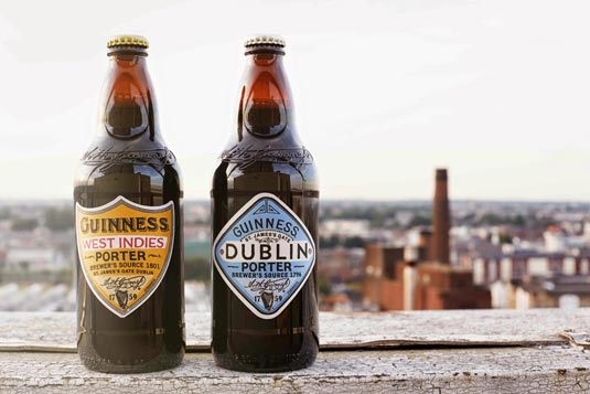
Guinness launched these two Porters towards the end of last year. The recipes for these Porters (well hopped dark beer) are said to have been inspired by old brewing books dating back to the eighteenth century. So it is fitting that the designs should pay homage to a bygone era.
Whilst these labels are not creatively ground breaking, admittedly I have a penchant for the vintage; they are still without doubt beautiful. Hand-drawn lettering, differing die cut label shapes and a great paper stock ooze craft.
And that's all from me. Keep the beer flowing and please enjoy responsibly.
Words: Stuart Humm
Stuart Humm has been creative director at Coley Porter Bell since 2012, where he has worked on FMCG and luxury brands for P&G, Unilever, PZ Cussons, Nestlé, GSK, Cadbury's, Premier Foods, John West, Diageo, The Edrington Group and Pernod Ricard.
Like this? Read these!
- Top 6 trends in beer packaging for 2015
- Create a perfect mood board with these pro tips and tools
- The ultimate guide to logo design

Thank you for reading 5 articles this month* Join now for unlimited access
Enjoy your first month for just £1 / $1 / €1
*Read 5 free articles per month without a subscription

Join now for unlimited access
Try first month for just £1 / $1 / €1

The Creative Bloq team is made up of a group of art and design enthusiasts, and has changed and evolved since Creative Bloq began back in 2012. The current website team consists of eight full-time members of staff: Editor Georgia Coggan, Deputy Editor Rosie Hilder, Ecommerce Editor Beren Neale, Senior News Editor Daniel Piper, Editor, Digital Art and 3D Ian Dean, Tech Reviews Editor Erlingur Einarsson, Ecommerce Writer Beth Nicholls and Staff Writer Natalie Fear, as well as a roster of freelancers from around the world. The ImagineFX magazine team also pitch in, ensuring that content from leading digital art publication ImagineFX is represented on Creative Bloq.
