10 tasty examples of restaurant branding
Tuck into these tasty offerings of restaurant branding, showcasing gorgeous illustration, typography and more.
Branding a restaurant is a huge task for any illustrator or graphic designer. It has to evoke the ethos of the establishment as well as inticing new customers, meaning it has to look great but provide important information too. These 10 examples did a great job at doing so - take a look at their impeccable presentation.
01. Santa Cruz
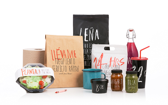
Anagrama’s work for barbecue restaurant Santa Cruz was a collaboration with architect Eiji Hayakawa: the Mexican agency developed the brand values and visual identity, while Hayakawa worked on the restaurant's building and décor.
"The brief was to create a restaurant franchise targeting families, kids and young people," Anagrama producer Lucía Elizondo says, "to communicate the joy of making food and the value of things in their raw state."
02. Masala Darbar
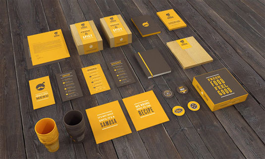
This branding for Indian restaurant Masala Darbar was created by Jekin Gala. "It was necessary to communicate the new brand without falling into the stereotypes of the category: hot and spicy food," he explains.
"So, the strategy was to make this ethnic food restaurant modern and pleasing to all kinds of consumers. The typeface selected is Cheap Pine, that came out of a search for traditional fonts with a contemporary feel which reflected Masala Darbar and its tradition."
03. Polpo
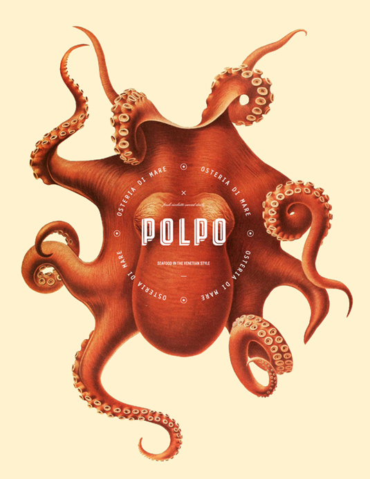
Graphic designer Richard Marazzi is the man behind this elegant branding work for Polpo, a conceptual Italian restaurant that specializes in Venetian fare with a focus on seafood.
"Polpo means octopus in Italian and is a staple in Venetian cuisine and a speciality of the house," Marazzi comments on Behance. "From playing with historical images that were used in textbooks before the invention of photography, a playful image style with a modern design was created."
Get the Creative Bloq Newsletter
Daily design news, reviews, how-tos and more, as picked by the editors.
04. Epic Smokehouse
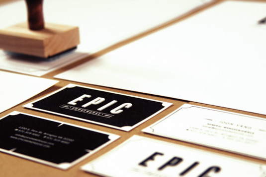
Epic Smokehouse, situated in Arlington, Virginia in the US, is a new "upscale barbecue" restaurant, serving "quality smoked meats and seafood paired with innovative cocktails and high-calibre wine at affordable prices", according to its blurb.
To convey this idea of homeliness meeting high-class cuisine, the owners commissioned New York-based Rock3rs - a small and relatively new studio - to create the branding, signage, menus, the website and other collateral.
05. Riffle
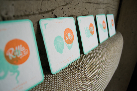
When respected restaurant Riffle NW, located in Portland USA, decided it was time for a total rebrand, it turned to Hovercraft, a local full-service creative agency that has worked for Nike and Magners, among other clients.
Part of Riffle's attraction is that it serves sustainable, locally caught seafood and river fish in an upmarket but unintimidating atmosphere, and that needed to be reflected in the branding.
06. El Montero
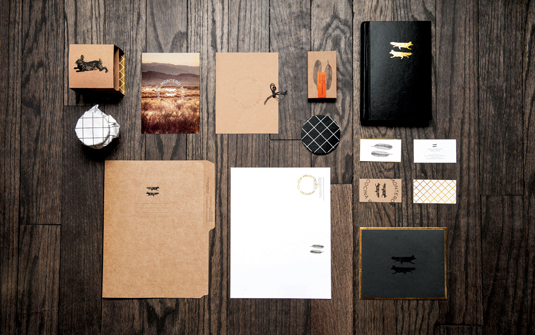
Prolific Mexican studio Anagrama has added another superb entry to its portfolio with branding for a new high-end restaurant.
El Montero is a restaurant located in Saltillo Coahuila, a city very close to Mexico’s northern border. The brief covered extensive branding, including packaging for gift sets that the restaurant sells, interior designs, stationery, opening night invitations, wine bottle labels, menus and signage for the restaurant.
07. Silver Ferns Farm Foods

From the looks of it, graphic designer Matt Hammond was inspired by the expression 'eat with your eyes' when developing this new identity for Silver Ferns Farm foods.
Completed at Designworks, Hammond created the delicious design to showcase the company's venison and beef products, with communications sent directly to chefs and restaurants. Everything from the layout to typography and colour combinations has been well planned in this design, showcasing the company's products beautifully.
08. The Gallimaufry
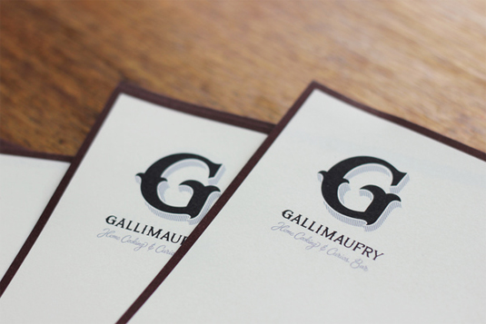
This branding for Bristol based restaurant and bar was created by typographer Ged Palmer. "The name 'Gallimaufry' comes from the French, meaning 'a mix or medley' and spoke of their ethos 'to make the best of what's at hand'," he explains.
"With home-cooked food, heaps of reclaimed furniture and a bar full of 'Curios' objects the identity was composed of various letterforms, hand-crafted in a traditional style."
08. Jackson & Rye
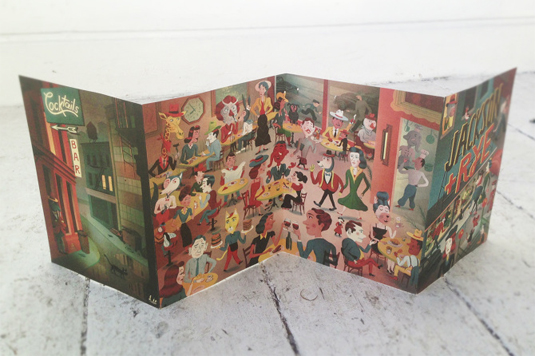
This vintage-inspired restaurant branding was created by designer Bjorn Rune Lie. "In September 2013 I was asked to illustrate the menu for a new and exciting american-inspired restaurant in Soho, London called Jackson+Rye," he explains.
"They wanted a sort of vintage 1940's feel to it, a bit like my Wolf's Whistle book, and I had pretty much free reign to include as many strange characters as I wanted. As well as the actual menu, I made a bunch of extra things like business cards and coasters. My writing has also been blown up and pained on the window with gold leaf."
09. Zizzi
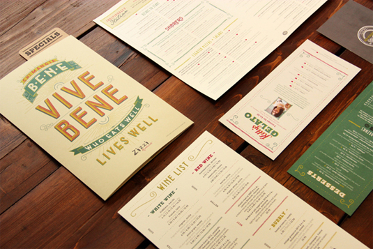
Since graduating in Summer 2010, illustrator Tobias Hall has been working closely with UK-based Italian restaurant chain, Zizzi, as their in-house illustrator, designer and art director.
From wall murals to menus and oil cans to logos, he has crafted and overseen just about everything about their restaurant branding. His typography based execution gives this branding a homemade aesthetic that perfectly reflects its menu options.
10. Sukkerbiten
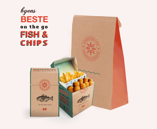
Oslo based graphic designer Martine Strøm was responisble for this gorgeous restaurant branding. She says, "Sukkerbiten is placed in the centre of Bjørvika, where the old and new part of the city meet.
"I took inspiration from this and wanted to show this in the profile by mixing old traditional drawings and newer pixel-elements. Pixels remind me of sugar cubes in an indirect way, and represents the 'new' very well."
Liked this? Read these!
- Useful and inspiring flyer templates
- The best 3D movies coming in 2014
- Discover what's next for Augmented Reality
Exclusive offer: 20% off tickets for new branding conference

Impact Conference | London | 06 Mar 2014
Impact Conference is a new event brought to you by Computer Arts that celebrates creative excellence and consistency across branding design. It's an event you can't afford to miss - and we're offering Creative Bloq readers a massive 20 per cent off the ticket price. Simply:
- Visit the website
- Enter your registration details
- Add this Promotional Code when prompted: FRIENDS20
Have you seen any inspiring restaurant branding? Let us know in the comments box below!

Thank you for reading 5 articles this month* Join now for unlimited access
Enjoy your first month for just £1 / $1 / €1
*Read 5 free articles per month without a subscription

Join now for unlimited access
Try first month for just £1 / $1 / €1

The Creative Bloq team is made up of a group of design fans, and has changed and evolved since Creative Bloq began back in 2012. The current website team consists of eight full-time members of staff: Editor Georgia Coggan, Deputy Editor Rosie Hilder, Ecommerce Editor Beren Neale, Senior News Editor Daniel Piper, Editor, Digital Art and 3D Ian Dean, Tech Reviews Editor Erlingur Einarsson, Ecommerce Writer Beth Nicholls and Staff Writer Natalie Fear, as well as a roster of freelancers from around the world. The ImagineFX magazine team also pitch in, ensuring that content from leading digital art publication ImagineFX is represented on Creative Bloq.
