It's not often you see illustration used in brand campaigns these days. But for that very reason, it can be a great way to make your marketing stand out, capturing attention and eliciting an emotional response from the viewer.
From hand-drawn images to vector art, the power of illustration cannot be underestimated when done well. So to inspire your own projects, we've brought together 10 examples that show just how illustration can be used in branding in creative and imaginative ways.
01. Oreo
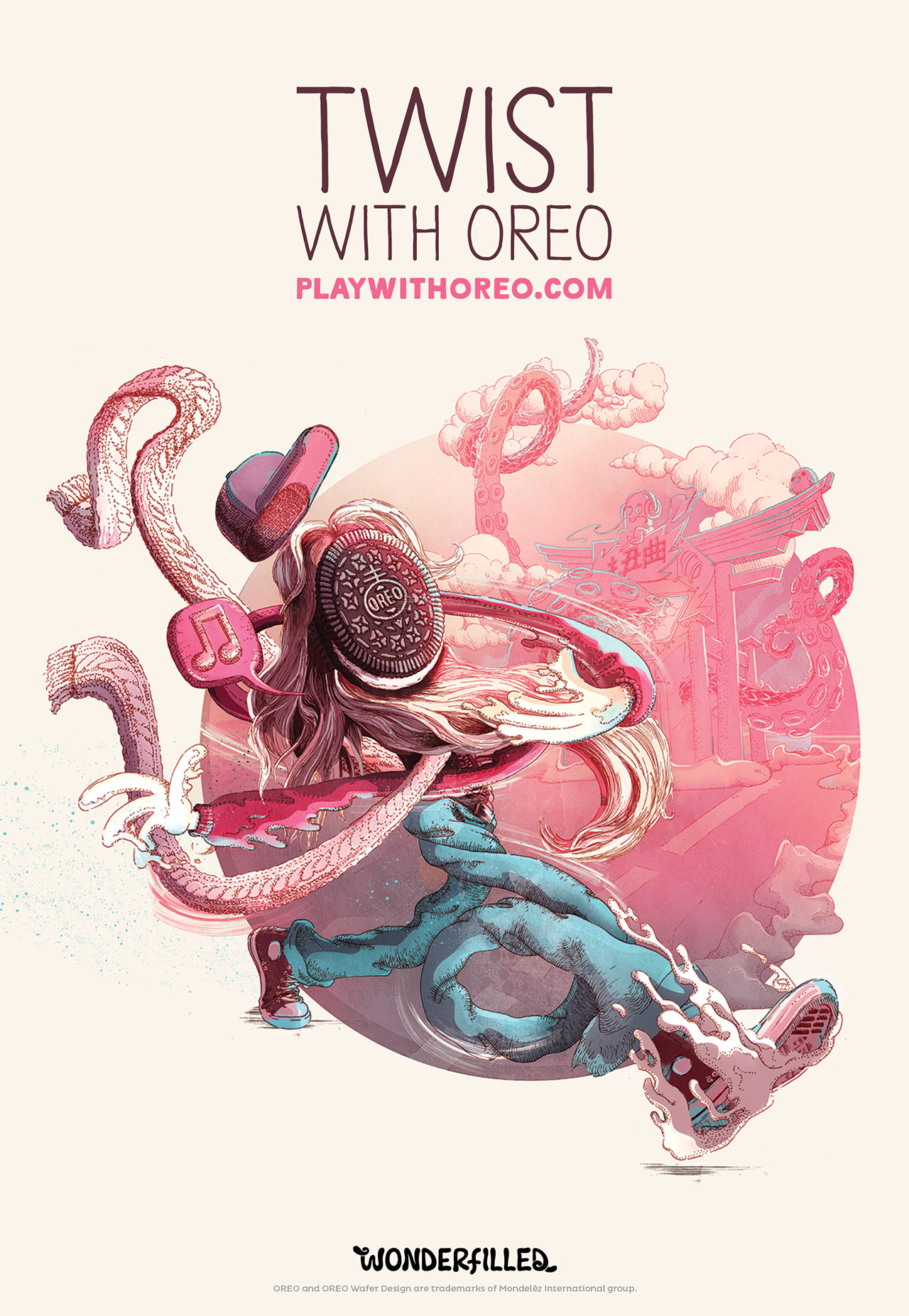
To celebrate its 103rd birthday, sandwich cookie company Oreo wanted to update its brand but still convey a sense of childlike wonder. Via The Martin Agency, Oreo commissioned 10 artists to create a character that embodied a single word. The only stipulation was that the character use the Oreo cookie wafer as the face/head.
The beautifully intricate example shown above was the work of Shotopop, whose word was 'twist'. You can view the full campaign here.
02. Penguin
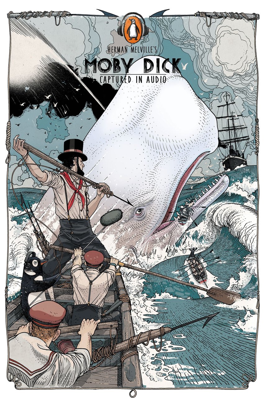
Everyone loves classic Penguin covers. And this multi-award winning campaign for Penguin Group China draws wryly on that sense of nostalgia, to promote its range of audio books.
In each of the ads, commissioned by Y&R China, a flipper-footed sound technician subtly invades the scene. The Moby Dick illustration shown above was created by Swiss artist Jared Muralt, and you can see the full campaign here.
03. Ram trucks
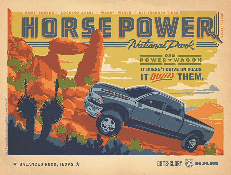
Selling automobiles is about engaging the emotions as much as anything else. So these print ads for Ram pickup trucks summon memories of the illustrative posters created in the 1930s and 1940s to awaken the public's taste for adventure.
Get the Creative Bloq Newsletter
Daily design news, reviews, how-tos and more, as picked by the editors.
The Richards Group commissioned Anderson Design Group (ADG) to create the poster art, inspired by the Art Deco-style WPA National Park posters created after the Great Depression to promote America's parks.
04. Faber-Castell
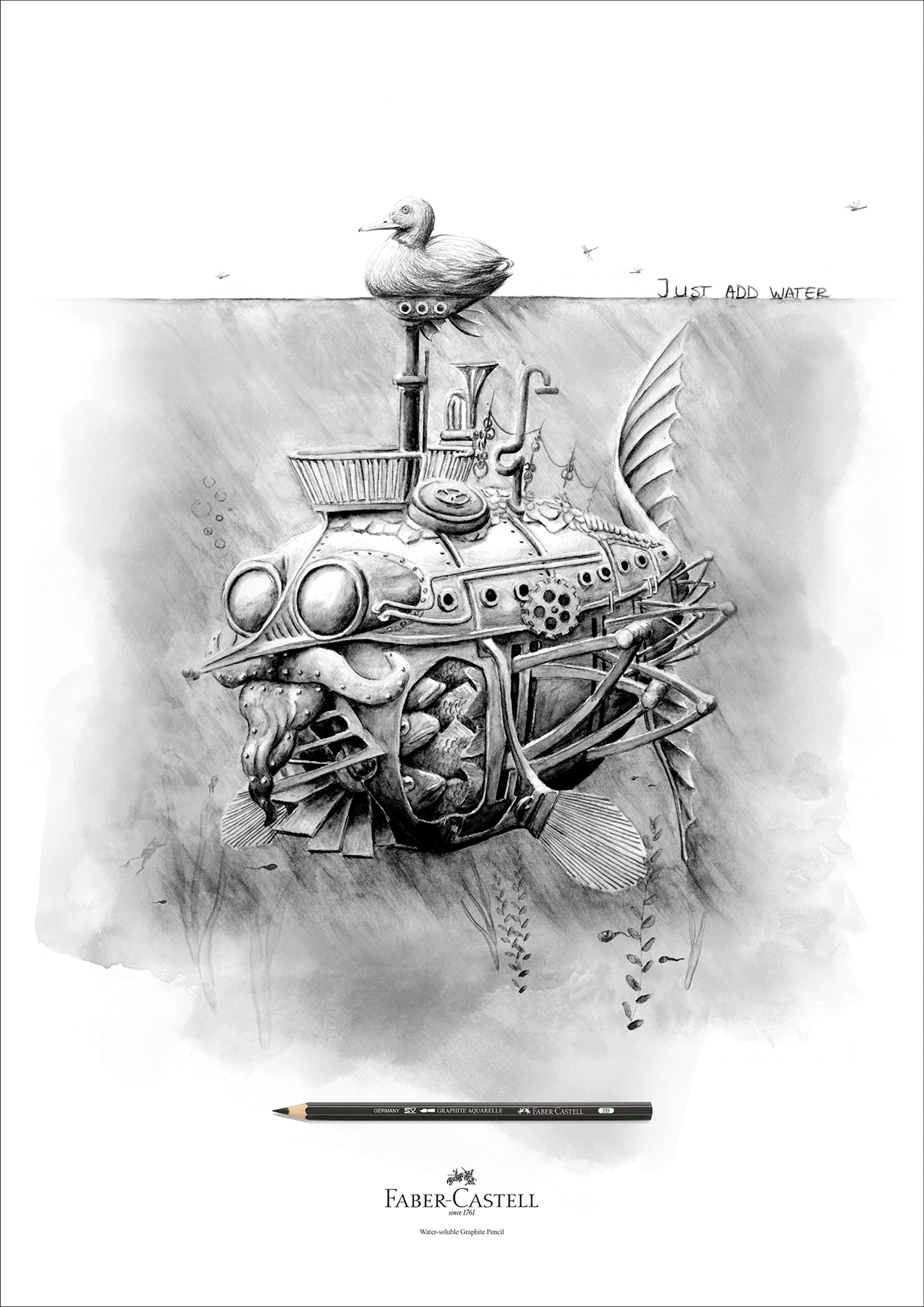
If you're going to advertise a drawing tool, why not show what it can do? Faber-Castell Aquarelle pencils can be used for normal drawing but also, as the slogan says, you can 'just add water' to make watercolour effects. This inventive campaign by Ogilvy & Mather Hong Kong brings that concept to elegant visual life. Illustrated by Redma Hoekstra, and you can see the full campaign here.
05. Kuoni
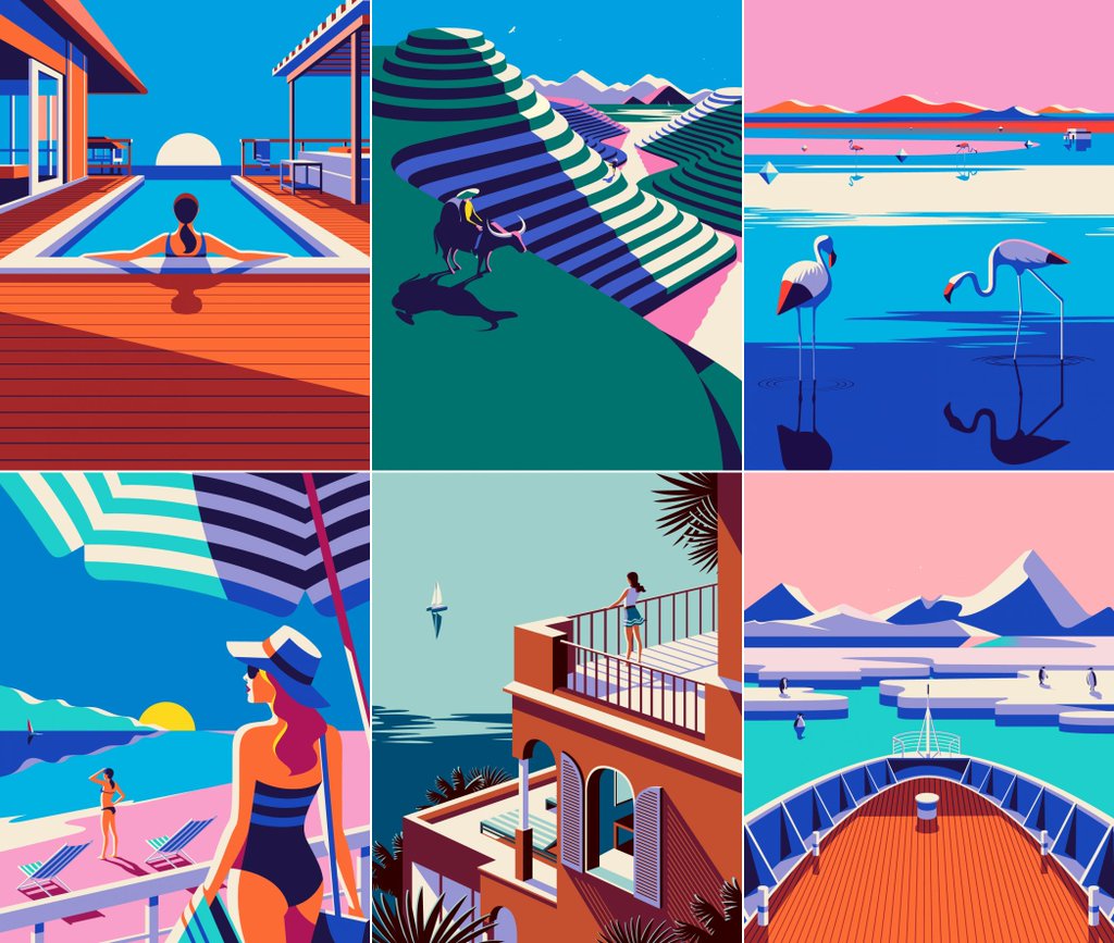
For its 2016 brochure design, high-end travel operator Kuoni wanted to move away from photography. So, working with Altavia, it commissioned a series of illustrations to depict some of the world's most desirable locations in an attention-grabbing way.
The brief for illustrator Malika Favre was to create a hero cover and a series of four complementary images for the different sections of the brochure. Favre's bold, minimal style gave Kuoni's brochure a look that really stands out as a premium product. You can see the full campaign here.
06. Royal Ascot

San Francisco artist Lauren DiCioccio uses sewing and embroidery to create unique illustrations, and she was commissioned by Royal Ascot to create this stunning piece, 'Like Nothing Else', to promote its 2015 event. The 48x27 inch tapestry depicts carefully selected elements of the Royal Meeting and took around five weeks to create. You can see a time-lapse video of the creation process here.
07. Schusev Museum of Architecture
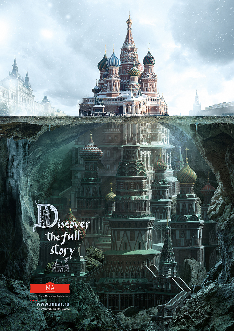
This campaign by Saatchi & Saatchi Russia for the Schusev Museum of Architecture was based on the concept: 'Discover the Full Story'. Art directed by Polonski Yuri and produced by Carioca Studio, the poster campaign focused on three symbolic buildings in the city: the main building of Lomonosov Moscow State University, St Basil's Cathedral on Red Square and the Bolshoi Theatre.
Each illustration demonstrates that behind the familiar exterior hides a story and there is much more to be discovered. Find out more here.
08. Mercedes
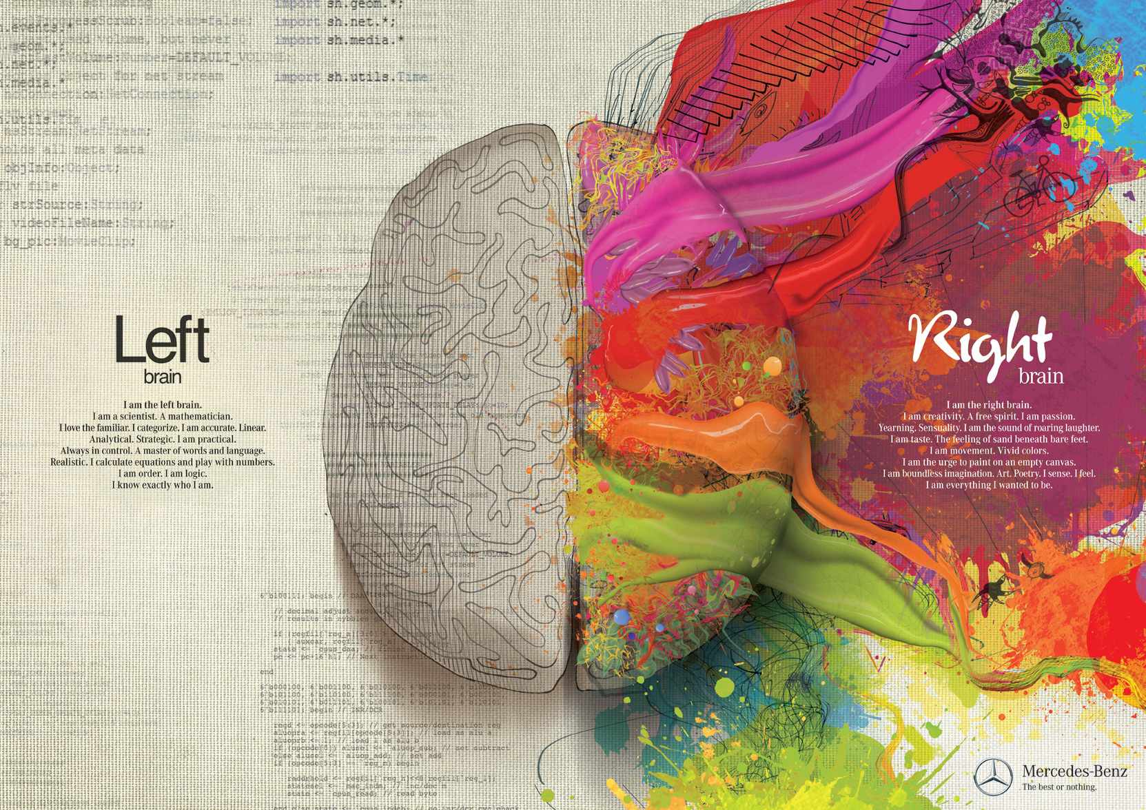
This unusual ad is the work of illustrators Gil Aviyam and Lena Guberman, commissioned by Y&R Interactive Tel Aviv to promote Mercedes cars. The concept is that like the brain, split between left and right hemispheres, the Mercedes Benz is a combination of opposites that together create technological innovation, inspiring design and passion.
09. Nike
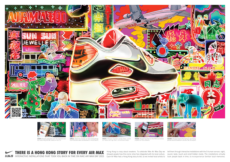
Nike's has a long and glorious tradition of using illustration in advertising, and this campaign celebrating Air Max Sneakers is no exception. Ogilvy & Mather Hong Kong created a series of ads with the help of local illustrators, each featuring a different Air Max sneaker model; this one was created by comic artist Little Thunder.
10. Lexus
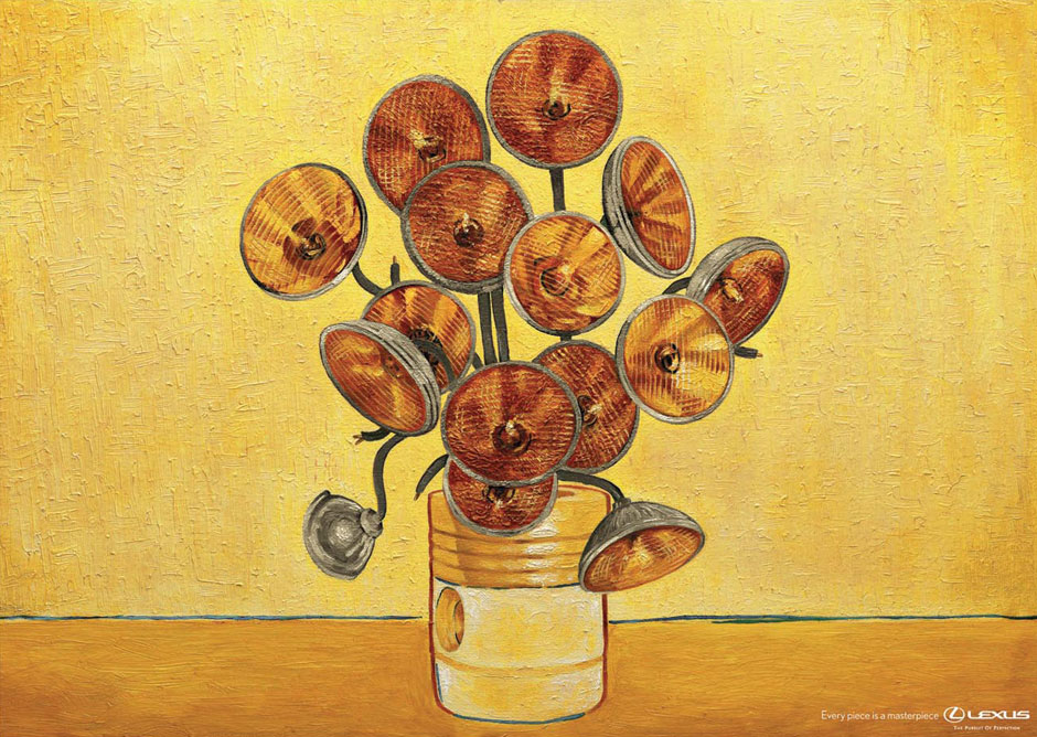
Wanting to convey the idea that every one of its cars is a masterpiece, Lexus commissioned this fun campaign to reinvent famous works of art in its own image. This example swaps bulbs for headlights to reinvent Van Gogh's famous Sunflowers painting. Saatchi & Saatchi Singapore masterminded this print ad campaign, which also parodied Salvador Dali and Andy Warhol, and was art directed by Ronojoy Ghosh.
Related articles:

Thank you for reading 5 articles this month* Join now for unlimited access
Enjoy your first month for just £1 / $1 / €1
*Read 5 free articles per month without a subscription

Join now for unlimited access
Try first month for just £1 / $1 / €1

Tom May is an award-winning journalist and editor specialising in design, photography and technology. Author of the Amazon #1 bestseller Great TED Talks: Creativity, published by Pavilion Books, Tom was previously editor of Professional Photography magazine, associate editor at Creative Bloq, and deputy editor at net magazine. Today, he is a regular contributor to Creative Bloq and its sister sites Digital Camera World, T3.com and Tech Radar. He also writes for Creative Boom and works on content marketing projects.
