Brand Impact Awards 2022: All the winners revealed
Discover which projects picked up Gold, Silver and Bronze trophies this year – plus download the full winners showcase.
We're delighted to reveal the winners of the Brand Impact Awards 2022.
This year's multidisciplinary judging panel was our biggest yet, featuring branding experts from London, New York, LA, Amsterdam, New Zealand, Australia and more. Category winners were decided via a series of group debates over several weeks, with specialist judging panels selected to maximise their sector expertise and ensure a rich mix of perspectives on the work.
Following the remote-judging format first established in 2020, winners were decided via a series of small-group debates over several weeks. From almost 230 entries, just one-fifth made it through to the shortlist stage: a total of 39 projects, from 22 different agencies, have been awarded Gold, Silver or Bronze.
All of these are featured in a special 48-page winners showcase.
Download the 2022 winners showcase
Top prizes were in particularly short supply in 2022. Just four Gold Awards were presented in total, plus 15 Silver Awards and 26 Bronze Awards, as well as our overall Best of Show.
Read on to find out which projects took home the gongs...
Best of Show
Brand Impact Awards 2022: Best of Show
All Gold Award winners were considered for the prestigious Best of Show accolade, but just two of them went head to head for an all-panel vote.
Get the Creative Bloq Newsletter
Daily design news, reviews, how-tos and more, as picked by the editors.
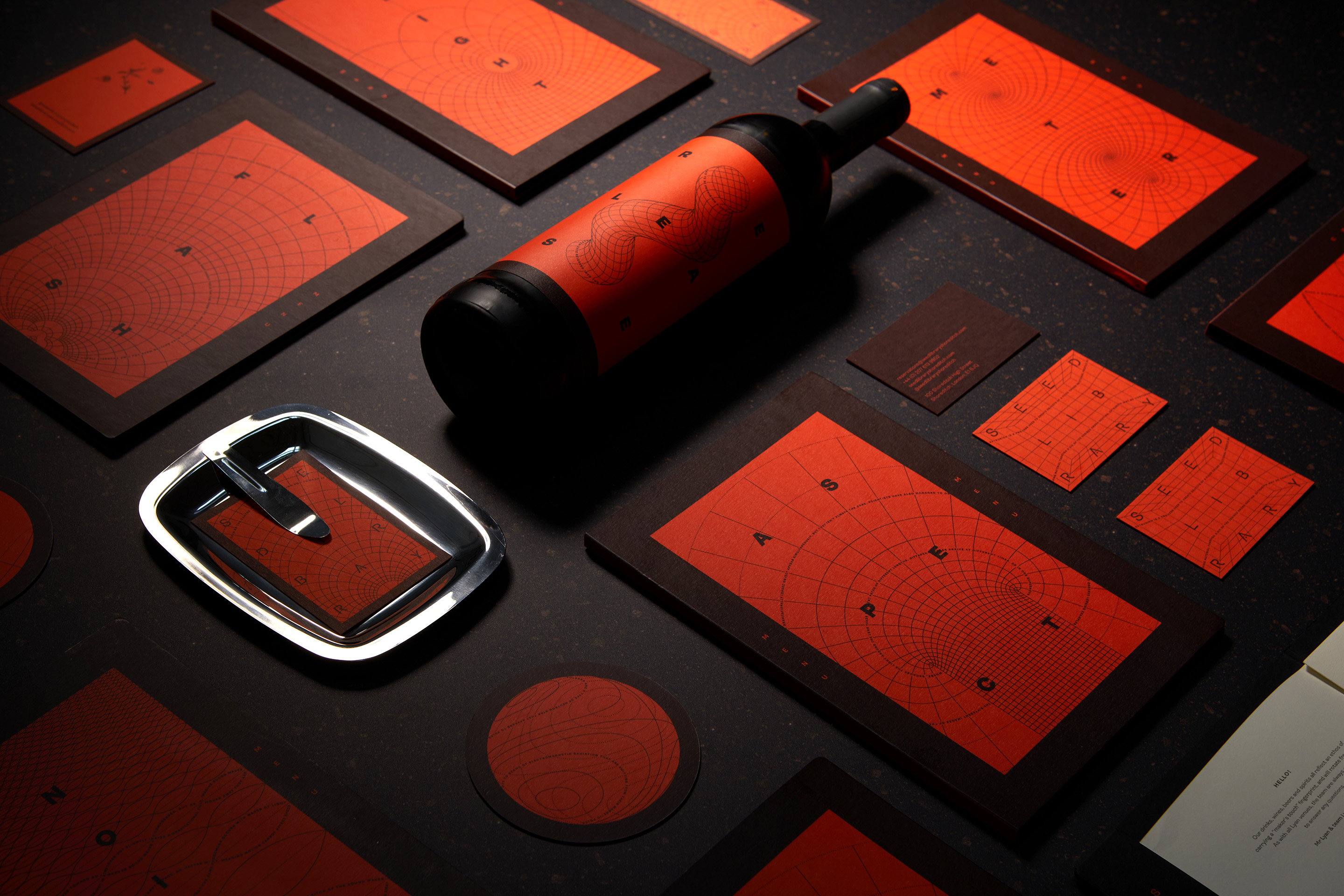
Best of Show 2022: Seed Library by Magpie Studio
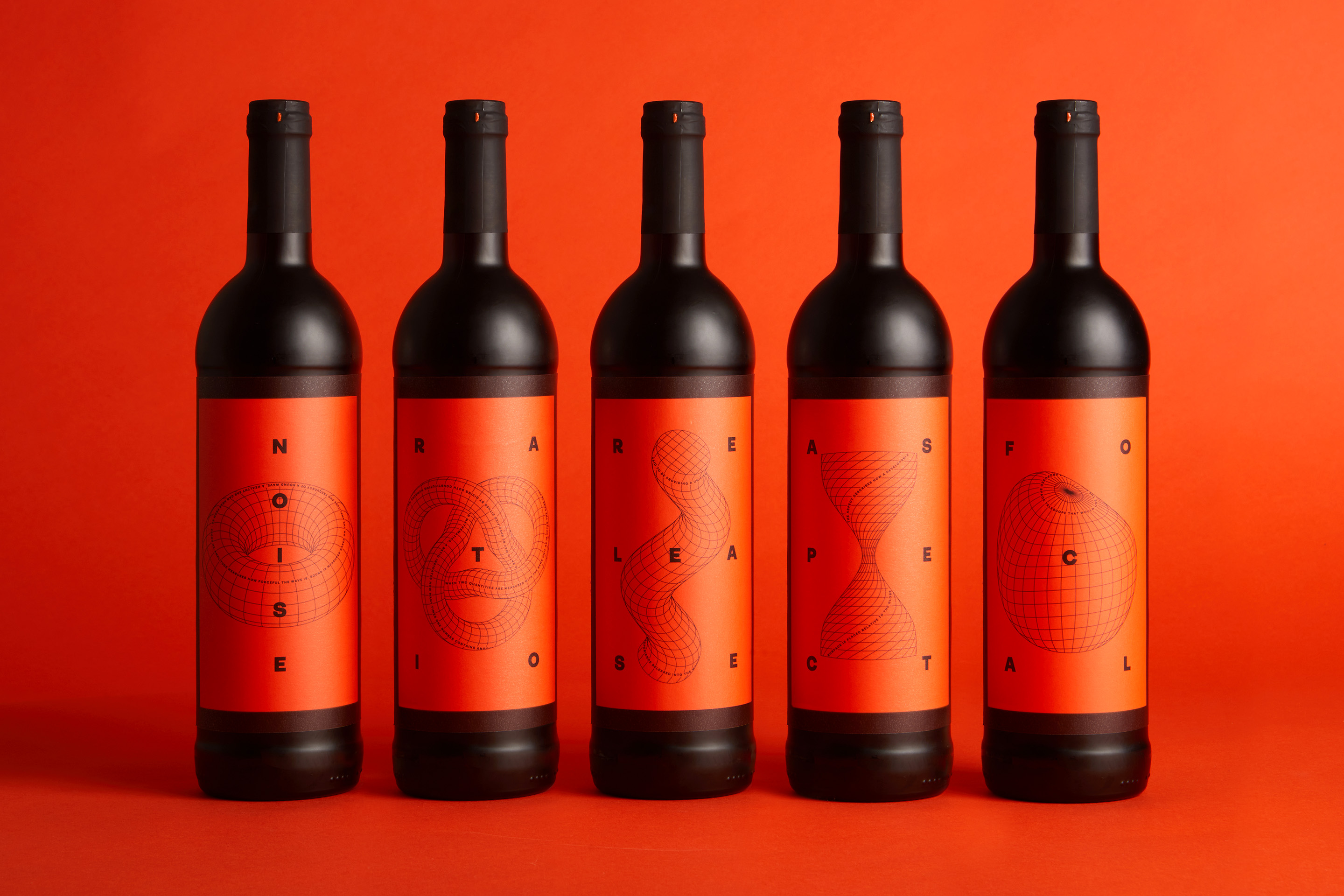
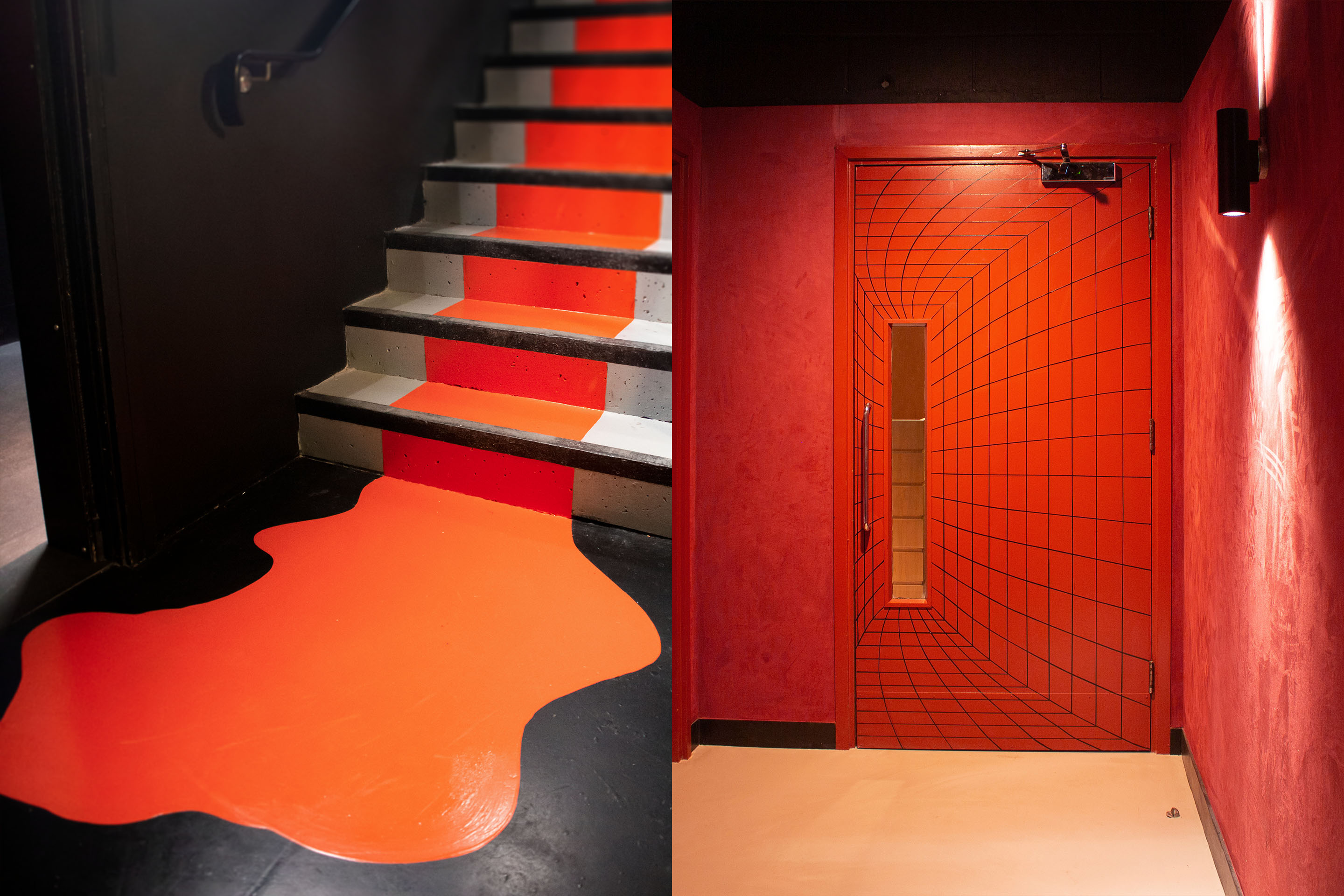
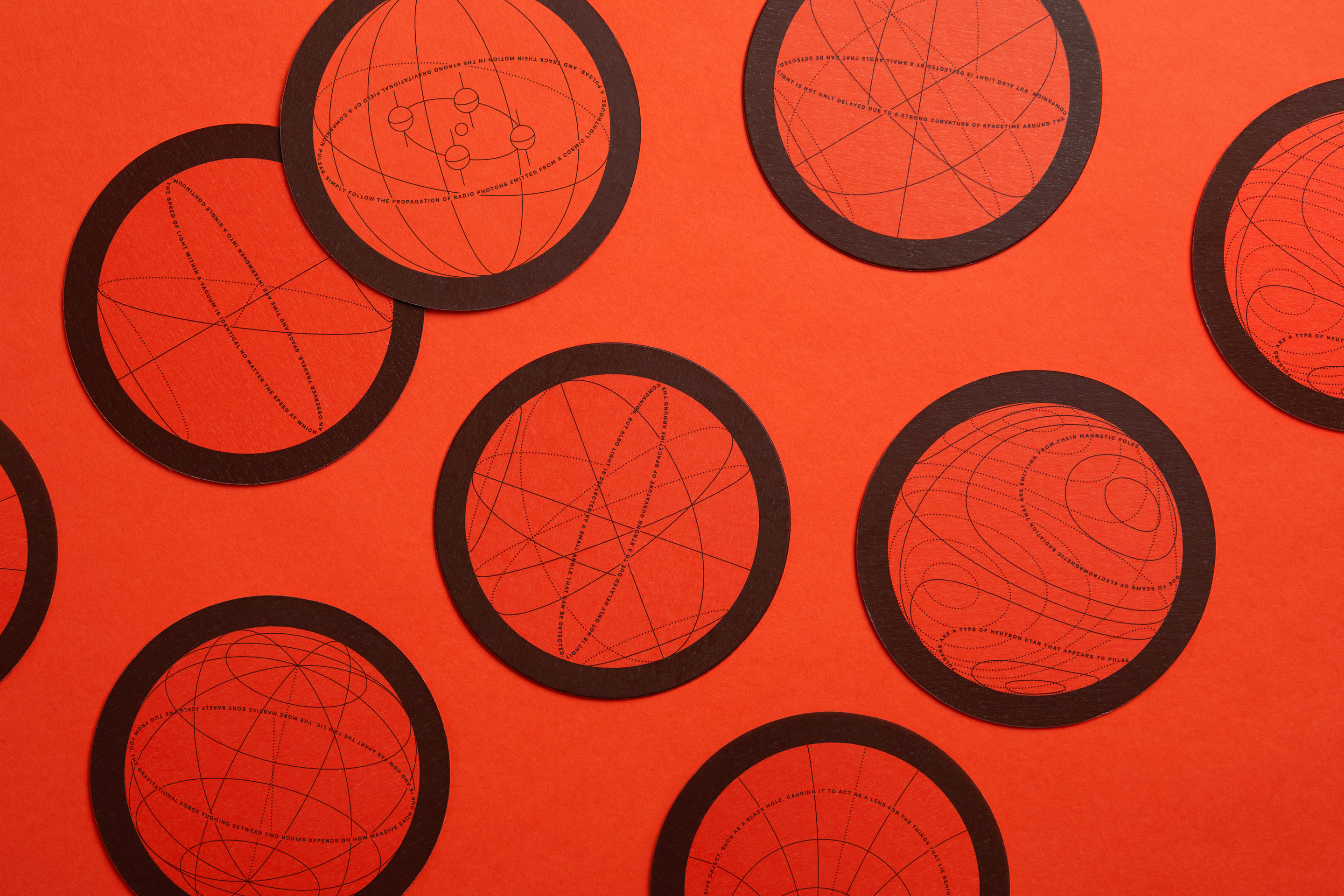
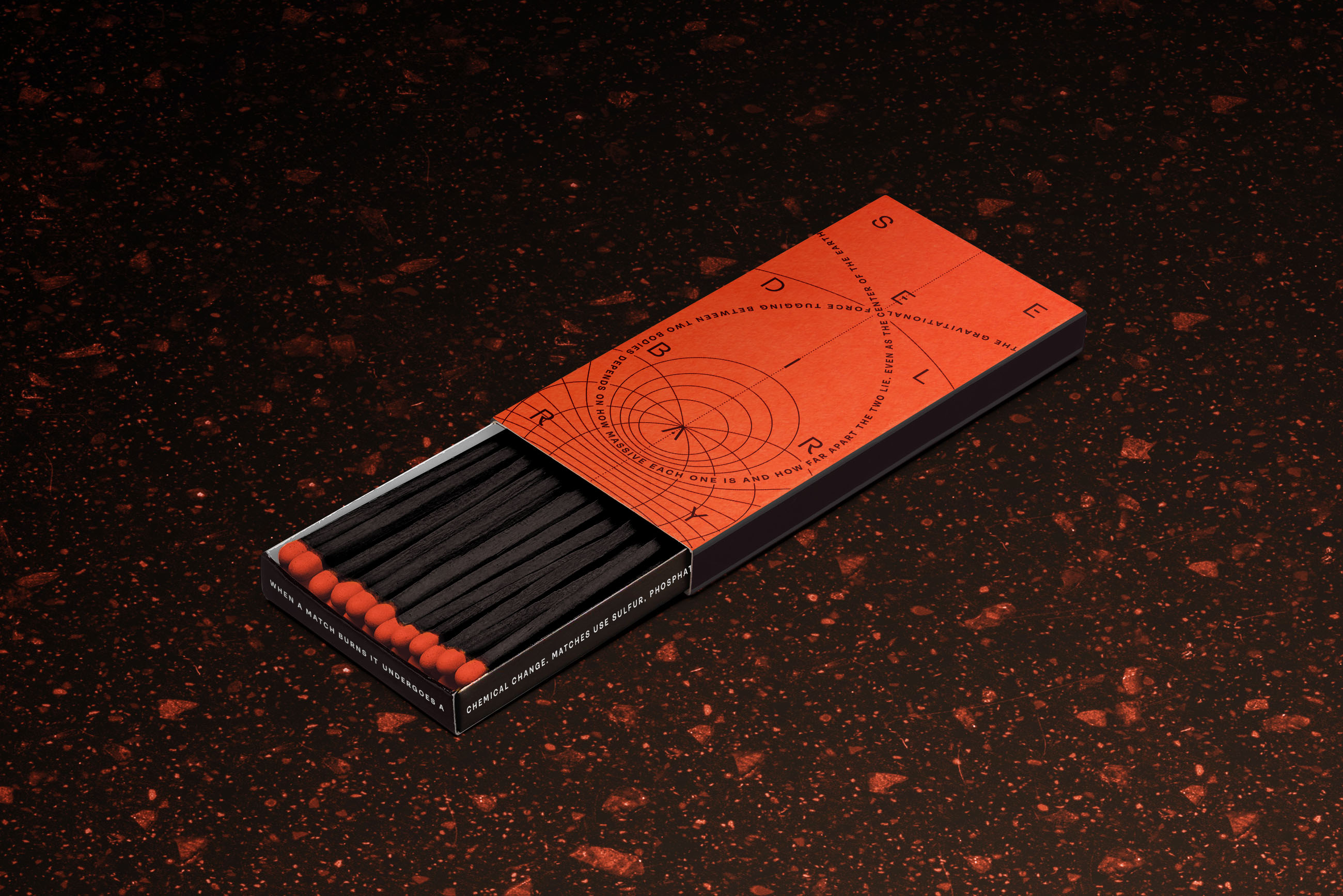
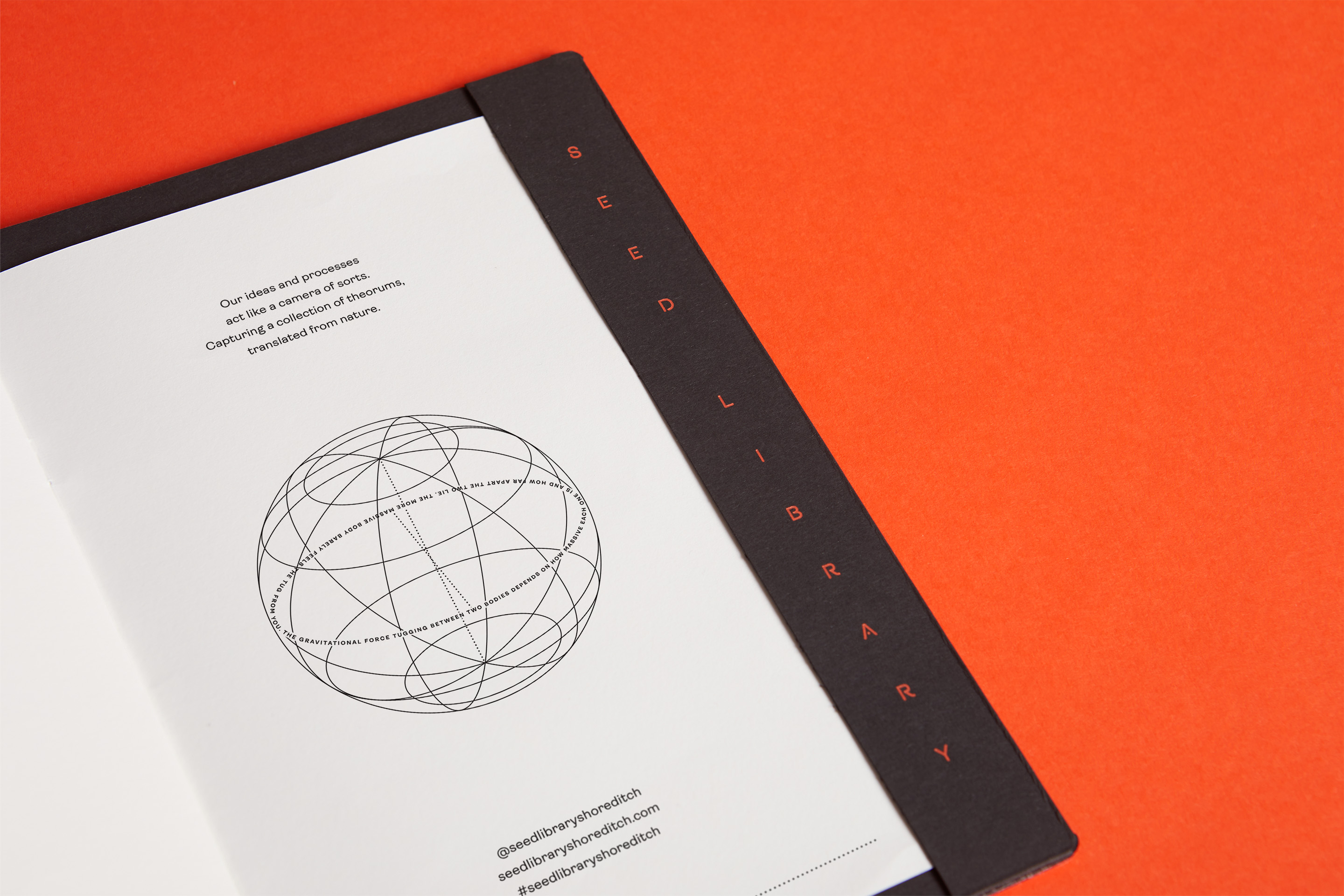
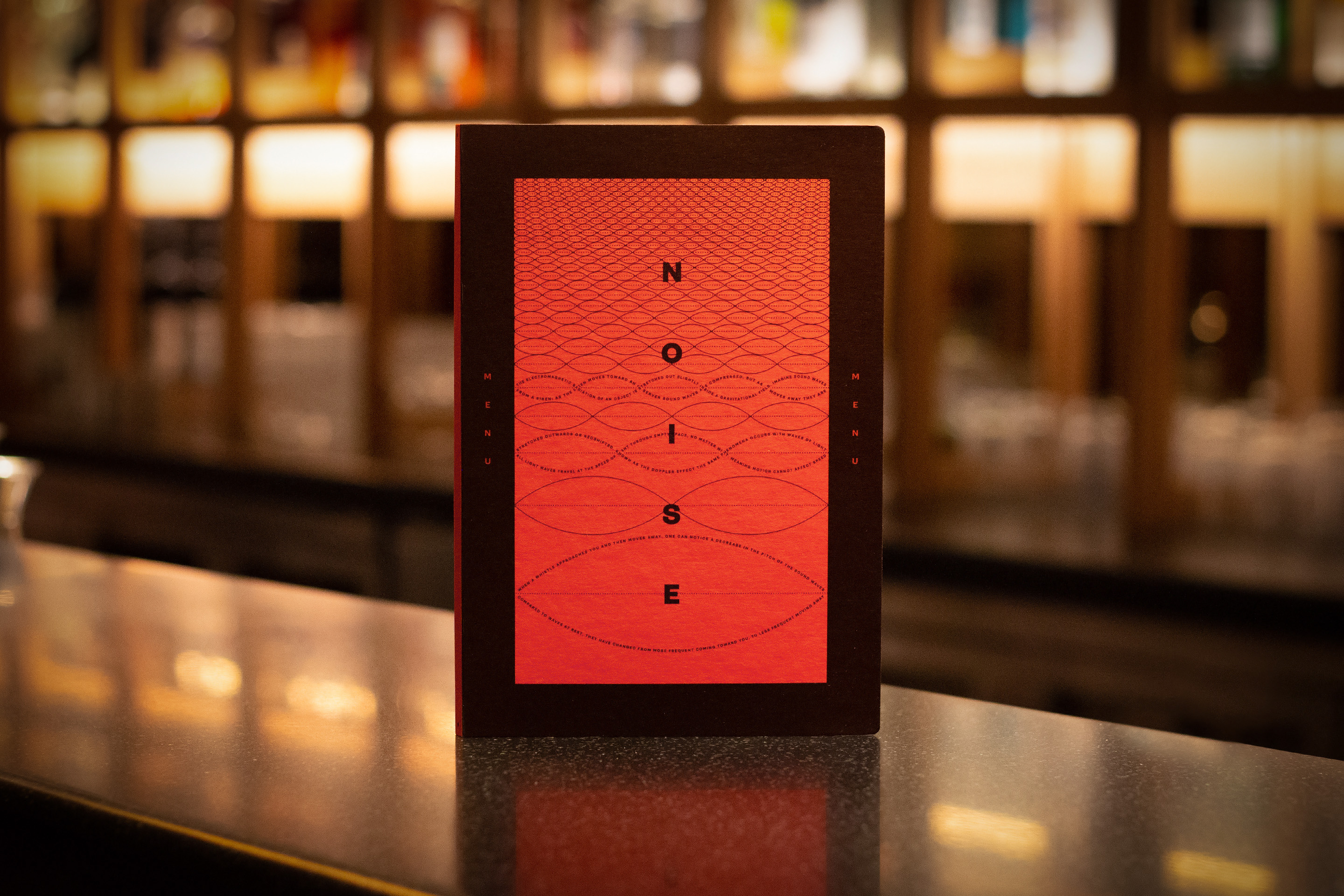
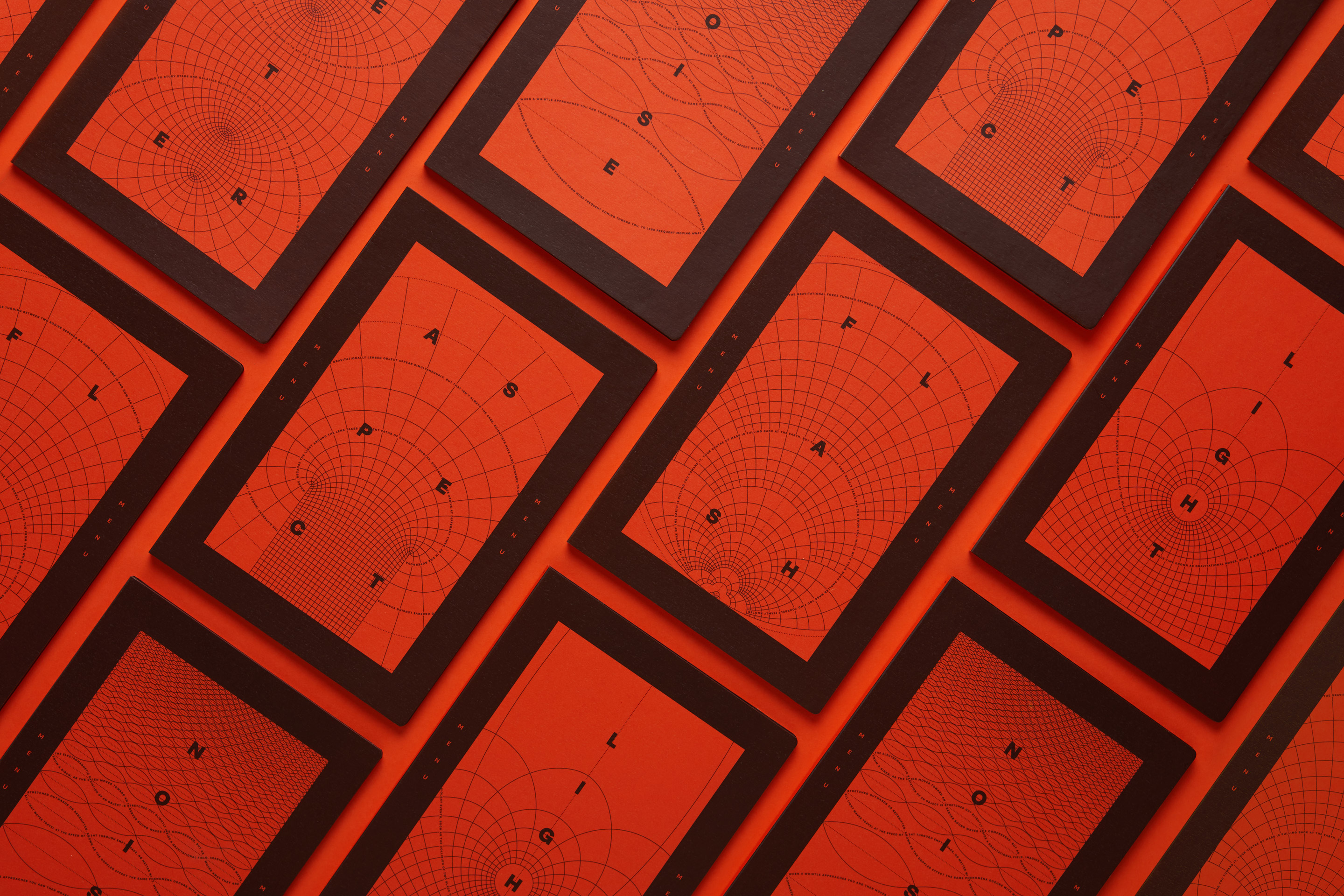
- Winner: Best of Show
- Gold Award: Bars & Restaurants
- Read more about this project at magpie-studio.com
Claiming one of just four Gold Awards in a particularly lean year for top prizes at the BIAs, Seed Library pitted Magpie Studio against Superunion for the ultimate Best of Show accolade. The small independent studio triumphed by the narrowest of margins after the choice was put to a panel-wide vote.
The stunning look and feel of this Shoreditch-based basement bar is the latest in a series of collaborations between Magpie and renowned mixologist Ryan Chetiyawardana (aka Mr Lyan), whose long list of awards includes recognition as the best bartender in the world.
No seeds. No libraries. But a hell of a lot of fun in what feels like a brand for another dimension. Crossing that bathroom door – just a little bit drunk – would probably feel like going to The Upside Down. Genius.
Jo Roca – For The People
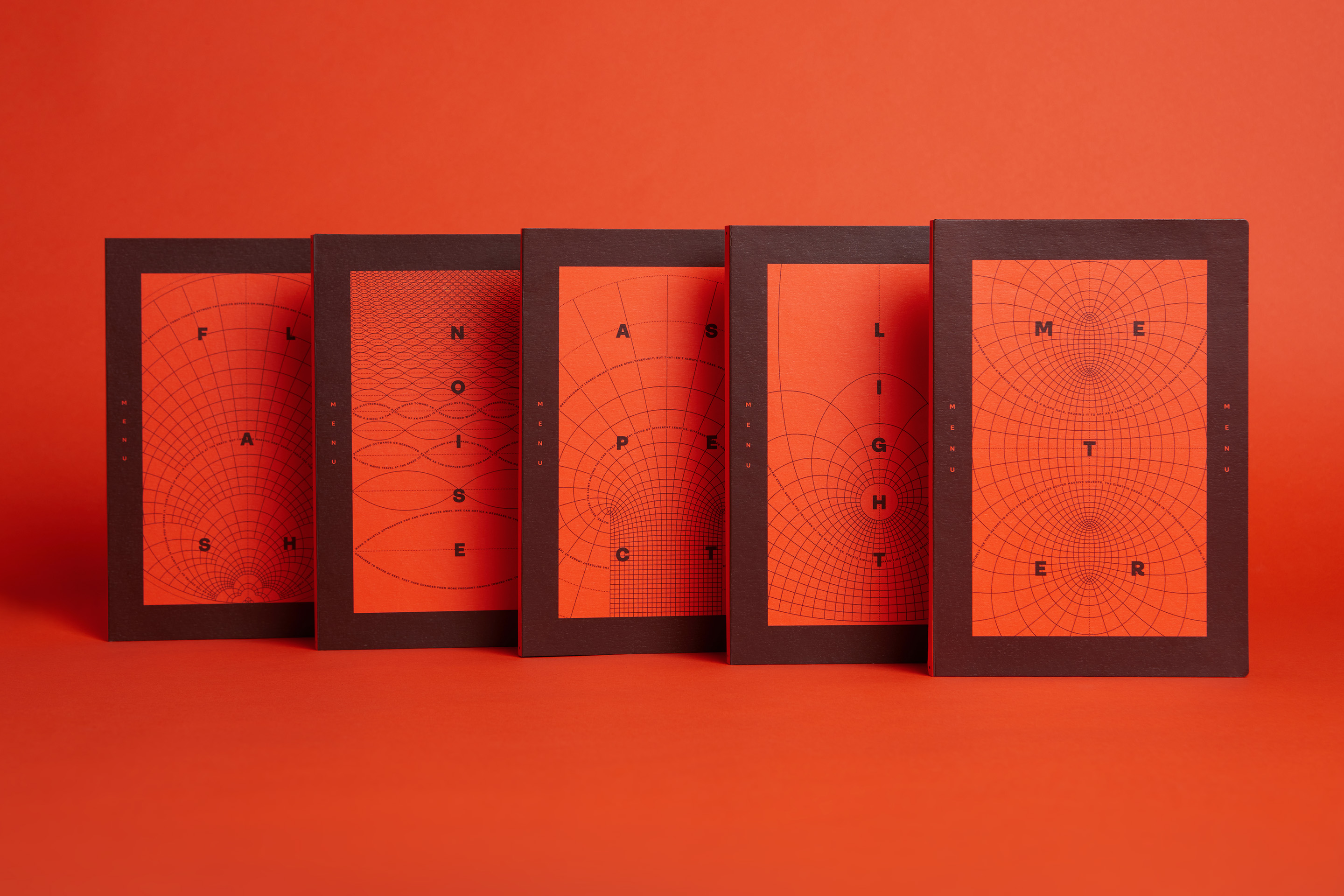
Seeking a lo-fi, analogue approach, Chetiyawardana briefed Magpie to steer well clear of literal representations of seeds or libraries in the bar's branding scheme, instead favouring a stripped-back, confident branding scheme that represents his team's innovative processes in an abstract way. In his words: "Clean, contemporary and bold, but a little bit fucked up."
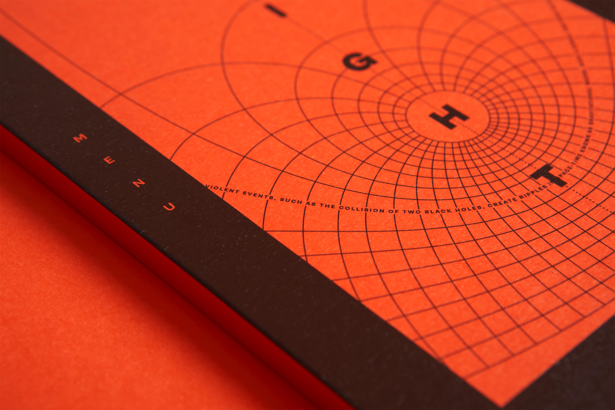
While researching patterns in nature, Magpie discovered a vintage scientific and mathematical diagrams that represented the ideal balance between clean and structured, but also beautiful and organic. These diagrams inspired a suite of illustrations, with a strikingly fresh and modern palette of black and bright orange that punches out of the bar's low-level light environment.

Minimalist, intelligent and simple. The name nods to nature, paired with an organic yet structured approach with an intriguing wit. And the 3D aspect of the rollout across the venue works a treat.
Lou Sloper – Here.We.Go.
Intertwined typography features excerpts from Einstein's writings on black holes – a nod both to Chetiyawardana's scientific background, and his team's weird and wonderful methods to discover alternative flavour sources. The words in the foreground of the menus act as a kind of code, in response to a comment from Chetiyawardana about his recipes: "Like a camera, translating nature in an unexpected way."
Seed Library's sister venues White Lyan, Dandelyan, Superlyan, Lyaness and Silver Lyan have all enjoyed rave industry reviews. They are frequented by the most discerning of cocktail lovers, as well as the general public seeking the latest hot bars on the scene. Since Seed Library's grand opening in 2022, feedback on the branding has been overwhelmingly positive.
Shortlisted for Best of Show: China Duty Free: Surreal Island by Superunion
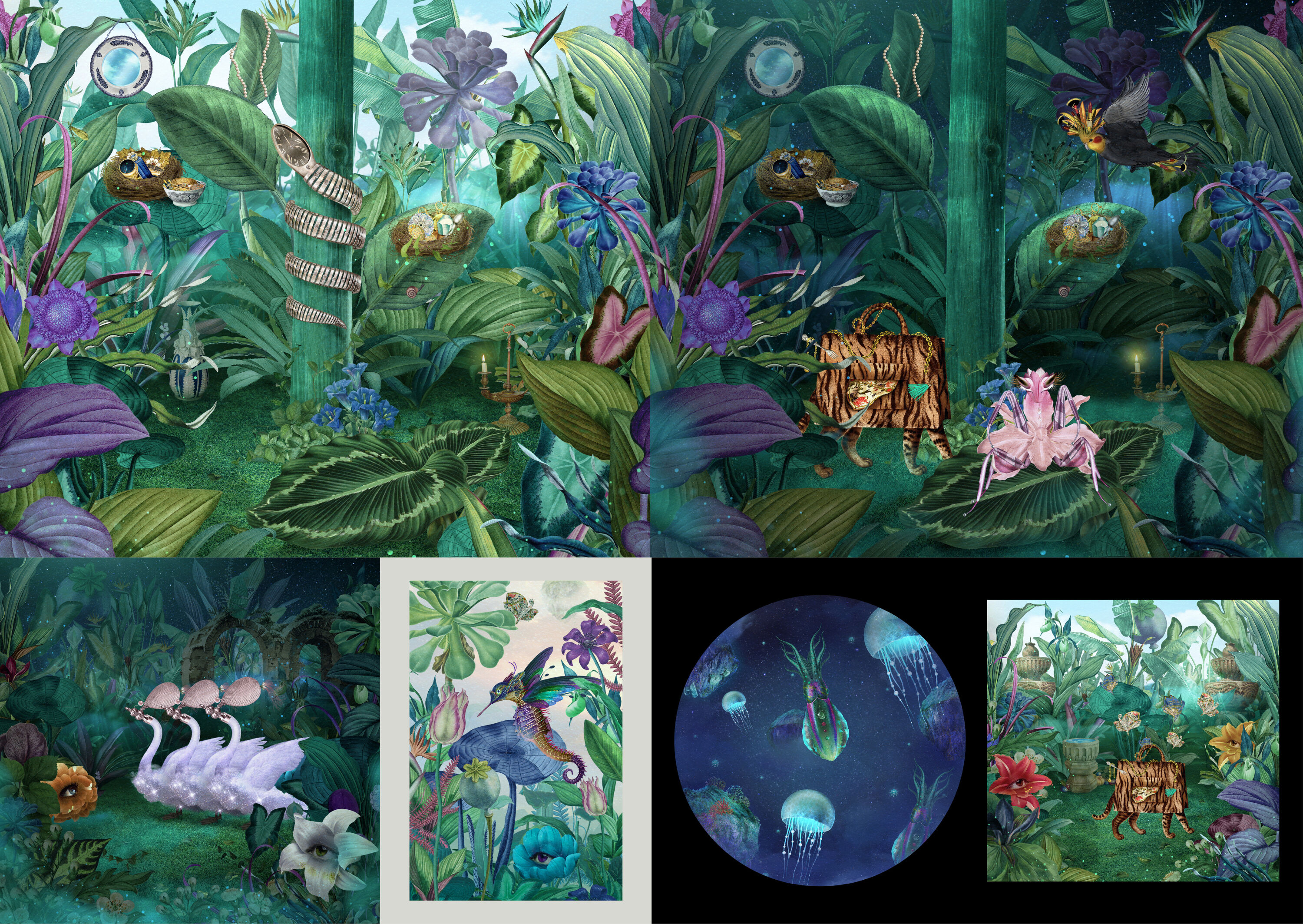
- Shortlisted: Best of Show
- Gold Award: Illustration
- Read more about this project at superunion.com
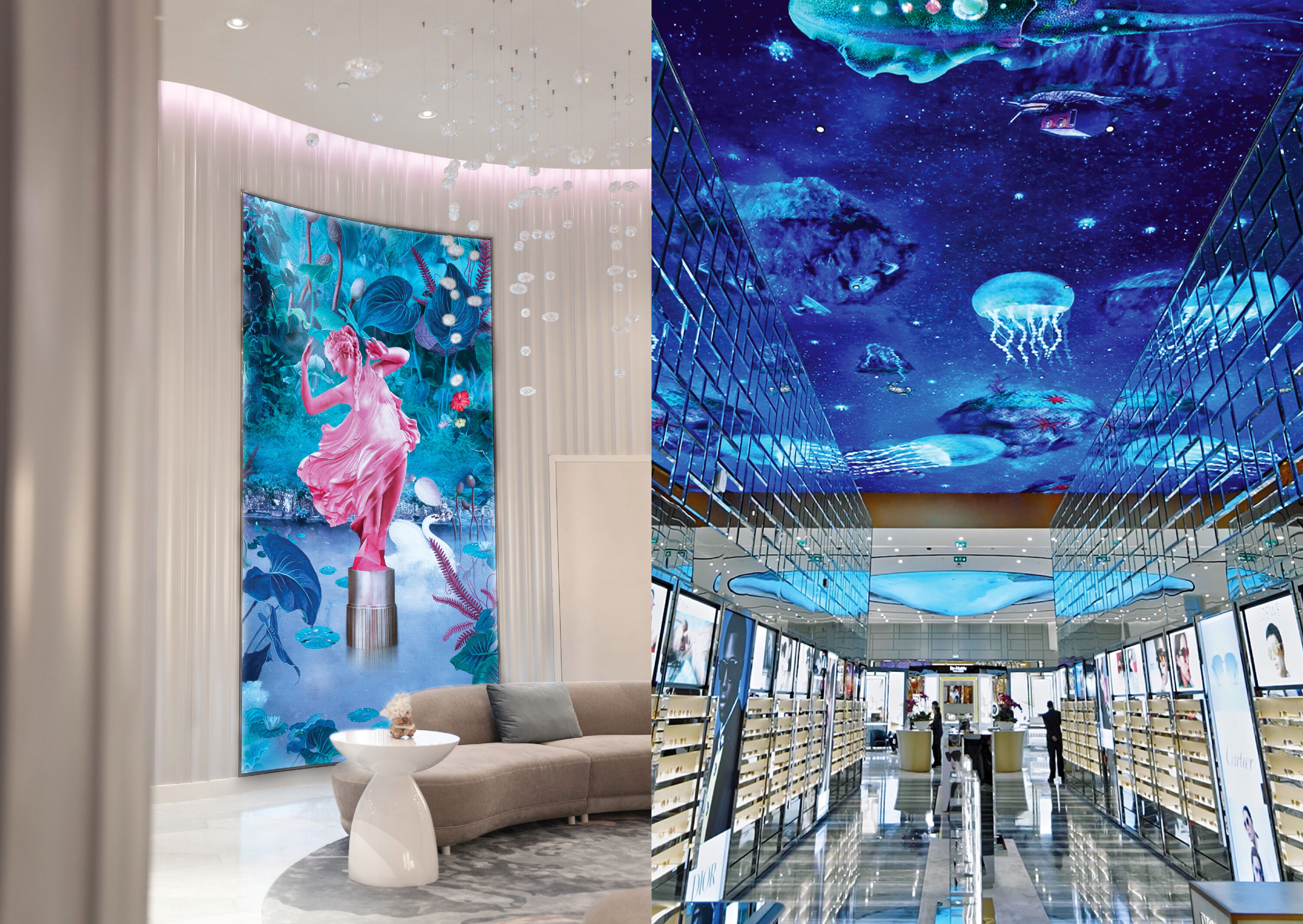
Coming a very close second in the panel-wide Best of Show vote, Superunion's beautifully enticing Surreal Island installation is the second of this year's four Gold Award winners for its compelling use of illustration.
An unexpected and artful use of collage to tell a dreamlike story in a traditionally hectic and commercial setting.
Christian Widlic – Mailchimp
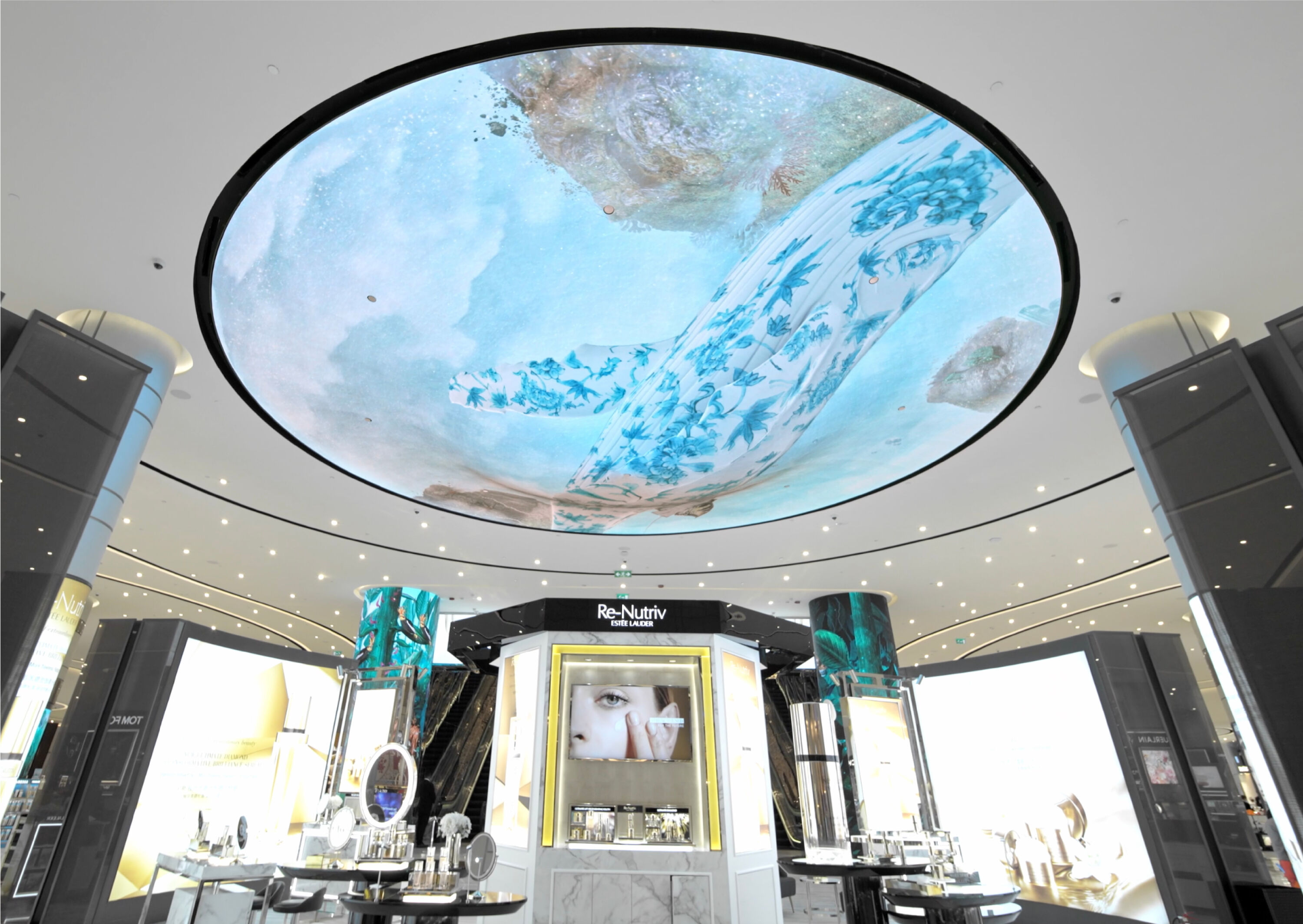
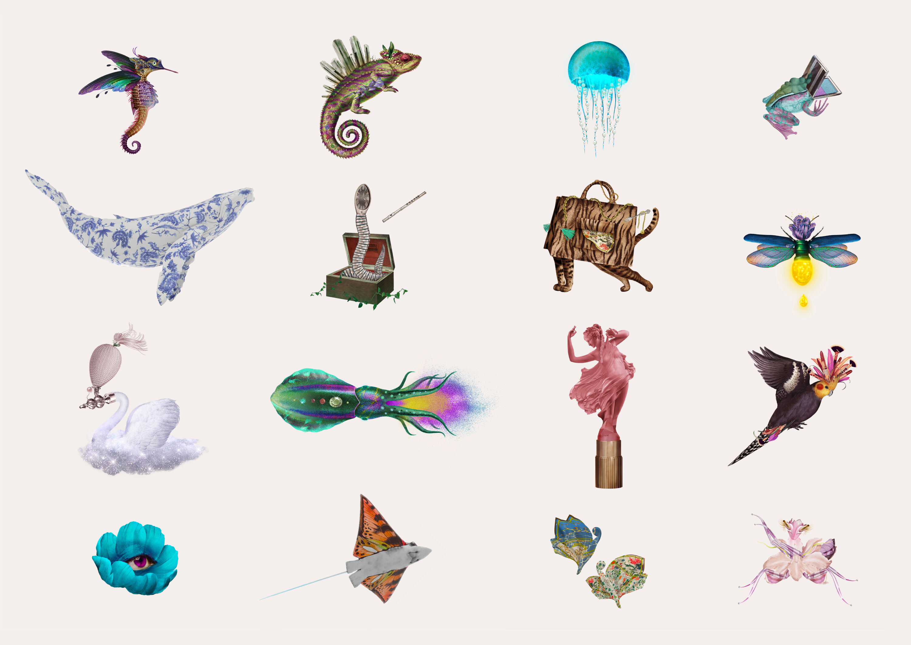
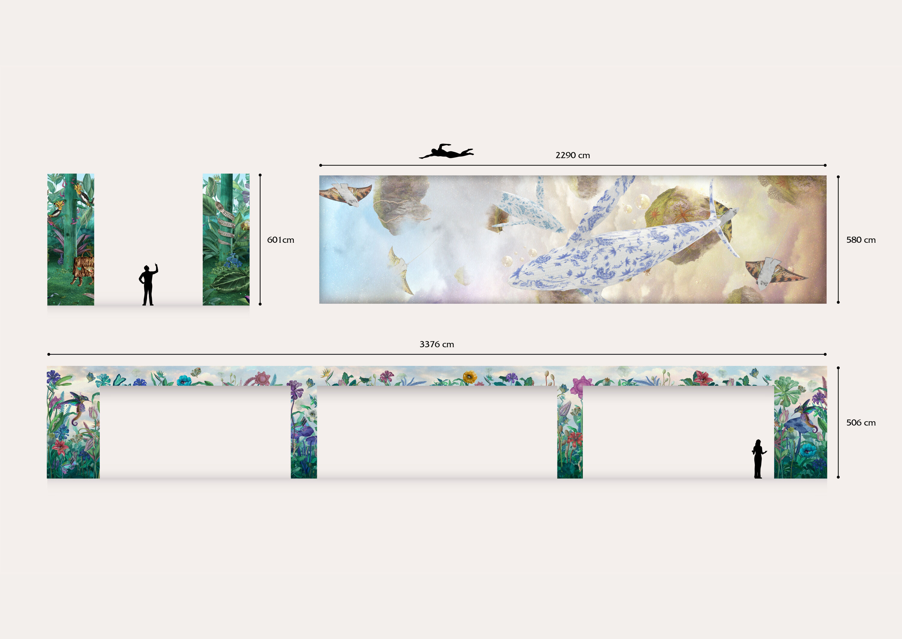
An immersive magical world comes to life across a suite of nine large-format LED screens, ranging from a 20-metre-long ceiling installation to wall panels three times the height of a person. Housed within China Duty Free's 7,500 square-foot retail space at Grand Lisboa Palace, Macau, Surreal Island plays with scale and perspective, creating intriguing flora and fauna by blending retail products with a menagerie of fantastical creatures.

Superunion's brief was to surprise and captivate an affluent audience in Macau – a city known for its larger-than-life attitude to experiences, having established its identity as a major casino city over the last 15 years. Visitors to China Duty Free are greeted by a Venus statue made from lipstick in a shimmering lake, while a Tiger Tote stalks the rainforests and porcelain whales dance above your head.
Marries surrealism and commerce, bridging fantasy and reality. Shows how illustration, spatial design and animation can create engaging new worlds.
Jump Jirakaweekul – COLLINS
Bringing the extraordinary into an otherwise ordinary retail experience, Surreal Island was produced in collaboration with Peru-based surrealist illustrator Paolo Torres. Brought to life in motion, Torres' highly intricate scenes are designed to seamlessly exist alongside the hustle and bustle of the retail environment. Day and night cycles ensure new discoveries are revealed each time.
Gold Award winners
Brand Impact Awards 2022: Gold Awards
The following two projects received at least one Gold Award trophy at the Brand Impact Awards 2022.
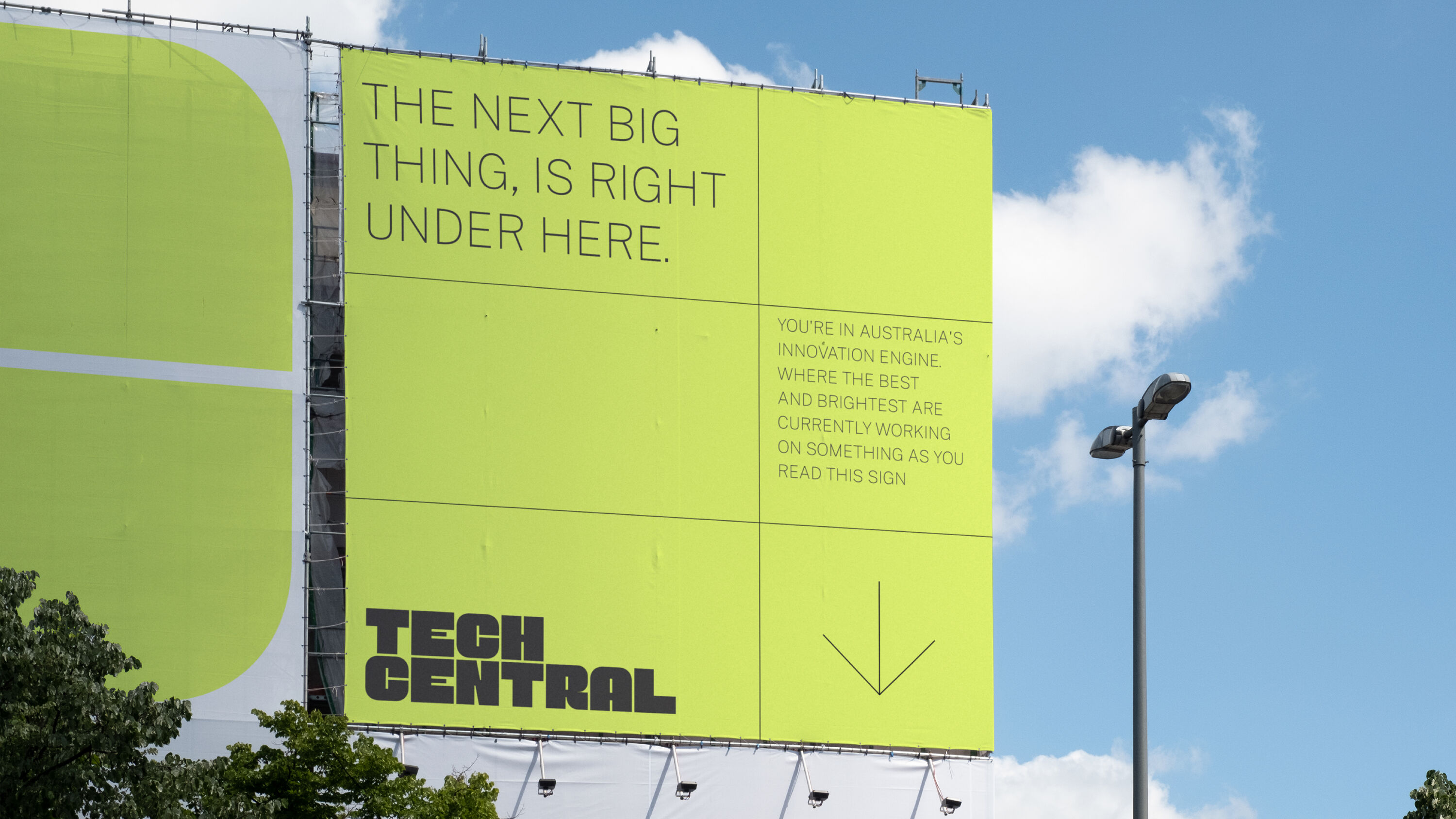
Tech Central by For The People
- Gold Award: Public Sector
- Read more about this project at forthepeople.agency
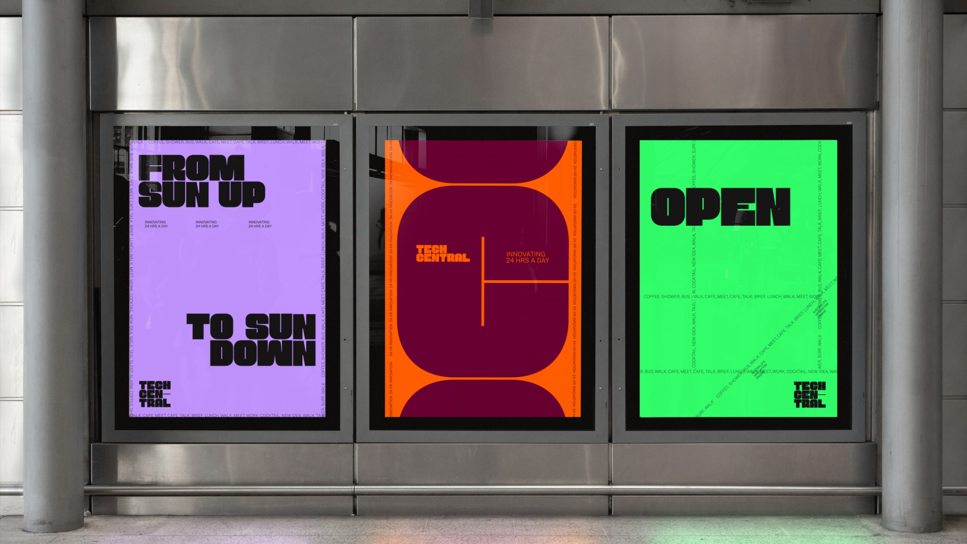
Our third Gold Award goes to For The People for its branding of Tech Central, a newly established tech and innovation district in Sydney. Australia's answer to Silicon Valley, the district brings together six neighbourhoods that are already home to some of the country's most exciting startups, world-class universities, research institutes and 'unicorns' such as Atlassian and Canva.
At the intersection of culture, arts, tech and education, Tech Central aims to attract 25,000 students, support new scale-up companies, create 25,000 innovation jobs, and facilitate the creation of 250,000 square metres of dedicated office space.
A clever solution that plays on the idea of intersection, using typographic stories to communicate people, culture and place in a refreshing style. Great ideas and exceptional execution.
Shabnam Shiwan – Osborne Shiwan
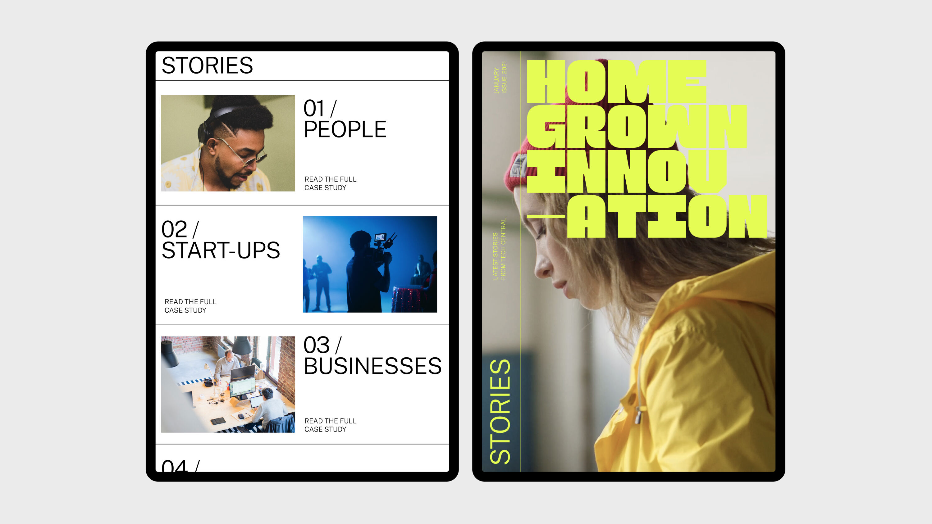
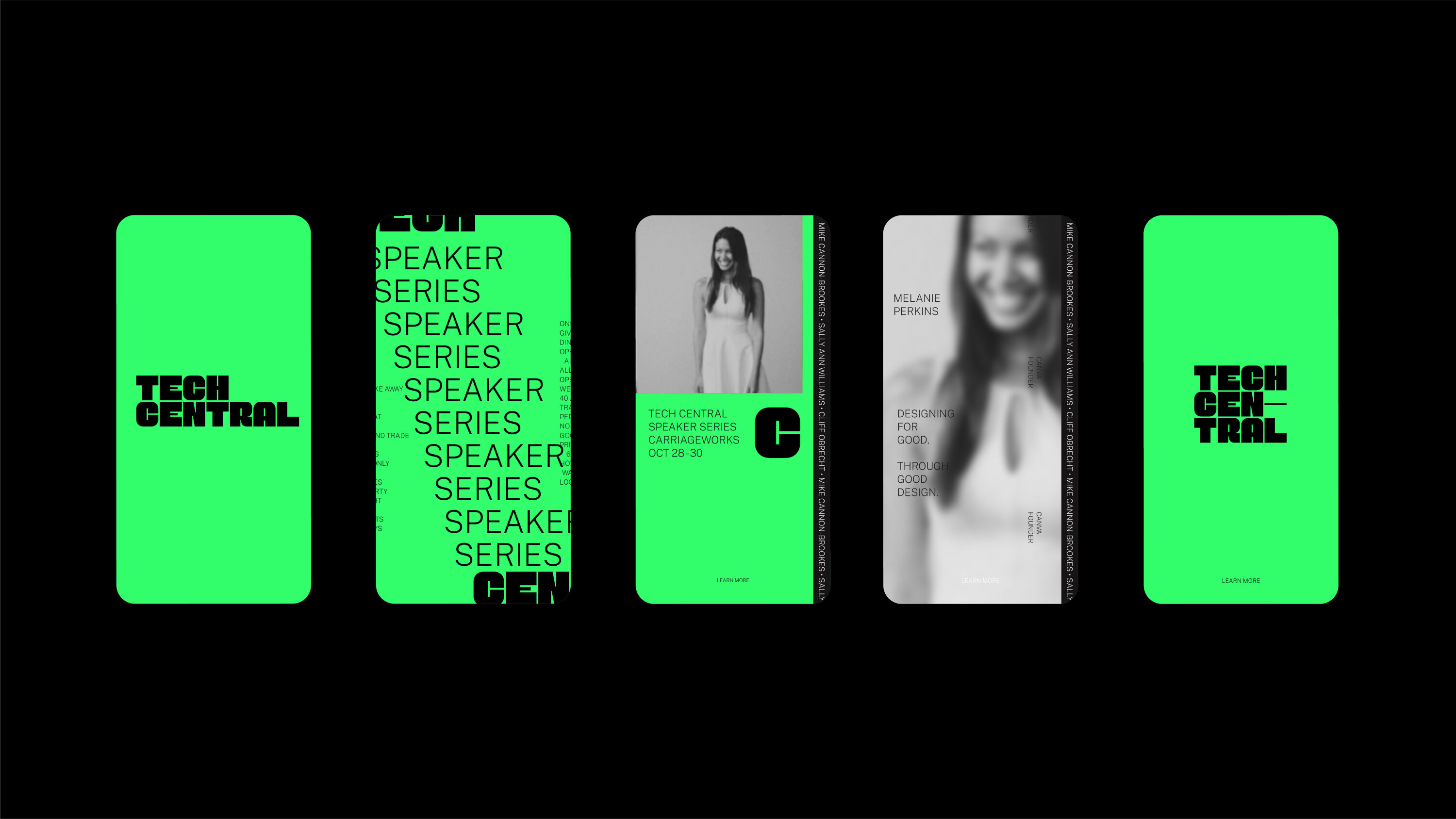
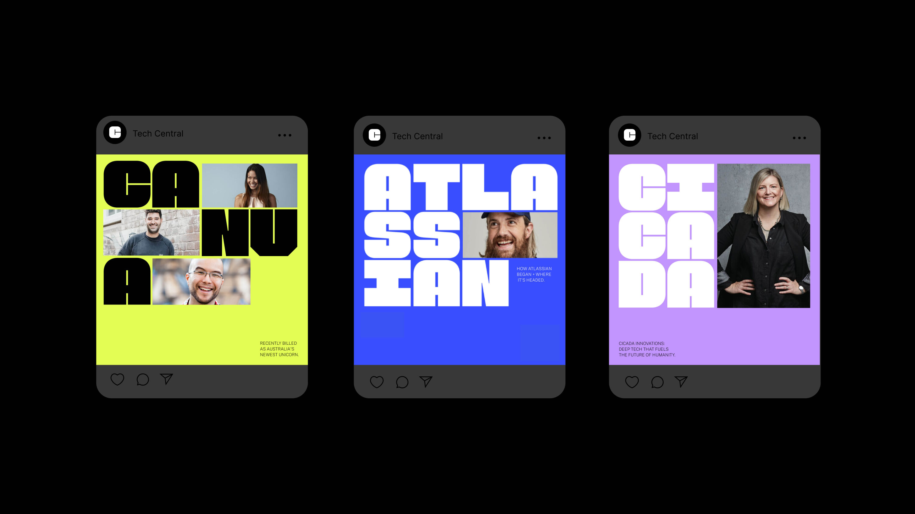
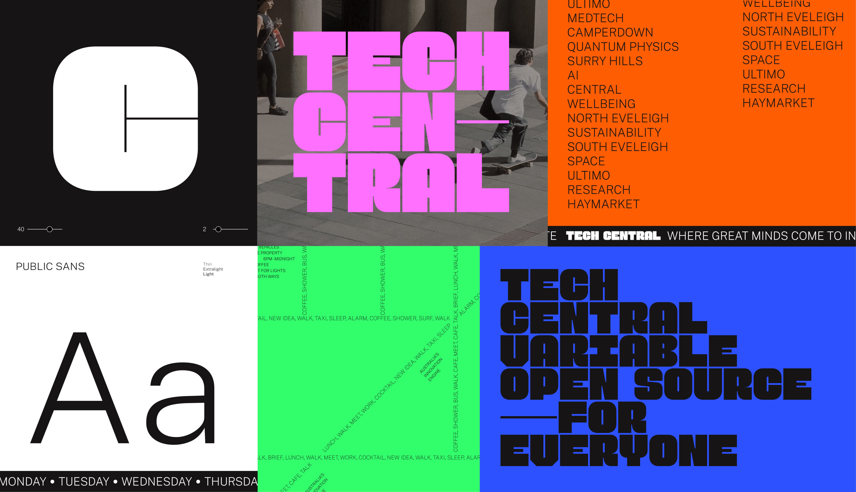
For The People's challenge was to create a brand that could unite this diverse area and champion Sydney's tech/innovation credentials to the world. Led by a monogram identity that fuses the T and C of Tech Central in a smart but simple way, the design system connects the ecosystems of government, education and tech with the broader community. Fully open-source, the system gives the multitude of partners and residents free access to all assets.
Transforming the streets of Sydney into a digital type world of movement and change, bespoke variable typeface Public Sans is used to tell stories and capture the vibrancy of all the happenings within the Tech Central district through custom graphic streetscapes. Typographic stories are blended with eclectic imagery from across the city, drawn from an ever-growing library of tech and innovation images from the district's various partners.
Social Impact Award
The Circle by UnitedUs
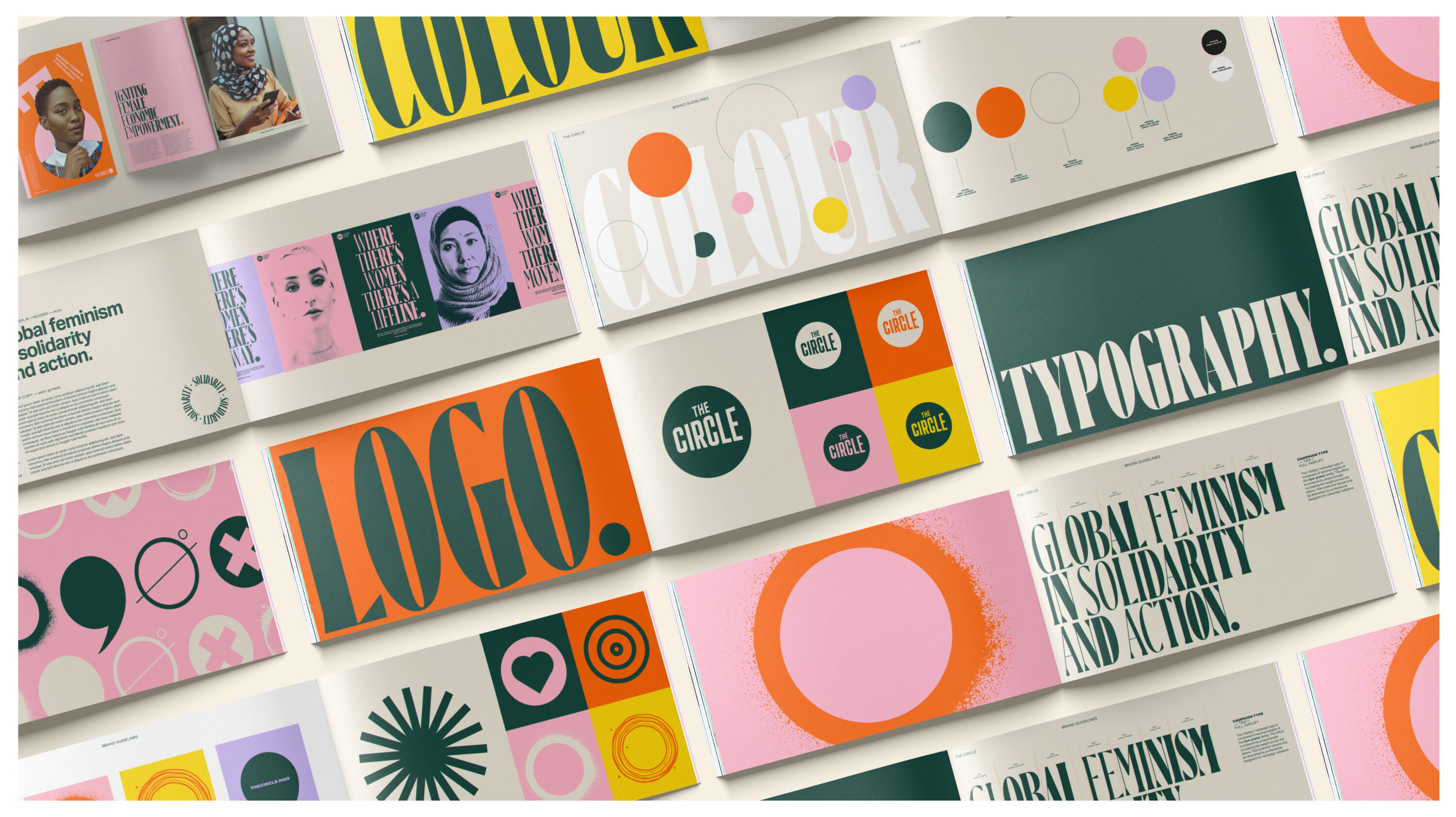
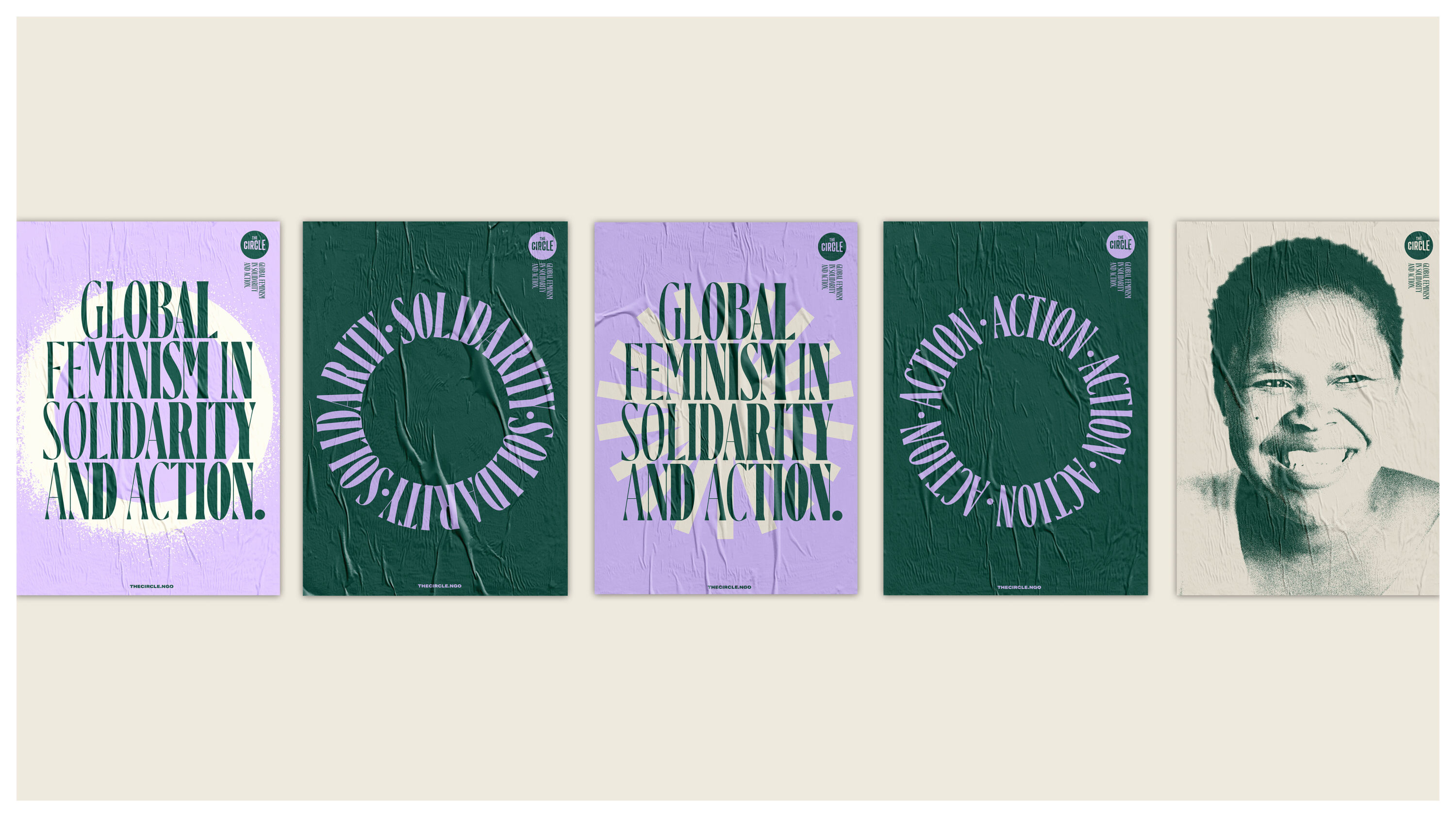
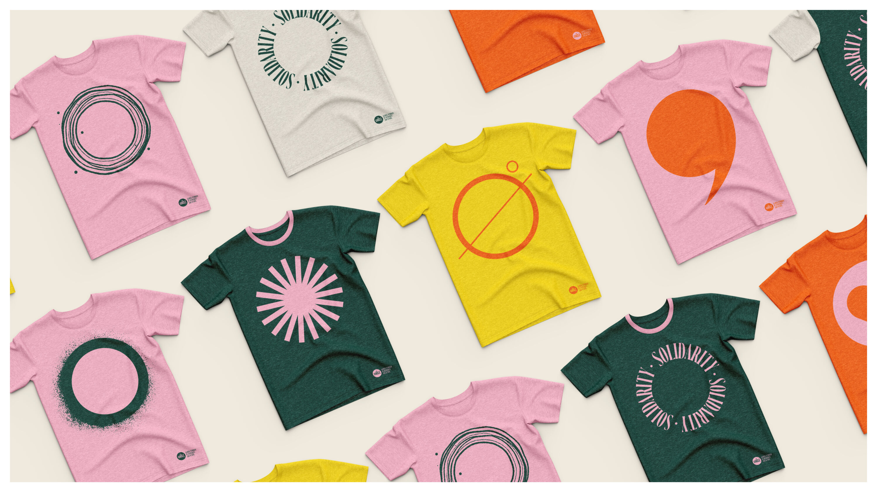
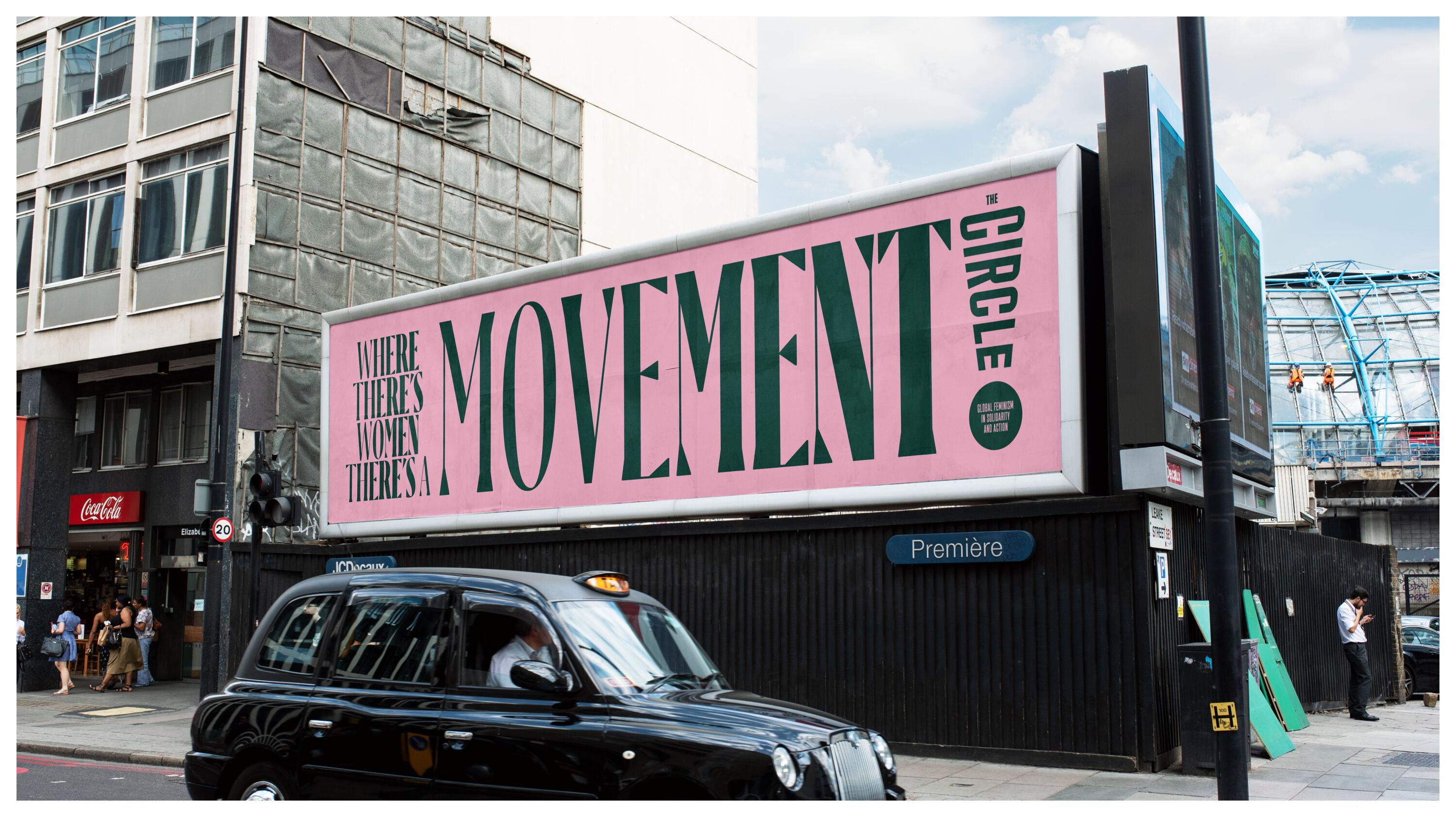
- Gold Award: Social Impact
- Bronze Award: Not-for-Profit
- Read more about this project at unitedus.co.uk
One of two Bronze Awards in the Not-for-Profit category, UnitedUs went on to win Gold for Social Impact after another round of votes from across our global panel. The Circle faced stiff competition from the other Bronze winner, Superunion's rebrand of Shelter – which after a close result took home an additional Silver Award for Social Impact.
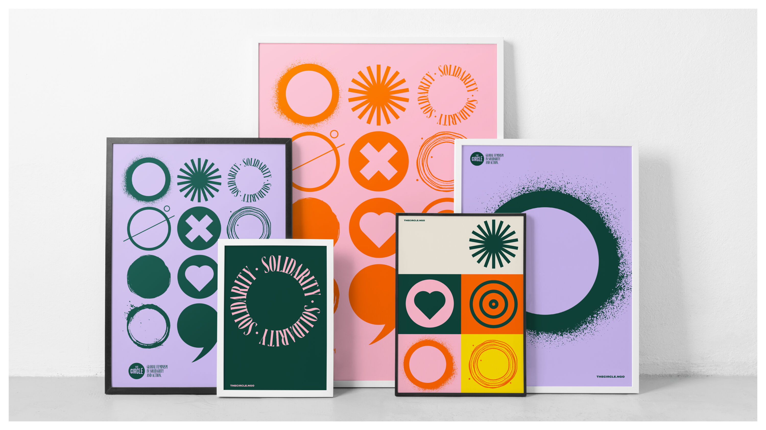
In 2008, a gathering of women with Annie Lennox at the helm led to the creation of The Circle – a collective space set on achieving a fairer world for women and girls globally. However, the organisation needed a strong rebrand to reflect how the world in general, and the feminist movement in particular, has evolved since it was founded.
I’ve been part of various organisations for girls and women since the age of four. I wouldn’t be the person I am today without them. But their brand identity is often massively lacking. The Circle hits the nail on the head. It is bold, authentic, human, engaging, and puts its members at the centre.
Eleni Beveratou – Dalton Maag
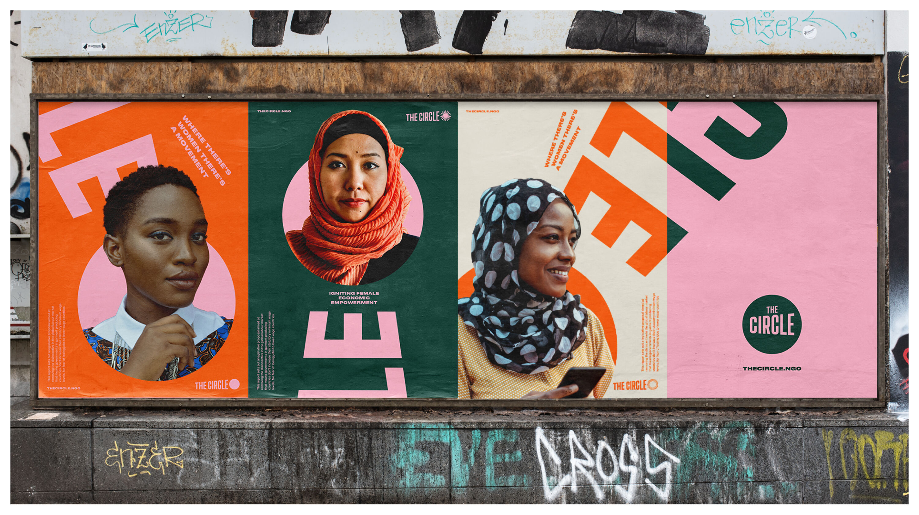
The Circle needed a courageous standpoint that made it distinct from other charities in the space: a clear and compelling call to action, while embodying the conditions needed to drive change in all its forms. UnitedUs responded with a brand that could harness The Circle's core belief: we should all aspire to be global feminists, both in solidarity and action.
This includes bold typographic statements that reflect the courage and the rallying cry of The Circle, custom typesetting that amplifies underrepresented voices, and imagery that is intentionally intersectional. Embodying the feminine principles of connecting and convening, the verbal identity demands change while providing a warm, safe space for global feminists.
Where other brands mimic feminism's steer towards intellectualism or protest, The Circle embodies it all. The mark is freely available to the global feminist community, providing tools at grassroots level to amplify the message. Its social impact speaks for itself, with a 180% uplift in social reach and a 20% uplift in donations following the rebrand.
Silver Award winners
Brand Impact Awards 2022: Silver Awards
The following 15 projects all received at least one Silver trophy at the Brand Impact Awards 2022.
Shelter by Superunion
- Silver Award: Social Impact
- Bronze Award: Not-for-Profit
- Read more about this project at superunion.com
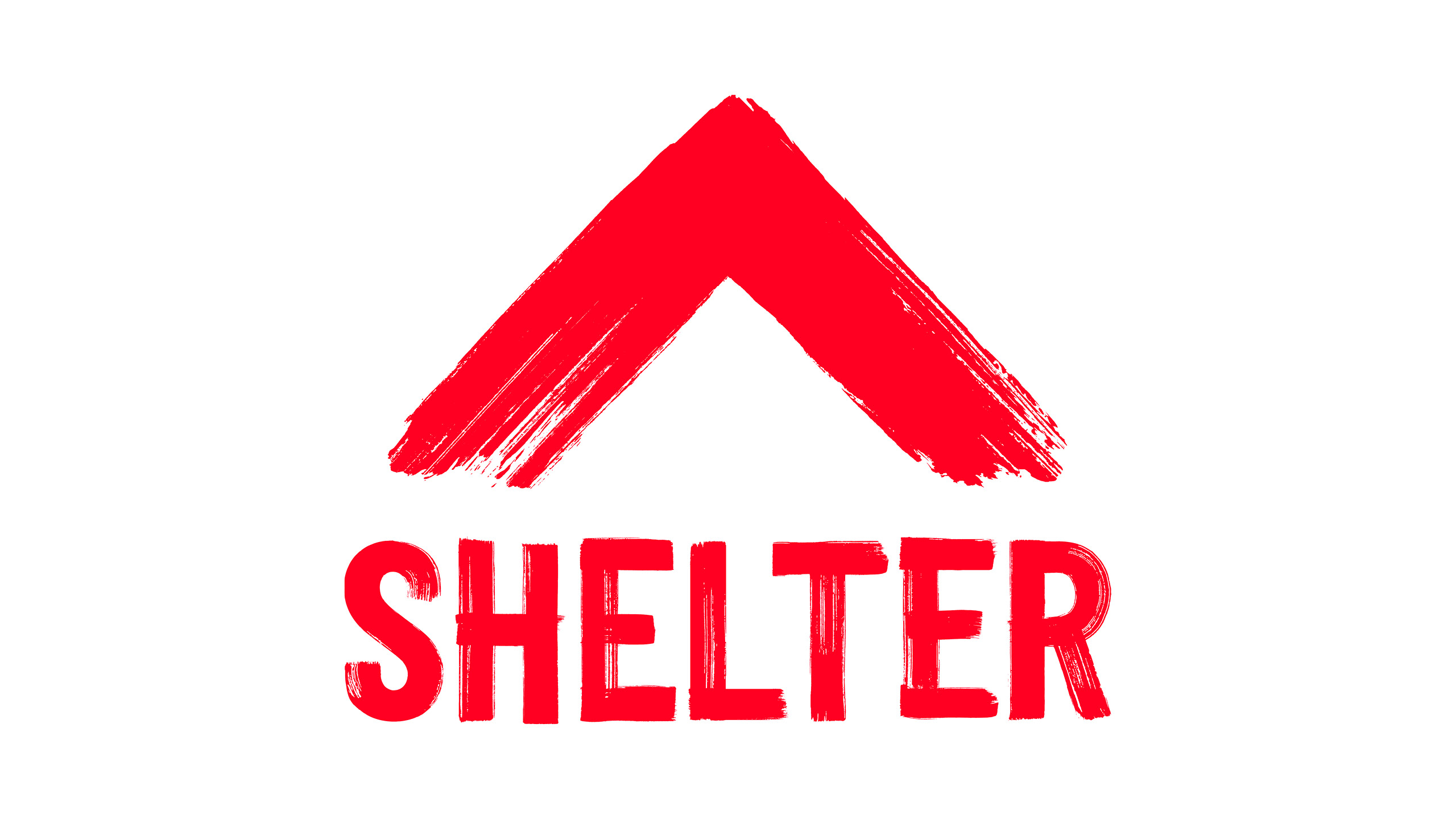
Netting a Silver Award for Social Impact after a close-run contest with Gold-winning project The Circle, Superunion's rebrand of UK social housing charity Shelter was also awarded Bronze in the Not-for-Profit category.
A grassroots movement founded in 1966 as the National Campaign for Homeless People, Shelter faces many of the same issues over half a century later: a housing crisis at breaking point. While its mission to fight for safe homes has always been there, over the years the brand had lost its voice and become yet another polite high-street charity.
Throws a spotlight onto the harsh reality of homelessness. Such an unapologetic, fighting voice is exactly what's needed to cut through the noise.
Doug Hey – DixonBaxi
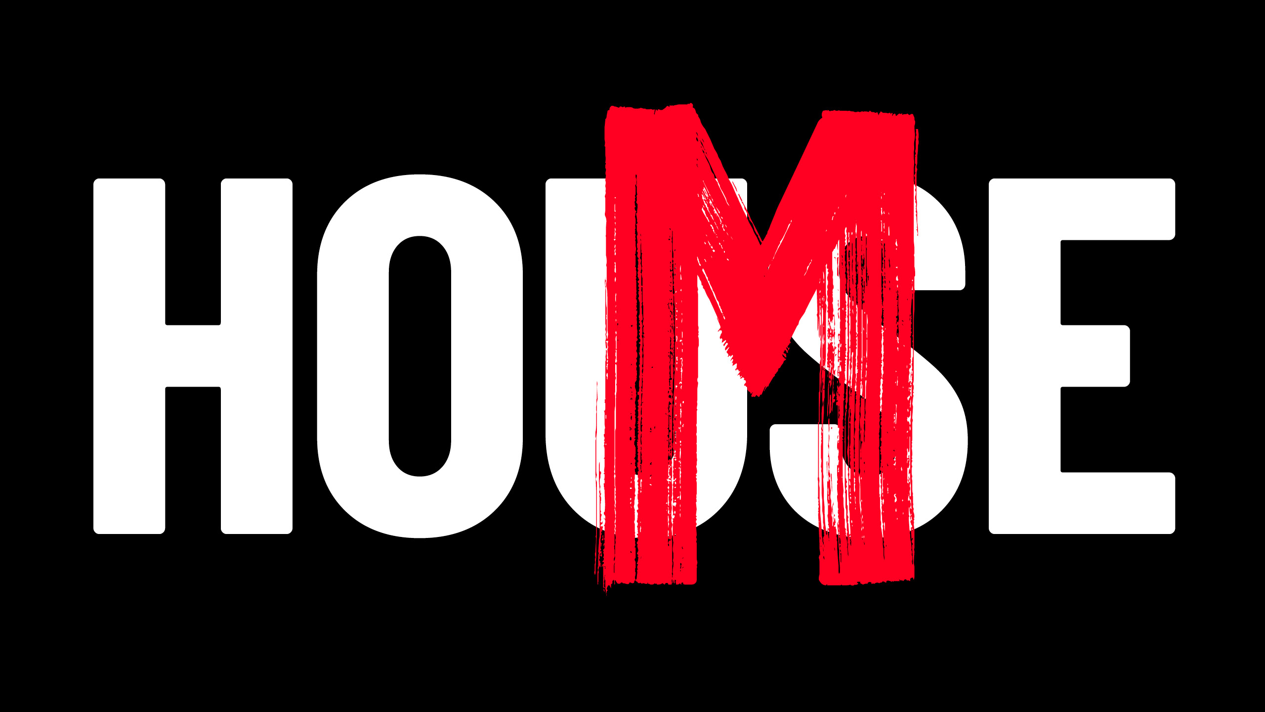
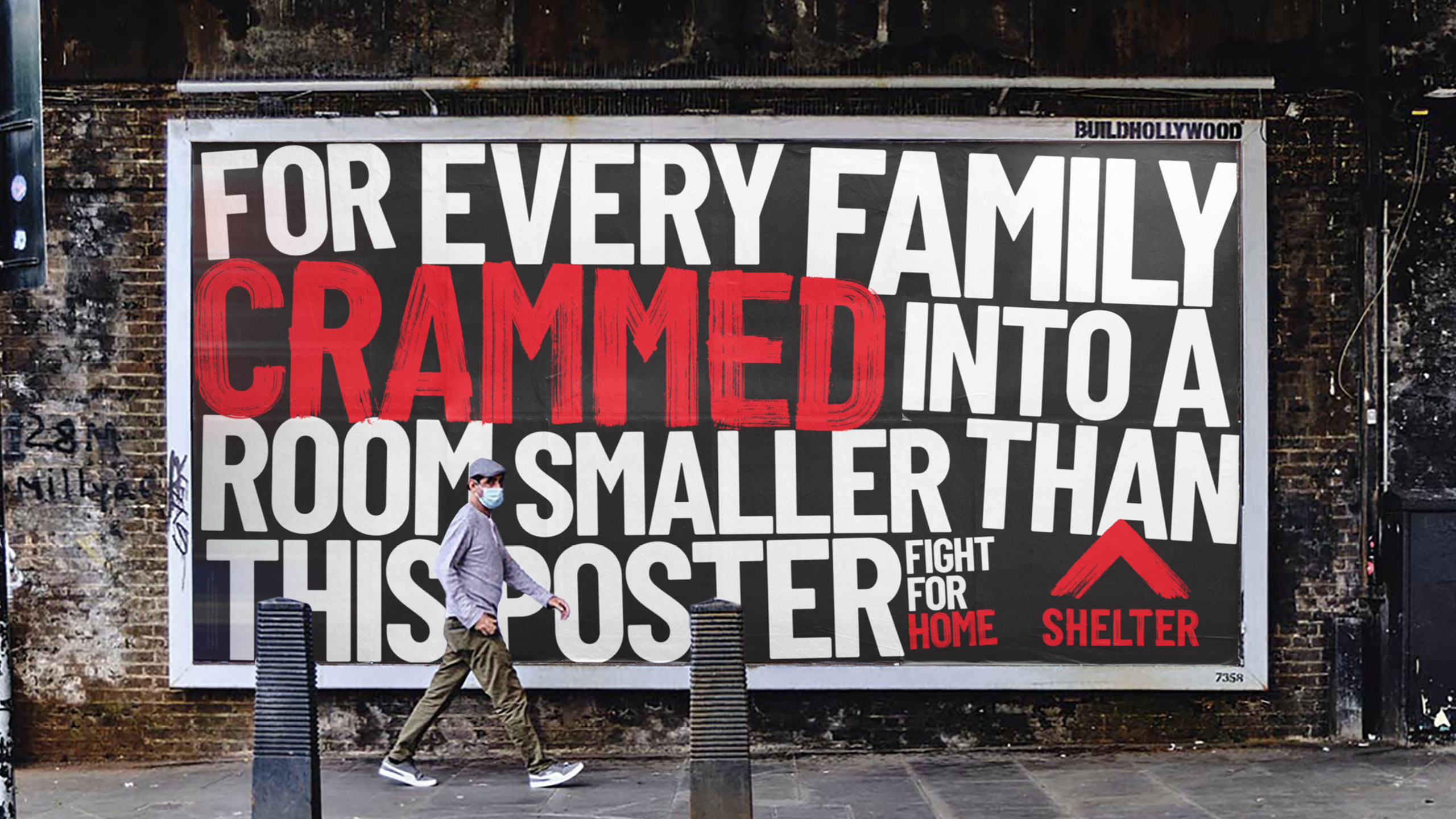
This rebrand repositions Shelter as an activist organisation, standing up to the housing crisis with the rallying call that enough is enough. Inspired by its protesting roots, Superunion introduced an aggressive, disruptive visual language based on red brush strokes to give it a more proactive presence.
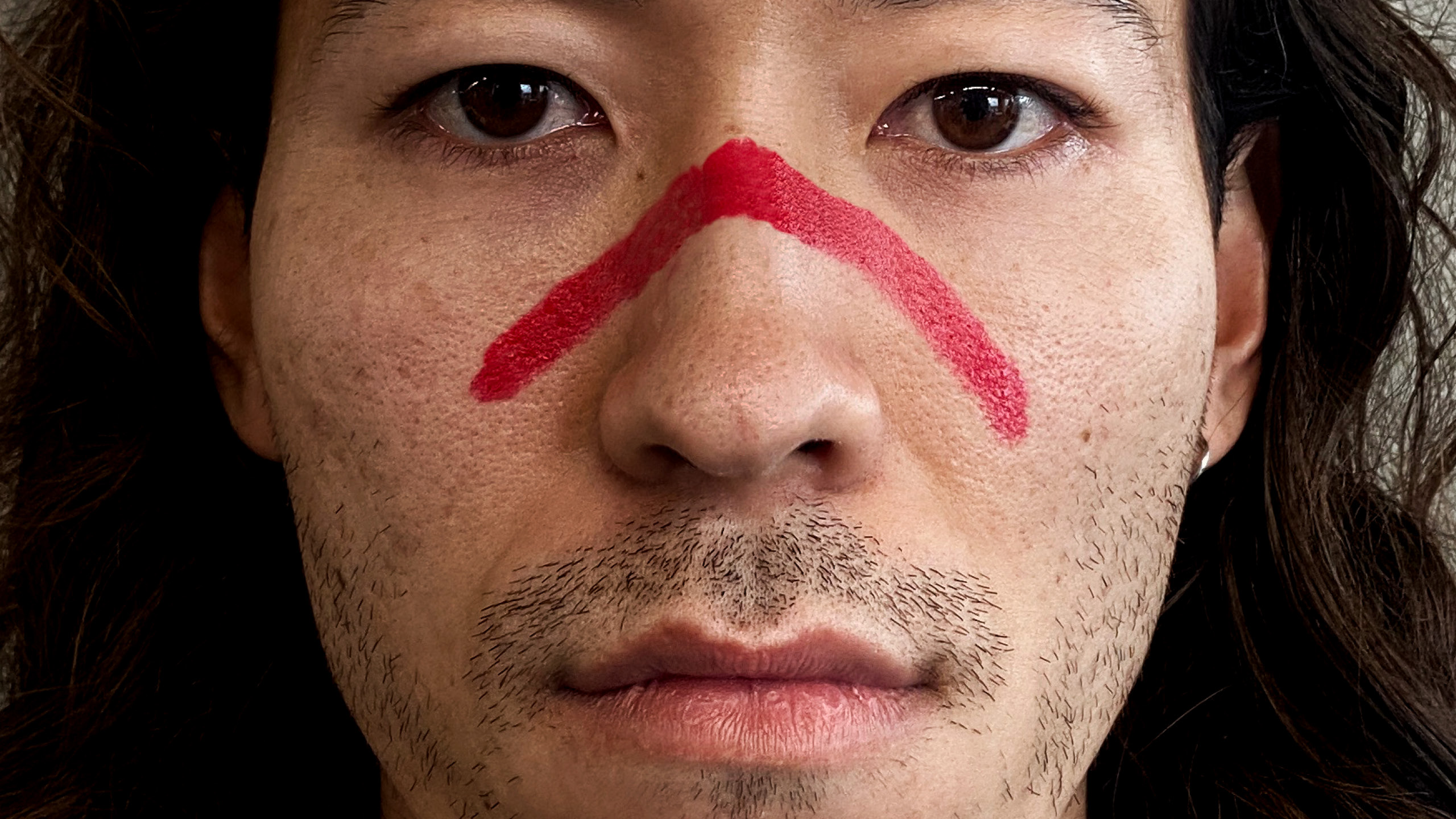
Combining the iconic roof shape with a positive upwards arrow, the new logo is a universal symbol that invites participation and demands change – and is simple enough to be distilled into an instantly recognisable hand gesture.
Shelter's activism-inspired rebrand is striking, bold, powerful and above all – unignorable.
Astrid Stavro
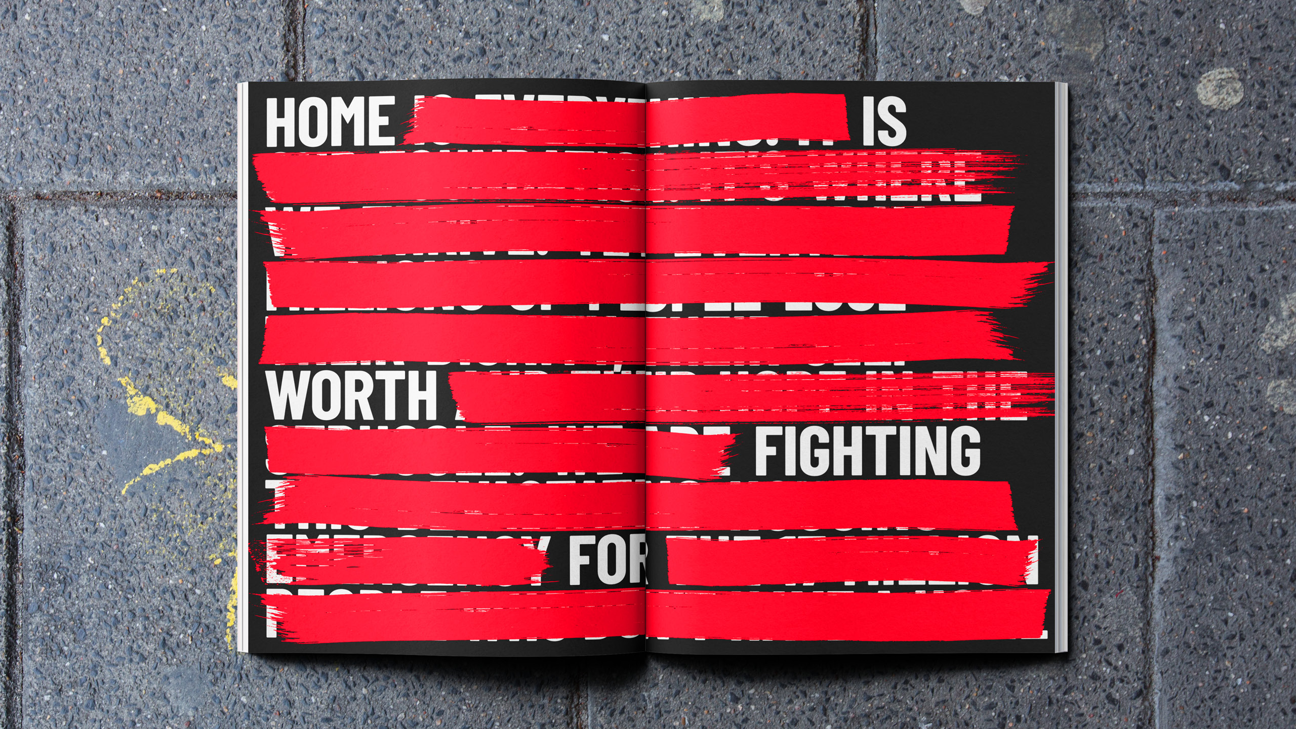
A bespoke typeface gives Shelter a voice to redact and amend words, turning negatives into positives as part of a hard-hitting brand campaign that instils the organisation's newfound sense of urgency. And by putting the brand toolkit in the hands of the people who use it most, supporters are empowered to take their message to the streets.
Fedrigoni: Happy Mess by Superunion
- Silver Award: Publishing
- Bronze Award: Illustration
- Read more about this project at superunion.com
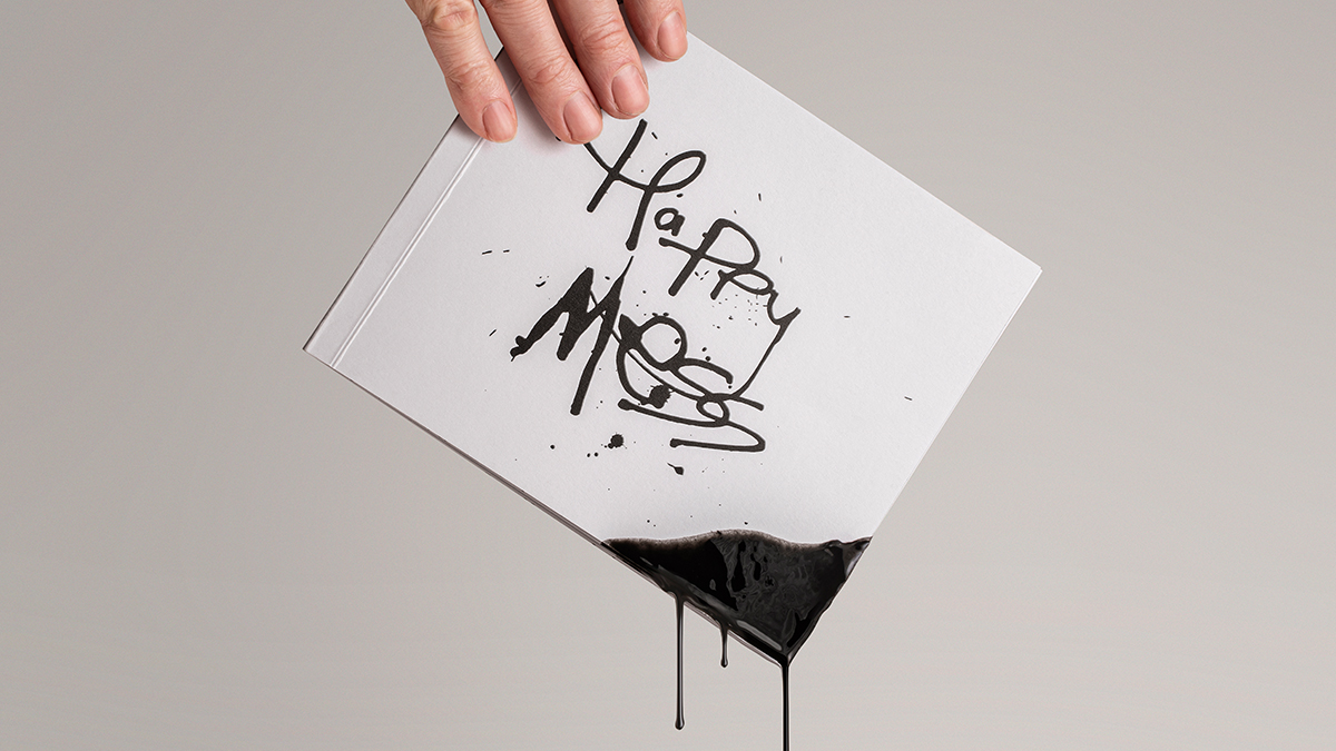
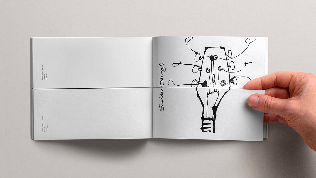
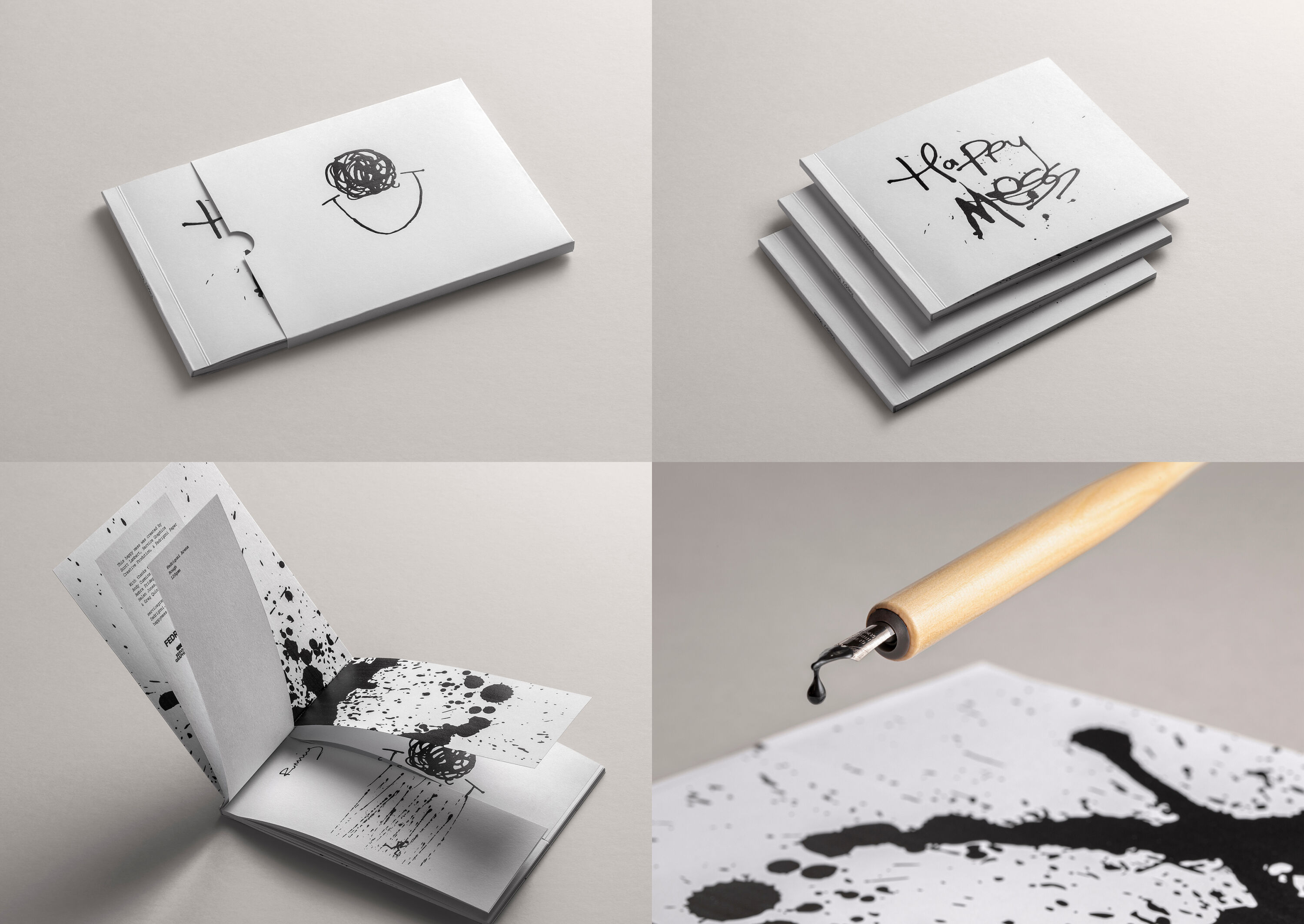
To promote its new range of Arena papers, Fedrigoni needed a creative solution to demonstrate the varieties of textures available. Part of Superunion's brief was to create an experience for designers to explore different stock combinations in a fun, tactile way.
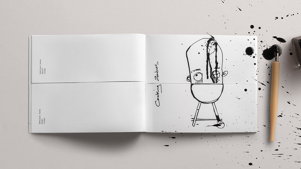
Building on the simple insight that happy accidents can often result in moments of pure joy, the team began sketching out some of the irrational, unexpected things that made them happy. The result: the traditional paper swatch-book got flipped on its head, and became a flip book.
A beautiful, charming concept with a childlike playful nostalgia that captures readers' imagination. Easy to overcomplicate this, but the simplicity of the idea is key.
Hamish Campbell – Pearlfisher
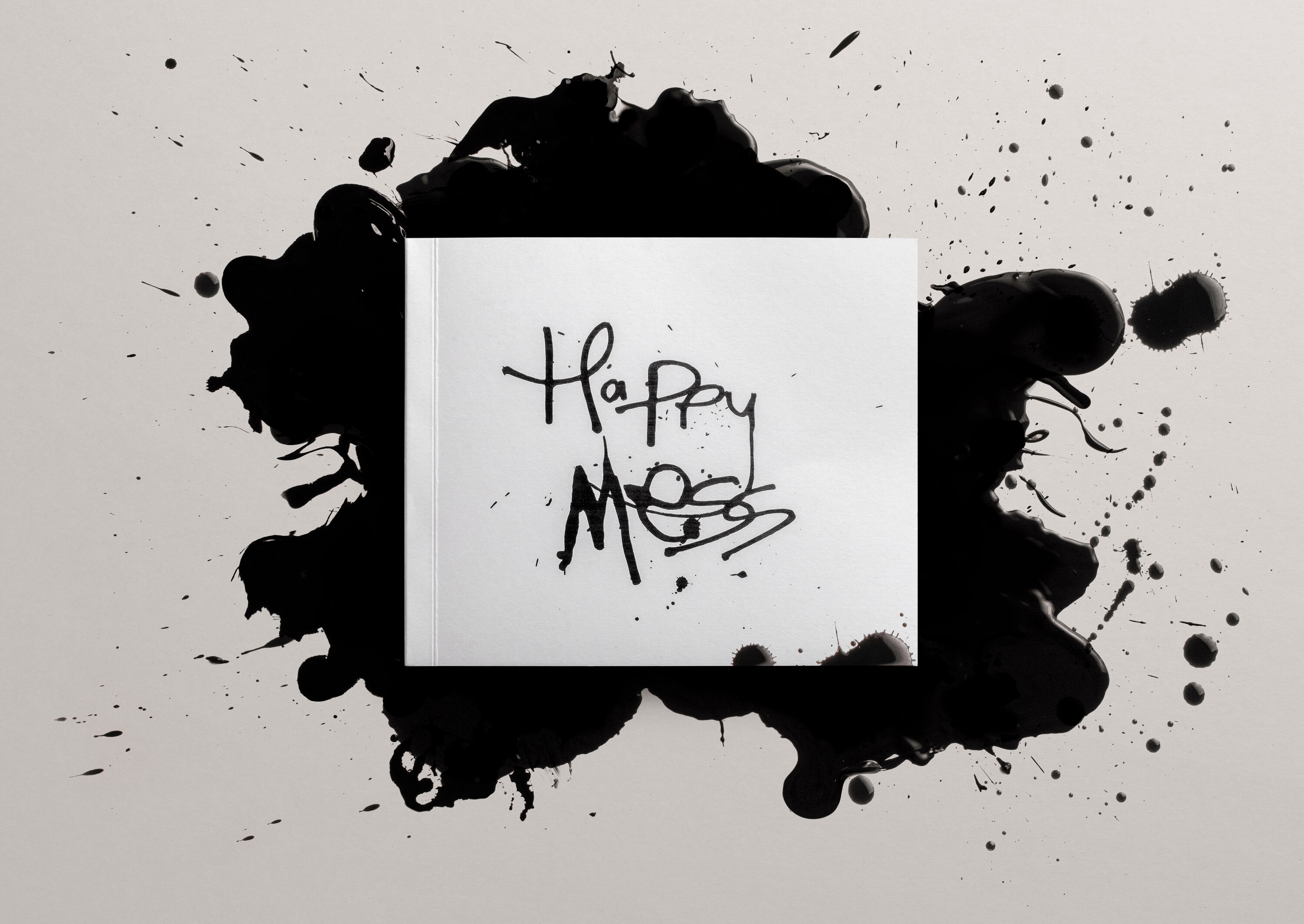
Hand drawn with Indian ink and dip pen, Happy Mess celebrates freedom, joy, and simplicity. In stark contrast to the cool, minimalist tomes that most paper swatch books become, it's a playful explosion of messy, inky illustration. Hundreds of limited-edition books landed on the desks of top designers and studios across Europe, showcasing the "rational elegance" of the Arena range through 1024 messy, irrational combinations.
LSO: The Master Conductor by Superunion
- Silver Award: Culture
- Bronze Award: Motion
- Read more about this project at superunion.com
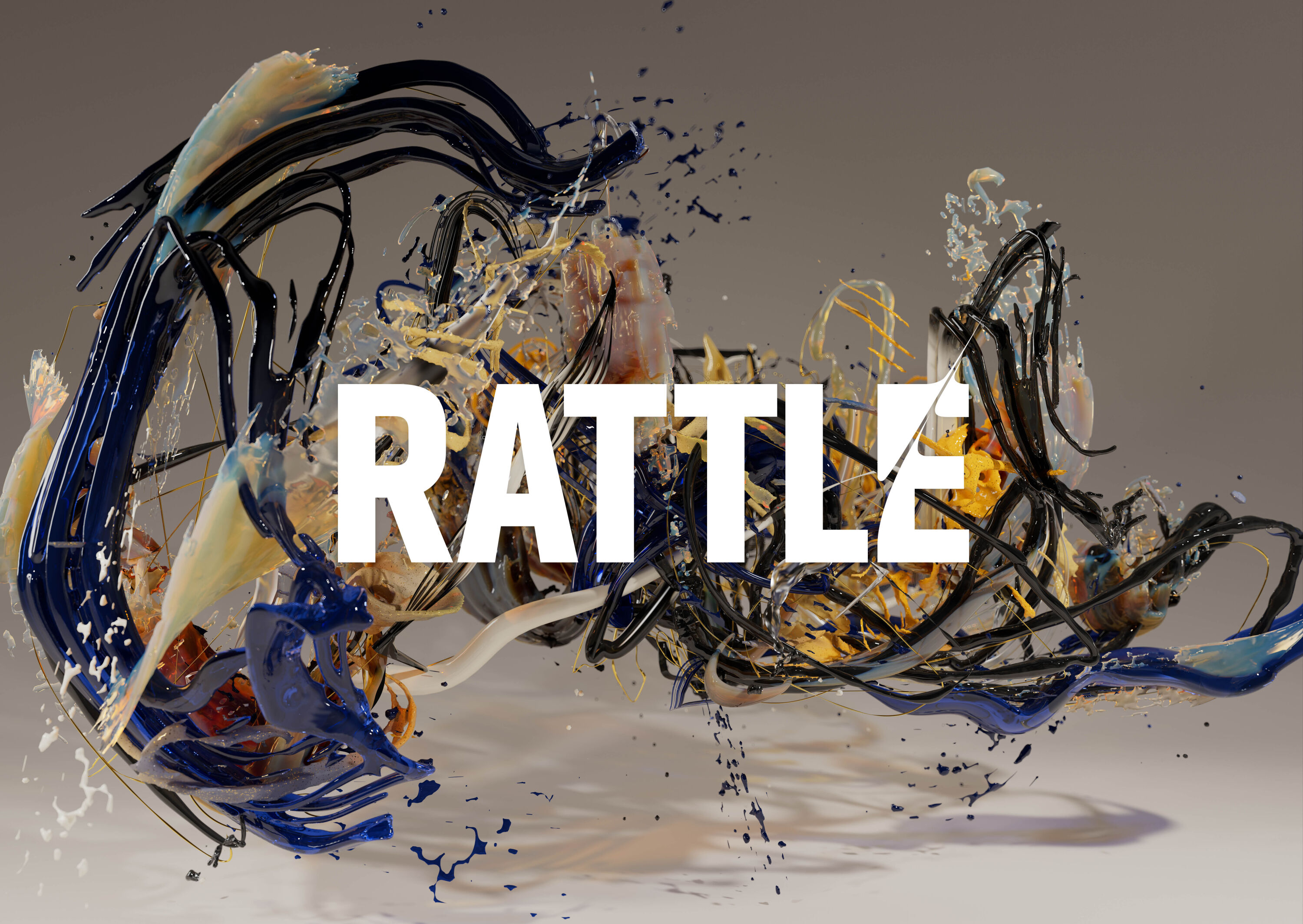
The Master Conductor is the latest and final iteration of Superunion's superb motion-capture-driven campaign for London Symphony Orchestra, updated every season since it was unanimously voted Best of Show at the Brand Impact Awards 2017. It provoked heated debate amongst both the Culture and Motion panels, who ultimately awarded it Silver and Bronze respectively – while acknowledging its Gold-level craft – because it was essentially an evolution of the same core idea.
LSO's 2022/23 season is the swansong for Sir Simon Rattle, the visionary conductor who inspired the original 2017 campaign and whose motion data has driven every iteration since, in collaboration with different digital artists.
Paying tribute to Rattle's artistry, The Master Conductor transforms his gestures into an expressive art-piece, painterly in texture with a sculptural physicality. Gathering intensity until the crescendo, the sculpture dramatically liquifies and drops to the floor to symbolise the end of an era.
Stills from the film were selected to reflect the narrative of the film in print across the season's brochure and promotional materials, with typography echoing the movement of the art-piece. The long-running campaign's expressive and emotive approach has helped transform the public perception of classical music for younger audiences, and The Master Conductor marks a fitting end.
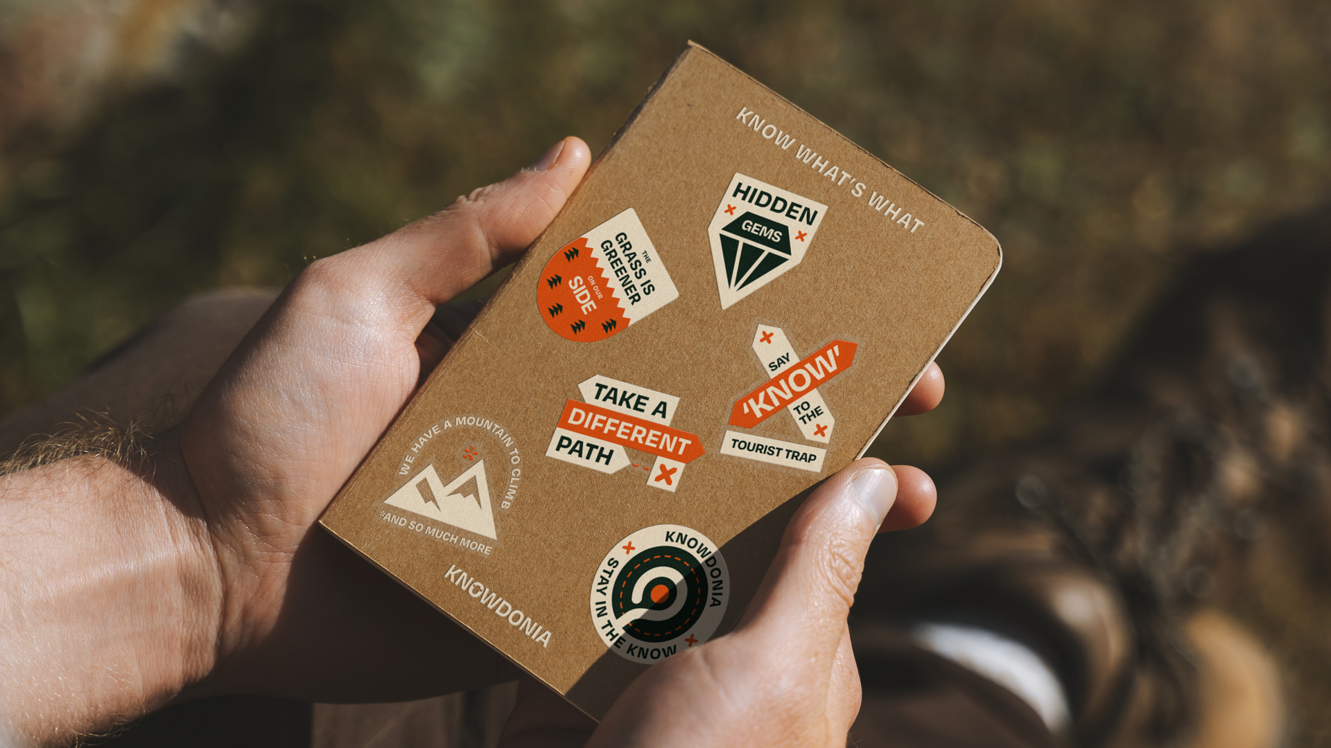
Knowdonia by Thisaway
- Silver Award: Copywriting
- Bronze Award: Transport & Travel
- Read more about this project at thisaway.co
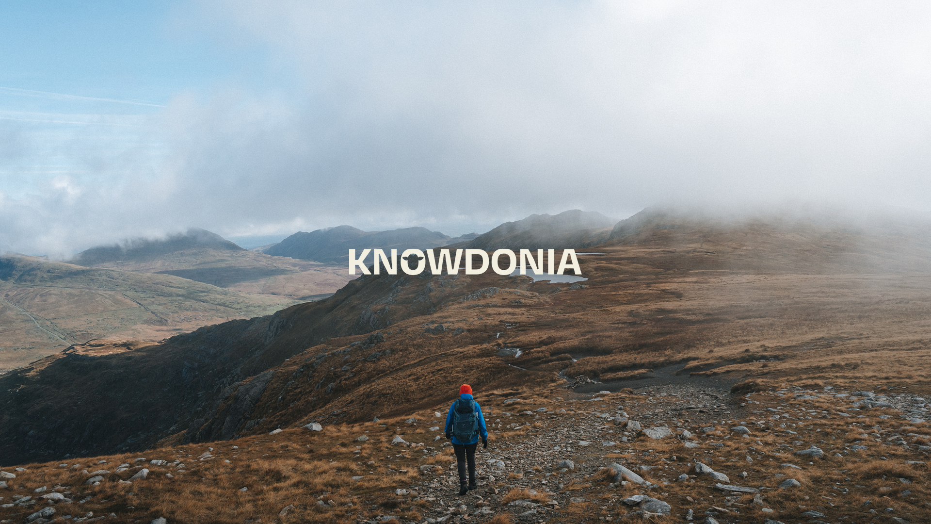
With over half a million visitors a year, Snowdonia has the highest concentration of mountains, beaches, castles, forest and lakes in the UK. Thisaway was briefed to show there's more to this much-loved area of North Wales than just climbing Mount Snowdon.
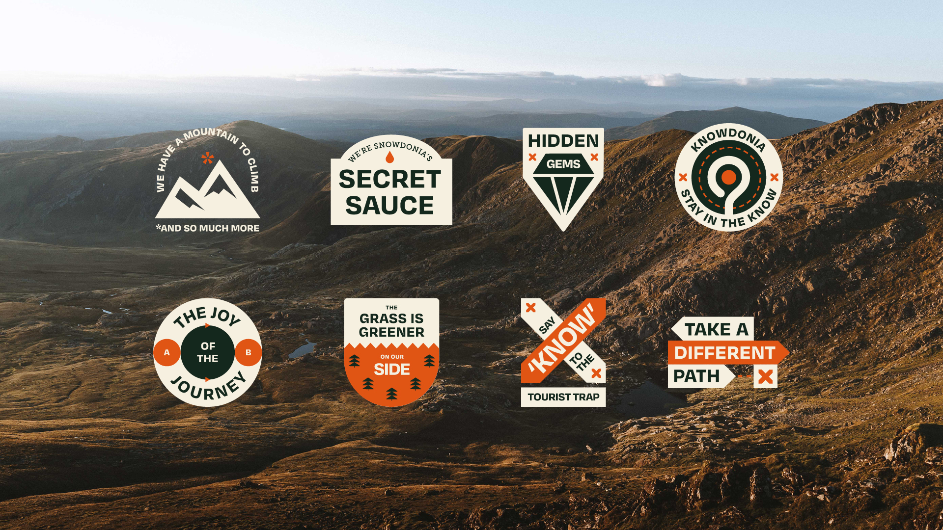
Putting a fresh twist on what a travel brand should look and sound like, Knowdonia features a distinctive verbal identity that caught the eyes of our Copywriting jury. Led by the tagline 'Don't Follow The Flock', its quirky and playful tone of voice is designed to appeal to curious tourists.
A sprinkle of wordplay. A smatter of smart headlines. And a clear brand idea that threads everything into a lovely whole. Knowdonia instantly stood out from the flock.
Jade Barrett – Reed Words
Knowdonia leads us off the beaten track to encourage visitors to explore the 823 square miles beyond the region's iconic mountain, including an array of hidden gems only previously accessible to those 'in the know' – such as the Knowdonia founder, who also runs a local premium hostel.
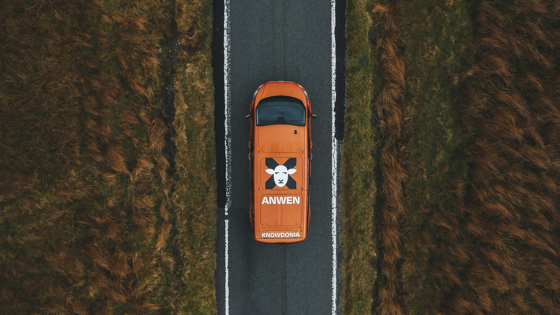
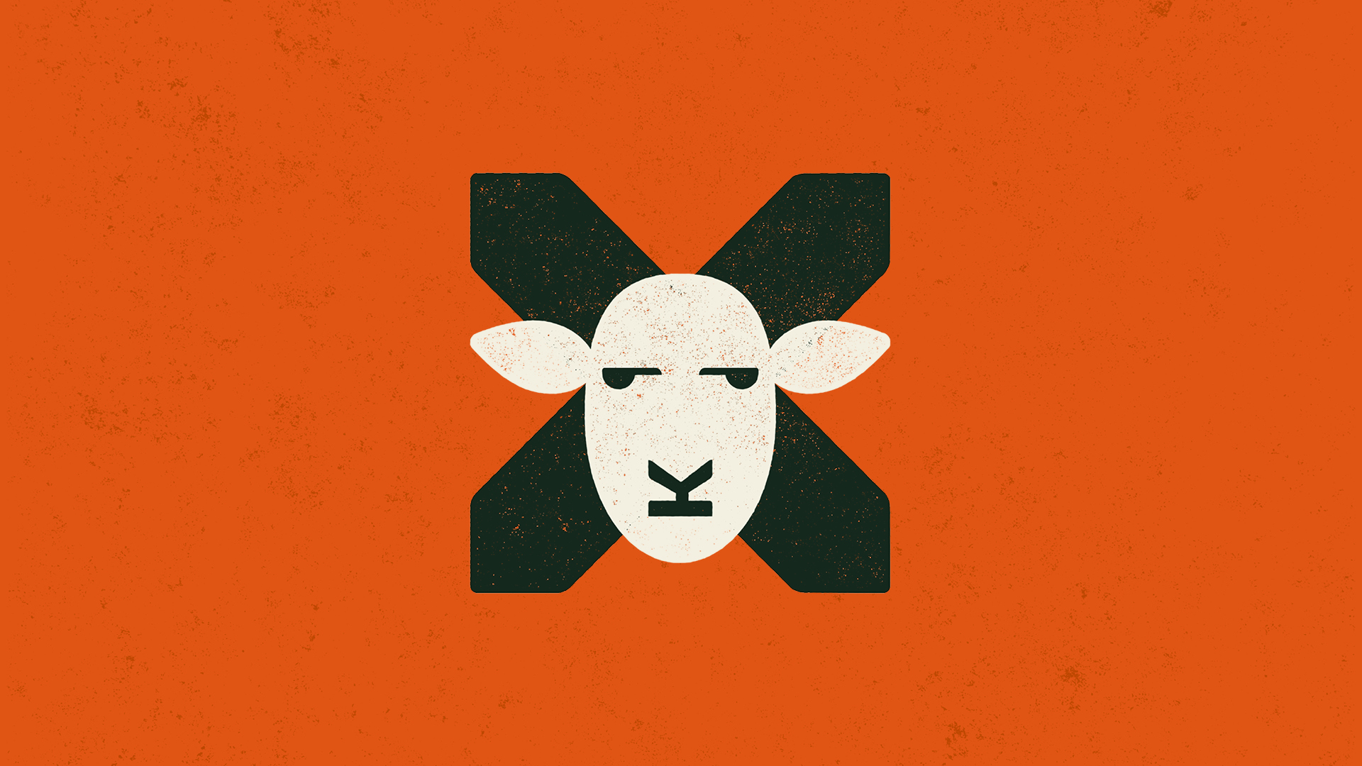
Wales' favourite animal is given its fair share of attitude in the brand symbol: the head of a sheep atop two crossed signposts, nose and mouth formed from the 'K' of the brand name. Emblazoned large and proud on the tour vans, the symbol is also placed on the roof – a smart detail that enables hill walkers and climbers to identity it from above.
Aplo by GoodLove

- Silver Award: Financial Services
- Read more about this project at goodlove.co
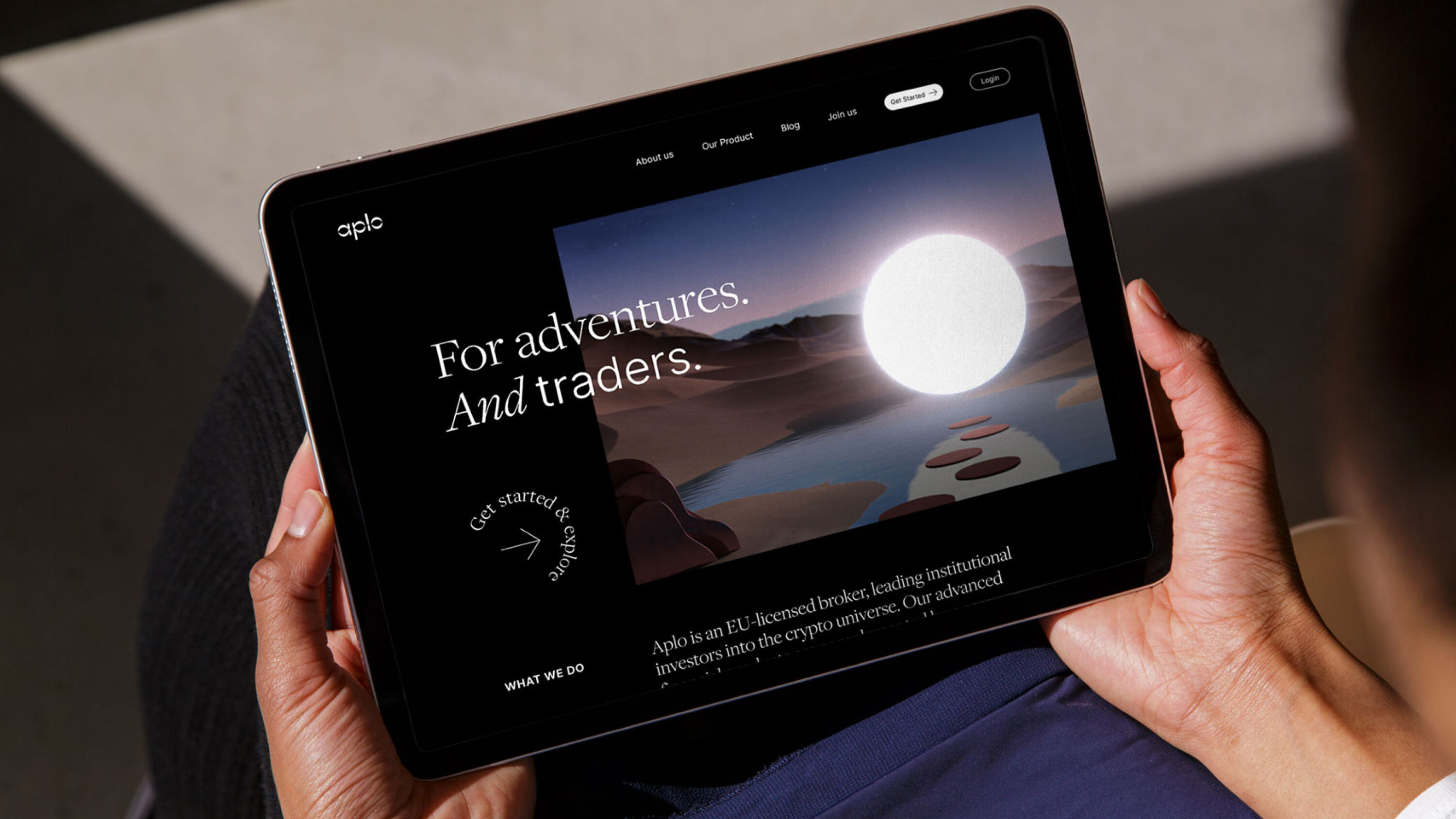
An EU-licensed crypto-broker, Aplo offers professional investors a way to purchase digital assets for the first time. Typical clients are traders at traditional banks and hedge funds, who are motivated by the thrill of profit and keen to invest in cryptocurrencies in a legitimate way.
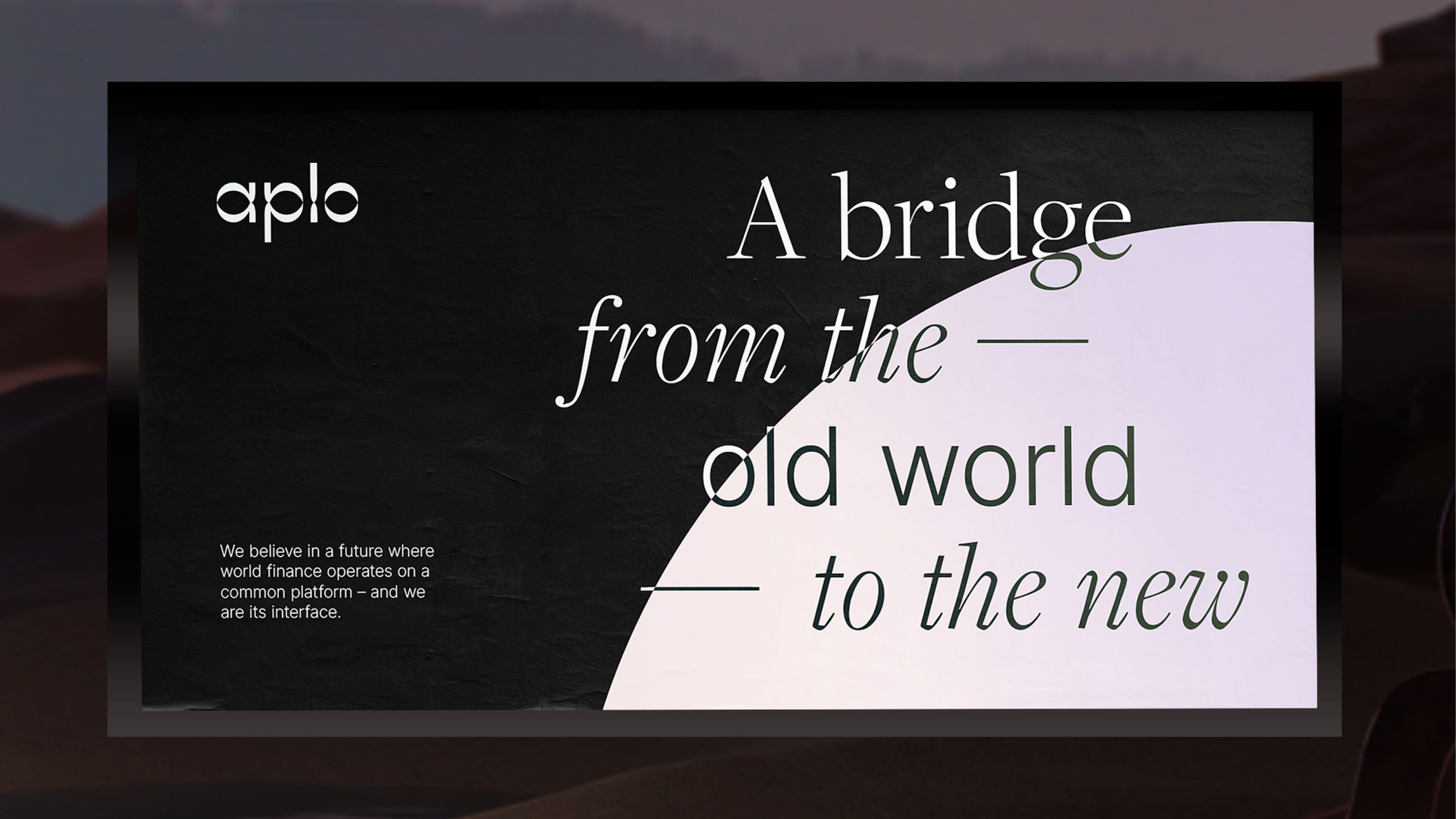
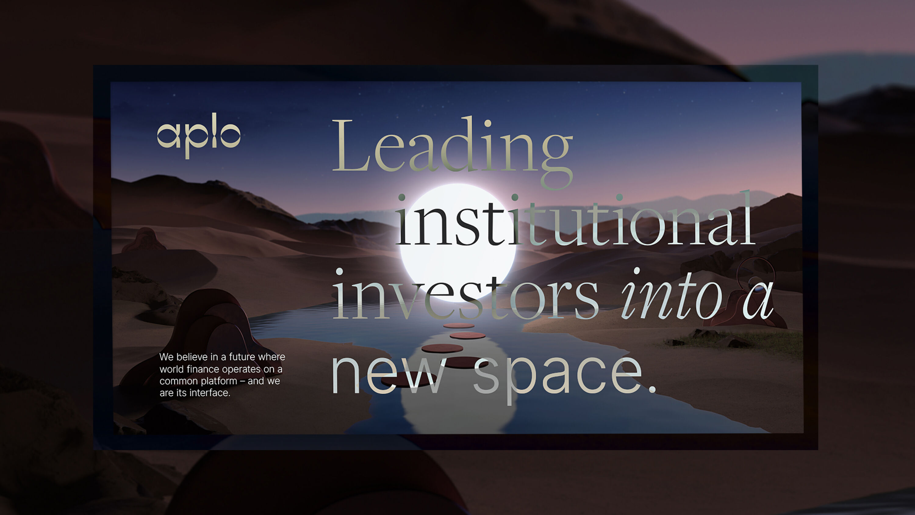
GoodLove partnered with Aplo (formerly SheeldMarket) to develop a name, visual identity and personality that blends credibility with the allure of new opportunities. A visual metaphor to represent Aplo's unrivalled access to the crypto universe, hero imagery shows a portal in a nondescript land, surrounded by mysterious objects.
Completely unexpected in a sector that is usually quite straight and complex. A calm energy that invites you to explore, rather than overwhelms.
Lou Sloper – Here.We.Go.
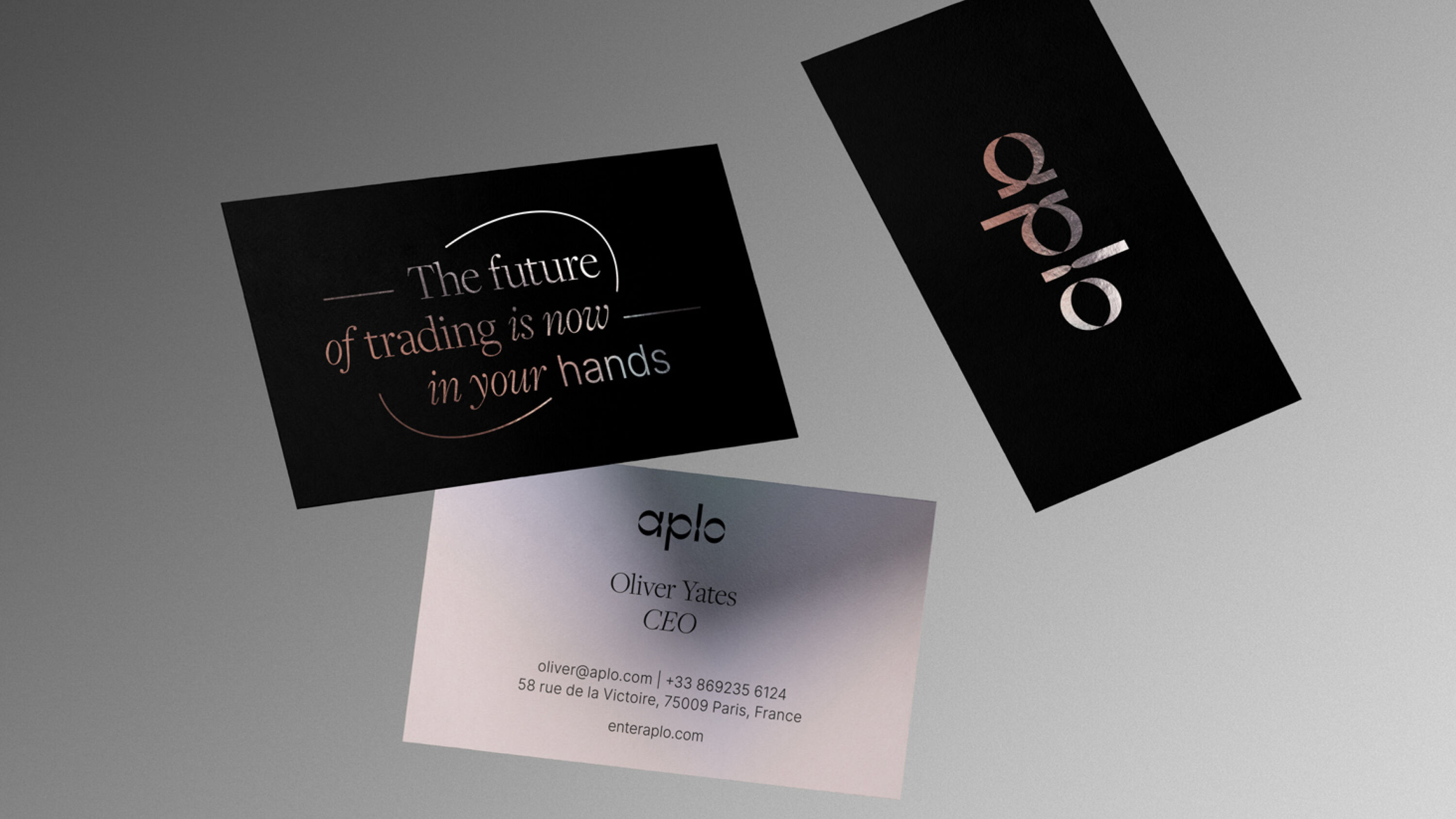
Inspired by offset reflections, Aplo's new logo hints at the idea of two connected worlds, and the identity system as a whole has an inherent duality: it must speak to both the old investment world and the new at once, striking a balance between sophistication and adventure.
This duality comes across in every detail, from type pairings to the combination of a monochrome palette with a shimmering gradient. In a sector that leans heavily on the tropes of corporate finance, with generic and deeply technical visuals, Aplo sets itself apart with an abstract, emotional approach – a crypto-native brand in a world of finance lookalikes.
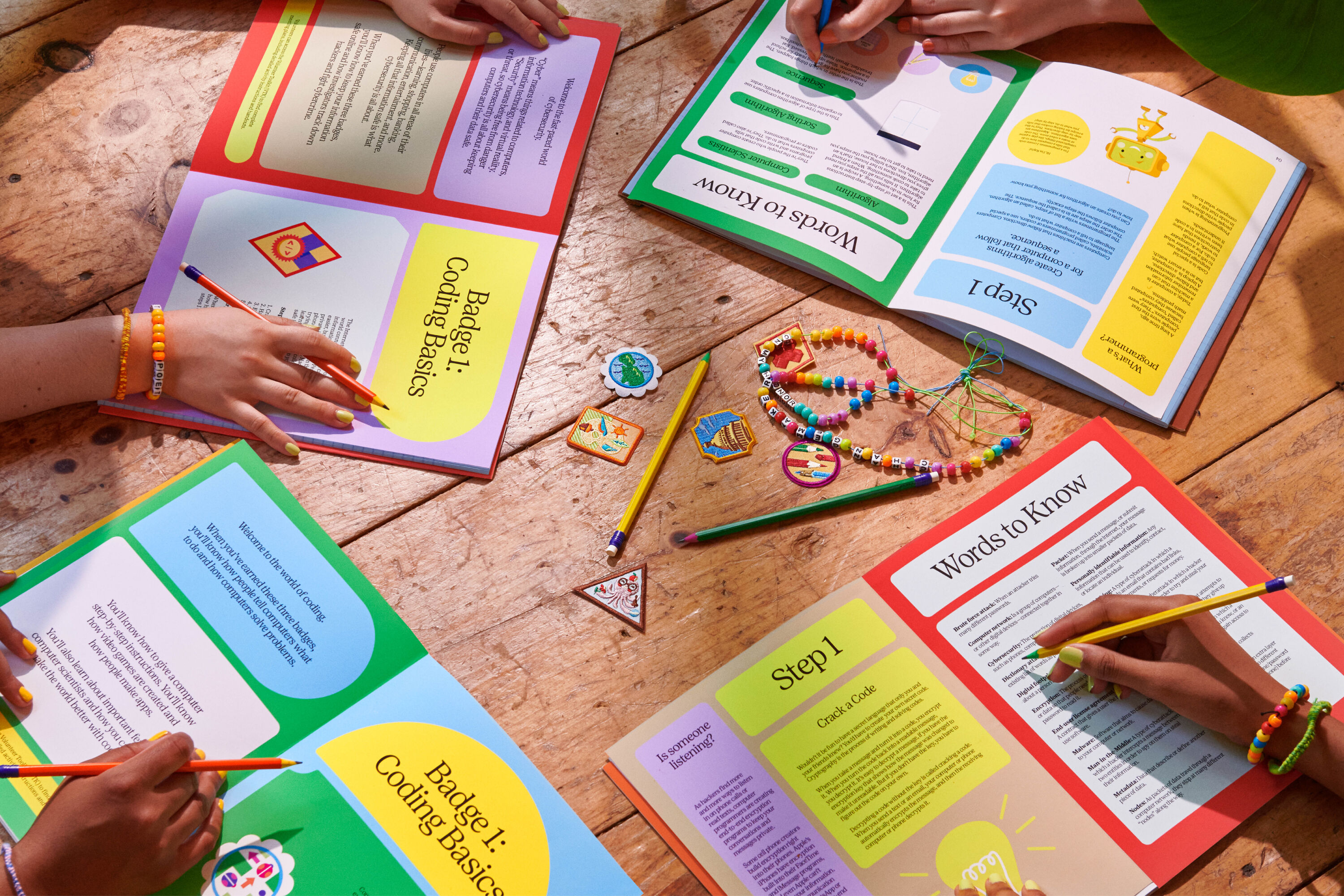
Girl Scouts of the USA by COLLINS
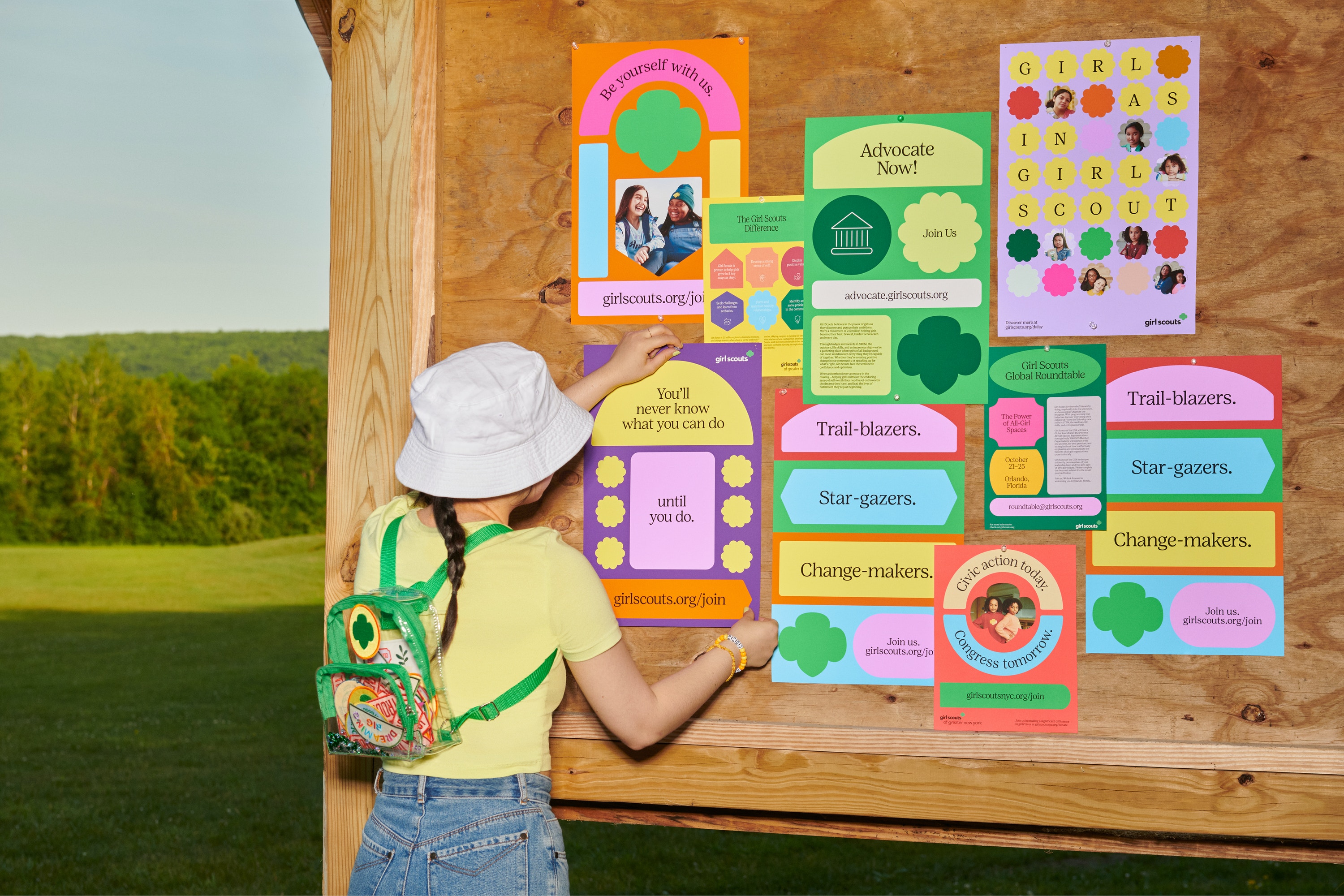
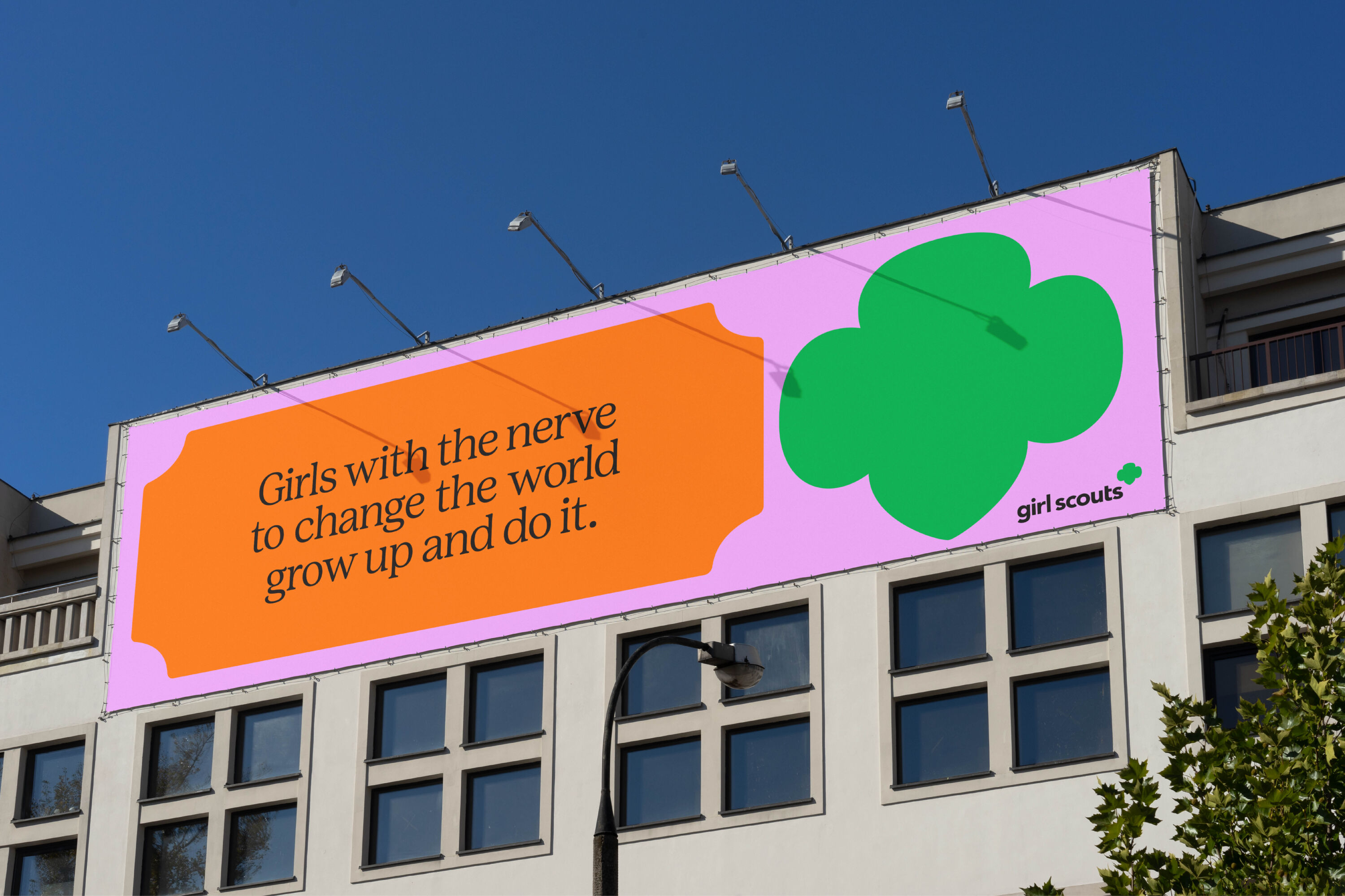
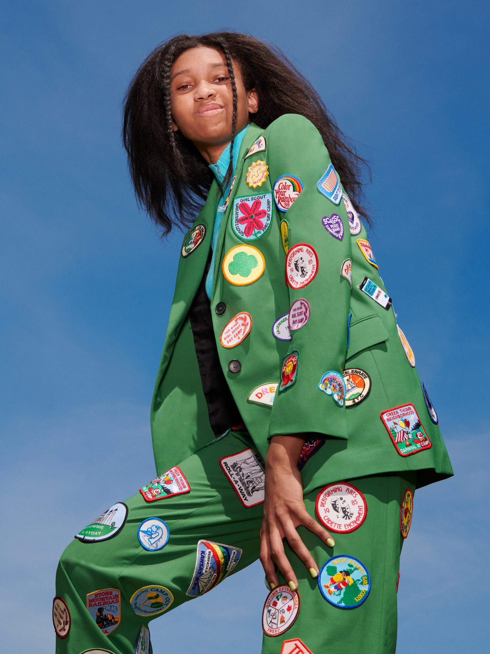
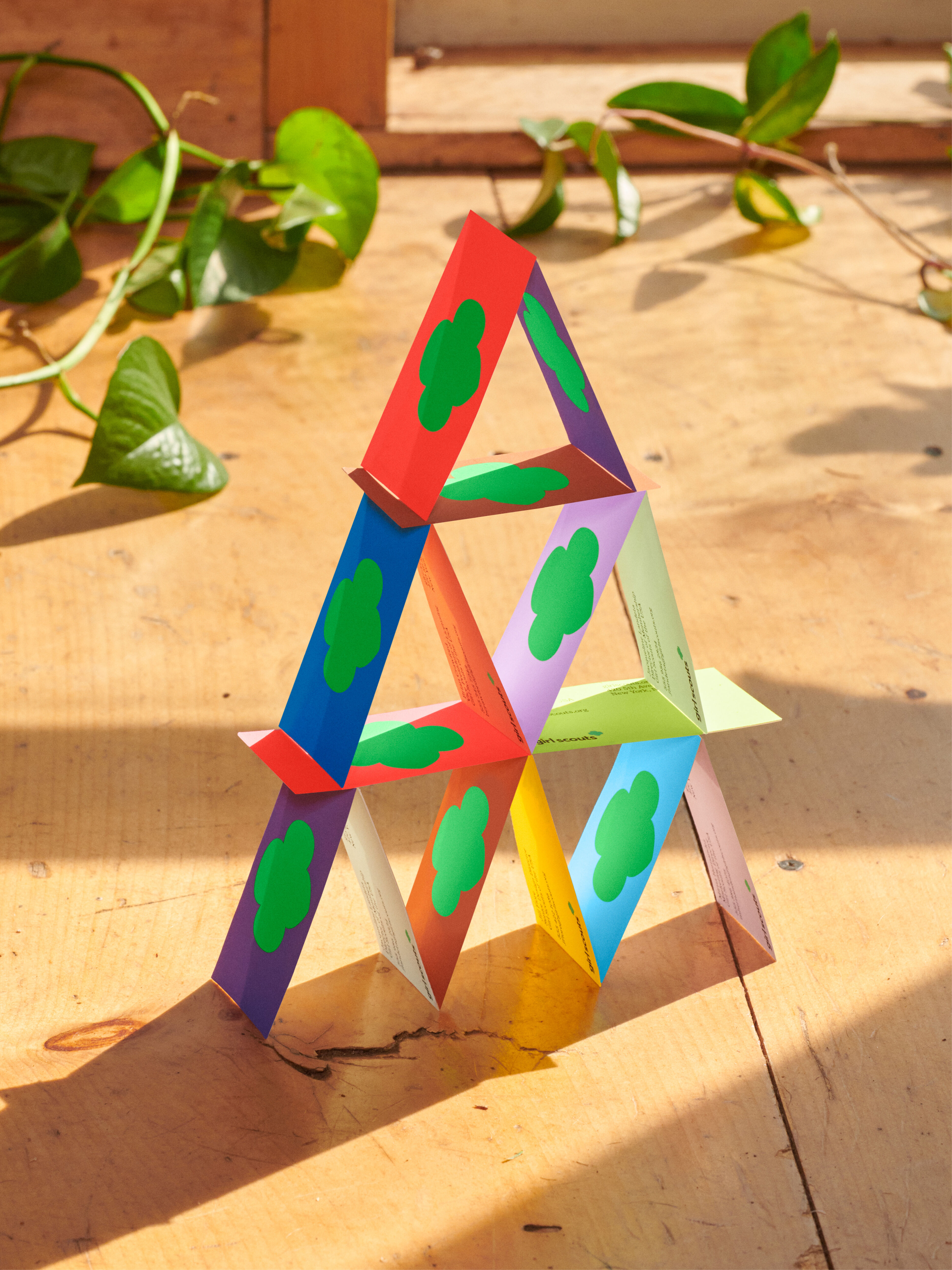
- Silver Award: Not-for-Profit
- Read more about this project at wearecollins.com
Savannah, Georgia, 1912: Juliette Gordon Low had the idea to prepare girls to meet the world with courage, confidence, and character. She brought together a small group of young women, the first step towards founding the largest non-profit youth organisations for girls.
For over 100 years, Girl Scouts have made a difference in every cultural milestone in American history. From women's suffrage to civil rights, they have pioneered female leadership in every discipline – encouraging girls to act on their dreams and change the world. Today, there are 1.7 million girls involved – and 50 million alumnae.
Great work adds instant value and plans for a timeless legacy, and this project does it in spades.
Laurent Simon – VMLY&R
But over time, the Girl Scouts mission became eclipsed by a cookie-shaped shadow. The world had started to see the organisation as cookie boxes above all else, and they lost the attention of the most important audience of all: young women. Girl Scouts no longer felt relevant, and it was left out of important cultural conversations in which it had a stake.
The movement's design approach had also become disparate, and it needed a cohesive creative point of view. In stepped COLLINS to help move their story forward, evolving the Girl Scouts brand to become an unignorable cultural force. By transforming cookies into an emblem of their mission, the new brand system turns the movement's legacy into fuel for the future, and reaffirms its relevance in the lives of young women.
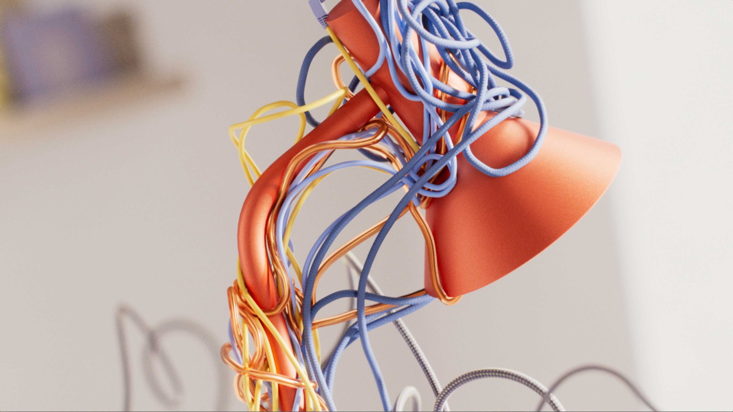
Logitech: Beautiful Mess by ManvsMachine
- Silver Award: Motion
- Read more about this project at mvsm.com
An all-in-one device designed to de-clutter and streamline the modern home office into a one-stop creative hub, Logitech's new Logi Dock responds to the phenomenal surge in popularity for home offices in the wake of the pandemic.
An incredibly satisfying way to spend 30 seconds. Smart and simple, loaded with tidy visuals and flawlessly executed. A truly beautiful mess.
Stephen Middleton – Art&Graft
ManvsMachine's brief was to illustrate how the product improves and accommodates this new way of working. By removing the need for unnecessary cables and devices, the Logi Dock declutters and streamlines the modern home office – clearing your headspace as well as your workspace.
Seeking the perfect balance between chaos and beauty, ManvsMachine worked through a multitude of different styles of 'mess', creating a complex tangle of colourful cords and objects. To glorify the Logi Dock's key features, these dance in a kind of chaotic harmony to show off the product's intuitive capabilities to rein in and organise.
Released towards the end of 2021, the film gained particular gravitas due to the vital importance of the home office throughout the global pandemic, and its enduring role in the future of business.
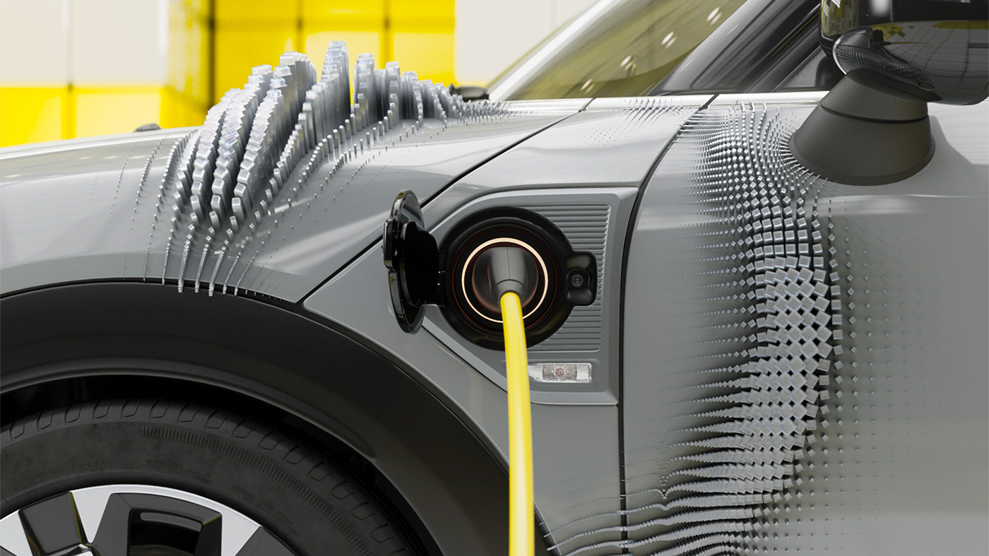
Mini Editions by ManvsMachine
- Silver Award: Motion
- Read more about this project at mvsm.com
Having never ventured into the world of 3D animation, it was a bold move for iconic car brand Mini to embrace a fully-CGI campaign for the launch of its new 2022 'Editions'.
Captures the energy of the brand for younger consumers, with worlds specifically designed to demonstrate each car's individuality. Really fun to watch.
Dorian Thomas – Territory Studio
Despite its premium status, Mini doesn't take itself too seriously: the brand's ethos is fun, playful and adventurous. As such, the films needed just the right amount of 'Mini twinkle' – whilst retaining enough sophistication to do justice to a heritage brand with a global audience.
ManvsMachine celebrates the joy of driving in a series of fast-paced, engaging films, which highlight new product features in electrifying style. Cars race, weave and zoom across bespoke environments as the camera desperately tries to keep up. At key moments, the films cut to a more abstract, conceptual approach – such as paint bubbling and popping, car wheels glooping with gold, and flowers engulfing the vehicle entirely.
With over 26 films and supporting assets in total, this was one of ManvsMachine's largest-ever motion projects. Embracing the brand's inherent playfulness and fun, the films celebrate the joy of driving one of the new Mini Editions.
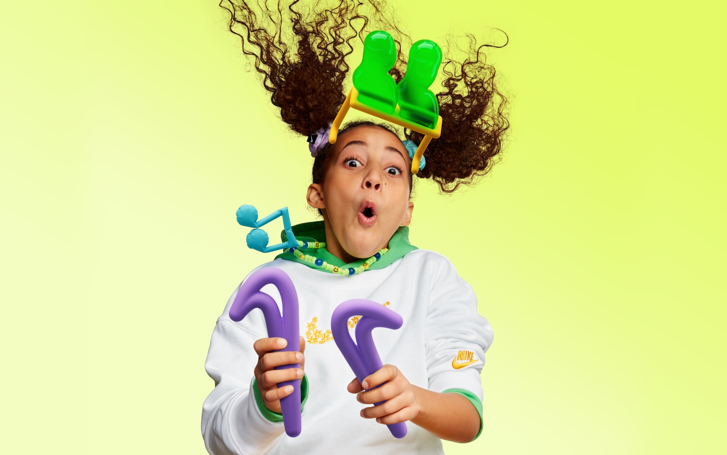
Nike Air Max Kids by ManvsMachine
- Silver Award: Sports & Leisure
- Read more about this project at mvsm.com
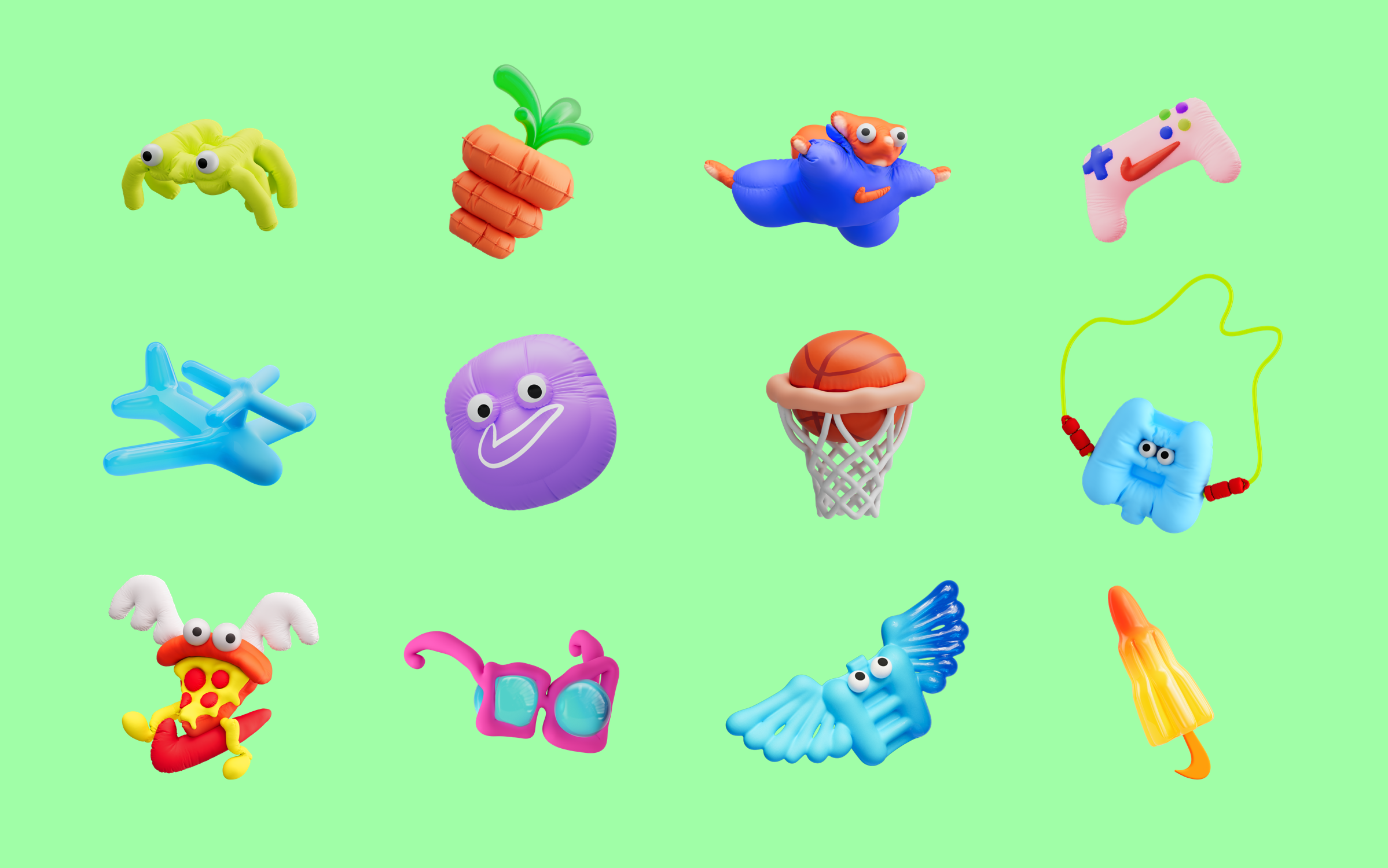
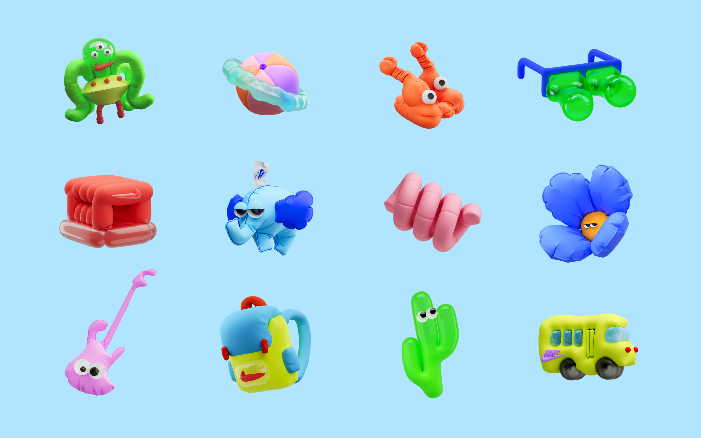
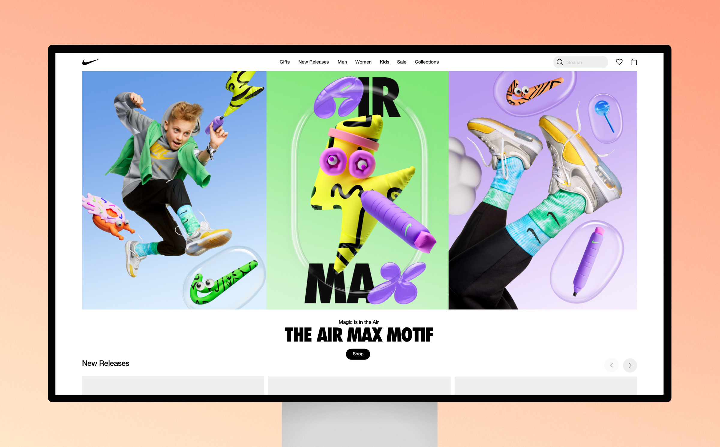
Nike approached ManvsMachine to bring 'Kid-vision' to the world of Air Max. This includes introducing their first kids-only air innovation product – The Air Max Motif – with a fun and engaging campaign and brand system, designed to appeal to a younger audience.
Working closely with Nike, ManvsMachine developed a full brand system for Kids Air Max, with a whole array of Air Max-inspired assets including a 3D-bubble typeface and an expansive library of 3D graphic assets. Celebrating the innovation of Air Max, the design system sparks kids' imaginations, illustrating a lighter approach to life when wearing Air Max shoes – one that's full of freedom, fun and a healthy dose of surrealism.
Balances Nike's iconic brand with a new sense of punchy playfulness. Illustrative characters add warmth and personality, while bespoke blow-up letterforms keep the typography refreshing and engaging.
Jump Jirakaweekul – COLLINS
At the heart of Air Max Kids is a focus on championing everyday play by highlighting innovation in an inspiring and imaginative way. Released on Air Max Day 2022, the campaign encompassed digital and in-store across the Nike ecosystem, including out-of-home applications in London, Paris and Barcelona.
Piedmont Art Walk by Mucho
- Silver Award: Not-for-Profit
- Read more about this project at wearemucho.com
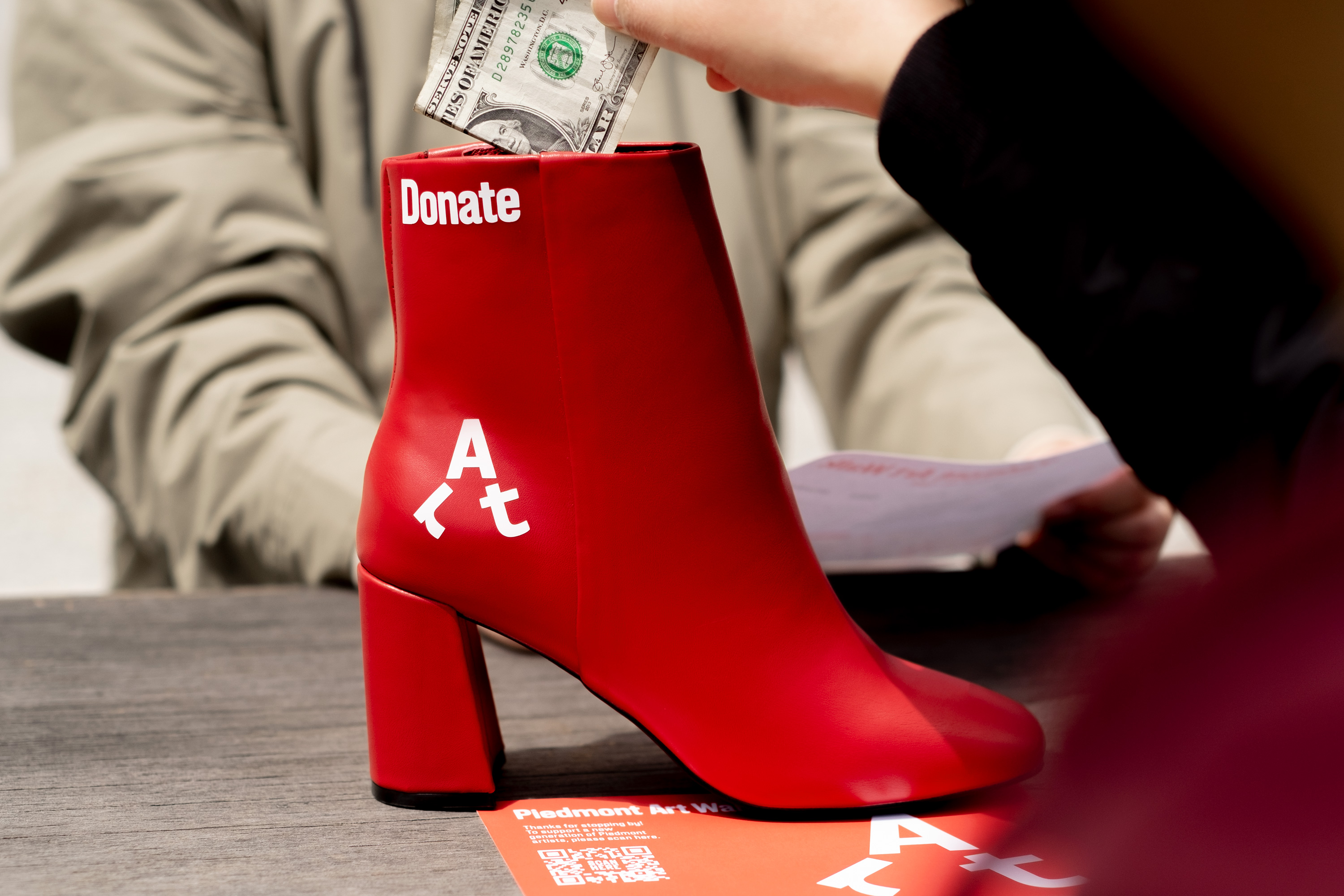
Annual fundraising event Piedmont Art Walk celebrates the rich diversity of acclaimed and emerging artists in Piedmont, California. Sidewalks, gardens, and front lawns across the city are transformed into walkable outdoor art exhibits, where over 45 local artists display their artwork in front of their homes.
Families and art-lovers from across the Bay Area walk from house to house across Piedmont to visit the exhibits. Art is available for purchase, with 20 per cent of proceeds going towards public school arts programs.
Fun, charming and memorable, Piedmont Art Walk's confident type-led approach manages to engage the wider community with playful and expressive timelessness.
Astrid Stavro
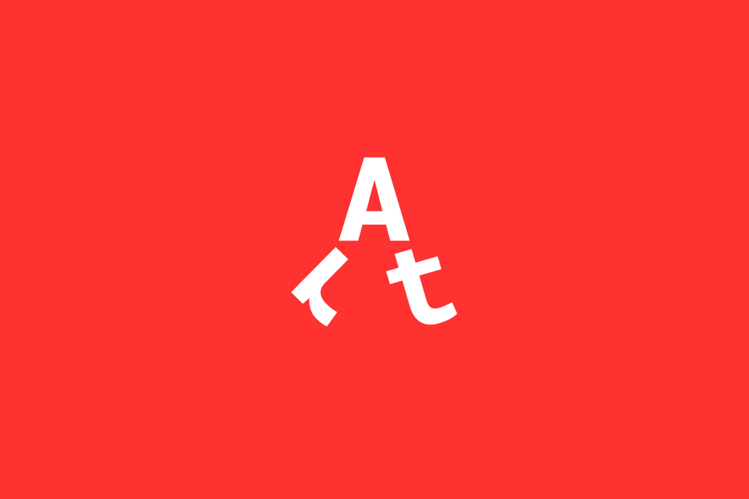
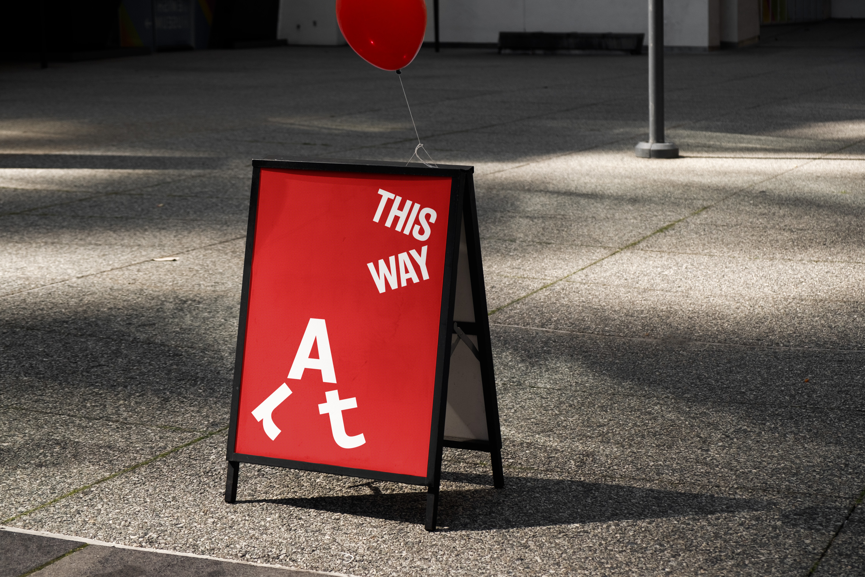
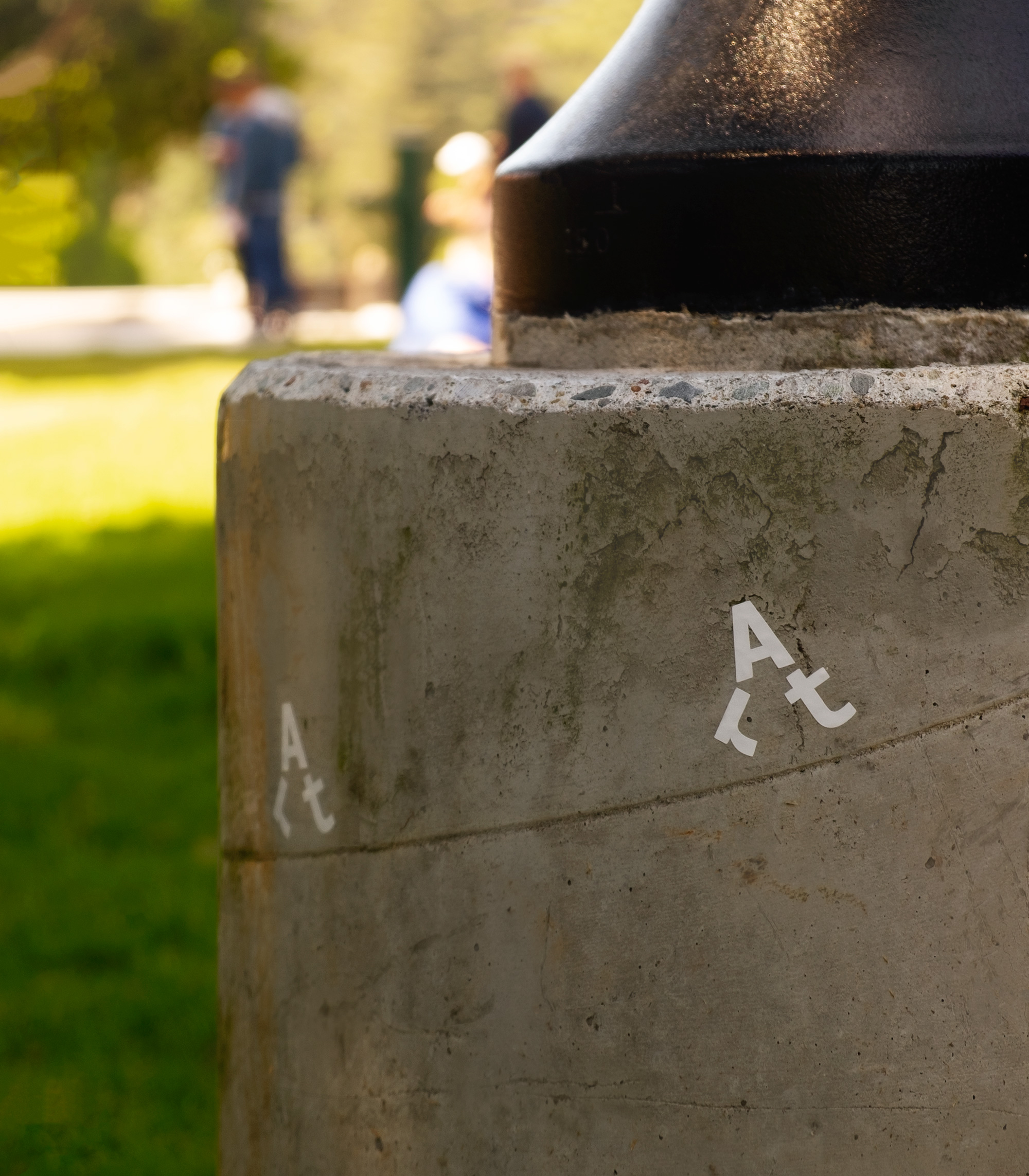
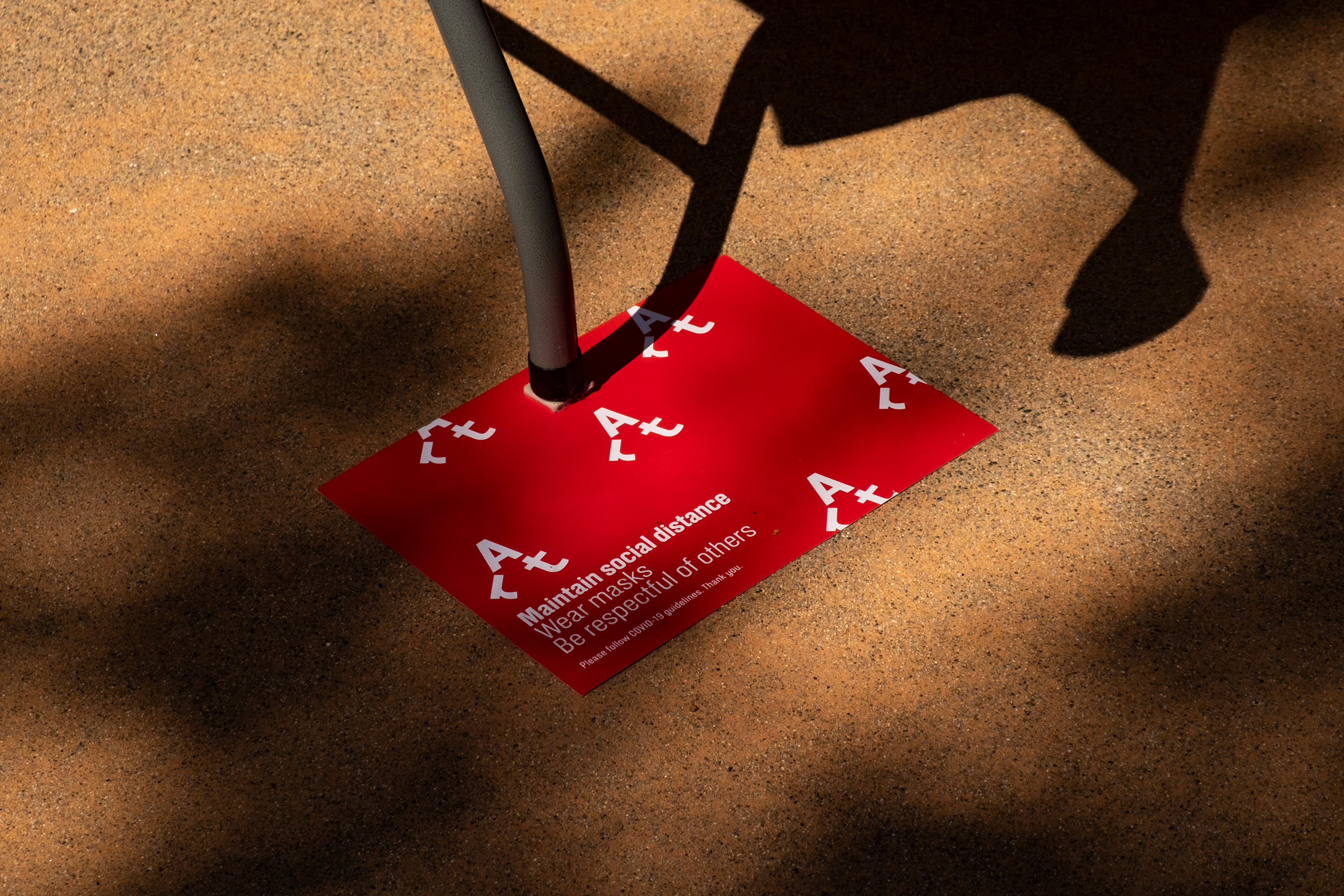
Art often has a certain stigma, and can feel inaccessible for many. Mucho's playful, unpretentious identity reflects the community-oriented nature of the event. The symbol transforms the word 'Art' into a walking character, which manifests in fun ways and – combined with a reductive red-and-white colour palette – serves as distinctive visual shorthand for the event across all collateral and exhibit locations.
As the event was socially distanced and involved walking around town to create a Covid-safe event, Mucho also created some playful animations of 'Art' walking. The identity also features pathway-inspired typography and playful copy lines such as 'Artwork from home', 'An exercise in local art', and 'Get inspired and perspired'.
Additional elements, such as tote bags, t-shirts, and a 'stamp card challenge' for the youngest generation of artists, engage audiences of all ages – and contribute to the Art Walk's mission to bring art to people from all walks of life.
Preparation H by Elmwood
- Silver Award: Pharmaceuticals & Toiletries
- Read more about this project at elmwood.com
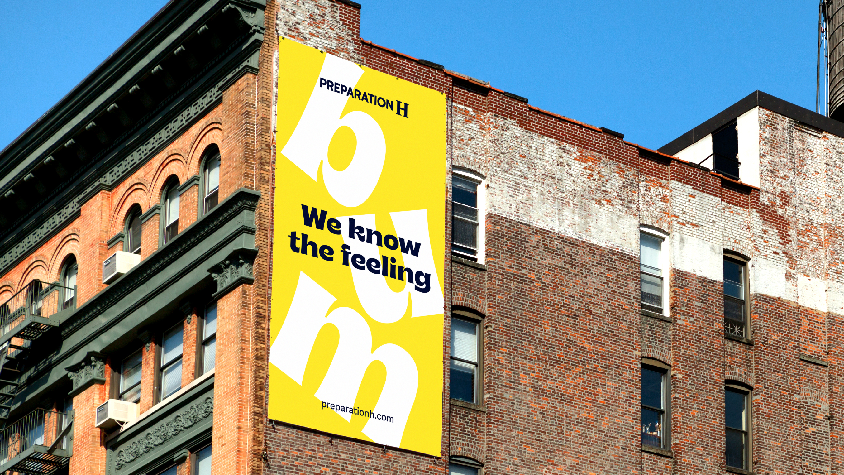
America's number-one brand for haemorrhoid treatment, Preparation H has been trading since the 1920s. But in recent years, competition from new challengers and DTC brands has threatened its market-leading position.
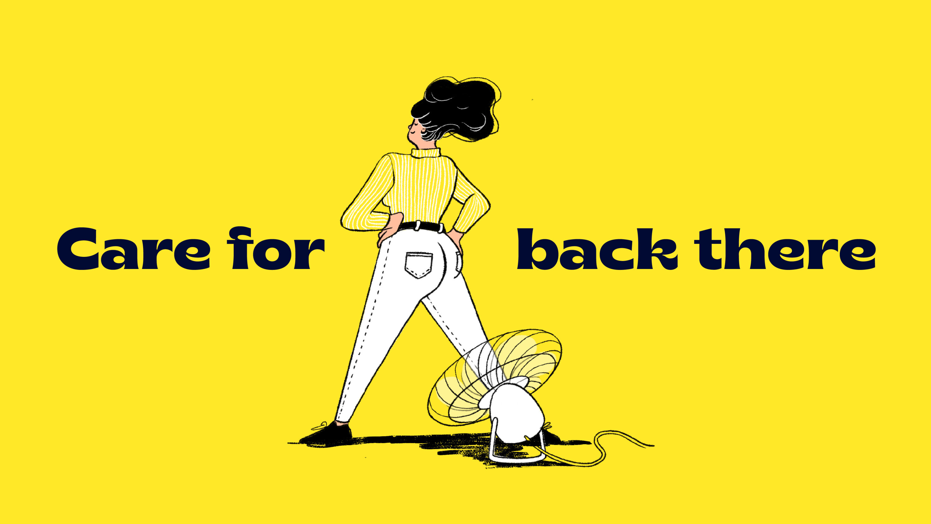
Elmwood developed a new brand expression for Preparation H, leveraging humour to help future-proof it against fast-growing rivals. Driving the work was the key insight that although most of us will experience haemorrhoids at some point in our lives, there's still shame and stigma attached and people rarely discuss it openly.
I love breaking taboos. Preparation H tackles a sensitive physical and emotional subject with humility, humour, and de-stigmatising design. And if you can't appreciate good bum puns, you're dead on the inside.
Spencer Buck – Taxi Studio
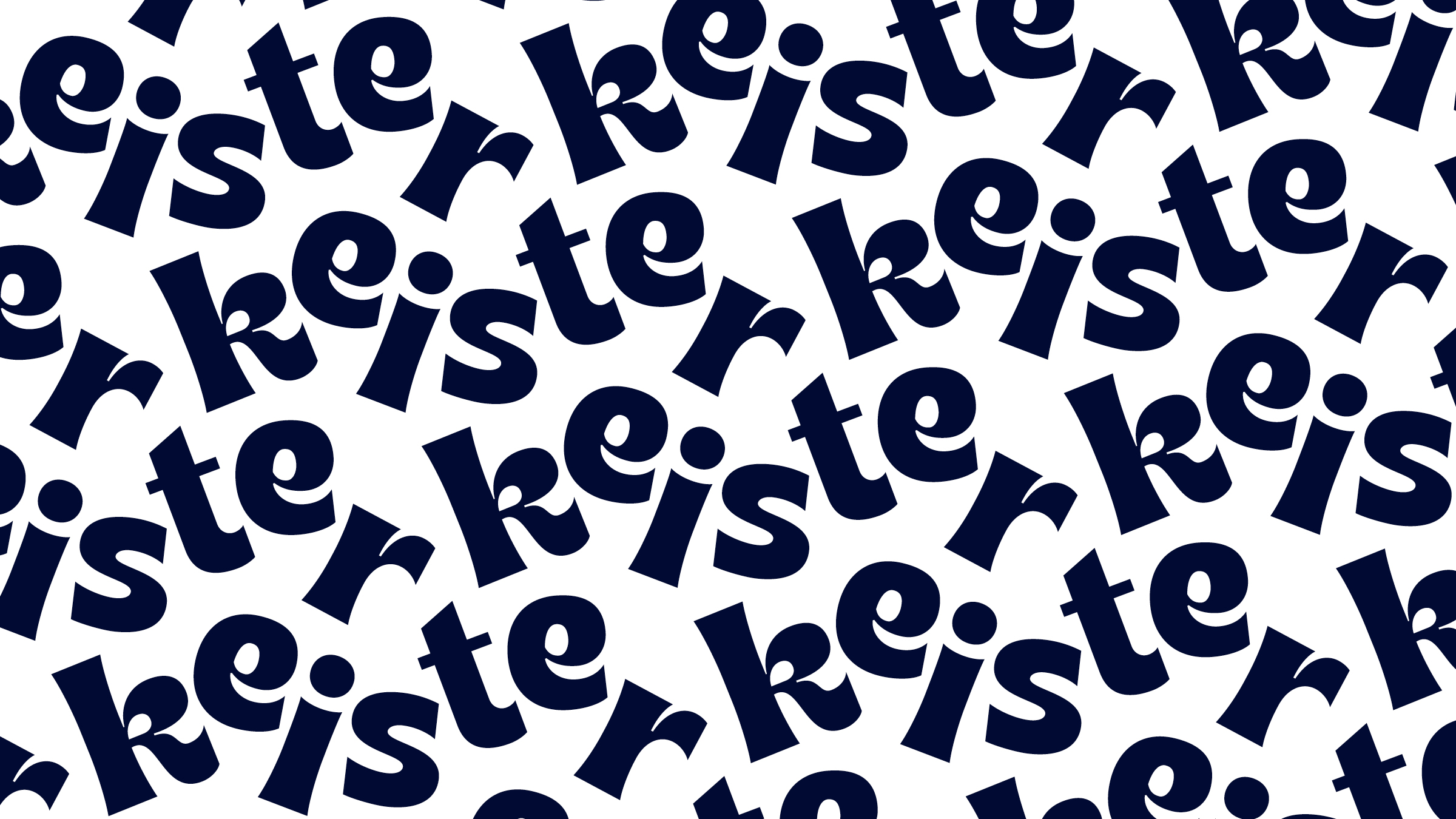
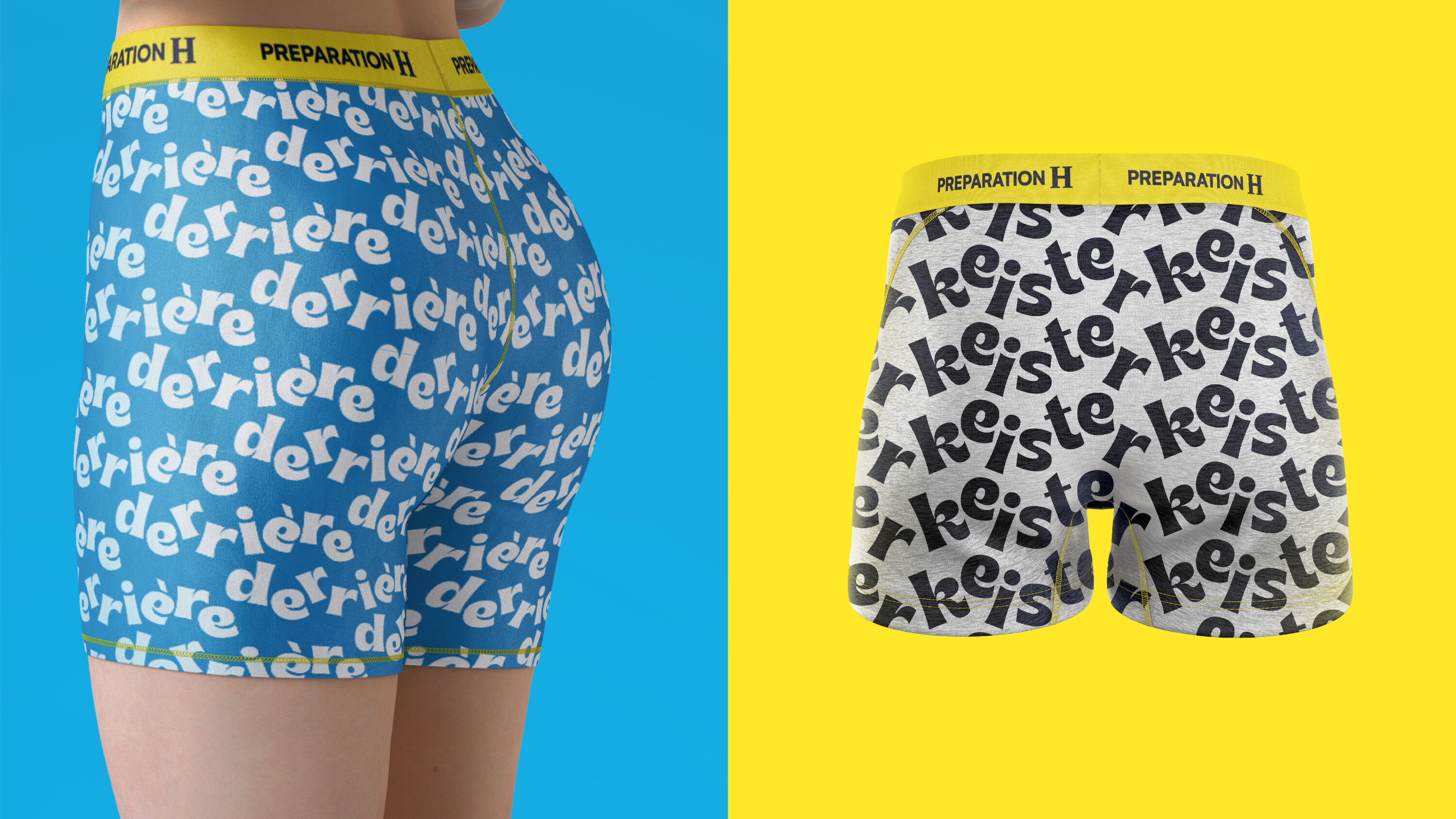
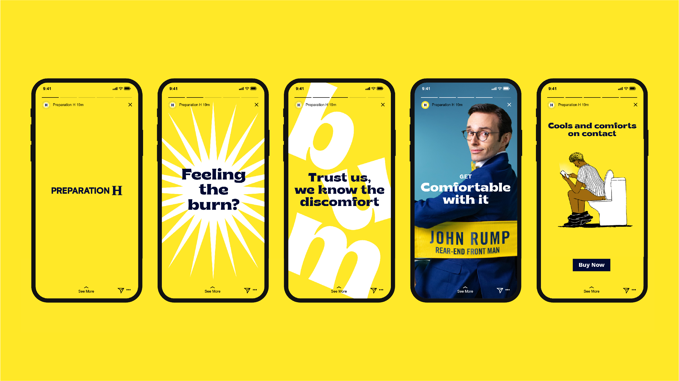
Built around a series of funny and highly shareable illustrations and animations, Preparation H's relatable new brand identity tackles the taboo head-on. Steering clear of cold medical language, playful colloquialisms like 'keister', 'rump' and 'derriere' bring the brand to life – as do witty captions such as: 'Your butt is behind you no matter what.'
A quirky retro typeface helps express Preparation H's newfound playful confidence, and the new brand expression was launched in February 2022 with a timely microsite through which customers could personalise Valentine's cards for loved ones.
Squirrels by Supple Studio
- Silver Award: Not-for-Profit
- Read more about this project at supplestudio.com
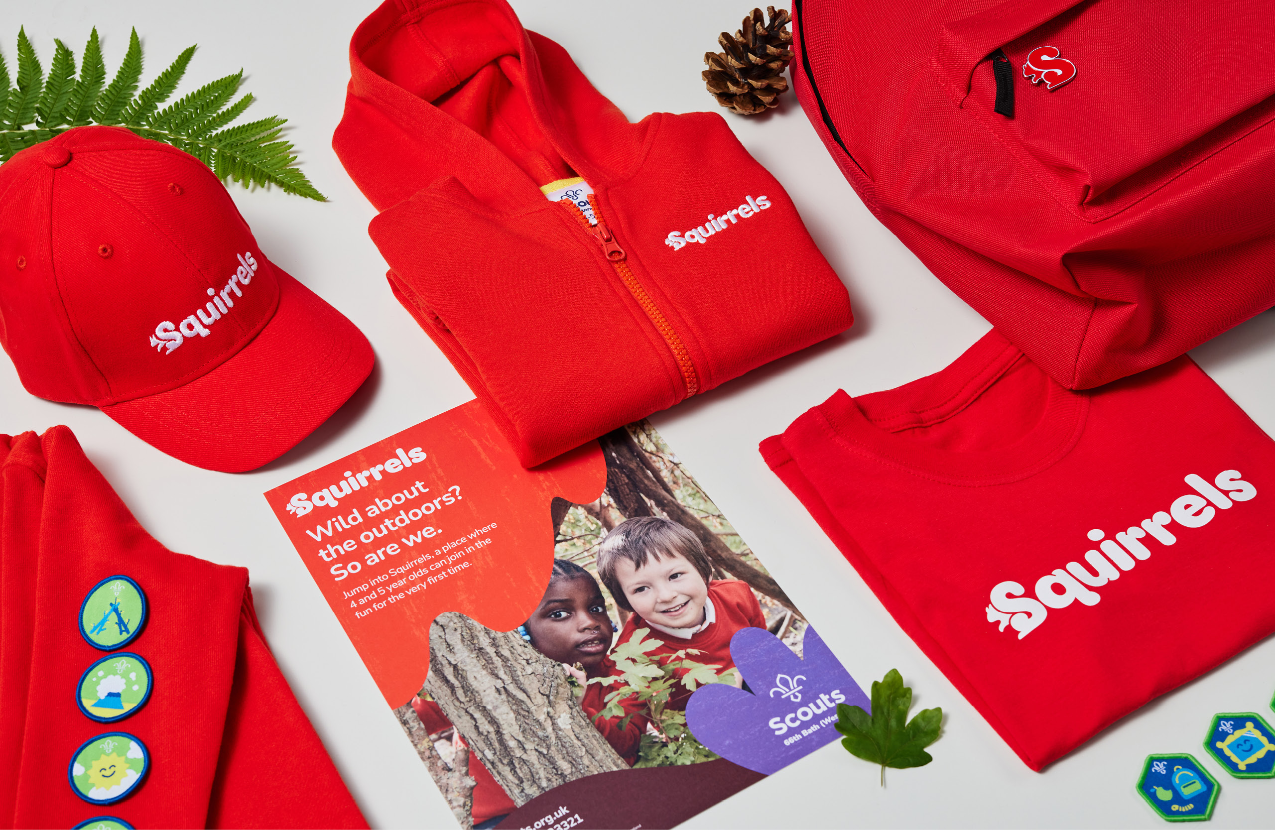
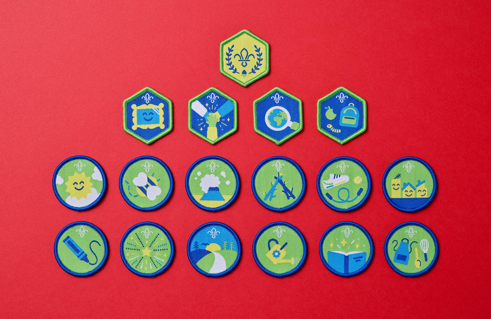
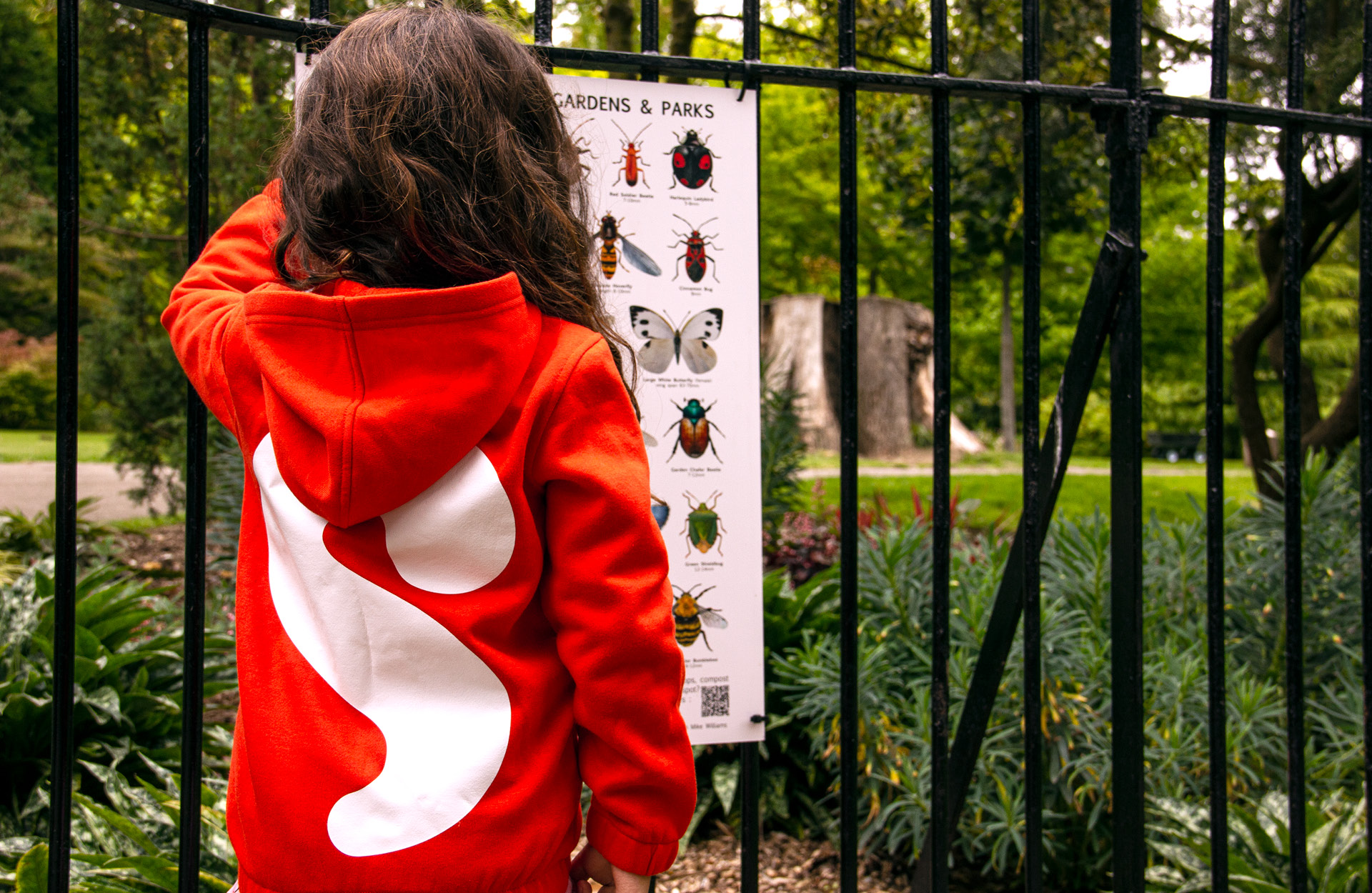
The first new branch of the Scouts' family tree for 35 years, Squirrels is the organisation's new early years offer for 4–5-year-olds – a new chapter at the very beginning of a child's journey through Scouts, encouraging young kids to be active, explore nature and have fun whilst earning badges.
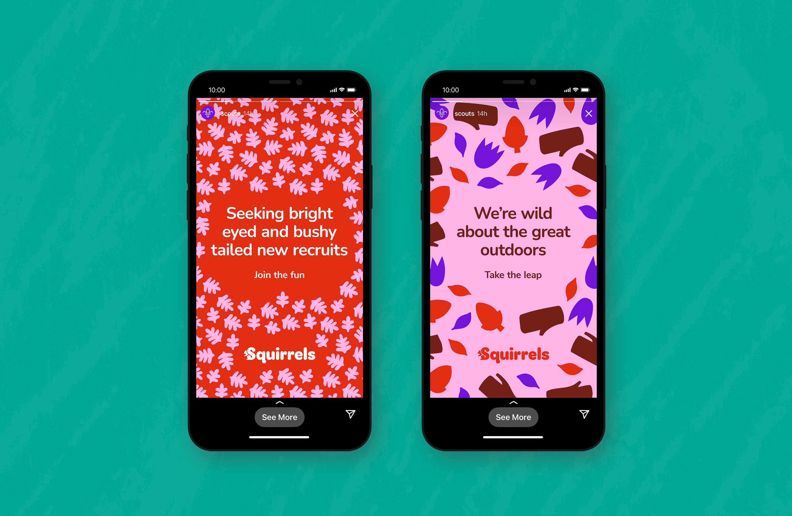
Supple Studio created an inclusive tone of voice and visual language for Squirrels, which complements the Scouts master brand wherever it appears – online or outdoors.
It's hard to get good work through with this kind of project: people bring all kinds of preconceptions about 'designing for children'. This scheme has classic, timeless simplicity. It could last for years – and probably will.
Michael Johnson – Johnson Banks
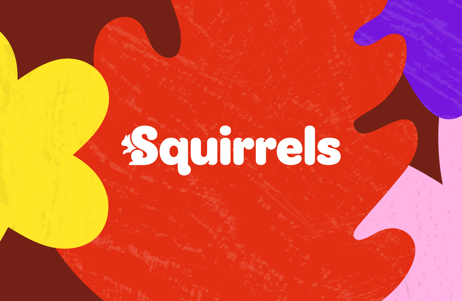
Home to the birth of the Scouts movement 112 years ago, Brownsea Island also plays host to a brood of ultra-rare red squirrels. Inspired by the island's flora and fauna, Supple created a squirrelly logotype, cut paper illustrations and tree rubbing textures that feel age appropriate.
Photography was commissioned and art directed with a child's eye view, and the Squirrels tone of voice was given a sense of curiosity and wonder that comes hand in muddy hand with being a pre-schooler.
Story Espresso Chapter 2 by For The People
- Silver Award: Copywriting
- Read more about this project at forthepeople.agency
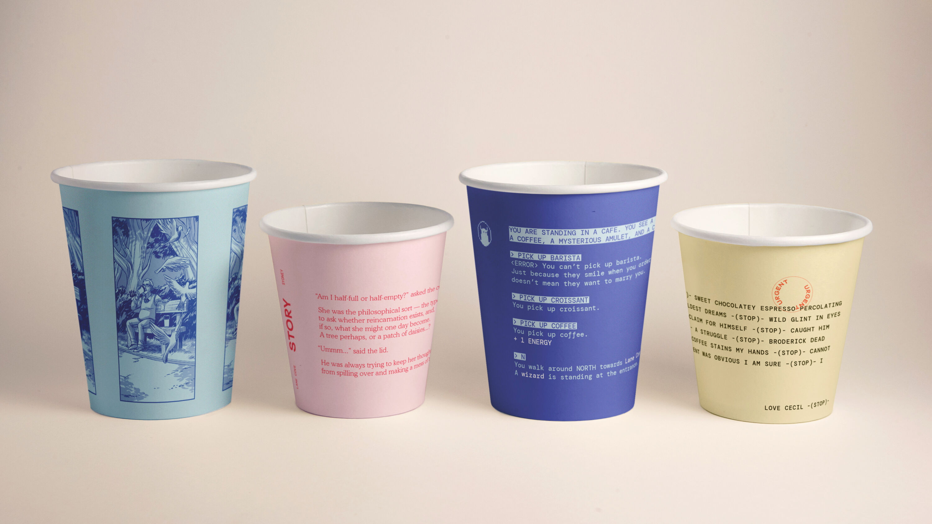
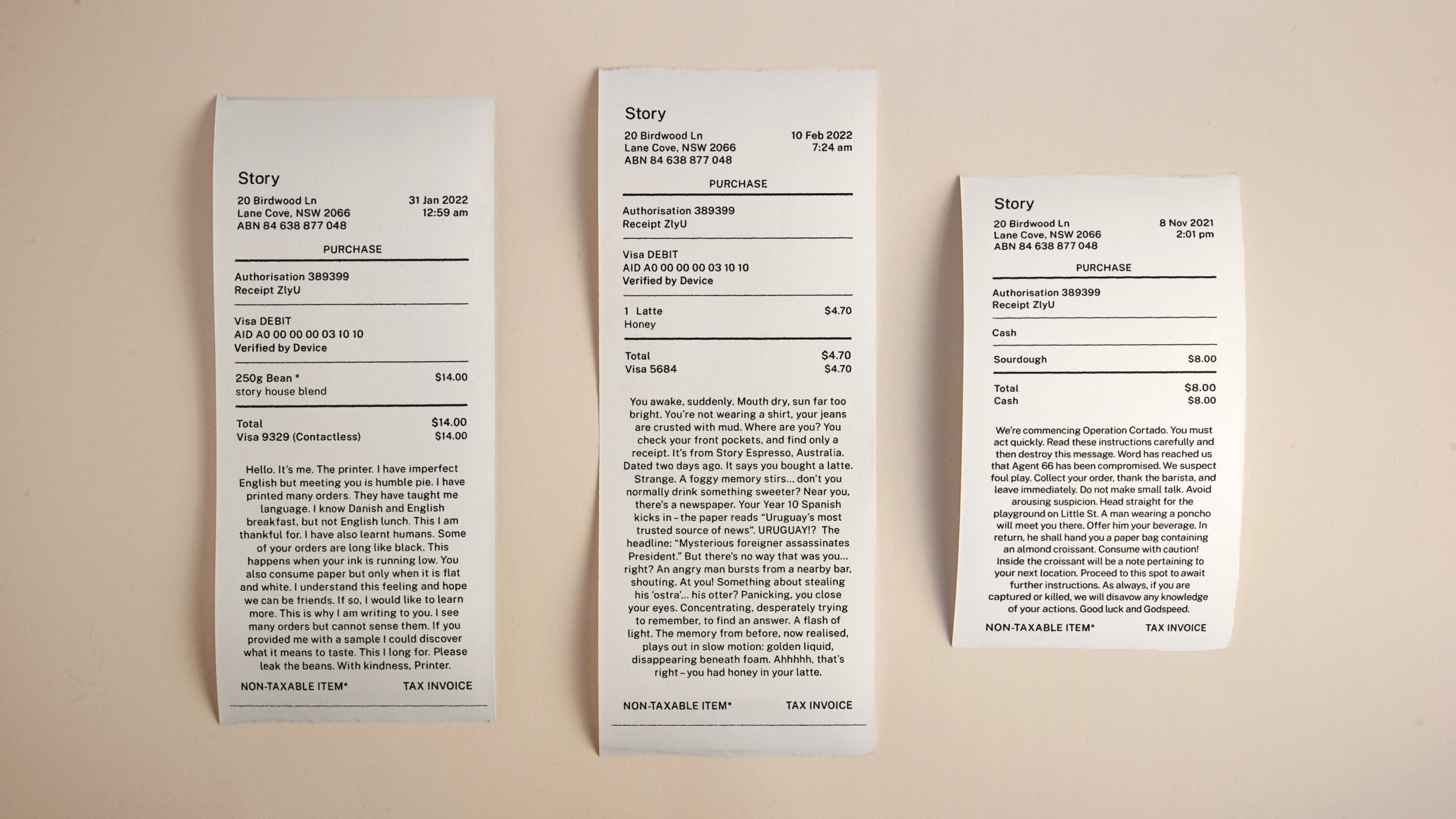
Launched in 2021, Story Espresso is a specialist coffee shop based in Lane Cove, Sydney, that has quickly established a reputation for its high-quality coffee and customer service. Winner of two Gold Awards at last year's Brand Impact Awards, and shortlisted for Best of Show, For The People's compelling identity scheme captures the storytelling theme with enticing, witty and playful copywriting across every touchpoint.
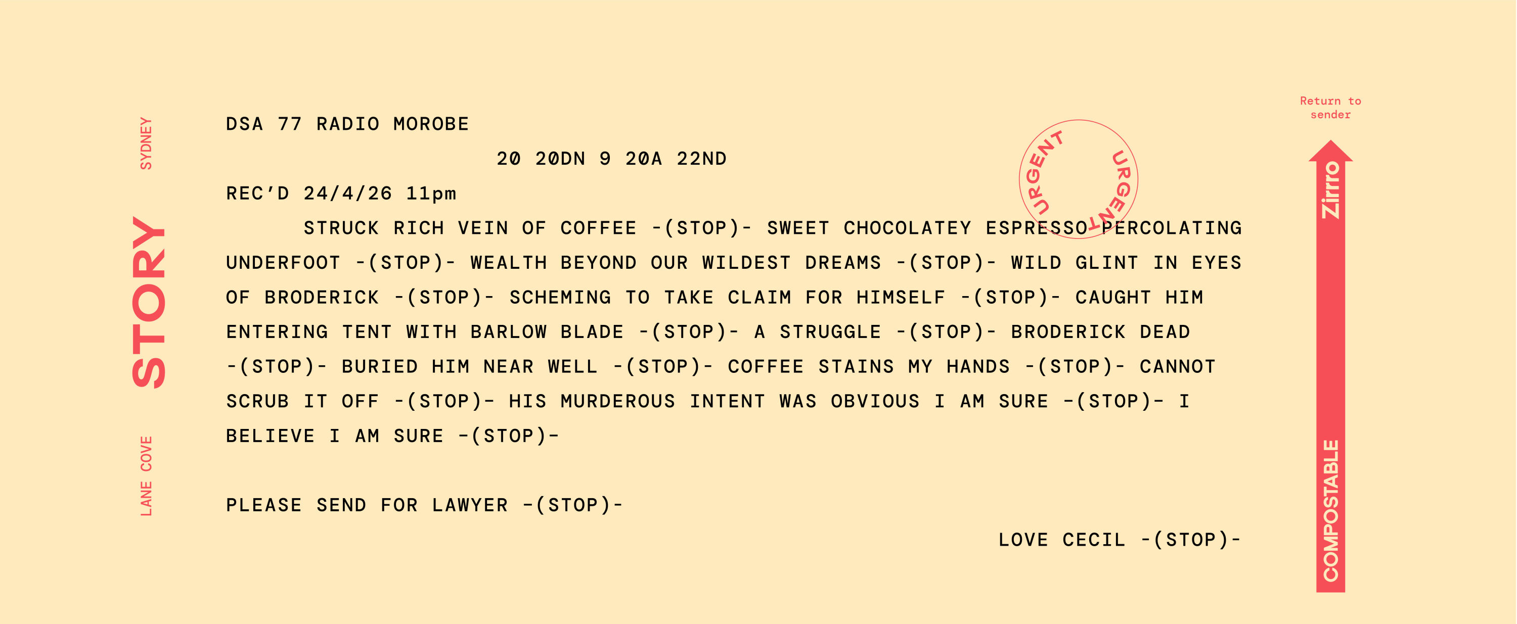
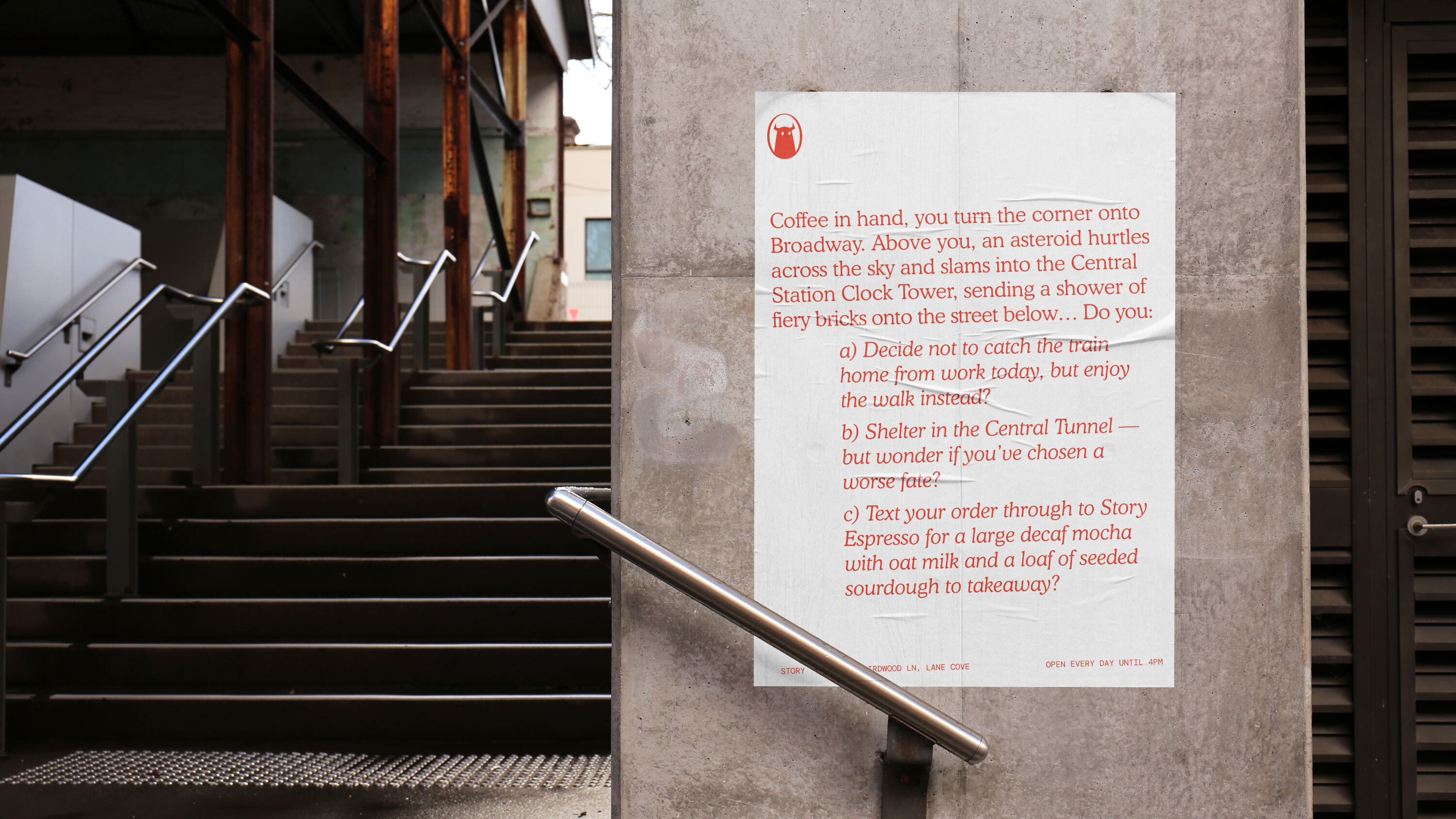
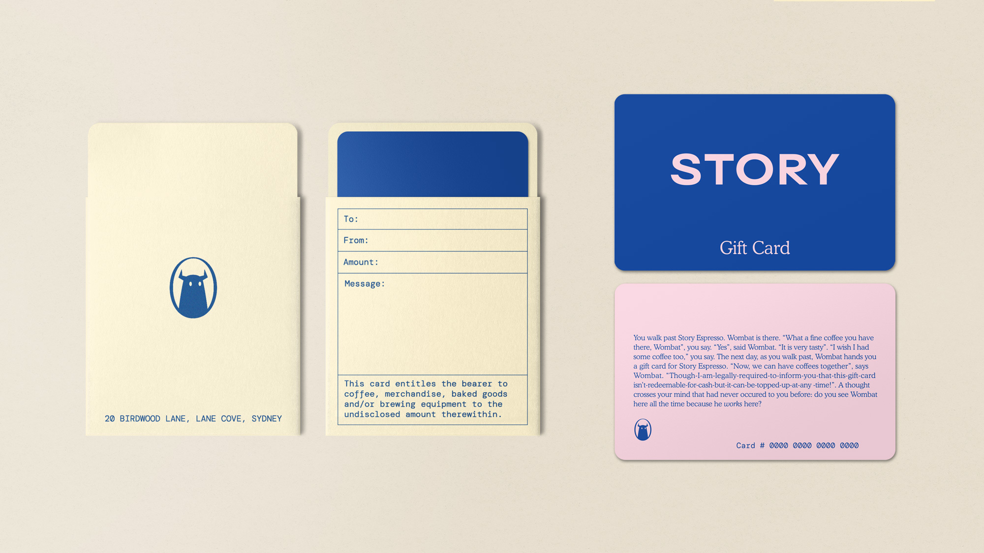
Now, Story is testing the versatility of the scheme with a fresh instalment: 'Chapter 2'. Building on the established concept of the cafe as a convergence point for stories to begin, pivot and end, this latest iteration continues to embrace every blank space as a storytelling canvas to engage and entertain customers: coffee cups, loyalty cards, till receipts, and more.
Chapter 2 had to overcome the issues that face all tricky follow-ups to the critically-acclaimed, chart-topping debut. FTP didn't half stick the landing, though. Rather than rinse-and-repeat, they evolved to not just tell customers a story – but bring them into the heart of one.
Chris Sharpe – JKR
Coffee cups were expanded, new receipts were sought, and a new range of outdoor posters expanded the cafe's presence throughout Sydney. The goal was simple: keep the stories fresh and ever-changing, entice new customers into the cafe, and spread the Story story far and wide.
With customers always at the centre of the story, each application adhered to a particular theme or story structure: cups were blank canvases for adventures, receipts told stories set around the nature of receipts, and posters placed the reader at the centre of their own disaster stories.
Our judging panel praised the consistently impeccable craft, but agreed that, as an evolution of a previously Gold-winning concept rather than totally fresh idea, a Silver Award was the highest it could achieve here.
Straits by Magpie Studio
- Silver Award: Illustration
- Read more about this project at magpie-studio.com
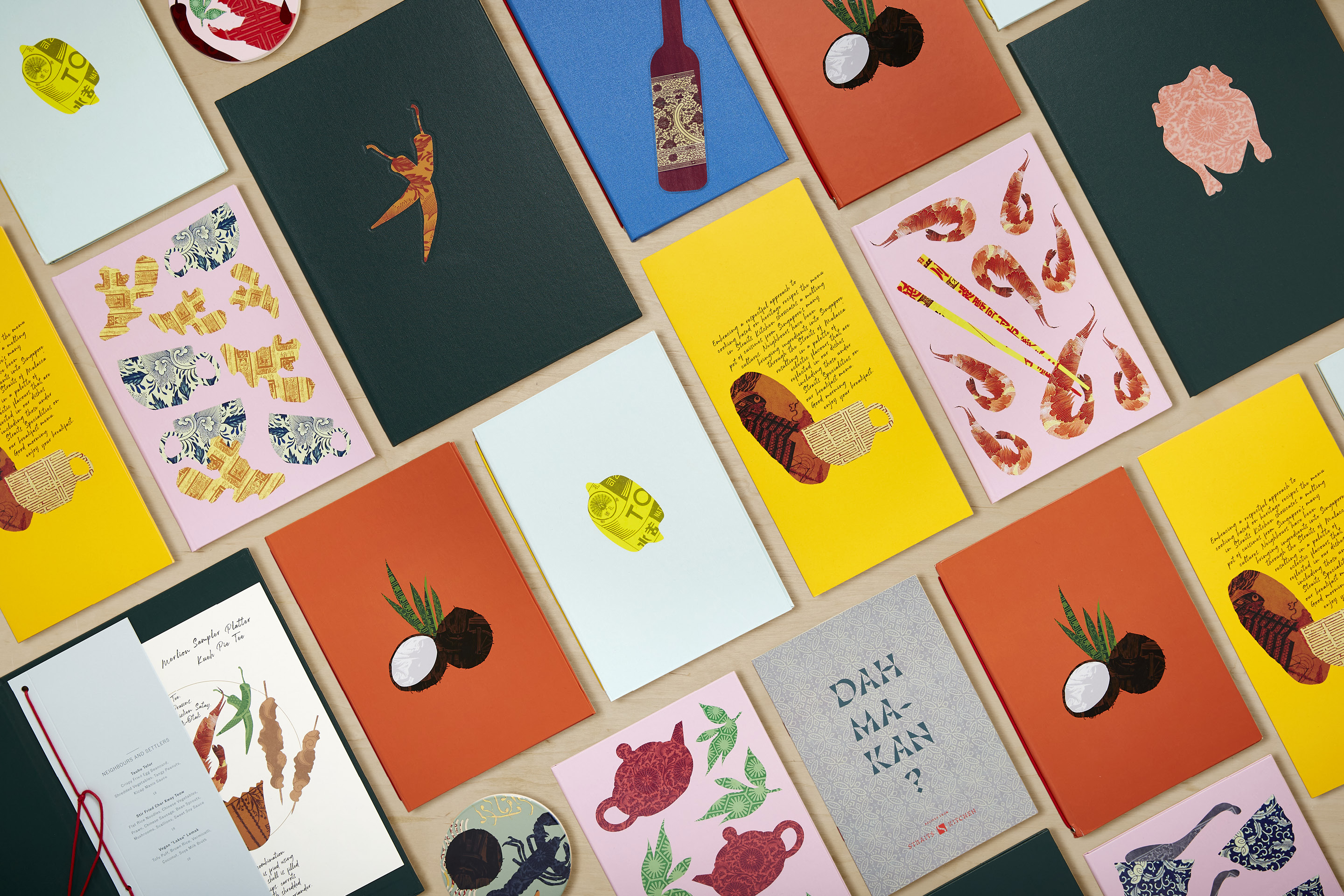
Chef Tony Khoo's vision for London-based restaurant Straits was to celebrate the rich melting pot of cultures and cuisines in Singapore, inspired by recipes, stories and experiences that have been passed down over generations.
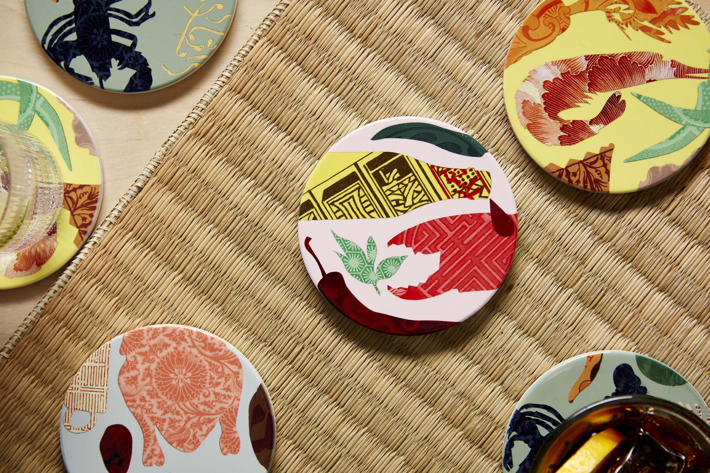
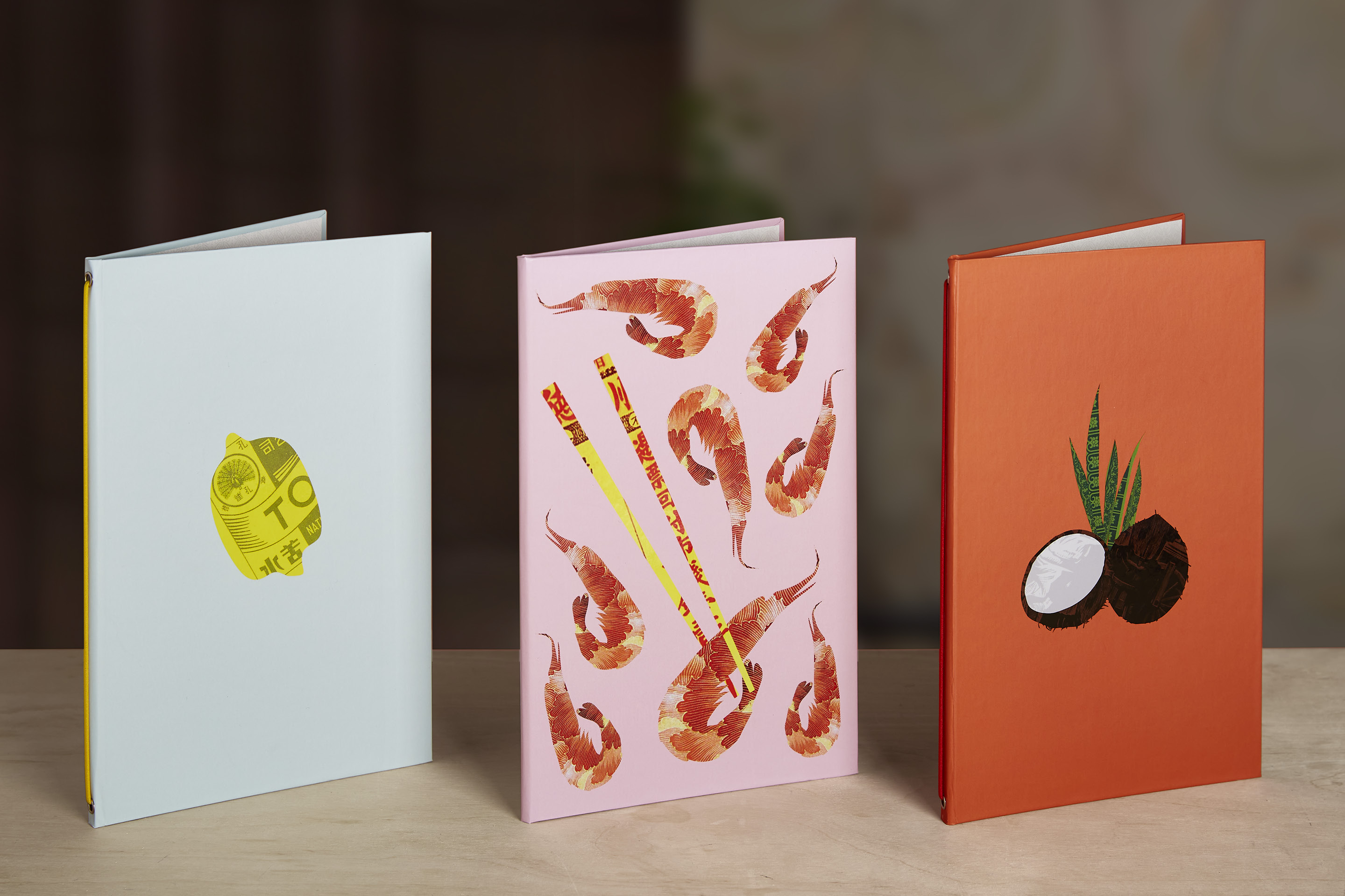
Straits' identity needed to feel warm and vibrant, visually reflecting the eclectic nature of the region and communicating the history and storytelling behind the dishes in an engaging way. Magpie's solution was to showcase the rich array of ingredients through eclectic food collages.
Rather elegant, reminiscent of Alan Fletcher: definitely something to pick up and keep. In just a few cutout shapes you get a real flavour of Singaporean culture and cuisine.
Sinem Erkas – illustrator
Archival patterns from the region to bring texture and colour to hand-cut silhouettes of different foods, reminiscent of the recipe scrapbooks passed down to Chef Khoo by his grandmother. Set in a 'modern Asian' calligraphic style, the accompanying typography harmonising with the angular illustrations.
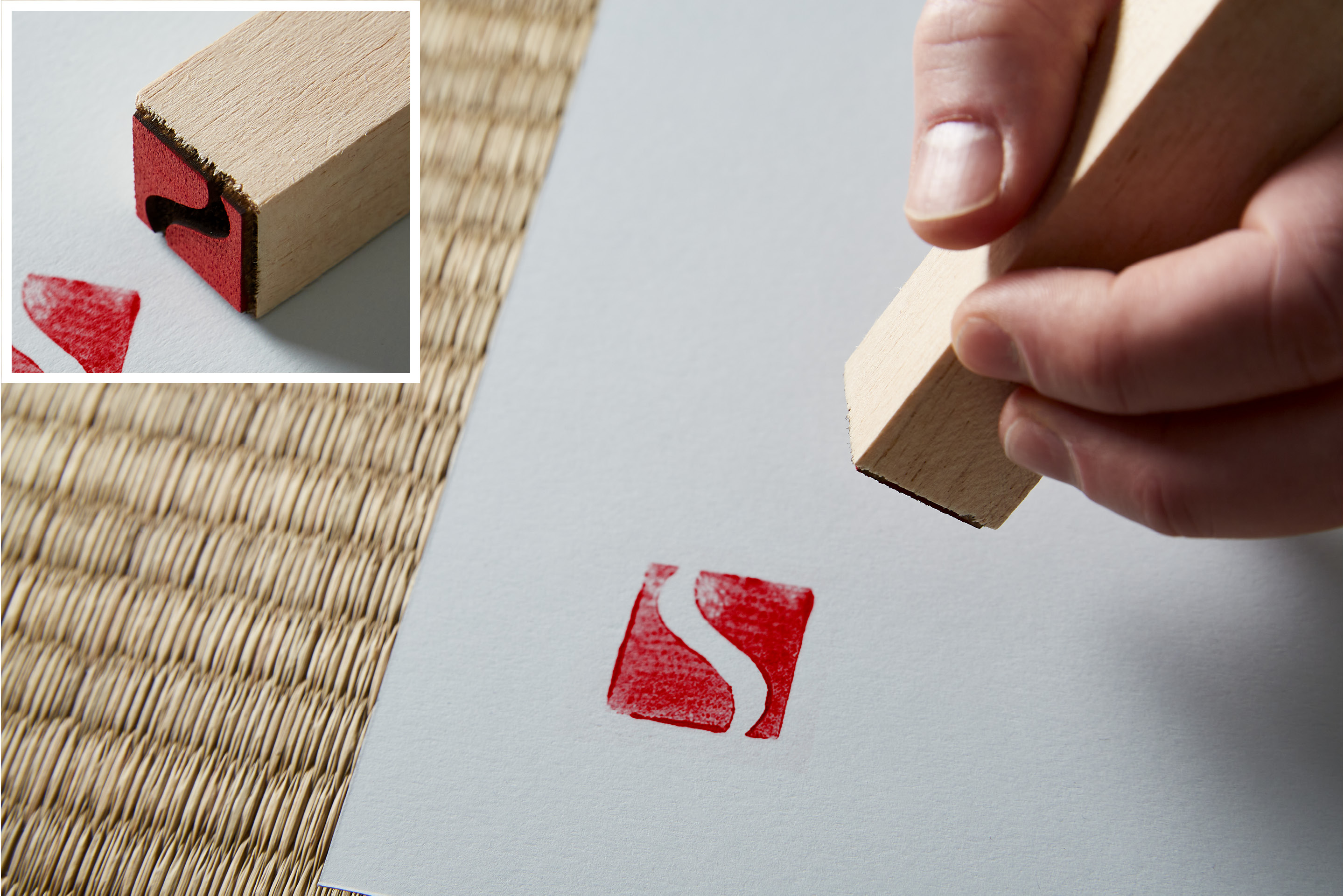
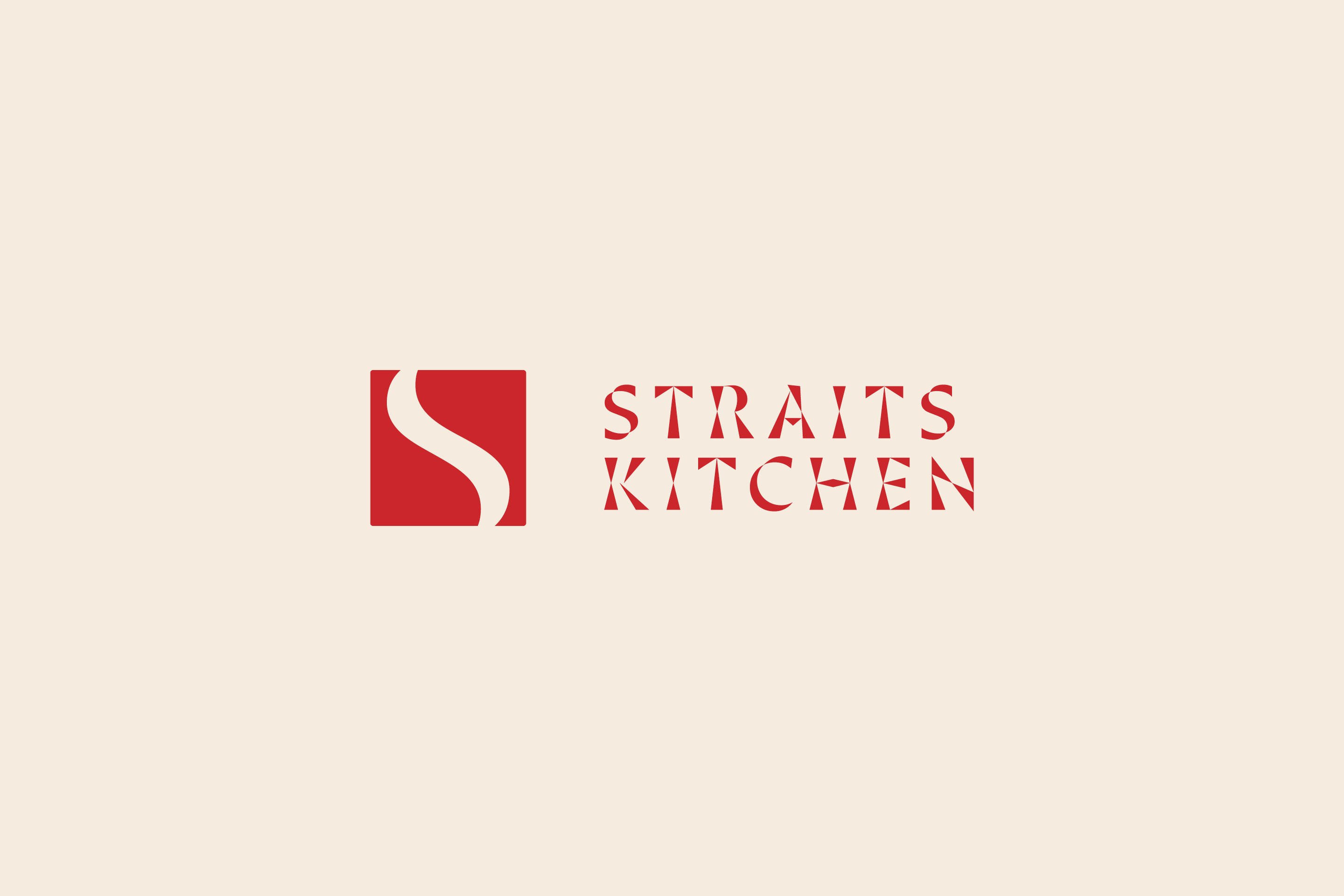
With an 'S' curve that mimics the body of water from which the restaurant takes its name, the Straits logo mark is delivered via a bespoke 'chop' – used as a seal of quality or authenticity in Asian culture. And a warm, friendly tone of voice carries the authentic message that these recipes have been built upon and shared from person to person before being refined for fine dining.
Supported by archival imagery, this narrative is carefully layered throughout, giving diners a window into the conviviality of Singapore's multitude of cultures. The resulting identity feels exciting and appropriate, with scope to surprise and delight diners throughout the experience.
Wallbaby by Reed Words
- Silver Award: Copywriting
- Read more about this project at reedwords.com
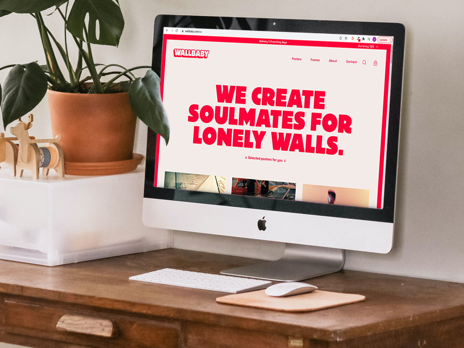
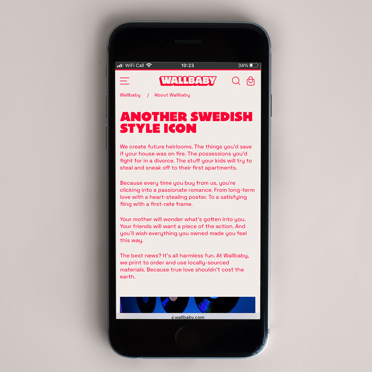
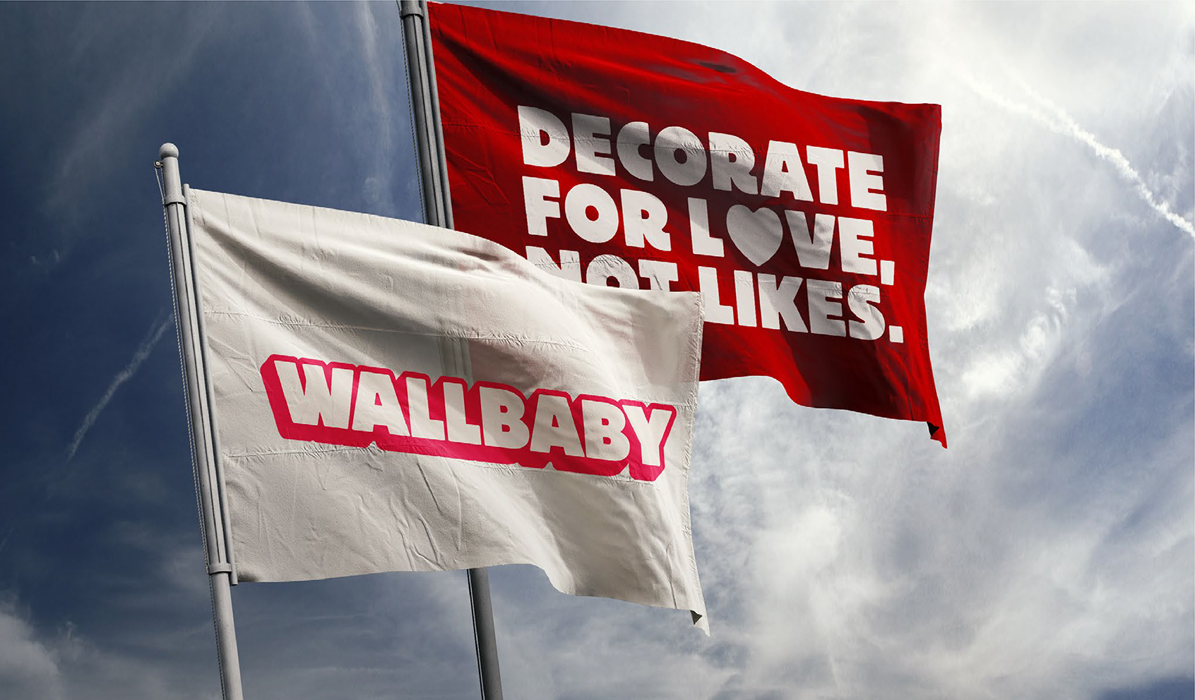
Swedish online poster store Wallbaby throws practicality and rationality out the window. These aren't just nice posters: they're objects of desire. Soulmates for lonely walls. The pieces you’d fight for in a divorce.
Collaborating with Swedish agency Snask, Reed Words helped create the Wallbaby brand from scratch. Pitched at modern, open-minded and curious women aged 25-45, it had to stand out in a sea of safe, simple voices. The strategy: position Wallbaby as a lifestyle brand that emphasises emotions, not product values.
In a category of safe and simple competitors selling 'nice posters', Wallbaby deserves plaudits for its fresh, bold take on objects of desire.
David Ormondroyd – Ragged Edge
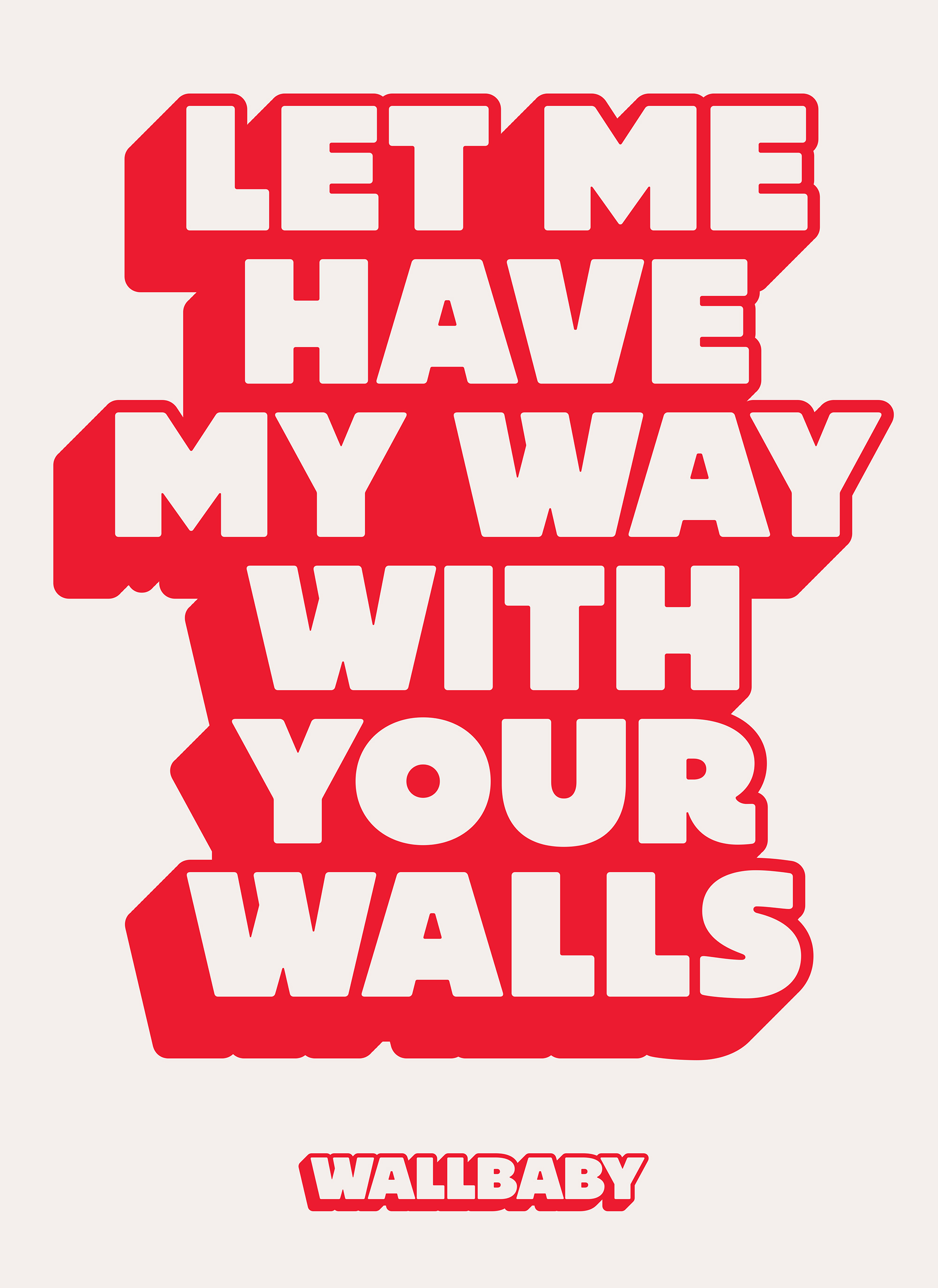
With a brand purpose to win hearts to overrule heads, Wallbaby's core essence is arrestingly simple: 'Fuck function'. Reed Words developed the name to hint at what the company offers, but in a modern, playful way that eschews the commercial attitude of its competitors.
A wholly made-up word, Wallbaby evokes similar connotations to 'lovechild'. Including 'wall' grounds it in the prints and posters space without the need to spell it out, the abstract edge making the name infinitely more ownable and distinctive.
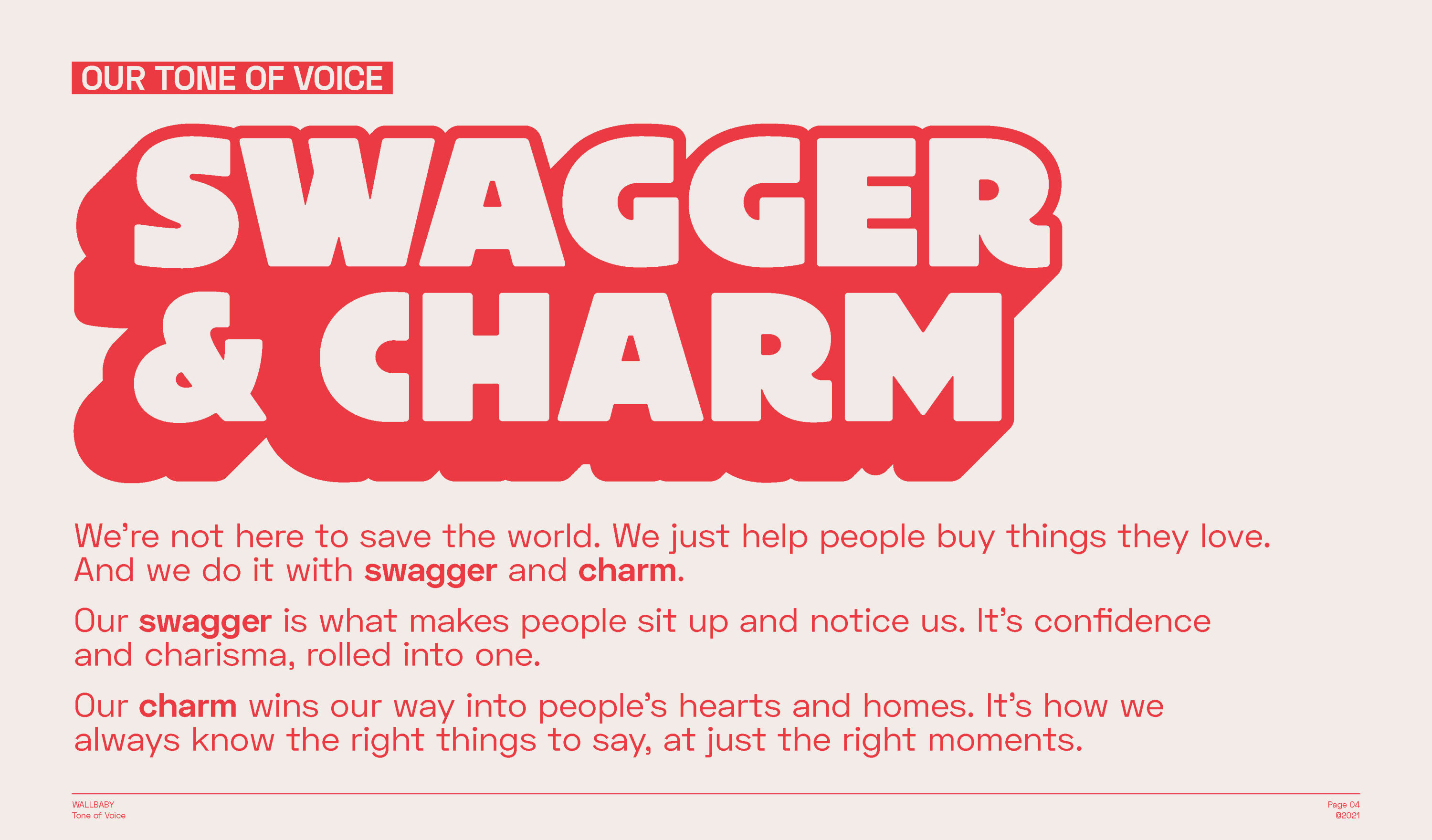
Defined by two key characteristics – charm and swagger – Wallbaby's brand voice comes in the form of a toolkit for in-house writers to pick up and run with. Reed Words also created a suite of key messages for Wallbaby to use across everything from web to social to packaging.
Striking a seductive balance of charisma and confidence, designed to steal any heart, Wallbaby delights in flirtatious turns of phrase and heart-stealing headlines, making the more functional, neutral voices in the market seem like wallpaper.
Bronze Award winners
Brand Impact Awards 2022: Bronze Awards
The following 20 projects all received at least one Bronze trophy at the Brand Impact Awards 2022.
NEXT Insurance by COLLINS
- Bronze Award: Financial Services
- Bronze Award: Illustration
- Read more about this project at wearecollins.com
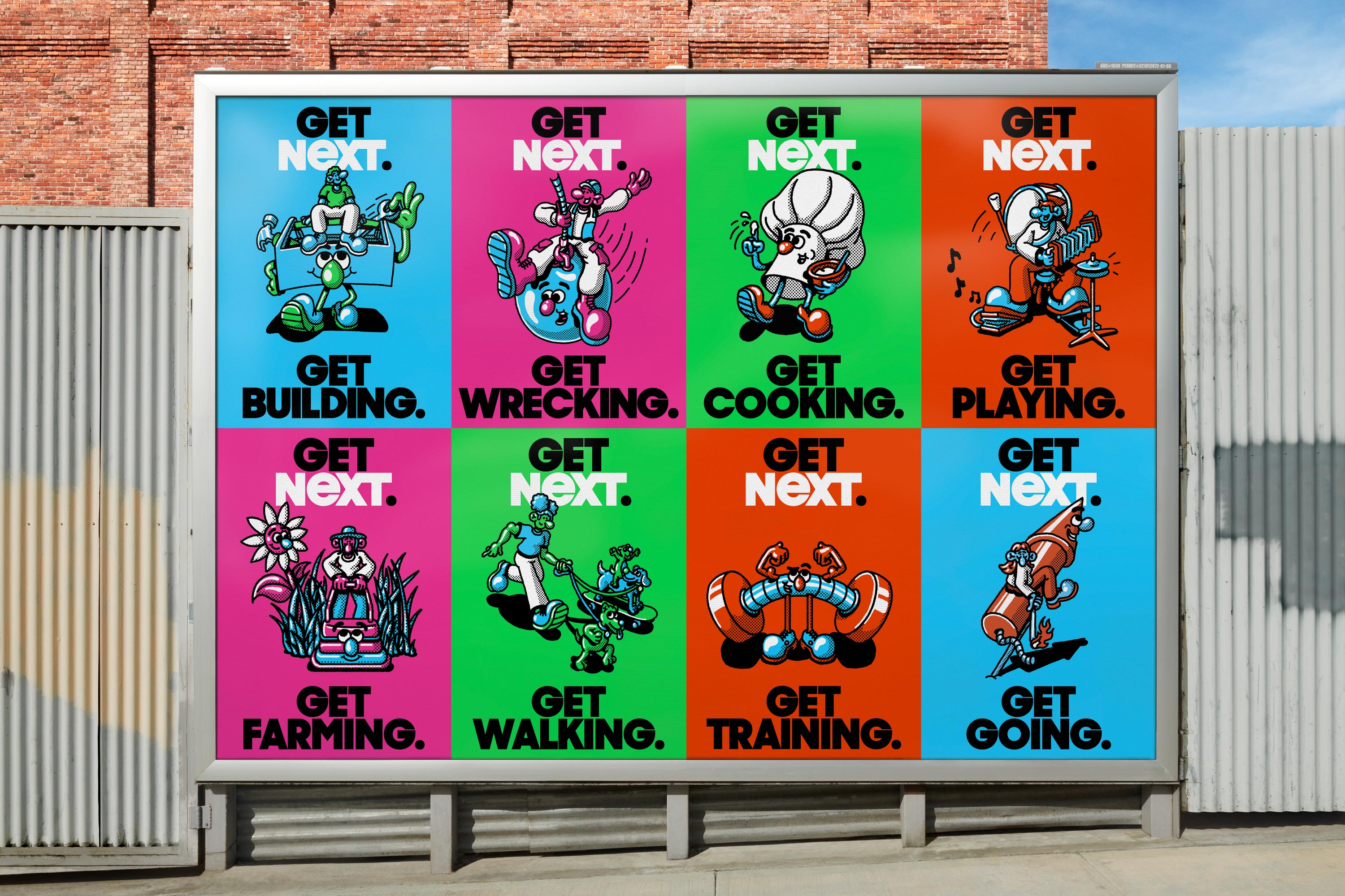
Insurance companies constantly remind us that risk is to be feared, but NEXT Insurance realised that the red-tape and high-fees of traditional business insurance were as much a negative risk to small businesses as any mishap.
With the line 'Get Going' as a rallying cry, COLLINS crafted a new narrative: insurance and risk bring opportunities to build better businesses, and embolden owners to take smart leaps. The identity embraces playful, hand-drawn styles of Depression-era cartoons and mid-century underground comics. By capturing the sincerity, positivity, and gritty can-do ethos of those eras, the brand visualises the possibilities that small business owners see around every corner.
UEFA Euro 2024 by VMLY&R
- Bronze Award: Motion
- vmlyr.com
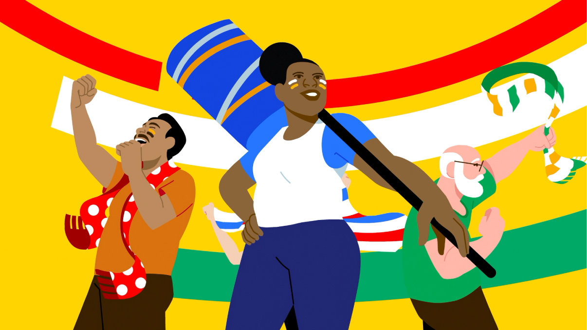
Although the visual identity of UEFA's Euro tournament is usually inspired by its host country, in 2024 – although the tournament takes place in Germany – its identity will be an invitation to all fans, from all European cultures. With the theme 'United by football', VMLY&R created a brand with a rich, complete visual identity, representing the Continent's diverse cultures, conditions and beliefs.
For the first time in the history of sporting event branding, fans aren't just the audience – they are the protagonists. Detailed animation showcases the true diversity of the audience, showing that fans come from all backgrounds, cultures, ages and genders.
Jodrell Bank by Johnson Banks
- Bronze Award: Copywriting
- Read more about this project at johnsonbanks.co.uk
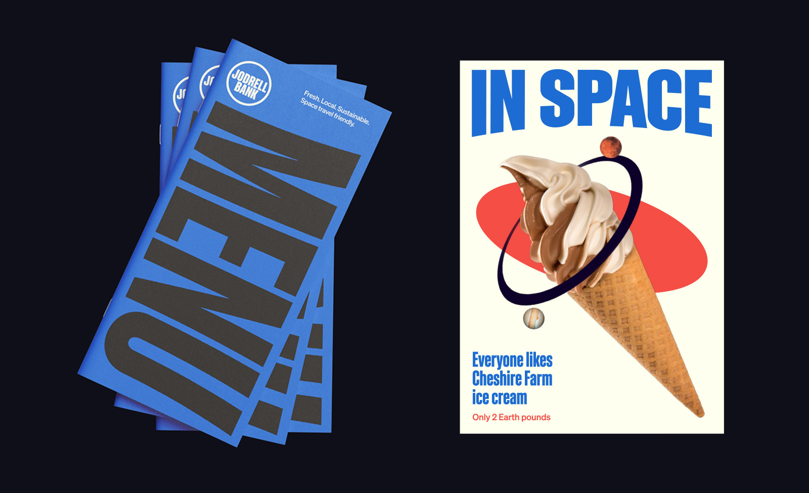
When some academics began tracking meteors in a muddy field in Cheshire, Jodrell Bank was born. 75 years later it is a UNESCO World Heritage Site at the forefront of scientific research, with hundreds of thousands of visitors a year.
Inspired by the site's giant telescope, Johnson Banks developed a motion sketch that turned, tilted and swayed, much like the telescope itself, but could freeze when a static version was required. Set in retro 60s-style type, the witty copywriting works on two levels: big, bold headlines grab attention, while little 'Easter Egg' sci-fi elements reward further exploration.
Game Six by Studio Sutherl&
- Bronze Award: Copywriting
- studio-sutherland.co.uk
- Read more about this project at thepoetryofitall.com
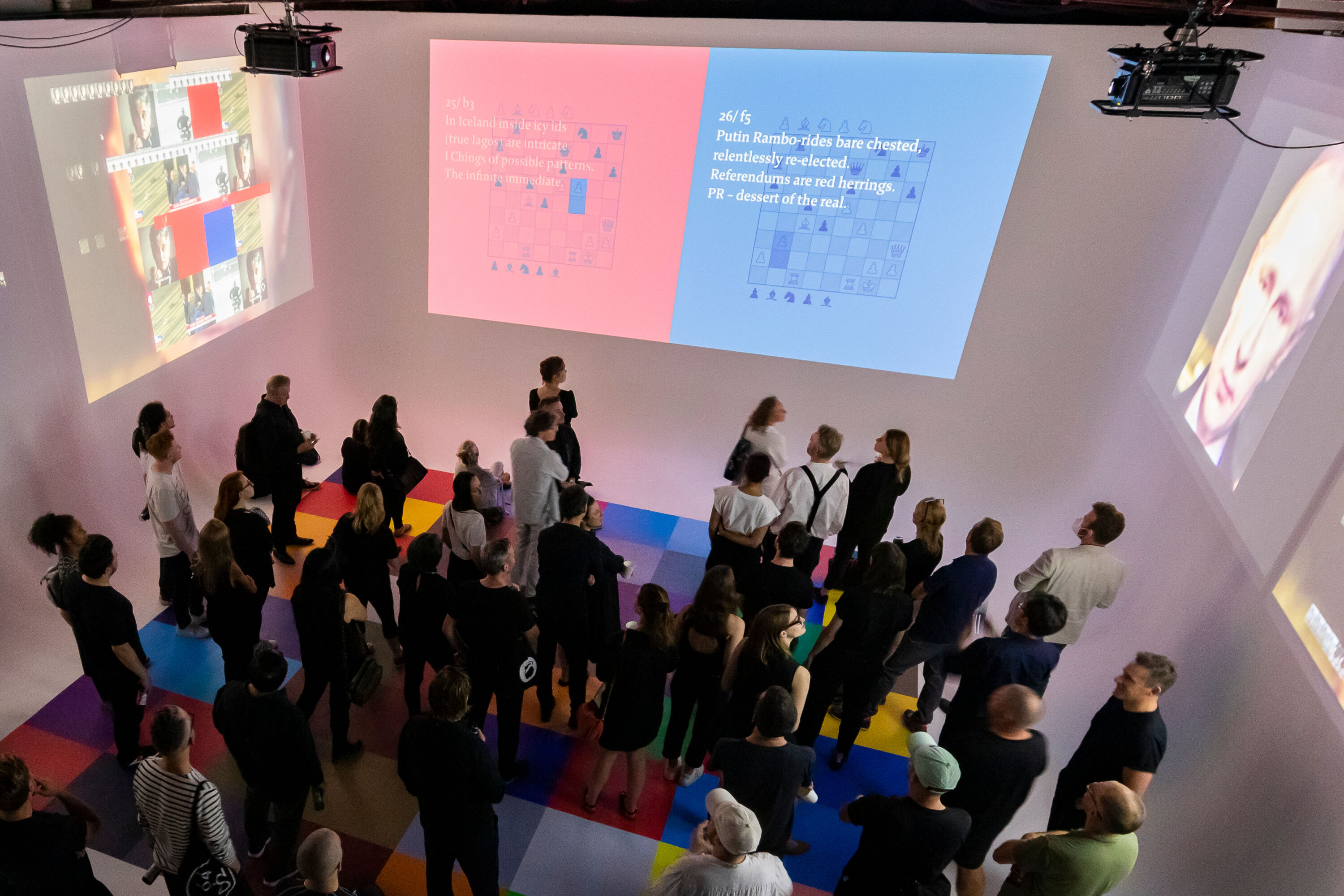
Blending writing, design, film, deepfake, experience and digital, Game Six is a joint self-promotional work for Studio Sutherl& and regular collaborator Tom Sharp. Both seek clients that are literate, intelligent, and politically, socially and culturally active. Accordingly, Game Six explores notions of post-truth politics and abuse of language in an unapologetically intellectual way to "put the wrong people off, and turn the right people on."
Each verse relates to a move in game six of the 1972 World Chess Championship. Alliterative, influenced by Norse poetry and referencing Reykjavik – the location of the match – the writing tells the story of post-modernism, chess, the Cold War, post-truth politics and the Bhagavad Gita.
Big C Charters by Mucho
- Bronze Award: Sports & Leisure
- Read more about this project at wearemucho.com
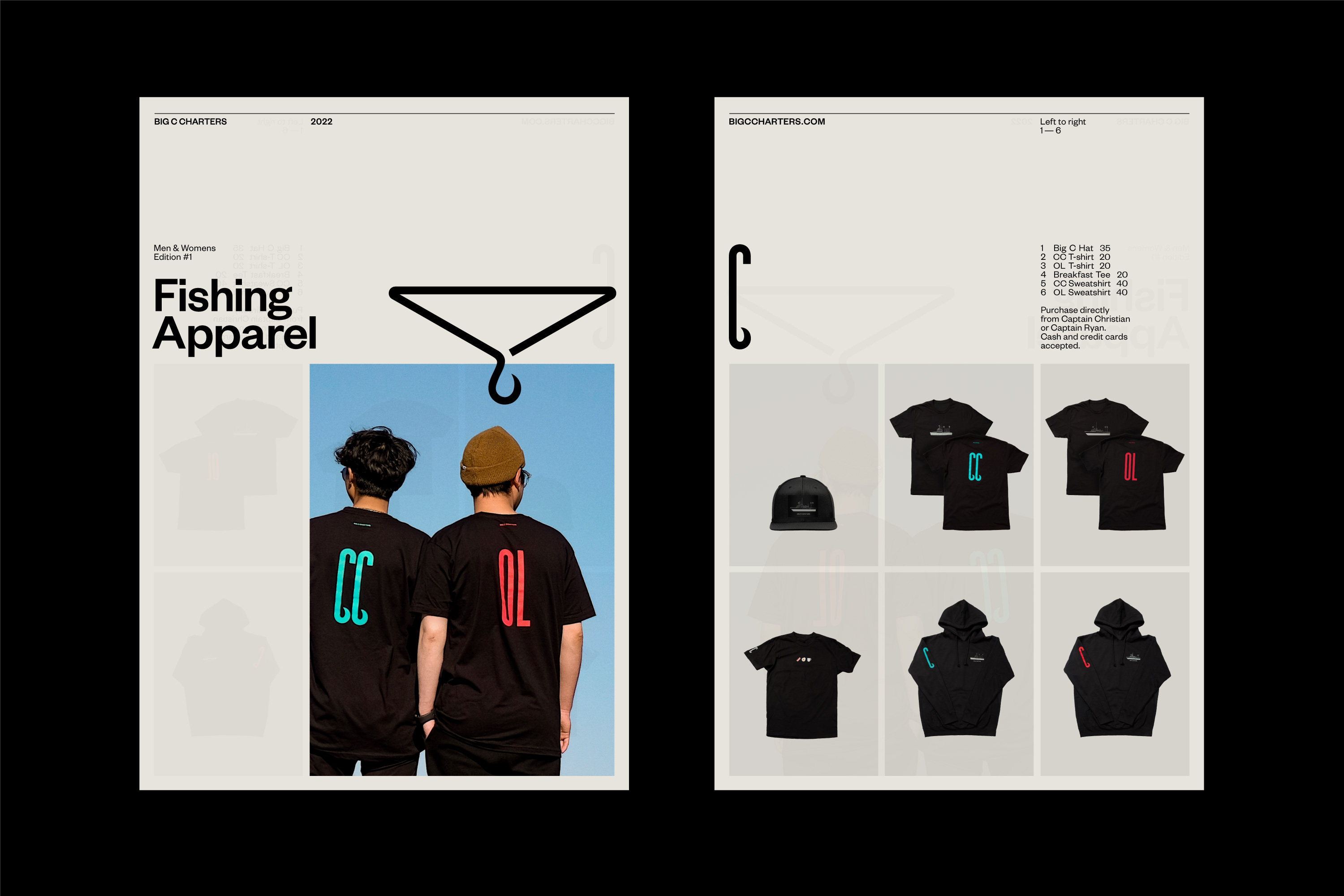
Founded by 6'8" former professional basketball player Christian Cavanaugh, Big C Charters is the premier charters service in the San Francisco Bay Area – and gets its name both from the big man himself and his local reputation for the biggest catches. Based on an unforgettably tall hooked 'C', Mucho's distinctive logo is echoed in Big C Sans, a custom display typeface that incorporates fishing hook/wave-like terminals into similarly elongated letterforms.
Vibrant colours inspired by hi-vis clothing, bait flashers and hooks buck the clichés of ocean blues and challenge old-fashioned views of fishing. And the hook motif translates playfully across everything from jewellery to paperclips.
SRF Sport by Superunion
- Bronze Award: Sports & Leisure
- Read more about this project at superunion.com
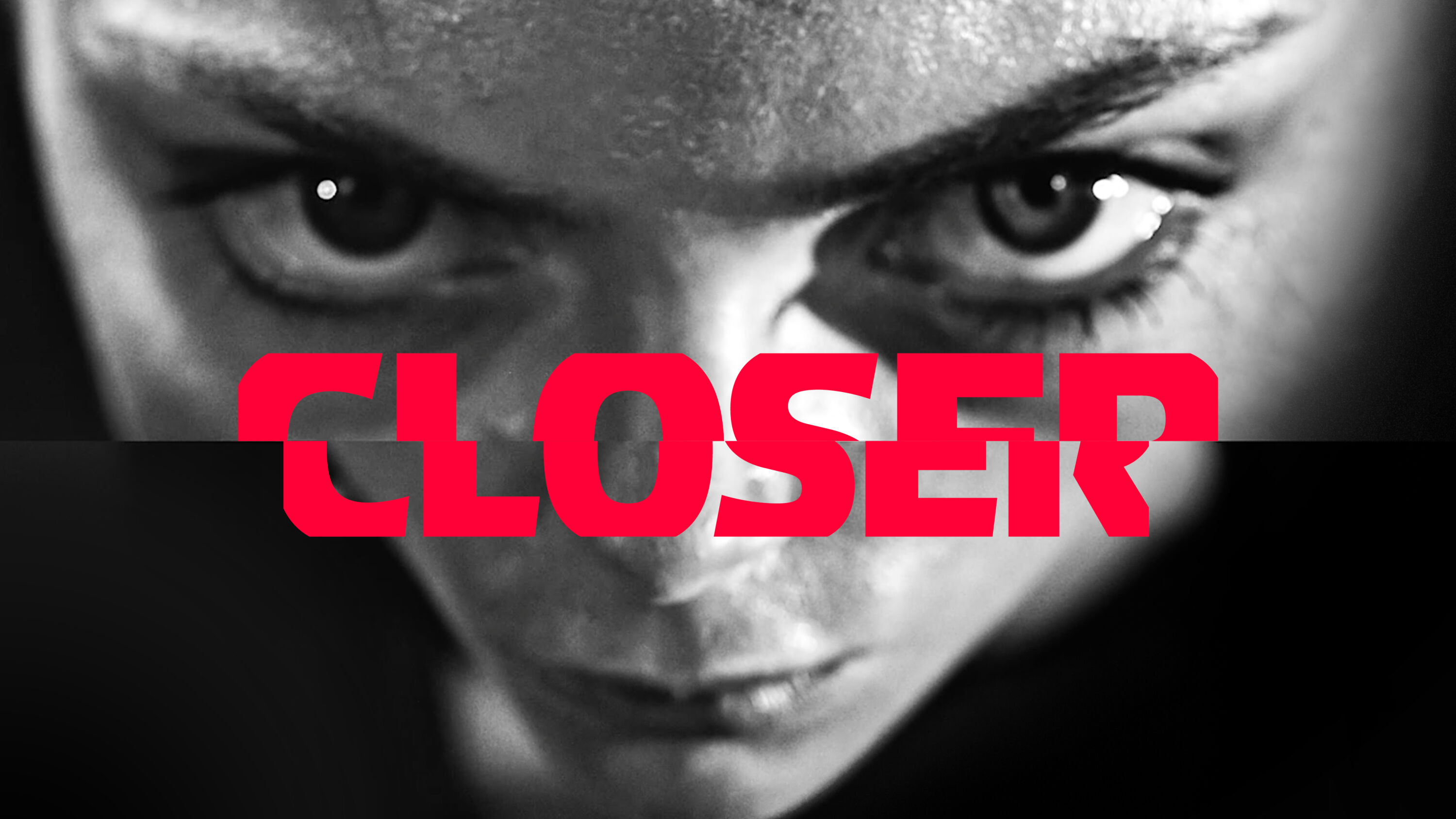
With its rebrand of SRF Sport, Superunion helped achieve the channel's mission of bringing the Swiss nation closer to the sporting action. Driven by the line 'Feel Closer', the identity emotively captures and amplifies the intensity of sport.
Using the geometry of the Swiss flag to split the screen into vertical and horizontal 'lenses', the new design system is based around zooming into key sporting moments, with artful uses of slow-motion footage and sound design amplifying their drama and intensity. From emotive show opening sequences right through to functional elements such as menu systems, SRF Sport's new dynamic, single-minded visual identity flexes across all channels, platforms and touchpoints.
Sinéad OD'wyer by Greenspace
- Bronze Award: Typography
- Read more about this project at thegreenspace.com
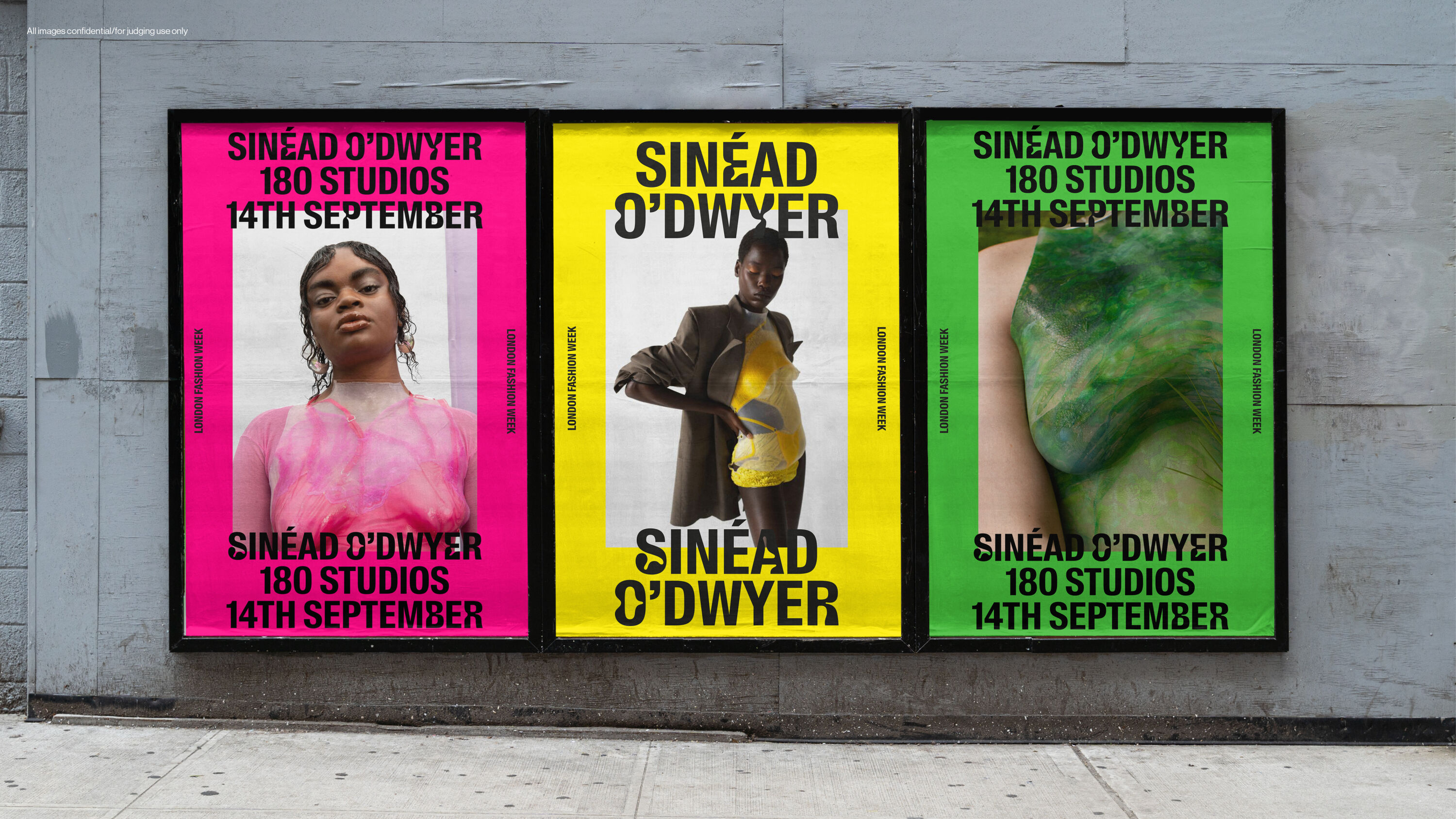
Dublin-born fashion designer Sinéad O’Dwyer creates wearable silicone sculptures using fibreglass moulds cast from women's bodies. Underpinned by themes of body, celebration, and inclusivity, her work challenges stereotypes about body sizes and types with a new language of beauty and acceptance.
Tasked with expressing these qualities, Greenspace developed an ever-changing wordmark in collaboration with Swiss Typefaces, inspired by the appearance of bodies – such as how skin and fat pinches and folds. This evolved into a custom display typeface, Every Body Suisse, for which every letterform has an alternate 'body form' character. When animated, the typeface expresses how different bodies move, conveying the character of O'Dwyer and her groundbreaking work.
Evri by Superunion and Monotype
- Bronze Award: Typography
- Read more about this project at superunion.com
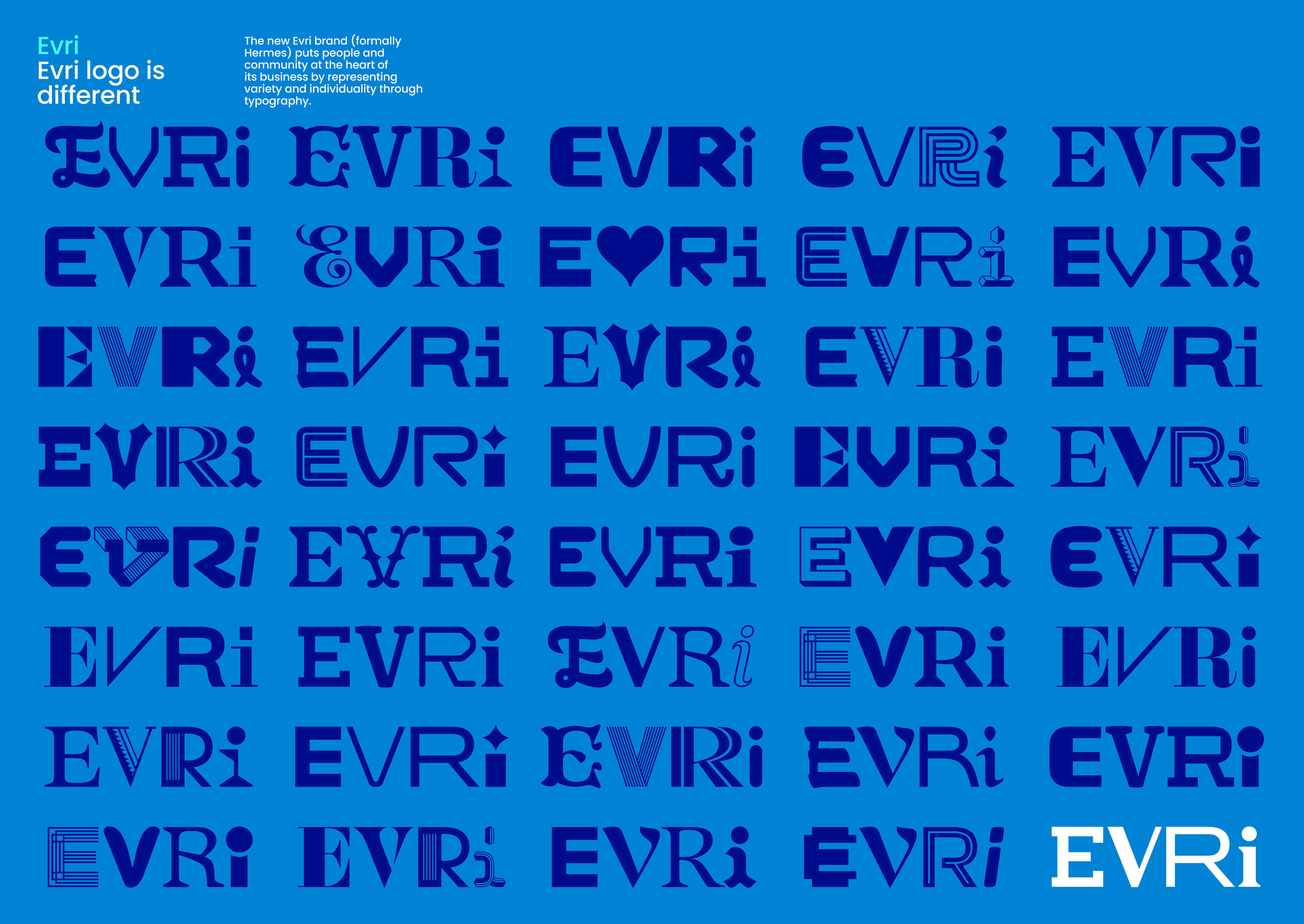
Superunion was briefed to create a new name and visual identity for Hermes, the UK's largest dedicated parcel delivery company. By representing variety and individuality through typography, the new Evri brand celebrates the people and community at the heart of its business.
In collaboration with Monotype, Superunion created a typeface and logo made up of many varied characters to represent the unique characters that make up Evri's customers and workforce. Each character (A-Z) is accompanied by 20 unique OpenType alternate glyphs, from which a generative tool unlocks a staggering 194,481 bespoke logo artworks for use across its delivery fleet.
Sejong Centre by Sejong Centre
- Bronze Award: Typography
- sejongpac.or.kr
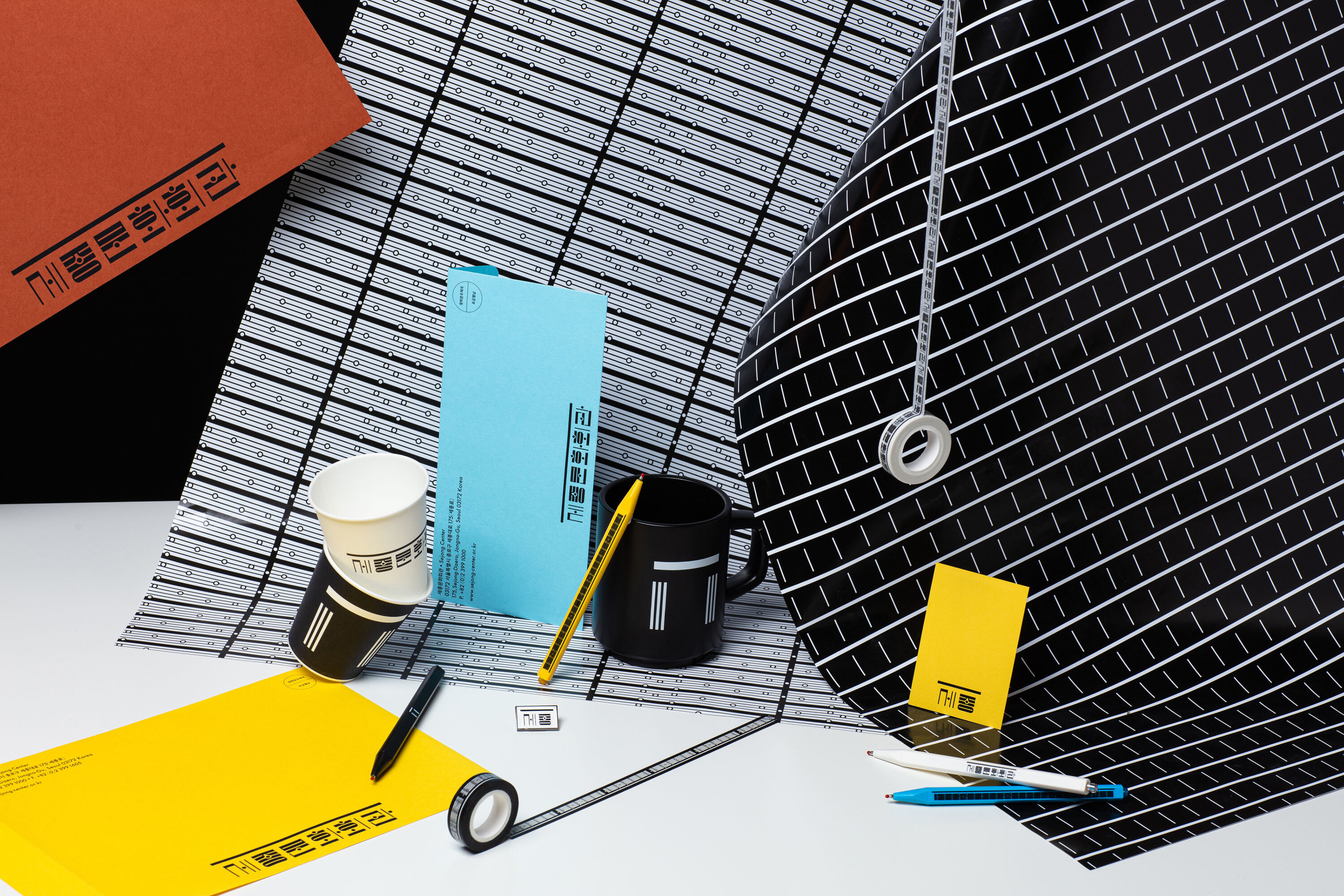
Based in Seoul, South Korea, the Sejong Centre commemorates the cultural achievements of King Sejong The Great. One of the 15th century ruler's most enduring accomplishments is the invention of Hangeul, the Korean writing system, and the Centre's type-led identity system skilfully blends vowels, musical symbols, and the architectural style of beams and pillars of its concert hall into an elegant typographic system of dots, lines, and faces.
It's common for Korean public institutions to combine symbols with readable, accessible English-language words in their branding: here, Hangeul is the fitting star of a modular, geometric graphic system that puts a fresh, unconventional twist on its native culture.
Contrarian Ventures by Sons & Daughters ID
- Bronze Award: Financial Services
- Read more about this project at sonsdaughtersid.com
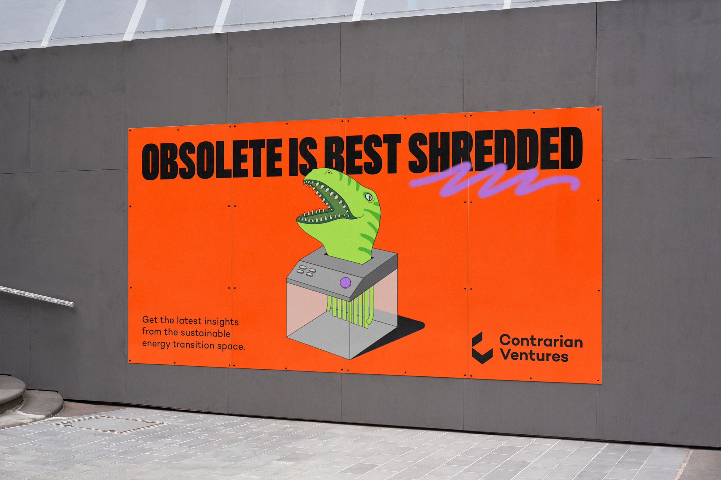
A VC fund that candidly challenges fossil fuel use, Contrarian Ventures seeks to speed up the transition to sustainable energy. Its young, entrepreneurial owners approached Lithuanian agency Sons & Daughters ID to develop a daring brand that lives up to its name, loudly expressing its forward-thinking attitude amidst a sea of look-alike VC funds.
Sparked by a doodle of a man holding his head in his hands, a quirky style emerged based on nonsensical illustration and frank messaging. Unexpected colour combinations, bold type, whimsical illustrations, and no-nonsense copy combine to give Contrarian Ventures a distinctive voice as it expresses the urgency of developing sustainable initiatives.
Visa by Mucho
- Bronze Award: Financial Services
- Read more about this project at wearemucho.com
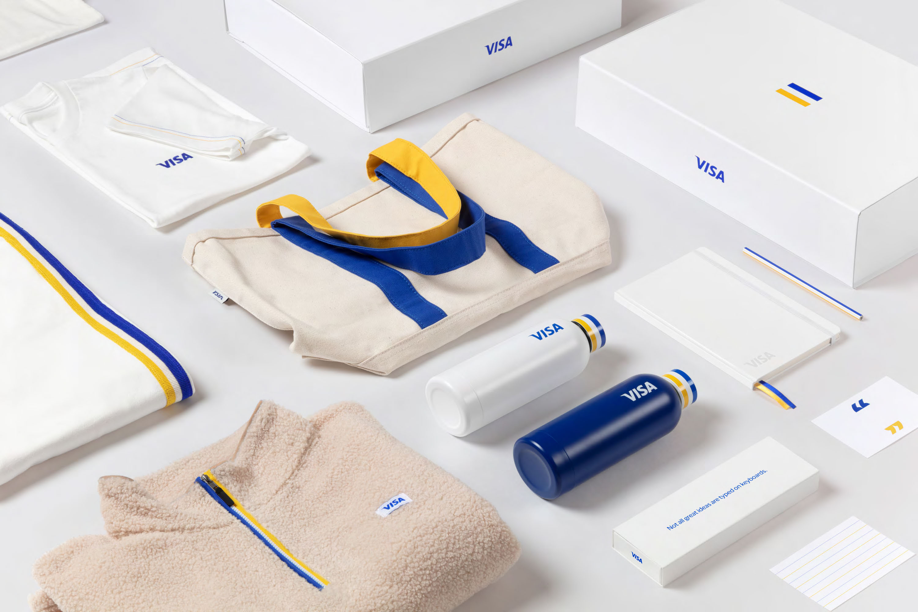
Mucho's identity system for Visa repositions the brand as more than a credit card company – rather, a trusted network that empowers people and businesses to participate in the global economy. Part of the brief was to modernise Visa's look for a digital-first world, and worldwide consistency was vital.
With over 60 years of equity, the distinctive three-stripe mark felt untouchable – but Mucho updated it with brighter, more dynamic colours that could punch out on screen. Breaking out of its restrictive rectangle, the three-stripe motif then comes to life across a series of playful, unexpected applications that span everything from office graphics to employee merchandise.
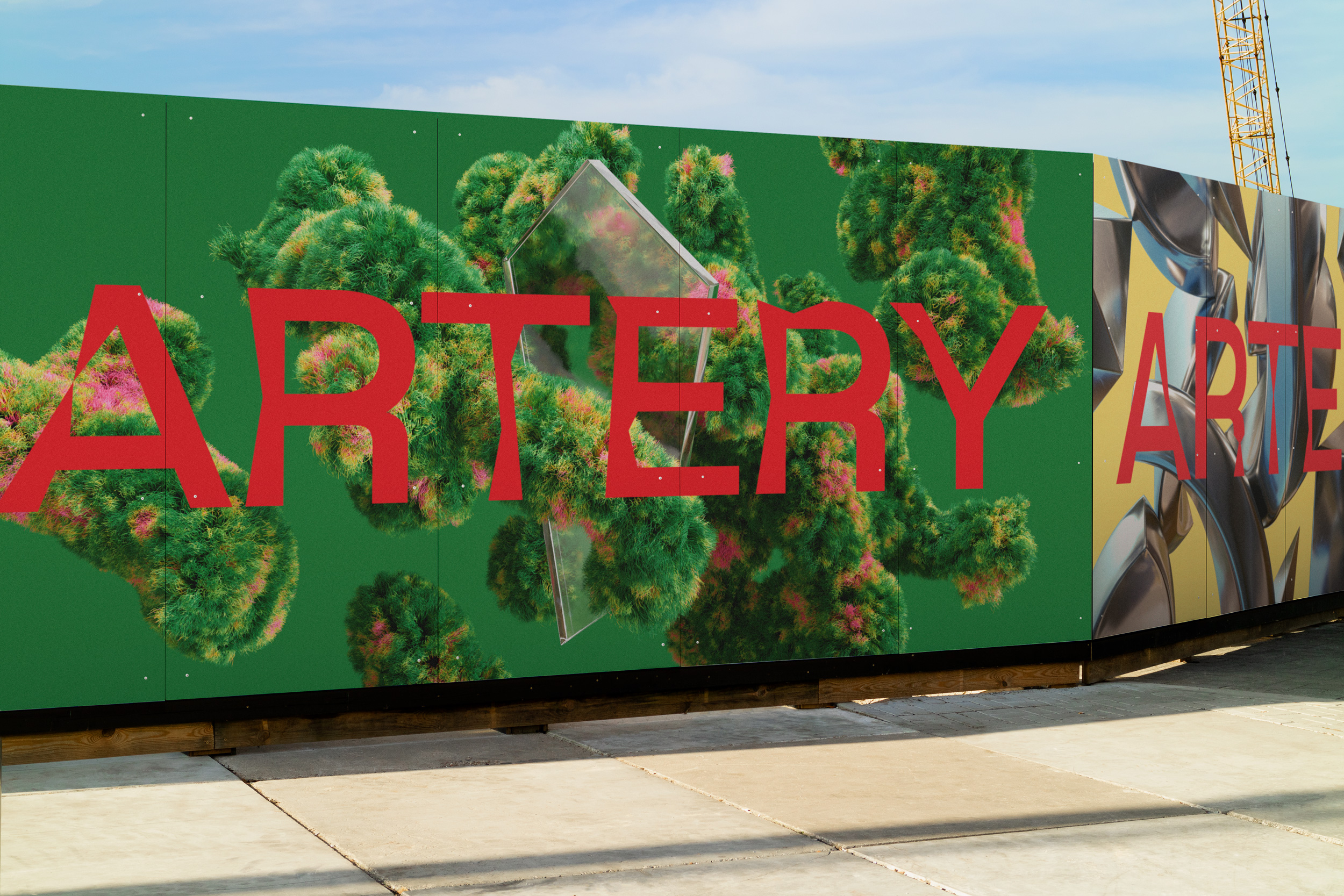
Artery by Sons & Daughters ID
- Bronze Award: Property & Construction
- Read more about this project at sonsdaughtersid.com
Famous for his use of deconstructivist forms, world-renowned Polish-American architect Daniel Libeskind designed the ARTERY business centre in Vilnius, Lithuania, which captures the emotion of its busy central location by constantly changing its appearance to reflect real-time data about the cars, pedestrians, and cyclists on the streets below.
The jagged shapes of the ARTERY logo by Sons & Daughters ID mimic the building exterior. Built using a generative design technique, it changes continuously within set limits – just as the ARTERY building itself seems to change shape by reflecting light differently throughout the day.
Crif Dogs by Design Bridge
- Bronze Award: Bars & Restaurants
- Read more about this project at designbridge.com
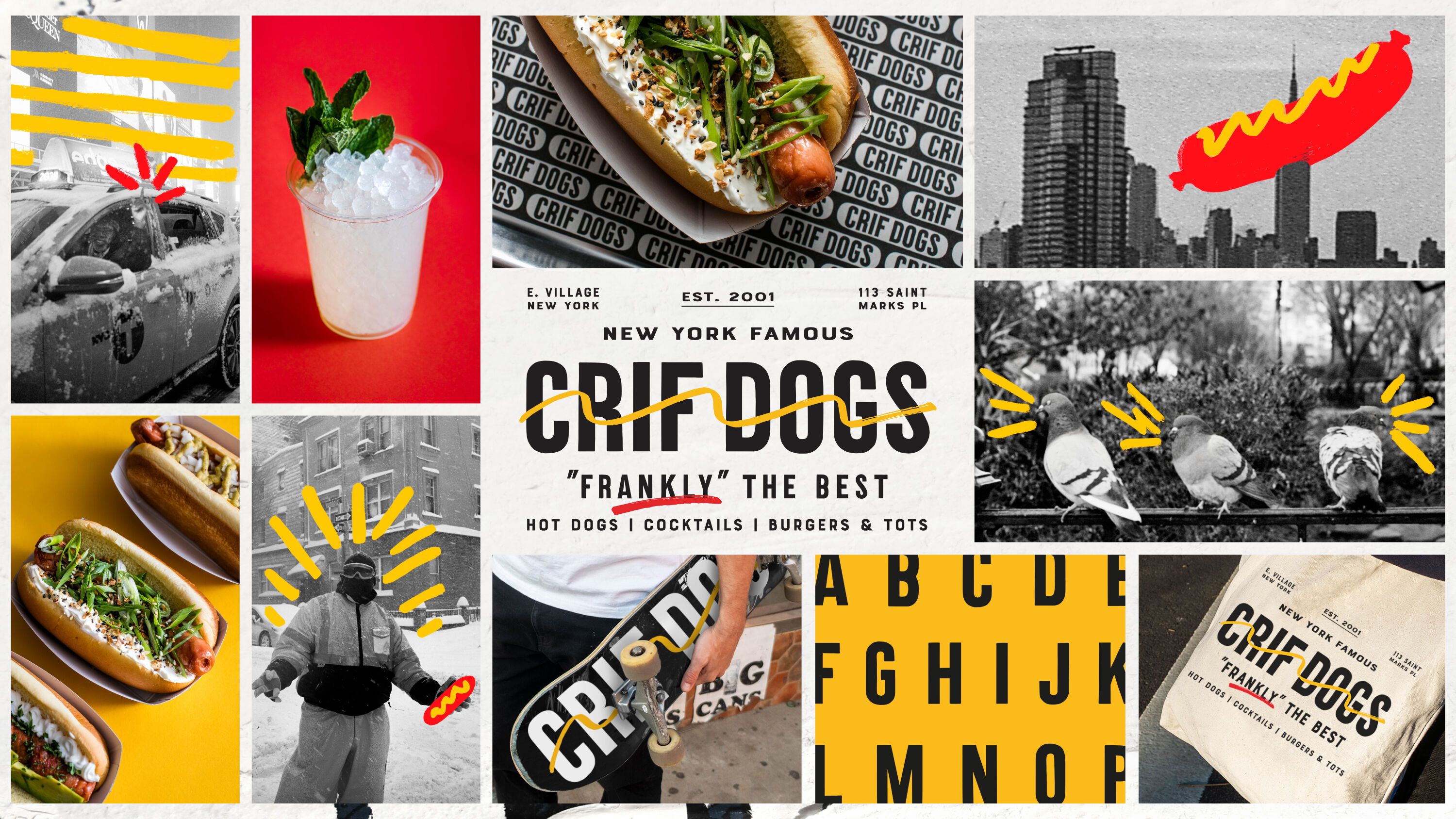
Beloved neighbourhood hot-dog spot by day, gateway to legendary speakeasy PDT by night, Crif Dogs has a menu as varied as its clientele. But when that clientele grew up, the brand didn't. Stuck in old bro-tropes and tired gags, it risked becoming dated and tasteless.
To express the brand's evolutionary spirit in true NYC style, Design Bridge blended evocative street photography with iconic faces and places. With a new tagline – "Frankly" the best – the brand has a unique, irreverent voice, and plenty to say. Mustard-yellow and ketchup-red doodles preserve Crif's playful spirit, but with a contemporary edge fit for a more grown-up audience.
Icelandic Provisions Skyr by Turner Duckworth
- Bronze Award: FMCG
- turnerduckworth.com
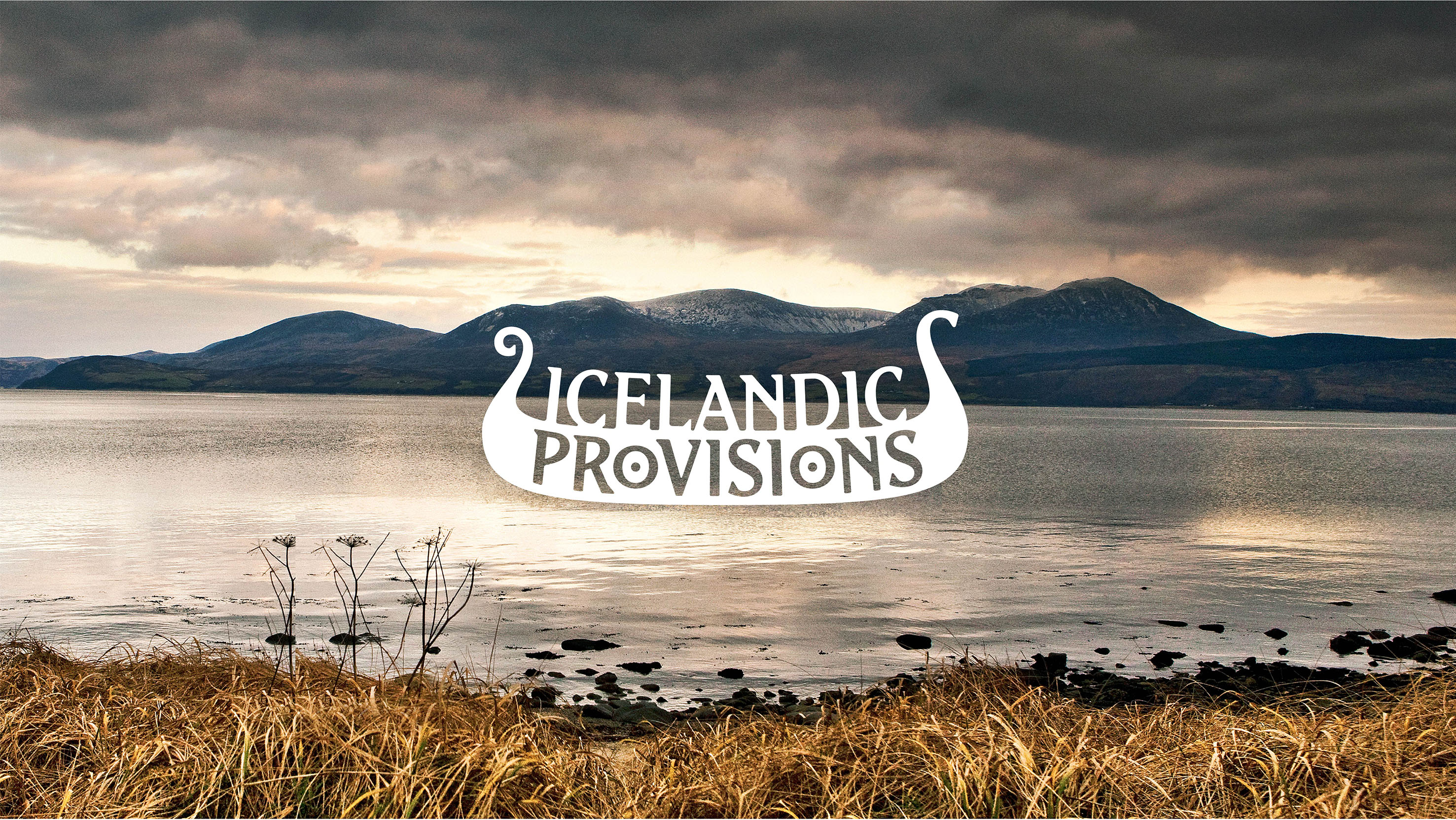
Made with heirloom cultures stretching back to the age of the Vikings, Icelandic Provisions Skyr has a unique story packed with rich Icelandic history. The growing brand needed an iconic identity that could expand over time, and a packaging system to convey its premium quality, differentiating the product in the increasingly crowded, overtly white dairy aisle.
Turner Duckworth drew on Skyr's heritage to tell the story of Iceland and its values, provisions and foods. Symbolising strength, resilience, and journeys, the Viking longship icon holds 'Provisions' in its hull, while the twin Os were a golden opportunity to hang shields from the sides, Viking style.
Vice Reversa by Taxi Studio
- Bronze Award: Pharmaceuticals & Toiletries
- Read more about this project at taxistudio.co.uk
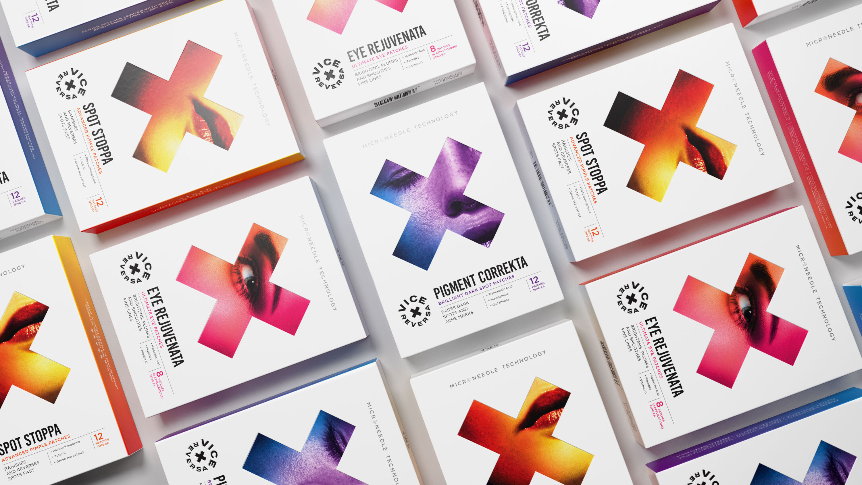
Beauty-conscious customers are investing time and money in self-care like never before, relying on regular at-home skin routines. Vice Reversa's medical-grade home-treatment patches feature a patented, pain-free crystallised serum needle design that delivers active ingredients under the skin – eliminating the need for expensive, painful clinic-based care.
Taxi Studio set out to disrupt the saturated beauty marketplace, building a brand mnemonic that symbolises how the brand targets problem skin areas: X marks the spot. A hygienically clean design system pops with hits of vibrant colour and lifestyle photography in a brand expression that feels as much at home in the world of fashion as conventional cosmetics.
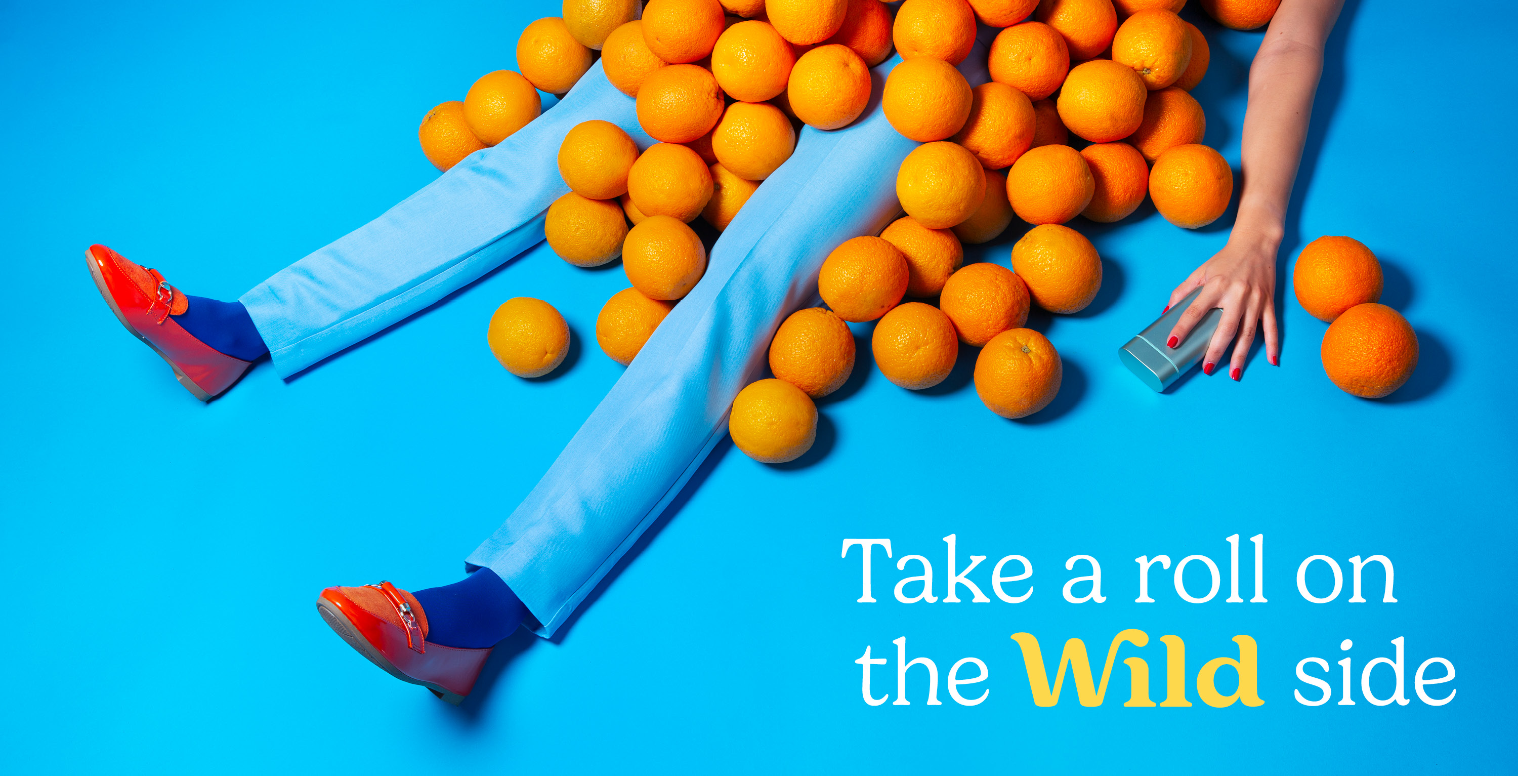
Wild by Johnson Banks
- Bronze Award: Pharmaceuticals & Toiletries
- Read more about this project at johnsonbanks.co.uk
Wild's core audience loved the idea of a deodorant they could refill rather than discard. But the client team admitted that everything was a little too slick and functional, and not as 'wild' as it could be. Retaining the essence of Wild's intriguing original logo, Johnson Banks developed a quirkier tone of voice and a bolder, more surreal photographic style as part of a brighter, punchier and 'wilder' design toolkit that keeps pushing at the edges of what Wild can really stand for, with a clearer focus on the product's sustainable credentials.
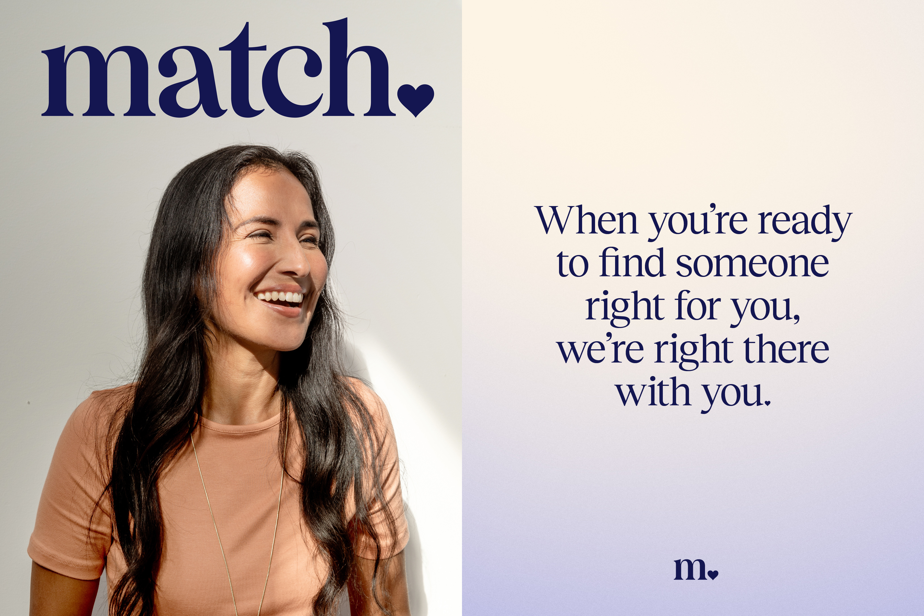
Match by COLLINS
- Bronze Award: Technology & Telecoms
- Read more about this project at wearecollins.com
Founded in 1995, Match pioneered the world of online dating. An entirely new category was born, ushering in an assortment of platforms and, in turn, cultures. But many modern dating apps are just a means to an end, so COLLINS asked: what is the opposite of this? How can a product feel more like a beloved service, rather than a game? The solution: romantic hospitality.
Match strives for the effortlessness of a concierge's wave, showing you to your table; almost invisible but deeply appreciated. With no glaring, bright colours the new palette is tonal and inviting as part of a quietly confident scheme that exudes trustworthiness and experience.
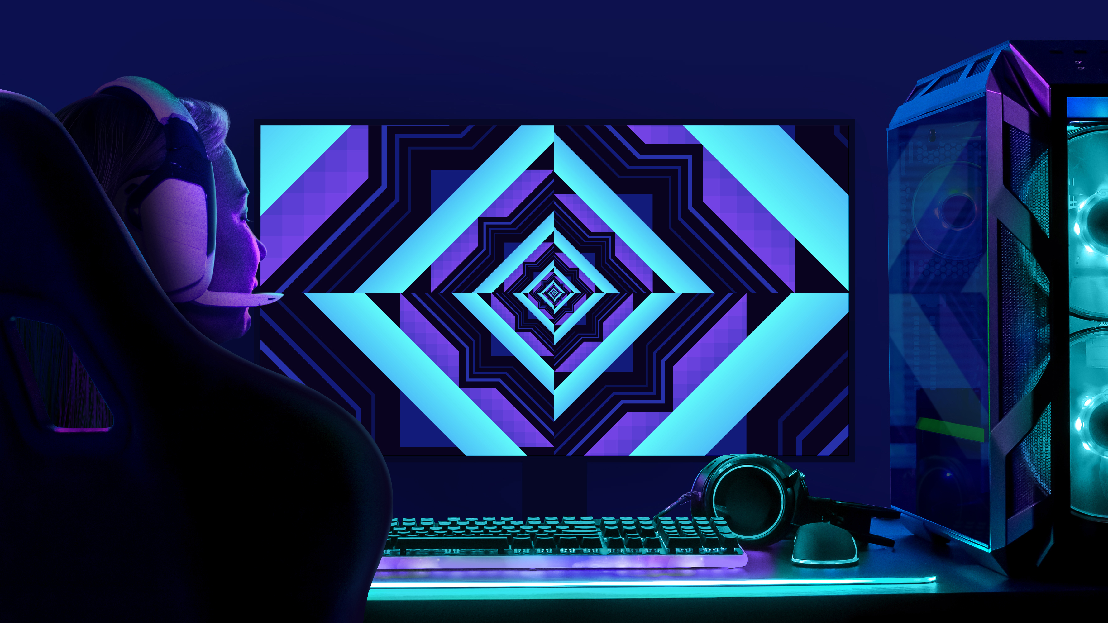
Intel: Portal by Superunion
- Bronze Award: Technology & Telecoms
- superunion.com
Briefed to shed Intel's "Evil Corporation branding" within the gaming community, Superunion developed a new global identity to signal Intel's commitment to gaming. It needed to resonate with gamers, and enable Intel to take due credit for its role in related technology and culture.
The solution: a graphic portal, based on the Intel 'square', which takes gamers on a fast-paced journey through the different worlds of Intel Gaming. It evolves and adapts across every touchpoint, with three main colourways used to support product launches and events. Reaching over 78 million gamers worldwide, the new brand energised new partner sign-ups, turbocharged Intel Gaming's social following, and boosted sales too.
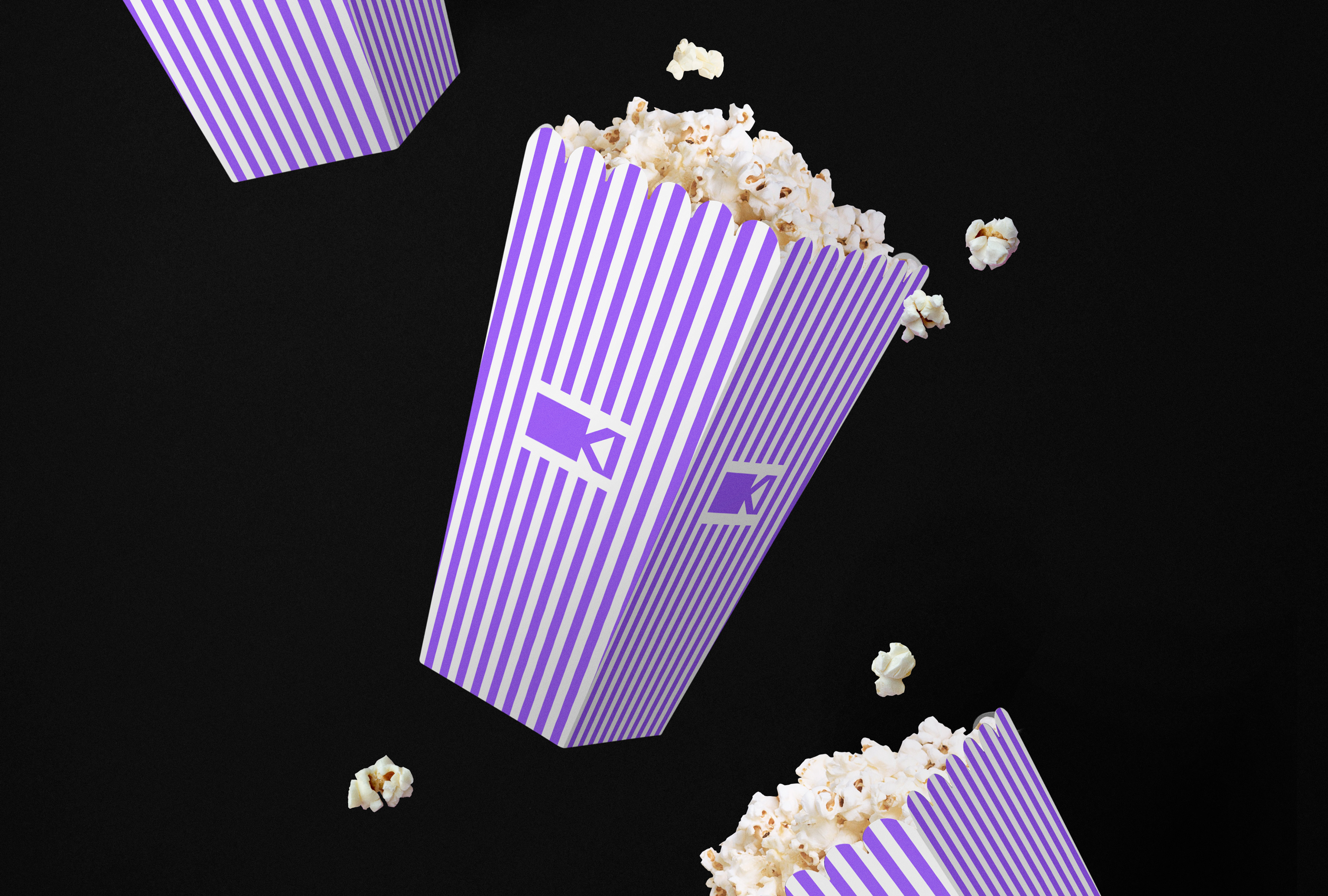
Kinema by Mucho
- Bronze Award: Entertainment
- Read more about this project at wearemucho.com
Social cinema platform Kinema makes it easy for anyone, anywhere to show movies and share in the proceeds. It enables grassroots screening tours of films in person and online, enabling smaller, independent films to reach places they might not have otherwise. A play on the words 'kin' and 'cinema', the name champions the idea that cinema and film can bring people together and build community.
Mucho's new identity that centres on a bold wordmark and symbol, combining the first two letters of the name into an icon that represents a graphic camera or projector – putting technology and entertainment at the heart of the brand.
Wonder What by Bond and Coyne
- Bronze Award: Education
- Read more about this project at bondandcoyne.co.uk
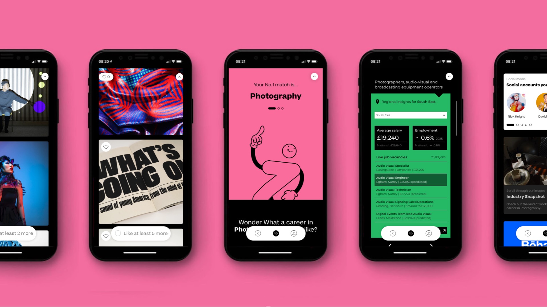
One of the UK's biggest economic success stories of the last decade, the creative industries are growing at five times the rate of the total UK economy. But this success story depends on a healthy supply of talent from schools, colleges and universities – and that supply is drying up as fewer students are choosing to study creative subjects.
In partnership with Arts University Bournemouth (AUB), Bond and Coyne developed Wonder What, a free careers app based on an innovative image-based search engine. Students pick images that appeal to them, and the AI presents potential careers based on those choices, complete with useful resources to stimulate further research and study, and relevant job vacancies.
Congratulations to all winning agencies
Thank you to everyone who submitted entries, and congratulations to all the worthy winners. All of the agencies on this list will be invited to a special drinks event in London to celebrate with your teams – we'll be in touch soon.
Full project credits (as supplied with the entries) are included within the winners' showcase, which can be downloaded below.
Download the winners showcase
See you in 2023!
Nick has worked with world-class agencies including Wolff Olins, Taxi Studio and Vault49 on brand storytelling, tone of voice and verbal strategy for global brands such as Virgin, TikTok, and Bite Back 2030. Nick launched the Brand Impact Awards in 2013 while editor of Computer Arts, and remains chair of judges. He's written for Creative Bloq on design and branding matters since the site's launch.
