Behind the scenes of hyper-stylised short 'Shave It'
The dynamic animation and vivid colours in Shave It make it a true visual treat. Kulsoom Middleton talks to co-director Jorge Tereso about motivation, Max and monkeys…
The visually stunning short Shave It kicks off with a colourful jungle scene, as a cheeky monkey unzips a tent to find a bag in which he discovers a shaver.
As he switches the shaver on and with the buzz of the device, the action cuts to a bulldozer destroying trees in the forest. Then, the monkey shaves himself and disguised as a human sets off to experience city life. There he climbs through the ranks and achieves position and wealth, but there’s more to the story than meets the eye, as the monkey ultimately takes its revenge on humans and their habitat.
Watch Shave It
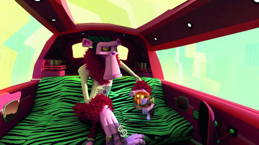
The monkey is reminiscent of the stylised characters from DreamWorks’ Madagascar. In this instance, the directors have really pushed the stylisation with the monkey’s crazy shock of green-blue hair, angular jaw, ping-pong ball eyes and floating ears.
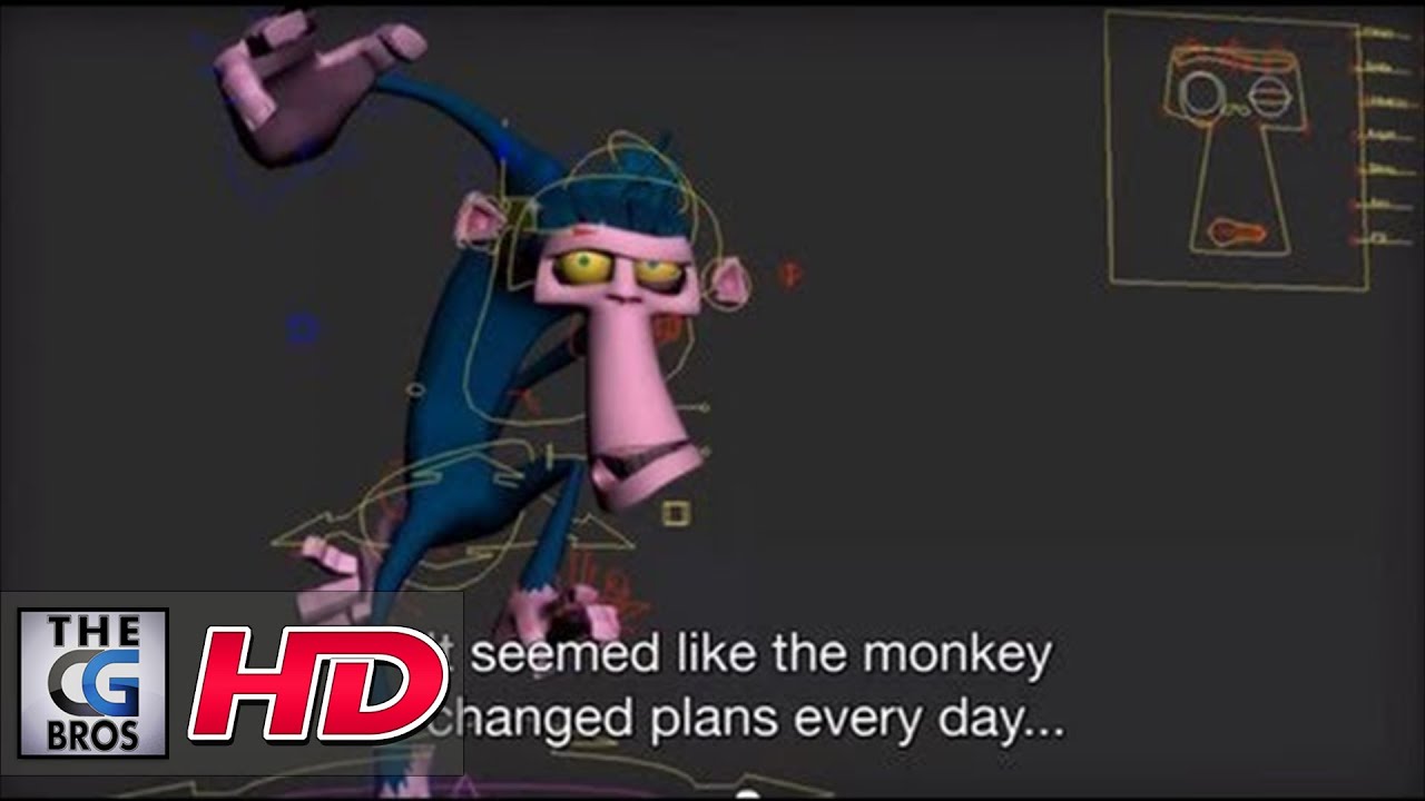
Article continues belowDirectors Jorge Tereso and Fernando Maldonado had envisaged the monkey character from the beginning and knew they had to work in a certain way to achieve the stylised look. They called on the experience of rigger Vincent Souza to help. “We needed an extremely flexible rig, with a deep level of control,” explains Tereso. “Vincent Souza’s scripts and rigs for the monkey allowed us to have up to 15 controls for simple things like his upper arm.” In total, the monkey’s rig has about 150 controls.

An any-software attitude
The main software used on the animation was 3ds Max, but Tereso points out that they could have produced the short with any of the leading programs. “None of them limits you if you’re trying to create something like Shave It.”
They also wrote scripts for handling certain tasks like rig controls and the jungle plant generation. In order to create the highly saturated colours and add more detail, the team turned to After Effects.
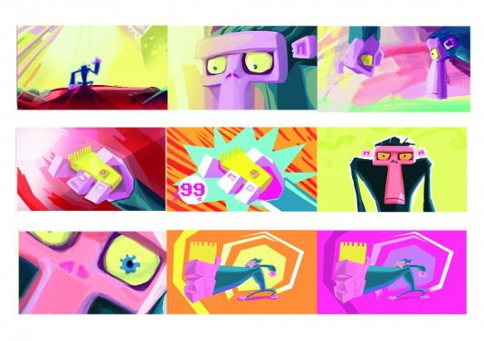
“Every shot was rendered in separate layers and later retouched, edited and composed,” explains Tereso. “We used lots of masks during colour correction – every shot was fine-tuned. We tweaked all the colours to take the saturation to its limit.
Sign up to Creative Bloq's daily newsletter, which brings you the latest news and inspiration from the worlds of art, design and technology.
We also got to a point when we were animating in 2D over everything. Adding a lot details, not just aesthetic, but also conceptual details such as shadows and things that reinforced what each shot had to say.” Drawing in 2D over the final animation gave such good results they ended up doing it on top of almost every shot.
Check out the behind the scenes video
It’s light on technical details, but the smiling faces makes up for that!


The Creative Bloq team is made up of a group of art and design enthusiasts, and has changed and evolved since Creative Bloq began back in 2012. The current website team consists of eight full-time members of staff: Editor Georgia Coggan, Deputy Editor Rosie Hilder, Ecommerce Editor Beren Neale, Senior News Editor Daniel Piper, Editor, Digital Art and 3D Ian Dean, Tech Reviews Editor Erlingur Einarsson, Ecommerce Writer Beth Nicholls and Staff Writer Natalie Fear, as well as a roster of freelancers from around the world. The ImagineFX magazine team also pitch in, ensuring that content from leading digital art publication ImagineFX is represented on Creative Bloq.

