Improve your lighting with these 7 expert tips
Getting the lighting right is key to setting up a 3D scene. Lance Evans explains how to get it right.

This article is brought to you in association with Masters of CG, a new competition that offers the chance to work with one of 2000AD's most iconic characters. There are big prizes to be won, so enter today!
One of the great things about 3D work is how it incorporates so many elements from the real world, only better. When you set up a scene in a 3D program, you are frequently mimicking attributes from the real world.
This is particularly true if one is aiming for something close to photorealism. So when we build the set, be it an indoor or outdoor scene, we often try to duplicate what would make sense in the real world. The same holds true for lighting, to a point. Limitation in CG always crop up and force us to come up with creative ways at either duplicating the real world, or sometimes bettering it.
Let's look at five things we can do to make out CG lighting better in any 3D program.
01. Become a student of light
Even if you never went to school to become a lighting tech, you have lived your entire life in natural and man made lighting, so you know what it should look like, right? Well, maybe.
Start paying better attention to what the lighting in the world around you looks like, and your scenes will start looking better overnight. Unless you are modeling a windowless room, most scenes have a mix of outdoor and indoor lighting. Even a scene at night with no light coming into the windows will affect what we do. This is because night time lighting is different than daytime. Stop and notice how often you change the lights in your environment as the day progresses.
02. Start with pragmatic lighting design

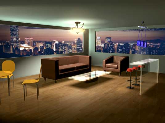
It is often far easier to begin lighting a scene by placing lighting fixtures where they would logically be in a similar real world setting. For example, let's assume you have a scene that takes place in an apartment like we have in our example. How would you light it? Having some knowledge of interior design can be helpful here.
Get the Creative Bloq Newsletter
Daily design news, reviews, how-tos and more, as picked by the editors.
Start thinking about the basics of room lighting, table lamps, floor standing lamps, chandeliers, track style lighting, natural light through the windows, etc. And don't forget to put in any corresponding 3D geometry of lighting fixtures that would logically be seen.
If you are unsure how rooms are lit, there are plenty of books on lighting design that give a crash course. And many interior design magazines that show spectacular real world lighting. This is what we aspire to in our CG work, so look and learn from these.
03. Learn lighting attributes
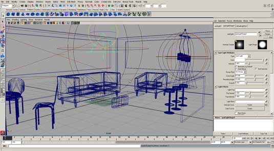
In most programs, lights come with an impressive range of controls to get just the look you are seeking. Your scenes will never look real by just dropping lights in a scene, that will look way too CG circa 1995!
High end 3D packages have a wide range of light-style options. Play with them and get to know how each one works. They are designed to mimic real world lights, but also offer many other uses as well. There are a few basic lighting types you need to know about.
- Point (bulb): Radiates light in all directions from a single point.
- Spot: Light is focused to emit in one direction with a (usually) narrow spread.
- Parallel/Directional (sun): This light has no spread as the rays are parallel. Light falls evenly across the entire scene, unless otherwise modified.
- Environmental (diffuse): Creates soft and non-directional light. This tends to add more into the shadow areas than it does to the highlights.
- Area (panel): Light emits from a wide area. This can be used to represent a fluorescent bulb, or the light coming in a window.
- Volume Light: Almost more of a special effect, it is used to create the atmospheric effect of light in a space. Think of beams of sunlight.
All of these types of lights can be used in multiples, and intermixed as needed, to create a realistic scene. Where things start to get rather cool is that we have more control of these digital lights than a lighting designer would ever have over lights in real life.
For example, we can decide if we want a light to be used for just diffuse illumination (most of the light we see), or just for specular illumination (the bright shiny reflections), or both.
We can even decide if a light is used to add light into a scene, which is how lights are usually used, or instead used as a subtraction light.

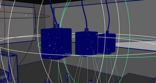
In this sample scene, we started with an area light used coming in the left side window to have a bit of daylight blue rolling in. While this was turned down a bit as the scene got redesigned to be at dusk, it is still there adding a puff of realism. Note that there is a spot light in every fixture, the ceiling fixture in the center, and the three drop-pendant lights over the bar on the right.
There is also a light over the dining table which is mostly out of view on the far left. You can see the light from that spilling onto the scene. One other main light that you can't see is the ambient light that is in the scene, used to fill in the dark areas like bounced light would in real life.
Ambient light is a fast and easy way to add this, and a sense of 'air' to the scene. There are more exotic rendering techniques that would do an even better job, but take a lot longer in set up and rendering. These are called global illumination techniques.
04. Casting shadows
The source of a light will also effect the quality of shadows that are cast. For example, a Parallel light used to replicate the sun should be set to generate harder edged shadows, like the sun creates. Spotlights create a cone of light, but fall dark outside of that. The edge of that oval (where the light hits a surface) is called the 'penumbra', and can be set to be a hard edge, or soft. Only theatrical follow-spots create a hard edge, so you usually want to make this edge soft.
Software programs offer a range of technology to generate shadows in CG, the two most common are DEPTH MASK and RAYTRACED shadows. Raytracing is a better technology, but it can add significant time to rendering. Not terrible if you are doing a small illustration. But if you are doing a super high resolution image, or an animation, see if a depth mask shadow might not be good enough.
Shadows make a big difference in realism. You can enhance that further by using various modifying techniques to refine your image. Gobos are cards in various shapes that were used in the film industry to cast moody shadows on a set. We can use that in our CG sets as well.
05. Volume/Fog lights and inverse square law

As great as CG lights have gotten, they don't all have every attribute found in a real world light. So sometimes we have to gang a few CG lights together to get what we need.
In our example image, we did this with every light. The ceiling light has a spot point down, set to a wide angle and a very soft pnumbra. But it needed to have light hiting the ceiling, and also have a sense of environment, so I added an area light which is what illuminates the ceiling and also the fixture itself.
One things was still missing however. The frosted glass parts of the fixture needed to be bright. Rather than doing this with lights behind it, I added a glow to the model itself, a technique available in many programs.
The var lights also had spots, with a fog added to give the SPOT some added body. And an AREA light was added at the fixtures to illuminate each.
While not used heavily in this quick example scene, keep in mind that lights become weaker as they move further away, this is called 'fall off'. Your science teacher would refer to it as 'the inverse square law' (so would I, so I guess we know who's a nerd here). Fall off can be set in most programs. It's not only good for enhancing reality, it is also great for simply giving us more control of what we will allow our light to illuminate.
One other control is to set a light to illuminate some selected models, and not others. This was very helpful with the unseen dinner table light which was illuminating the walls too much. Once set to not affect them, the scene looked much better.
06. Advanced: Colour, temperature, light specs, image-based lighting
Be aware of colour, or the more tech name for it, Colour Temperature. Outdoor lighting is an odd mix of bright yellow from the sun, but on a sunny day, also a lot of blue from the sky. On an overcast day, it all gets gray and desaturated.
Indoor light is generally much warmer, though this can vary a bit with all of the new types of bulbs being made today. Go into any home store and you see bulbs offered in various color temperatures. But most of us still favor the warmer lights, especially for residential use.
For illustrative purposes what we have discussed will give us fine results. But for architectural CAD production, where exactness counts, packages allow you to import IES photometric data for specific lighting fixtures, which provide accurate renditions of the lighting.
Finally, if your software package supports it, one other option in lighting a scene is called image based lighting. In this technique you bring in a High Dynamic Range Image (HDRI), which has the environment of the scene your 3D models are to be immersed in. The results are often very realistic, but often need to be augmented with additional lighting.
07. Render multiple passes
One of my favourite techniques, used for both illustration and animation, is to render a shot not just once all together, but instead in multiple passes. This can be done many different ways, but for our discussion, we would render each light (or perhaps small groups of lights, like those over the bar) as individual passes. When done, they can all be brought into Photoshop or After Effects and adjusted to our heart's content, and in real-time!
Words: Lance Evans
Lance Evans is creative director of Graphlink Media. He has written books on 3D, and produced the 3DNY Seminars for Apple and Alias.
Win a trip to SIGGRAPH!

Masters of CG is an exciting new competition for EU residents that offers you the one-in-a-lifetime chance to work with one of 2000AD's most iconic characters: Rogue Trooper.
We invite you to form a team (of up to four participants) and tackle as many of our four categories as you wish - Title Sequence, Main Shots, Film Poster or Idents. For full details of how to enter and to get your Competition Information Pack, head to the Masters of CG website now.
Enter the competition today!

Thank you for reading 5 articles this month* Join now for unlimited access
Enjoy your first month for just £1 / $1 / €1
*Read 5 free articles per month without a subscription

Join now for unlimited access
Try first month for just £1 / $1 / €1

The Creative Bloq team is made up of a group of art and design enthusiasts, and has changed and evolved since Creative Bloq began back in 2012. The current website team consists of eight full-time members of staff: Editor Georgia Coggan, Deputy Editor Rosie Hilder, Ecommerce Editor Beren Neale, Senior News Editor Daniel Piper, Editor, Digital Art and 3D Ian Dean, Tech Reviews Editor Erlingur Einarsson, Ecommerce Writer Beth Nicholls and Staff Writer Natalie Fear, as well as a roster of freelancers from around the world. The ImagineFX magazine team also pitch in, ensuring that content from leading digital art publication ImagineFX is represented on Creative Bloq.
