21 killer tips for CG artists
Lance Evans offers pro tips to help you work faster and better, in the latest in our series sponsored by HP.
The term 'computer graphics' covers such a broad range of topics, categories, industries and workflows, that it gets harder every year to quite pin down what we even mean when we say "CG". In many circles, the term has erroneously become synonymous with 3D, although it quite obviously includes 2D as well. It also includes all varieties of computer animation, and often interactive/multimedia content as well.
So with that broad mindedness in mind, this article offers 21 easy to follow tips divided into three categories: 3D, 2D, and Motion/Animation Graphics. And with alphanumerical convention as good a reason as any, I'll start with 2D...
01. Work small to make workflow fly
Even with our fast new computers, there are many things in Photoshop that can take a while to do, or be slower than we would like when facing short deadlines. Filters come to mind, but there are other things as well, like crazy numbers of layers. Workflow is greatly sped when we work with smaller canvas sizes, but you'd never do that, right?
Well I frequently do just that! Most images have foreground content, and background content. And often, that background matter is going to end up out of focus anyway, so why kill yourself working on it high res?
Duplicate the file and scale the new doc down to half the width and length. That will reduce the file by a whopping 75 per cent, making your work fly, even when working on your laptop at the coffee lounge. When done, make a merged copy, paste it back to the original file, and transform it back to fill the background. Blur to suit your taste, and you may wish to add a few points of monochromatic noise to finish it off.
02. Use free backgrounds
Let's take a page from the first tip and apply it to other uses. When creating images that have strong foreground and background components, we sometimes want to drop a photo in. I do this frequently with foregrounds created in 3D, or even with photographic portraits shot on green screen. But where do you get that background photo from?
Mostly we have to either take the photo ourselves, or buy one from an online stock house. But as it will be a background, if you can live with it very blurred, and I often can, then we can take almost any photo we find on the web. Blurring it enough makes it non-identifiable, and in most jurisdictions that opens it up for free use.
When using this technique, search for images with higher resolutions of 800-1000 pixels. This is enough to enlarge to your final size, and the blurring will take care of any jpeg artifacts.
03. Clean your screen well

Here is a rather new issue that's sneaked into our world as of late. With all the new laptops that have touch screens, we frequently find ourselves using both the keyboard as well as the screen for interaction. This is what they were designed for and it works great. Except when you you are doing colour sensitive graphics work.
Fingers leave oils and dirt and grime (and Lord knows what other cooties) on your screen. This has always done nasty things to the way you view your on-screen creations, and the invention of the touchscreen doesn't change this.
So either refrain from using your touchscreen, or at least make sure to clean it well, with touchscreen safe cleaners, before jumping into an important edit session. Check out this article from Intel News for more tips.
04. The healing brush is magical
Another item from my list of favorite new things over the past few years, is Photoshop's healing brush. It took my old-school self a bit of time to give it a try after it first came out, and when I did--don't recall which version - it was impressive.
Each successive release of Photoshop has brought with it significant improvements to this tool that make me want to applaud. It's as if it is starting to read my mind. But I still see some have problems with it, most that can be avoided.
Even in the latest versions it is still an art to use the tool. If you aren't getting the results you want, try varying some of the attributes. For example, use different size brushes, or sometimes using a mouse instead of a pen might give better results. It all depends on the subject, so be flexible how you approach it, and you will see a marked improvement in the results.
05. You don't have to use Photoshop
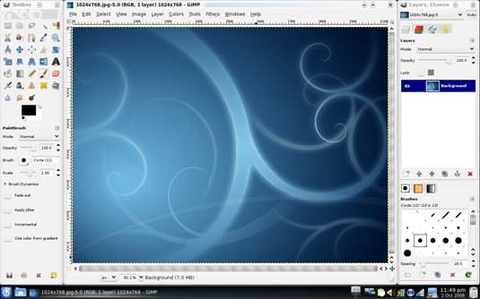
Photoshop is the epi-center of 2D computer graphics. I live and breathe the program, and love it to bits. But I have to say that it is expensive and can be overkill for many users - even professional graphics folk.
So I'd urge you to take a serious look at the open source gem GIMP. It is a full-featured pixel based editing program that is said to be about the equivalent of Photoshop a few versions back. Really, that ain't bad.
The fact that it is a free download is great. But that also means all upgrades are free, and you can have an entire team up and running on the same software in a few minutes. It runs on Mac, Windows and Linus. Also read: The 10 best alternatives to Photoshop.
06. You don't have to use Adobe
Staying on the same thread here for just a second, why stop at just a Photoshop replacement? If you're a bit adventurous, you can decide to install Ubuntu Studio. This is a spin-off dev project of the Ubuntu Linux operating system, which installs a whole suite of open source applications that replace Photoshop, Illustrator, InDesign and a host of other graphics programs. (Again, I love Adobe tools myself, but it's good to know there are other options.)
07. Cut your CHOPS
There is a term that is not heard as much any more, CHOPS. In old days it used to mean, roughly, your skill-set. In old day Photoshop terms, it referred to CHannal OPerations. Understanding and using CHOPs in Photoshop is one of the most important things you can do to up your graphics game.
As Photoshop has matured, the term can be applied to more things. For example, it used to just apply to alpha channels, but in today's Photoshop we can extend those skill sets to layers, layer masks, etc. Nesting masks is one of my favorite CHOPS in the last few years!
From 2D to 3D: the next seven tips are for those wishing to make the leap into the third dimension...
08. Blender
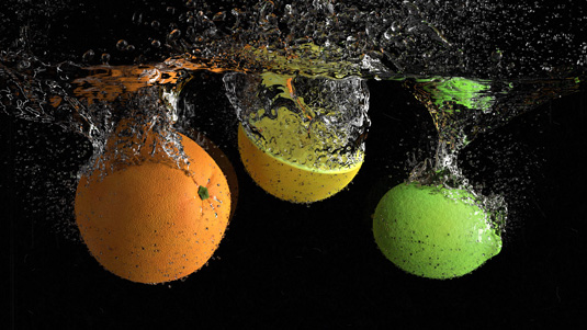
If you're new into 3D, or want to get your feet wet, there is no better tip than to download a free copy of Blender 3D, the open source app. It is hugely powerful, capable, popular, and affordable.
Don't worry about getting Maya, Max and their ilk until you go pro. Even then, there are many pros who are perfectly happy staying put with Blender. For more details read: 10 things you didn't know you could do with Blender.
09. Keep your scene simple
It's all too easy to get caught up in creating an entire scene in 3D. It can be an addictive process. We've all done it, and its time from your life you will never get back - trust me!
Instead, create what must be created in 3D, probably the foreground elements. Create the rest in 2D.
10. Don't be a purist
As with the last tip, don't be caught up with getting everything perfect in 3D. So as well as not creating your entire scene in 3D, don't become obsessed with making the perfect finished rendering.
In other words, do what must be done in 3D, but don't worry about anything that can be fixed later in post. Do all the other corrections like colour tweaks and tonal shifts in your 2D post-production environment, often either Photoshop or After Effects.
11. Discover Photoshop Extended
Another great way to do 3D on the cheap, and get your feet wet, is to upgrade to Photoshop's Extended version, which includes a nice breadth of 3D tools. While it's not a replacement for other 3d programs, it may give you enough of what you need.
12. Find a good 3D modeller
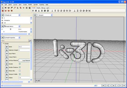
One quick and painless, and low-cost way to have it all is to use Photoshop Extended's 3D tools and simply supplement them with the one thing it really lacks, a 3D modeller.
There are many good 3D modeling applications out there. Here is a nice list of ones that are available for free.
13. Polygons vs Spline
Just jumping into 3D opens a world of "WTF?" questions. One common query is the difference between these two types of modeling. Both have benefits, and downsides.
The best way to describe it is to say that polygonal modeling is a lot like working in Photoshop, which is a pixel editor. Splines are just like bezier curves, only in 3D. So spline modelling is easier to scale up in size, or zoom into a model, and not see those nasty polygon edges (again, akin to pixel jaggies in Photoshop).
But like in Illustrator, changing the shape of beziers and splines requires more work and working within more restrictions.
14. Set realistic goals
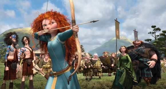
Modelling, texturing, and lighting are each specialities that can take years to master. But you can become functional at these and other tasks if your projects set attainable goals. When you're starting, choose easier 3D programs; don't expect to be churning out Pixar or Dreamworks movies for a while.
(That said, there are many really talented individuals and small teams that do spectacular work. So if you have that multi-discipline talent, don't set your goals to low either!)
Now we're into the home stretch: the last seven tips cover motion and animation CG work, for both 2d and 3d projects.
15. Multi-pass rendering in 3D
This technique is always one of my faves, because even though it puts a bit more work on the rendering queue, it can save you tons of time later - later as in, when you are on deadline and re-rendering 3d is not an option.
By breaking your render into many passes - diffuse, specular, occlusion, depth, separate lighting passes, and so on - you get to do your final visual “mix down” in your NLE or compositor in post.
16. Rendering depth of field in 3D
While many animation programs allow you render an image with a generated depth of field, this can often be a slow process. Plus, you are stuck with it once rendered.
Instead, render your animation, and then render out an additional depth of field, or 'Z-Depth' pass. In post you can use that pass to control the CG camera's focus, changing it as needed, or for creative effect.
17. Move it to post

Like we talked about before, the more you can move out of 3D and into the 2D realm, the more productive you will be. Programs like After Effects and the huge library of effects plugins available for it today are just amazing.
You can now create so many effects in post that used to need 3D to make. No more. Doing these effects in 2D is faster, interactive, and sometimes the effect actually looks better than the 3D option.
18. The difference between an NLE and compositor
It's not just newbies who get these two things confused. The differences between a non-linear editor, or NLE, and a compositing program seem quite subtle, until you start using them.
Editing is an art, which is why the Oscars give out an award for doing it very well. Editors (Apple's Final Cut, Adobe's Premiere, Sony's Vegas) tend to work long (or long-ish) form, and they tend to be used to bring in content produced elsewhere, like in a camera.
By comparison, compositor (Adobe's After Effects, Apple's Motion, Autodesk's Combustion and Smoke) tend to be used to produce shorter form work, and while it can import content also, content is often created right inside the program.
19. Best of NLE and compositor
While you can do either type of work in either type of program, if your choice is mismatched you will be pulling hair out of your head in short order. Instead, use both types of programs to enhance your productions and workflow.
Adobe makes this super easy, with links to allow taking projects back and forth between their Premiere and After Effects programs.
21. Blur is your friend
Unlike most other types of projects, in animation, blur is your friend. It helps you trick the viewer's eye/mind into thinking the animation is smoother than it actually is. Or that objects are moving faster than they actually are.
There are many types of blur. If making a 2D animation, you can soften the original artwork before importing it. Or you can use 'motion blur' effects that automatically add motion softness. You can even create long motion trails, the kind Superman or the Road Runner make when zipping past. Fun stuff!
Words: Lance Evans
Lance Evans is creative director of Graphlink Media. He has written books on 3D, and produced the 3DNY Seminars for Apple and Alias.
Win a trip to Los Angeles!
Masters of CG is a competition for EU residents that offers the one-in-a-lifetime chance to work with one of 2000AD's most iconic characters: Rogue Trooper.
We invite you to form a team (of up to four participants) and tackle as many of our four categories as you wish - Title Sequence, Main Shots, Film Poster or Idents. For full details of how to enter and to get your Competition Information Pack, head to the Masters of CG website now.
Enter the competition today!

Thank you for reading 5 articles this month* Join now for unlimited access
Enjoy your first month for just £1 / $1 / €1
*Read 5 free articles per month without a subscription

Join now for unlimited access
Try first month for just £1 / $1 / €1
Get the Creative Bloq Newsletter
Daily design news, reviews, how-tos and more, as picked by the editors.

The Creative Bloq team is made up of a group of art and design enthusiasts, and has changed and evolved since Creative Bloq began back in 2012. The current website team consists of eight full-time members of staff: Editor Georgia Coggan, Deputy Editor Rosie Hilder, Ecommerce Editor Beren Neale, Senior News Editor Daniel Piper, Editor, Digital Art and 3D Ian Dean, Tech Reviews Editor Erlingur Einarsson, Ecommerce Writer Beth Nicholls and Staff Writer Natalie Fear, as well as a roster of freelancers from around the world. The ImagineFX magazine team also pitch in, ensuring that content from leading digital art publication ImagineFX is represented on Creative Bloq.
