How to render interiors in 3ds Max
Walk through the process of building a 3D model of an interior from start to finish, with pro tips along the way.
Anyone who works in the worlds of architectural or interior design, and has need for 'artist renderings' of interior or exterior spaces, will be familiar with 3ds Max, published by industry giant Autodesk.
3ds Max is the default standard bearer for such work, not because it can't be done in other 3D programs - it can. But more likely because 3ds Max is so well integrated into Autodesk's other architectural and AEC industry packages, such as AutoCAD and Revit, which dominate their respective and related markets.
Creating an interior room in 3D can be approached a number of ways, but it breaks down into the following general steps (regardless of the program you use): modelling, scene building (which predominantly includes texturing and lighting), and rendering the final image, followed (usually) by post-production.
01. Modelling
This is the step where we create the room and all of the furniture that goes into it. Just like visiting a Hollywood set, people are often surprised when they see the actual models that make up a 3D illustration. The 'room' is often a terribly simple 3D geometry - more or less a hollow box, with any needed variations in shape. Push out an L-shape there for a dining area, knock out holes for windows and doors, maybe another hole in the ceiling that will later have a flight of stairs added beneath it, and so forth.
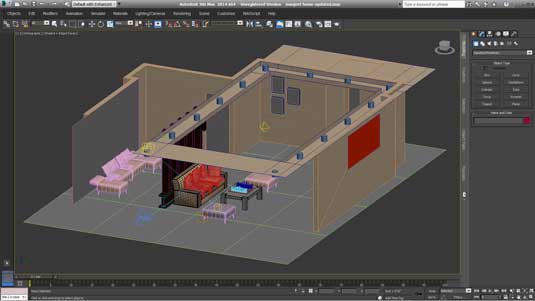
Modelling the room's architecture is usually not very hard, and can easily be done in 3ds Max without too much training or practice. This is often because room interiors are made up of lots of straight and reasonably simple shapes.
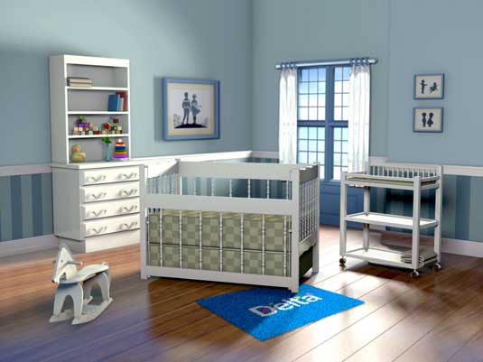
For example, in the 3D illustration at the top of the page, we have a room that is a simple box. To it we added a slight setback area on the back wall where the window is. And of course, we added the window itself. All of this was rather simple work. And even most of the furniture in this scene is pretty simple, containing mostly box-like shapes with straight lines.
Things get more complex, though, when we need to start populating the room with furniture and objects that make it all come alive. 3DS Max has all of the tools one would need to create such models, but learning how to use them, and in combination with one another to create exotic shapes, begins to get more complex.
Get the Creative Bloq Newsletter
Daily design news, reviews, how-tos and more, as picked by the editors.
The crib model in the centre gets a bit more complex, as the trim along the top required an undulating wave shape (created using lofting and boolean tools), and the spindles have a complex profile (created using revolve profile tools). Other items in the scene are still more complex: the rocking horse, curtains, and toy duck were all created using a range of toolsets.

While learning to model objects in a program like 3ds Max is no quick thing, there are shortcuts. One is to buy (or otherwise download for free) models that can be used in Max, thus avoiding large amounts of time spent modelling every item yourself.
Finding the freebies
Many models that are appropriate for interiors - from furniture and appliances, to doors and window dressings - can be found online and legitimately downloaded at little to no cost. Free models often need some work, and certainly need rescaling to fit your room dimensions.
Thousands of very high quality free models can be found at sites like www.archive3D.net. Another option is to purchase model sets from places like turbosquid.com, and digimation.com.
Purchasing a model tends to ensure a bit more quality and ease of use, but not always. You can even buy completely finished room sets, all set up for you and ready to render or animate, should a pre-fab suite your project needs.

02. Scene building
The scene building stage is where we take the raw models we assembled, and turn them into a room. First this means we scale and and put the models in place in the room. Then we begin to texture them. This is done using one of two methods.
The standard way is to bring in pixel-based images (usually prepped in Photoshop), which are then applied or "mapped" to the models. For example, an image with the texture of wood is applied to the floor. This can be done as a "planar" or flat projection map, which is appropriate for a floor texture. For other model shapes, texture maps can be applied in a cylinder or a sphere pattern.
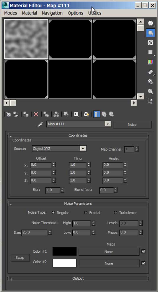
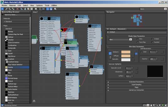
The other method of adding texture is to use "procedural" textures. These are patterns that are actually generated within the software and can have a wide range of modifying attributes that allow you to vary the image a great deal. These can also be animated over time in ways pixel based images cannot be. Wood, marble, and other standard textures are included in Max, plus a whole lot more.
Lighting the room
The last major step to scene building is to light the room. If you have a background in photography, film lighting, stage lighting, or are an environmental lighting specialist, all the better. Max gives you lighting styles that replicate the types of lights we work with in the real world.
These include directional lighting (aka, the sun), point lights (bare bulb lighting that would usually have lampshades applied), tube lighting (flourescent), and others. It also lets us bring in IES lighting data, which helps to generate real world lighting simulations, imperfections and all.
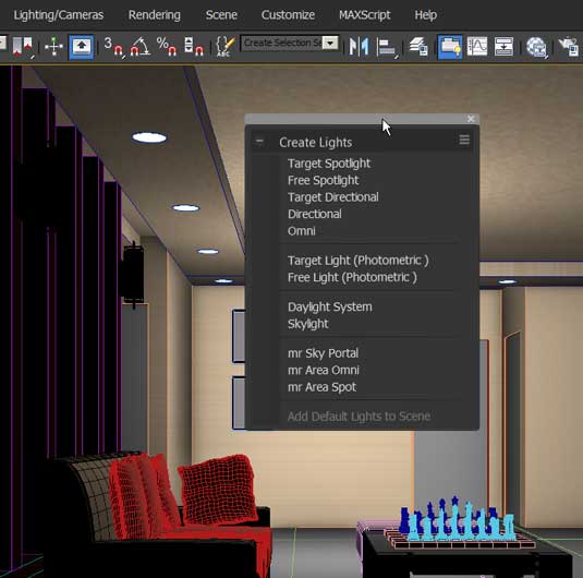
Lighting a scene is a fun experience. You can not only do most or all things you could do in the real world, but you can also do the impossible as well. For example, you can subtract light from areas, and you can render multiple passes with different lighting, and make your final decisions by compositing the renders in Photoshop.
03. Rendering
The rendering process takes all of the decisions you made along the way and uses that information to create a final rendering of the file. The texturing, the lighting, the geometry datasets... all come together in that final rendering. Except for the fact that there is hardly ever just one rendering.
There is almost always something that needs tweaking or didn't look quite right, so we go back again to fix and re-render. If you are new to 3D, get used to this.
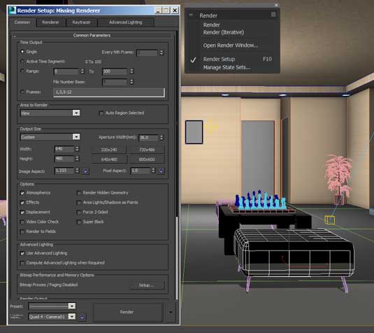
Part of what makes 3ds Max so popular with the architectural market is that it offers many rendering options, like radiosity and mental ray engines. A third party rendering engine called V-Ray is also a very popular option and used a lot in architectural work.
04. Post production
Let's add one more step here, because it is almost always needed. Post work. No matter how great you are, no matter what kind of 3D guru you have become, virtually all 3D work goes into post for tweaking. This can mean Photoshop for stills, or something like After Effects for animations. Fixing things in post is just faster and easier in most cases.
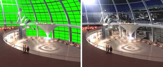
And as mentioned earlier, it is possible to render your scene in many passes and effectively offload much of the slow-moving decision process to post, where you can try out variations much faster.
For example, why not do a separate render for each light in the scene (or groups of lights)? Stack the resulting images in Photoshop (usually using the screen or lighten Blend Mode), and interactively build up your scene's lighting in post. This is particularly helpful in interior renderings that rely on the lighting to help make or break their success.
One last tip
Don't forget about depth of field when creating your interior masterpieces. Even if you want a sharp image, having infinite DOF is a sure way to spot CG. Take the time to render out a depth map pass and use it to bring more realism to your shot.
Where to learn more
- Rendering in 3ds Max with Mental Ray
- 30+ Autodesk 3Ds Max Interior Design Tutorials
- A good article on advanced lighting techniques
- Hands-on review: 3ds Max 2014
Resources for models
Words: Lance Evans
Lance Evans is creative director of Graphlink Media. He has written books on 3D, and produced the 3DNY Seminars for Apple and Alias.
Delivered in conjunction with ZED!
This content was produced in collaboration with HP & Intel as part of ZED - a Pop-Up Studio for the Creative Community held in Soho, London. For more information about ZED and any future events see here.

Thank you for reading 5 articles this month* Join now for unlimited access
Enjoy your first month for just £1 / $1 / €1
*Read 5 free articles per month without a subscription

Join now for unlimited access
Try first month for just £1 / $1 / €1

The Creative Bloq team is made up of a group of art and design enthusiasts, and has changed and evolved since Creative Bloq began back in 2012. The current website team consists of eight full-time members of staff: Editor Georgia Coggan, Deputy Editor Rosie Hilder, Ecommerce Editor Beren Neale, Senior News Editor Daniel Piper, Editor, Digital Art and 3D Ian Dean, Tech Reviews Editor Erlingur Einarsson, Ecommerce Writer Beth Nicholls and Staff Writer Natalie Fear, as well as a roster of freelancers from around the world. The ImagineFX magazine team also pitch in, ensuring that content from leading digital art publication ImagineFX is represented on Creative Bloq.
