How to extend a set with 3D matte painting
Lance Evans walks us through a scene redo in which the background is extended using 3D matte painting.
Most of us know about matte painting, right? It's where artists would paint a matte (which used here basically means a flat board) to be used as a background extension or special effect in a film production. Some of the most famous matte painting was the work done on the original Star Wars movies, but there have been many great ones before and since.
The problem with creating a 2D matte painting is that you're largely relegated to a locked down camera. If the camera were to move too much, then many of the elements would have a shift in perspective, thus rendering the visual trickery useless.
With the technologies of 3D generated images, and image tracking tools, we can now patch moving footage as well. Adobe After Effects' tracking has seen a big improvement in recent versions, which allows it to do the most amazing things (things that are, unfortunately, out of the scope of this article).
Reasons for the redo
We are going to look at a not-too-uncommon example of a scene that needs redoing. In part, the redo is because the original production had a background plate that was shot in Standard Def (SD), which is not very usable today. Other reasons were the need to update the talking head model used in the foreground, which was re-shot new for the update.
As can be seen in the first image (below), we have a background in SD that will need to be extended off to the right. We will need to generate fill-in content that was never shot in the original video.
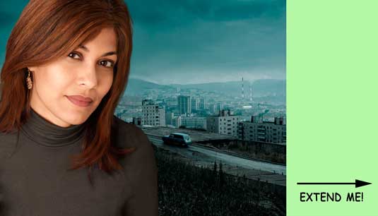
The clip is only a few seconds long, but it moves in a way that eliminates a 2D matte painting as a solution. How can we create the new content as easily as possible?
The first step is to set up our scene in our 3D application. I'll be using Maya, which let's us bring an image or video into the Camera as a backplate. We will start to build our extension in front of that, in the space between the backplate and the camera.
Get the Creative Bloq Newsletter
Daily design news, reviews, how-tos and more, as picked by the editors.
While it's tempting to keep all of those 3D elements as close to the backplate as possible, keep in mind that as the video advances in time, we may need room to move our geometry around to accommodate.
Two sections
You can see that the video footage has a foreground of a car on a road and some buildings, as well as a background city scene. To make my job a bit easier, I treated these two sections separately.
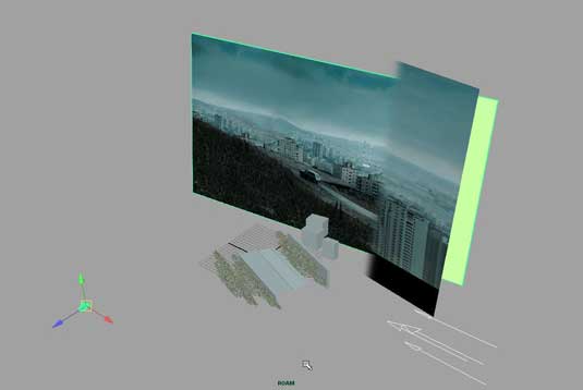
My thinking was this: far away elements only have minor perspective issues, and besides, who wants to start modeling a whole city? So I created a traditional matte painting in Photoshop, and attached it to a flat panel in Maya (by the way, for a great book on the subject , check out Dave Mattingly's Digital Matte Painting handbook).
Lighting
This panel was placed close, though not actually on, the video backplate. There are a few ways to go about lighting this panel. Some self-illumination is a clean way to go, but there seemed to be a color shift. Also, you will not that the left side of the matte painting image is feathered, to eliminate any hard edge transitions.
This caused some issues in self-illuminating in Maya as well, so I ended up just lighting it with an ambient light. The light was set to only illuminate this one panel, nothing else. And the panel was set to only accept light from this one light, and not the other light in the scene, a directional coming from the far right.
Modelling
The next step is to get into a bit of modelling by creating a simple piece of geometry to extend the roadway, and the embankments on either side of it. There is also a wall a bit further back, and finally some buildings. Again, since these items were all in the foreground, as the video progressed, they would not work as a matte painting.
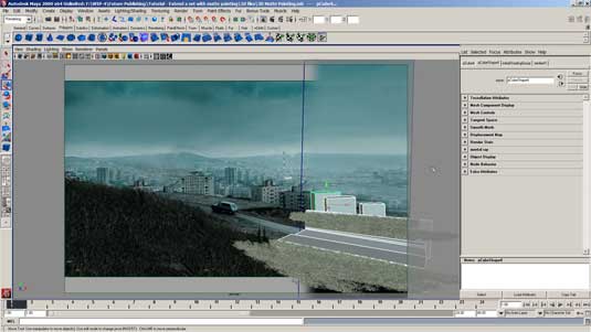
Finally, the foliage on both sides of the roadway needs to be extended. Since I am using Maya, I take advantage of its Paint Effects tools to paint in some grassy areas. I change its specs and color to better match the foliage in the video, and then duplicate it a few times to fill in the spaces.
If I were not doing this in Maya, and didn't have Paint Effects, I would probably have created a few panels with grass textures and transparency maps applied. This older-school technique would work as well, if less elegantly.
You can see all of the elements in place in the camera view screen grab (above). And you can see a rough render dropped in place in the compositor in the last shot (below).
While I do not have a finished textured render to share on this work-in-process project, you can see how it would finish up.
After adding appropriate textures to the geometry, I would feather the edges here as with the matte panel, to ensure seamless integration into the video material.
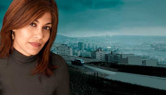
Words: Lance Evans Model: Sharm Rambissoon
Lance Evans is creative director of Graphlink Media. He has written books on 3D, and produced the 3DNY Seminars for Apple and Alias. See all the articles in this series here.
Win a trip to Los Angeles!
Masters of CG is a competition for EU residents that offers the one-in-a-lifetime chance to work with one of 2000AD's most iconic characters: Rogue Trooper.
We invite you to form a team (of up to four participants) and tackle as many of our four categories as you wish - Title Sequence, Main Shots, Film Poster or Idents. For full details of how to enter and to get your Competition Information Pack, head to the Masters of CG website now.
Enter the competition today!

Thank you for reading 5 articles this month* Join now for unlimited access
Enjoy your first month for just £1 / $1 / €1
*Read 5 free articles per month without a subscription

Join now for unlimited access
Try first month for just £1 / $1 / €1

The Creative Bloq team is made up of a group of art and design enthusiasts, and has changed and evolved since Creative Bloq began back in 2012. The current website team consists of eight full-time members of staff: Editor Georgia Coggan, Deputy Editor Rosie Hilder, Ecommerce Editor Beren Neale, Senior News Editor Daniel Piper, Editor, Digital Art and 3D Ian Dean, Tech Reviews Editor Erlingur Einarsson, Ecommerce Writer Beth Nicholls and Staff Writer Natalie Fear, as well as a roster of freelancers from around the world. The ImagineFX magazine team also pitch in, ensuring that content from leading digital art publication ImagineFX is represented on Creative Bloq.
