Intelligent character design: 9 pro tips
How do you create a character that engages and inspires your audience? Antony Ward offers some expert tips.
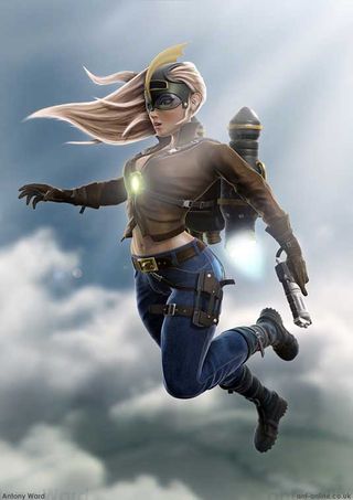
Creating a character may seem like an easy task. Scribble down some ideas, make them look cool and then build them - job done. In reality it’s nowhere near as simple as this, if it was everyone would be doing it. If not planned and thought out correctly your creation could suffer from being bland and uninspiring, and that’s before you begin fleshing them out in 3D.
What follows are a handful of tips to get any aspiring character artist ready to give birth to the next CG superstar.
01. Research your character
Before you build your first polygon it’s a good idea to get to know your character a little. Take them out, buy them lunch and bond if you must, but you can only truly develop the way a character looks once you understand them.
As an example, if your character likes to eat all the wrong, but oh so tasty foods, and spends his life glued to the sofa, the design should reflect this with him appearing unfit and overweight.
02. Find good source material
As you design, with crayons in hand, surround yourself with reference material relevant to your character. If they are to wear a biker jacket for example, have some real life examples to refer to.
If you are creating something based on a real world object or item, it’s important to study them first. As humans we naturally compare what we see with real world items that we know, so if your design is off even a little it will be noticed.
03. Don't be generic
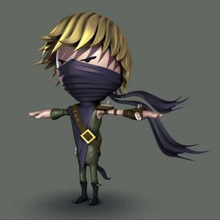
It can be easy to fall into a stereotype trap when designing your character, even if you don't mean to. We are all used to seeing mechs, soldiers and busty babes of all style’s so don't let your creation fall into the “been seen before” category.
Get the Creative Bloq Newsletter
Daily design news, reviews, how-tos and more, as picked by the editors.
If you do have to create someone in an often-seen genre, give them a twist or a hint of something different. This will make your work stand out from the crowd and be noticed.
04. Personality through design

Even though you have this character pretty much nailed in your imagination, you should still share some of their secrets through their design. Perhaps they have a tattoo of an ex-lover, or wear a jacket which ties into their hobby. Maybe they have a pink bunny squashed into their chest pocket.
All these items will catch the viewer’s attention and make them ask “Why?” Just be sure you have a convincing back story ready, as a random item may just look out of place.
05. Plan your approach
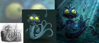
You know how your character lives and breathes, and also what makes them tick, but you can't dive into the virtual world just yet. It’s always a good idea to sit and plan your approach before you start working.
This could be dictated to you by the project, the target platform, or by the design itself, but a solid pipeline will remove many of the risks usually associated with a project. Particularly when working with those indecisive individuals - you know who you are.
06. Start big and bold
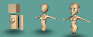
When the time has come to begin fleshing out your design, don't rush ahead and focus on one area initially. Spending the majority of your attention on the head, for example, will mean the rest of the body becomes neglected and then issues may arise with proportions and topology.
Block out the whole character first using basic shapes before then working in gradual detail passes. Each of these passes should focus on smaller and smaller details until you eventually find the character is complete.
07. Work with less geometry
It’s always better not to overload yourself with too many polygons or vertices. If you’re working with Subdivision Surfaces in particular, having too many edge loops can cause unwanted bulges or pinches.
If you find this happening don't be afraid to strip out a handful of loops and reassess. Often you'll find that simplifying a problem can make it much easier to solve.
08. Always have clean topology
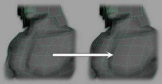
You can get carried away when working - we all have - and before you know it you have nGons and triangles all over the place. This is all well and good but bad topology is the single most common cause of baldness among digital artists - fact!
There is nothing worse than receiving a model from a fellow artist which has bad edge flow, and what seem to be random cuts across the surface. I can hear your mum nodding in agreement when I say - tidy as you work!
09. Good edge flow for animation
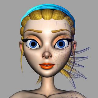
Most characters need to perform well on stage, and in order to portray that perfect academy award winning emotion they must also deform convincingly. As they move, their geometry should deform as you would expect it to, and this is never as important as with the face.
A good rule to work by is to allow your main edge loops to match the outlines of real muscles. By doing this you will ensure your model deforms in a realistic and flexible way.
Words: Antony Ward
Antony Ward has been provoking pixels since the early 1990s. In that time he has worked for some of today’s top studios, written three books and created many tutorials both online and in print. You can find him lurking online at ant-online.co.uk and follow him at any of these places: Twitter, Facebook or Google+.
Delivered in conjunction with ZED!
This content was produced in collaboration with HP & Intel as part of ZED - a Pop-Up Studio for the Creative Community held in Soho, London. For more information about ZED and any future events see here.

Thank you for reading 5 articles this month* Join now for unlimited access
Enjoy your first month for just £1 / $1 / €1
*Read 5 free articles per month without a subscription

Join now for unlimited access
Try first month for just £1 / $1 / €1
The Creative Bloq team is made up of a group of design fans, and has changed and evolved since Creative Bloq began back in 2012. The current website team consists of eight full-time members of staff: Editor Georgia Coggan, Deputy Editor Rosie Hilder, Ecommerce Editor Beren Neale, Senior News Editor Daniel Piper, Editor, Digital Art and 3D Ian Dean, Tech Reviews Editor Erlingur Einarsson and Ecommerce Writer Beth Nicholls and Staff Writer Natalie Fear, as well as a roster of freelancers from around the world. The 3D World and ImagineFX magazine teams also pitch in, ensuring that content from 3D World and ImagineFX is represented on Creative Bloq.
