Paint a classic film poster in 14 steps
Discover the painting processes that go into illustrating retro film posters with this walkthrough.

For this workshop I'll paint a retro film poster-style illustration. Vintage posters used to be painted or airbrushed on canvas or illustration board, and I'll use a technique inspired by the great Drew Struzan. It's based on airbrush painting with acrylic colours to build up the colour and shadings, and then colour pencils for rendering out the lighter parts and adding details.
For this I usually use the same mediums, but here I'll be doing a mix of traditional and digital. Often an illustration needs to be changed during or after the process – working digitally makes this significantly easier.
Each step is equally important to get the end result we want
Starting off with a traditional drawing on paper, I'll do the colouring and final rendering in Photoshop as well as adding different textures and so on. But first we need to get the idea and composition done. Each step is equally important to get the end result we want.
Since it's a classic 1980s fantasy film theme, I'll make a composition of some of the famous characters from the era, keeping in mind where the text and titles are to be placed on the cover.
Researching reference pictures with the ImagineFX team is crucial as they need to be instantly recognisable. I usually come up with an idea, make a rough sketch, move on to the drawing, scan it and do the colouring in Photoshop. The colour scheme is a classic blue and orange-yellow theme that's often used in film posters.
01. Composition and rough sketch
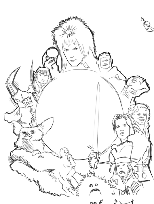
During this early stage I think of composition, colour theme and content. Since the main words on the cover will be placed in the middle, me and the IFX team decide on a circular composition. Some film posters are built up by different elements, like a collage, and I want to recreate this same feeling. So using photo references I make a rough sketch in Photoshop.
02. Full-size drawing

I decide to make the final illustration about double the size of the cover, which enables me to bring in lots of details. I use my references to create a full-size drawing using lead pencil and a heavy-weight illustration paper. It's important to be confident at this stage and to emphasise the characteristics of the actors or creatures, as well as creating good contrast.
Get the Creative Bloq Newsletter
Daily design news, reviews, how-tos and more, as picked by the editors.
03. Scan and prepare the document
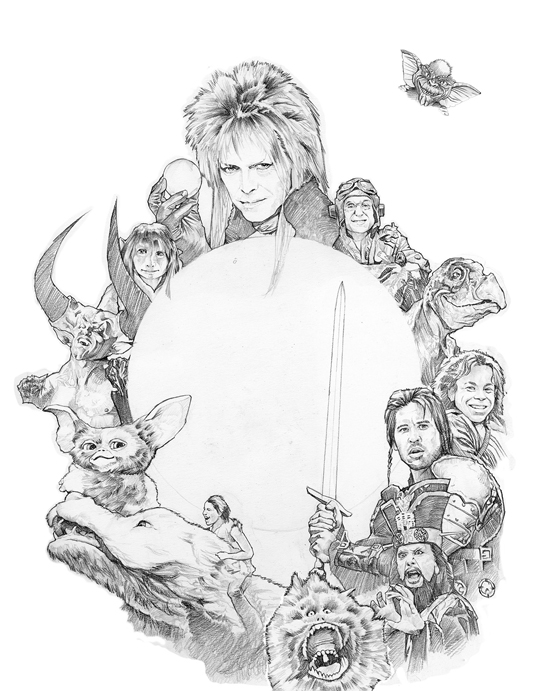
I scan the drawing in sections using a flat-bed A4 scanner. A setting of 600 DPI captures the details. In Photoshop I go to File>Automate>Photomerge and choose my scanned sections. This automatically merges all images and blend them together on separate layers. I create a new document (50x70cm and 300 DPI), drag the sections into it and merge them to one layer.
04. Start colouring
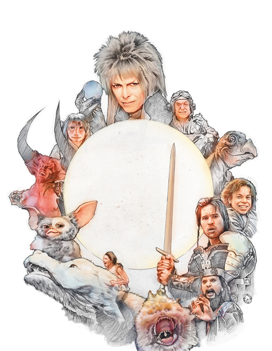
Now I make another layer and begin to do the colouring. This is done with the standard Soft brush, at about 10-20 per cent Opacity or less, and I carefully build up the colours. I usually start with the skin tones and lighter areas, and gradually move on to the darker parts of the painting from there.
05. Ensure the edges are sharp
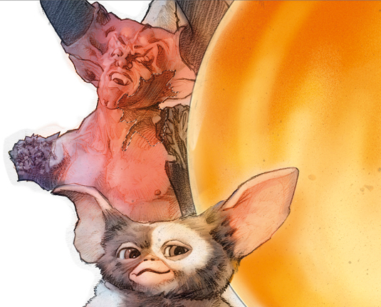
I mask off certain areas with the Lasso tool to achieve sharper edges, much like airbrushing in real life. I don't build up too much colour because I still want to see the drawing underneath, which is my guide and makes everything look more alive. I'm not working with details at this stage. Rather, I'm finding the right values from studying my references.
06. Background colouring

Now I move on to the background and paint this in the same way as the characters. Later I'll add textures to make it look more alive and painted. A glow effect will surround the character group and so I leave that part lighter here. The corners and edges fade into near-black.
07. Rendering the details
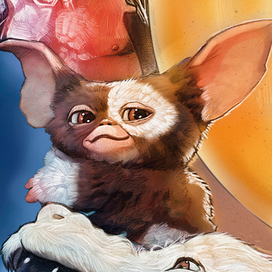
Now I concentrate on the details. This is where I traditionally would have used colour pencils, so I create a lightly textured brush. After establishing a new layer I set the brush's Opacity to about 80 per cent and Size to about the same as the lines in the drawing. I usually start with areas such as eye reflections and shiny armour, since I know that they'll be the brightest parts of the painting.
08. Draw with confidence

Working through the whole image, I use a lighter version of the base colour for each part. Again, my drawing needs to be confident and in the right places, also showing how objects are affected by coloured light sources. This is time-consuming, but also rewarding because I can start to see a more finished result. For the background I increase my brush size slightly.
09. Tinting techniques

Tinting is used to help blend colours together and to develop, for example, coloured light. Create a new layer and choose Color in the Layer Mode dialog. I use the standard Soft brush and tint the character group slightly blue around the border of the blue background, while a yellow-orange on the inside blends them with the glowing crystal ball.
10. Reflections and glow
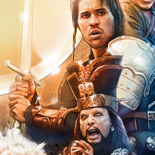
For a glow effect I use the standard Soft brush on a new layer, with Opacity set to between 20 and 40 per cent, and make soft dots where I want highlight to glow. I don't overdo this effect – less is more. On the same layer I use the Path tool to draw some reflections on the crystal ball. I convert the path to a selection and fill it with white. Once I make a layer mask, I'm able to control the Opacity by painting either black or white in the mask.
11. Who's inside the crystal ball?
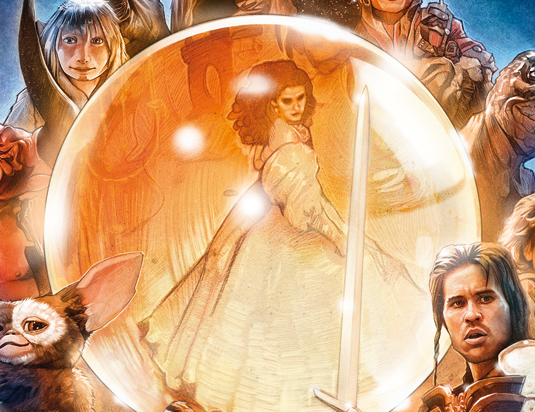
I need to develop the crystal ball element for the subscribers' version of the cover, which doesn't have text on it. So I paint Jennifer Connelly from the film Labyrinth. I create it in the same way as the rest of the illustration. Again, this shows the convenience and flexibility of digital painting.
12. Add noise and textures
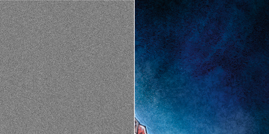
I make a new layer and fill it with 50 per cent grey, then add 10-15 per cent Noise. I set the layer to Overlay and adjust the Opacity slider to 30 per cent. Gaussian Blur softens the noise. The watercolour texture is made by painting black watercolour on to wet paper. When dry, I scan the texture into Photoshop, and drag it to a new layer with Layer Mode set to Multiply.
13. Colour splashes
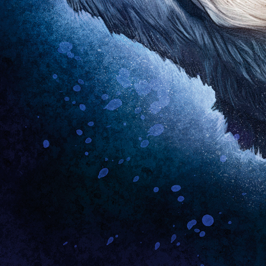
I splash some colour onto a new paper. After scanning, I open the image in Photoshop and drag it on to a new layer. I go to Image Adjustments, click Invert, then choose Screen as its Layer Mode. I go to Image Adjustments Levels and drag the black slider until only the colour splash dots are visible. Then I go to Image Adjustments Hue/Saturation and click Colorize.
14. Final adjustments
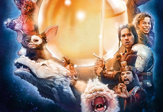
I make a new Adjustment layer and choose Hue/Saturation. I adjust any colours that need to be more or less saturated and change hues by choosing the colour in the drop- down menu and adjusting either hue or saturation. The illustration is now finished. I merge all layers, except the troublesome Gremlin, and save it as a PSD file.
This article was originally published in ImagineFX issue 132.

Thank you for reading 5 articles this month* Join now for unlimited access
Enjoy your first month for just £1 / $1 / €1
*Read 5 free articles per month without a subscription

Join now for unlimited access
Try first month for just £1 / $1 / €1
