These in-store creations brighten up the retail giant.
(Image credit: Walmart)
The recent refresh of US superstore Walmart's branding got people talking. The word 'refresh' is operative here. This wasn't a splashy new logo or big sweeping changes from agency JKR, it was more subtle logo tweaks and a new typeface. We called it the "definition of a glow up".
One area that I think has been overlooked are the new illustrations that have been created by Ross Murray, Nash Weerasekera,Peter Greenwood, Jason Solo and Kelly Llanos. These add a personal touch to the brand refresh and really brighten up the stores when seen in-situ. In fact, I'd go as far to say that they're my favourite part of the new look.
Although they are by five different artists, they definitely feel part of a cohesive identity, with Walmart's blue and yellow tying everything in together. I really like the use of animation to bring them to life, too.
Latest Videos From Creative Bloq
Some are more detailed, like the above scene that shows two Walmart vans, shopping bags and I presume website, yet still doesn't feel like it's shoving the Walmart brand down your throat. The line feels carefully placed and I like the way the shadows are in light blue.
Other animations focus on brand icons, which show off the breadth of what Walmart offers (no guns included!). There are flowers, a candle, hammer, some vitamins, makeup and books. Again, these feel like a cohesive set despite the range of products.
Image 1 of 5
(Image credit: Walmart)
(Image credit: Walmart)
(Image credit: Walmart)
(Image credit: Walmart)
(Image credit: Walmart)
Elsewhere, different illustrations show people interacting with Walmart in different ways, from shopping online to being seen at the pharmacy.
Image 1 of 4
(Image credit: Walmart)
(Image credit: Walmart)
(Image credit: Walmart)
(Image credit: Walmart)
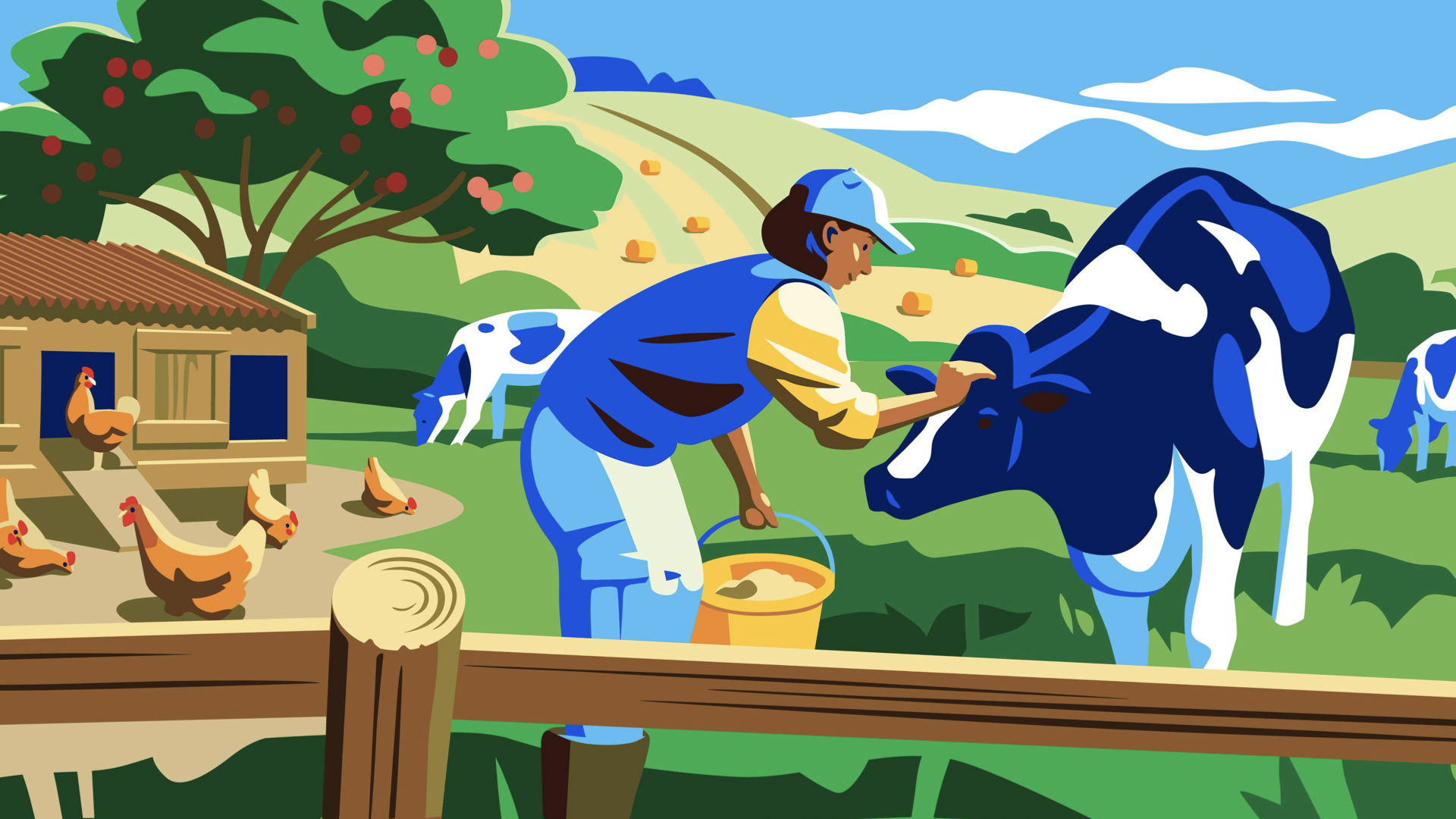
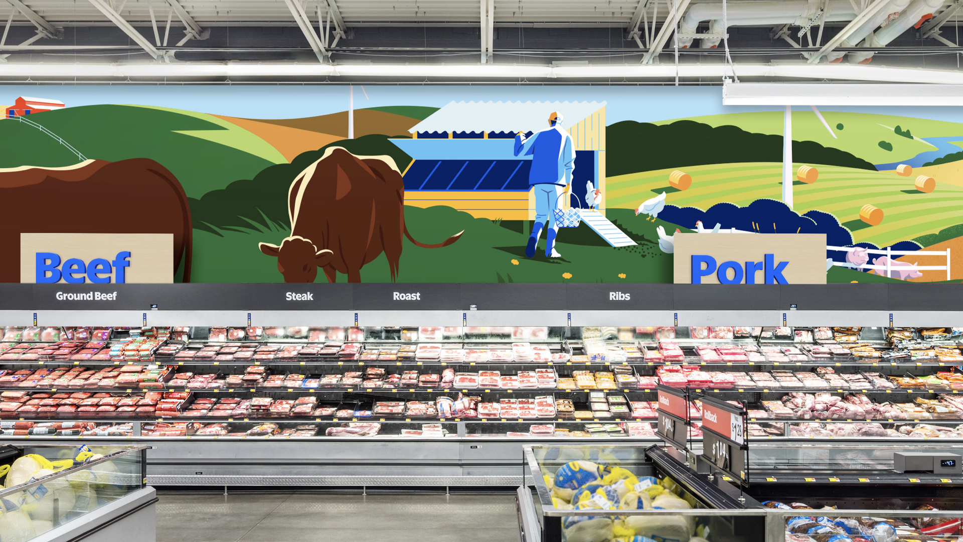
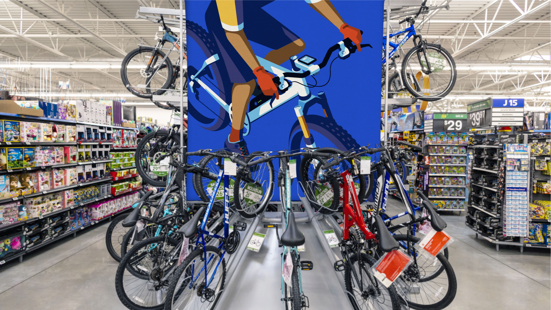
More illustrations show different parts of a Walmart store, including a pharmacy, meat counter and cycling section. I think the farm scenes are my favourite. They showcase a connection to where meat comes from, which is not always seen in supermarket chains.
Get the Creative Bloq Newsletter
Daily design news, reviews, how-tos and more, as picked by the editors.
Are these illustrations groundbreaking? Probably not, but that's arguably not what's needed for this brief, and what they do, they do very well.
For more on the Walmart refresh, see our piece on designers' reactions to it. To feast your eyes on more brilliant illustration, see the winners of the 2024 Brand Impact Awards, which include JKR.
Thank you for reading 5 articles this month* Join now for unlimited access
Rosie Hilder is Creative Bloq's Deputy Editor. After beginning her career in journalism in Argentina – where she worked as Deputy Editor of Time Out Buenos Aires – she moved back to the UK and joined Future Plc in 2016. Since then, she's worked as Operations Editor on magazines including Computer Arts, 3D World and Paint & Draw and Mac|Life. In 2018, she joined Creative Bloq, where she now assists with the daily management of the site, including growing the site's reach, getting involved in events, such as judging the Brand Impact Awards, and helping make sure our content serves the reader as best it can.
You must confirm your public display name before commenting
Please logout and then login again, you will then be prompted to enter your display name.