How to use the rule of thirds in art
The rule of thirds will elevate your composition, whatever your subject matter. This is how to use it effectively.
By following the guidelines and intersections created by the rule of thirds, you can more easily create compositions that are asymmetric and much more dynamic.
Now we've seen the rule of thirds in action in other artists' paintings, it's time to show you how you can use the rule of thirds to create your own art. These three quick tutorials show you how the rule can be applied to a still life painting, an architectural drawing and a figure painting.
The rule of thirds in still life
Our first demonstration uses the rule of thirds to compose a still life painting.
01. Set the scene using the rule of thirds
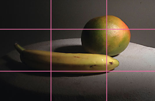
Begin by arranging your objects so that the composition lines up with the guidelines and intersections created by the rule of thirds. The banana and shadow here follow the bottom guideline while the highlight on the mango falls on the upper-right intersection, creating a dynamic focal point.
02. Use intersecting guides
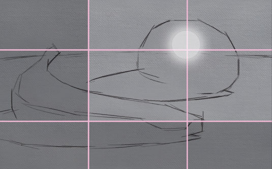
The next step is to create the drawing using the intersections as guides. Creating a value thumbnail now also means you can plan your dark value composition. Here, the lower and left thirds are dominated by darks while the bright highlight in the upper section creates a dynamic focal point.
03. Block in
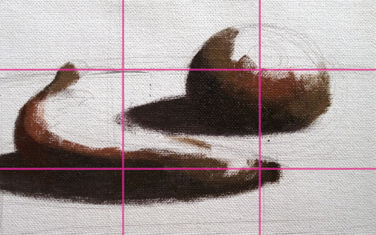
Begin the painting by blocking in the dark shadows and adding more saturated colours into the shadows and transition tones. To make the composition more dynamic and asymmetric, straighten the drawing of the banana’s shadow. This gives it a stronger horizontal alignment with the bottom guideline.
04. Add colour
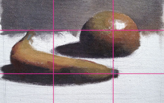
Next, add the half-tone shapes and more colour. Here the upper third is entirely a dark mid-tone that will help to frame the highlight focal point. Straighten the curve of the table surface so that it lines up with the upper guideline and creates a more asymmetric value composition.
05. Make final touches
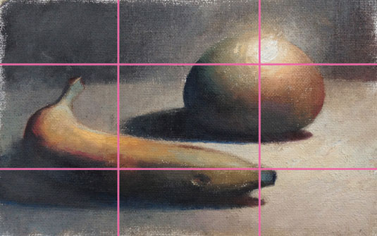
To complete the painting, add light tones, highlights and finishing touches. The light on the table surface fills out the lower two-thirds of the composition. Thicker and brighter paint and technique variation are added at the highlight, which really draws the eye to the main focal point.
Urban landscape
The next demonstration is an urban landscape painting that uses the rule of thirds to play with height in the architecture.
01. Align the reference image with the grid
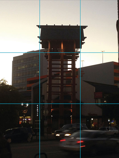
Here we slightly 'break' the rule of thirds by using it in a vertical or portrait orientation. The reference photo here shows that we will have to align the central structure with the right vertical guideline to give more asymmetry and counterbalance in this composition.
02. Draw and design

Begin the painting with the drawing and design. In the drawing, move the centre object to the right so that it lines up with the right vertical guideline. Similarly, design the other elements in the bottom of the composition to line up with the lower guideline.
03. Lock in major elements
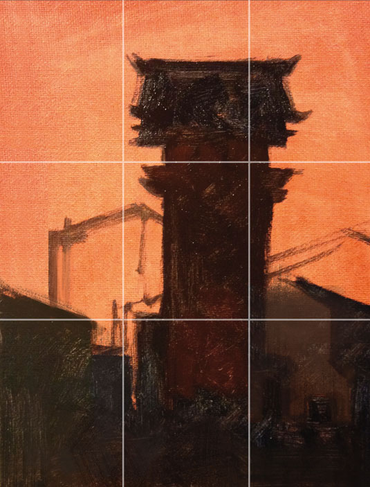
Next, block in the darks and add colour in the shadows. This step helps you to lock in the major elements of the composition such as the central focal point and the dark lower thirds section. This creates an interesting tension with the upper two-thirds of light.
04. Build in half-tones and lights
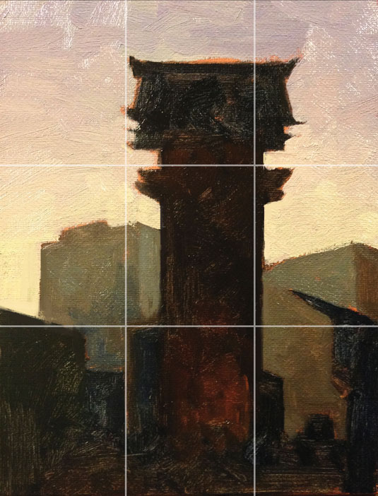
Next, add half-tones and lights. This locks in the major elements of the design and composition. The tower focal point lines up nicely with the right guideline and the darks with the lower guideline. The colours in the sky also add colour and value contrast with the darks in the lower third of the picture.
05. Add final details
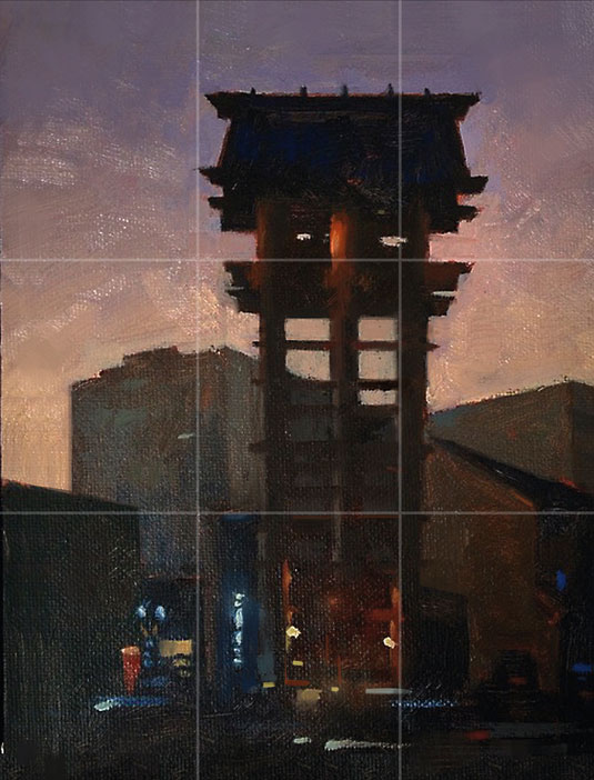
To complete the painting, add details in the dark foreground along with more colour and technique variation. This also creates more depth and movement. Clean up the shapes in the central tower structure and use the upper guideline to help you place the small details and horizontal beam shapes.
06. Use sub-divisions
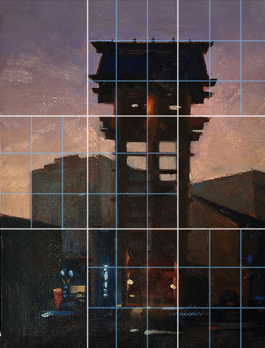
This image shows how the rule of thirds is sub-divided in this painting. The top of the tower lines up with a guideline. The central elements line up nicely with a guideline. And many of the lower details, colours and small strokes line up with guidelines in the lower section.
Figure painting
This last example is an action-packed figure painting in watercolour, which uses an asymmetric composition based on the rule of thirds to emphasise the thrust of the image.
01. Line up the main action
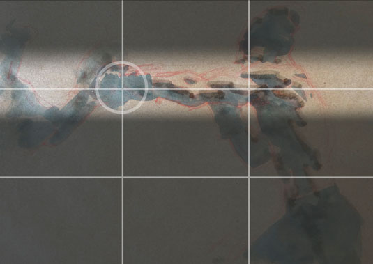
Begin the drawing and shadow block-in by using the upper guideline to line up the main action of the pose. This sets up a dynamic, asymmetric composition. Line up the face with the right-vertical guideline to create a secondary focal point.
02. Create an asymmetric counterbalance
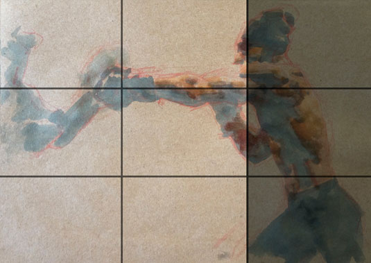
Next, block in the dark and light half-tones, add as much colour as possible and begin to soften the core shadow edges. Having the dark shadows and half-tones dominate the right thirds of the composition creates an asymmetric arrangement of value. This helps to counterbalance the main focal point.
03. Add highlights
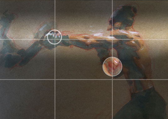
Next, add the highlights. Since the highlights fall on the upper guideline, it helps reinforce the composition. Add highlights on the main focal point, too. To counterbalance the image, add intense red colour along the right-vertical guideline. Now you have a simple and dynamic arrangement of values and colour.
04. Make the final touches
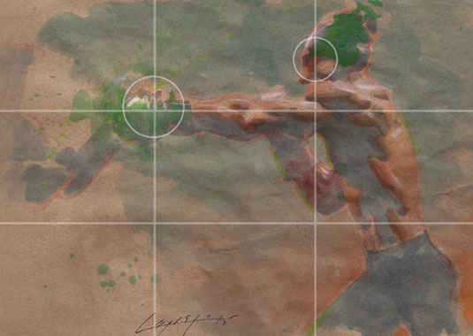
To complete the painting, add more colour to the focal point hand, along with variation in technique to really draw the eye to the punching hand. For counterbalance, add saturated reds to the eyes in shadow. This gives the image a secondary focal point and a dynamic eye-flow to the composition.
Digital images courtesy of the Getty’s Open Content Program. This article originally appeared in the How to Paint and Draw bookazine from ImagineFX. Subscribe to ImagineFX here.
Read more:
- Pencil drawing techniques: Pro tips to sharpen your skills
- Art techniques: Expert tutorials for painting and drawing
- Pencil shading techniques: 5 expert tips

Thank you for reading 5 articles this month* Join now for unlimited access
Enjoy your first month for just £1 / $1 / €1
*Read 5 free articles per month without a subscription

Join now for unlimited access
Try first month for just £1 / $1 / €1
- 1
- 2
Current page: How to use the rule of thirds in your art
Prev Page Traditional art and the rule of thirdsGet the Creative Bloq Newsletter
Daily design news, reviews, how-tos and more, as picked by the editors.

Chris is obsessed with figure drawing and painting. He loves sharing great information on art, picture-making and topics like which paint brush to use.
