How to draw a scene in graphite
Drawing a whimsical aviation scene in graphite – from thumbnail to final.
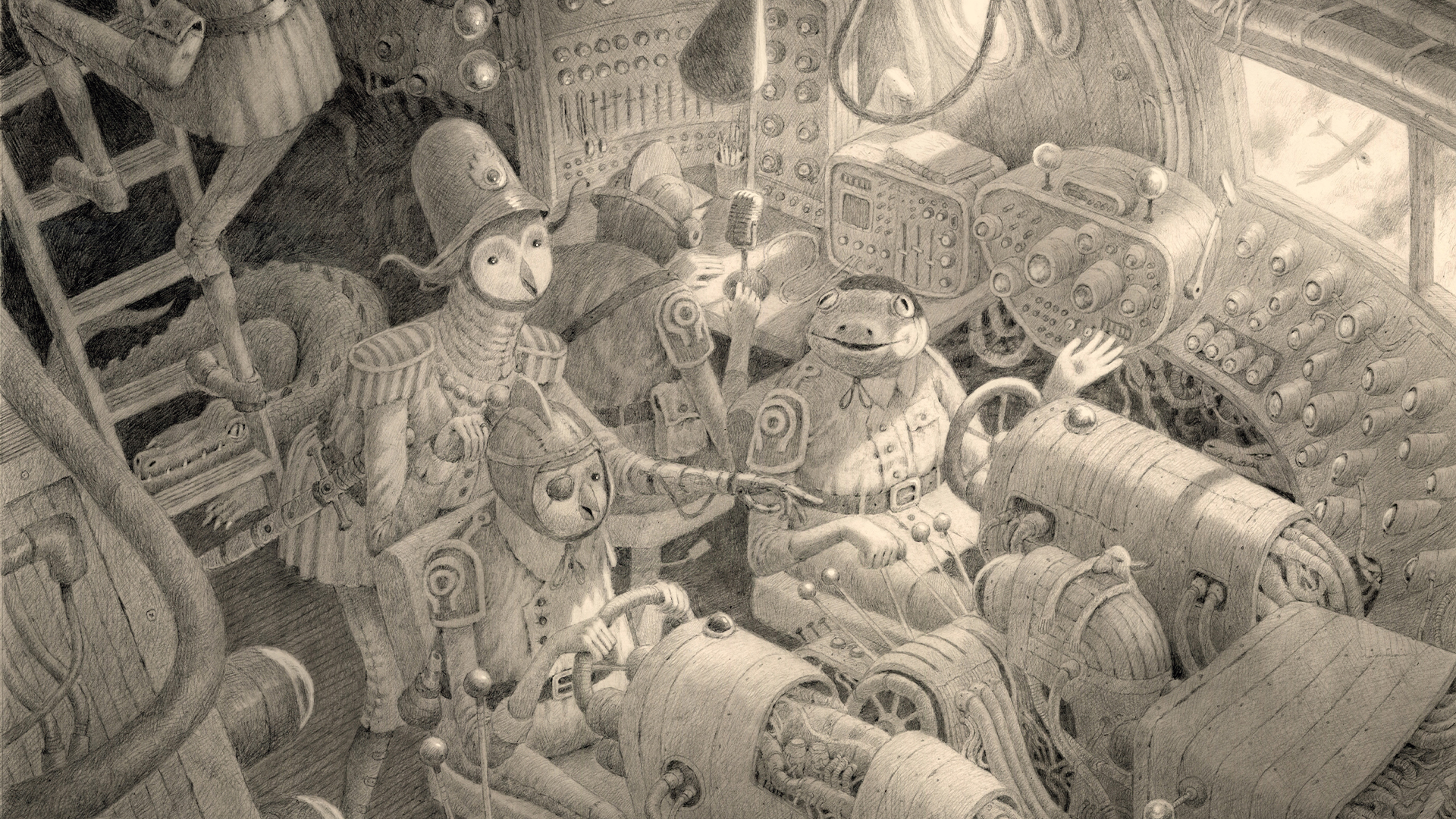
Graphite has always been the go-to medium for me. I love the way it feels on paper, and the myriad of textures and techniques I can get from it. Working traditionally forces me to learn and adapt. I can’t simply undo a line or delete a layer: I have to work around my mistakes or confront them head‑on, and I find that so exciting!
In this workshop, you will see how I plan and build up my drawing in stages. I’ll show you my process for thumbnailing, rendering, and adding final touches.
Click the link to buy the product
Pencils
- Graphgear 500 (0.3‑0.7mm)
Miscellaneous
- Soft paper towels
I grew up around airplanes and lots of goats and chickens, so my work often centres around aviation and anthropomorphic animals, typically birds. So this piece will be a love letter to both, in the form of a whimsical flight deck run by strange avian creatures.
For materials, I primarily work with mechanical pencils on Bristol paper. I’m not too picky about the pencil model, as long as it’s durable and can reliably hold the graphite. I use a combination of cross-hatching and blending in my work. For blending, I use soft paper towels or brushes. I generally avoid using tortillons (blending stumps): I find they make unpredictable markings.
My studio sits inside a remodeled shed, and is full of old things that fascinate me. I’m always collecting antique art supplies I can use; my ruler is 120 years old. I’m a fan of the old and the handmade, and I try to imbue those qualities into my work.
I try very hard to get my reference and inspiration from the real world. I build dioramas and maquettes for reference, and I collect photo reference books by the dozen. The Generative AI controversy has really pushed me away from the digital world, and has led me to appreciate art and life beyond the screen.
01. Start working on ideas
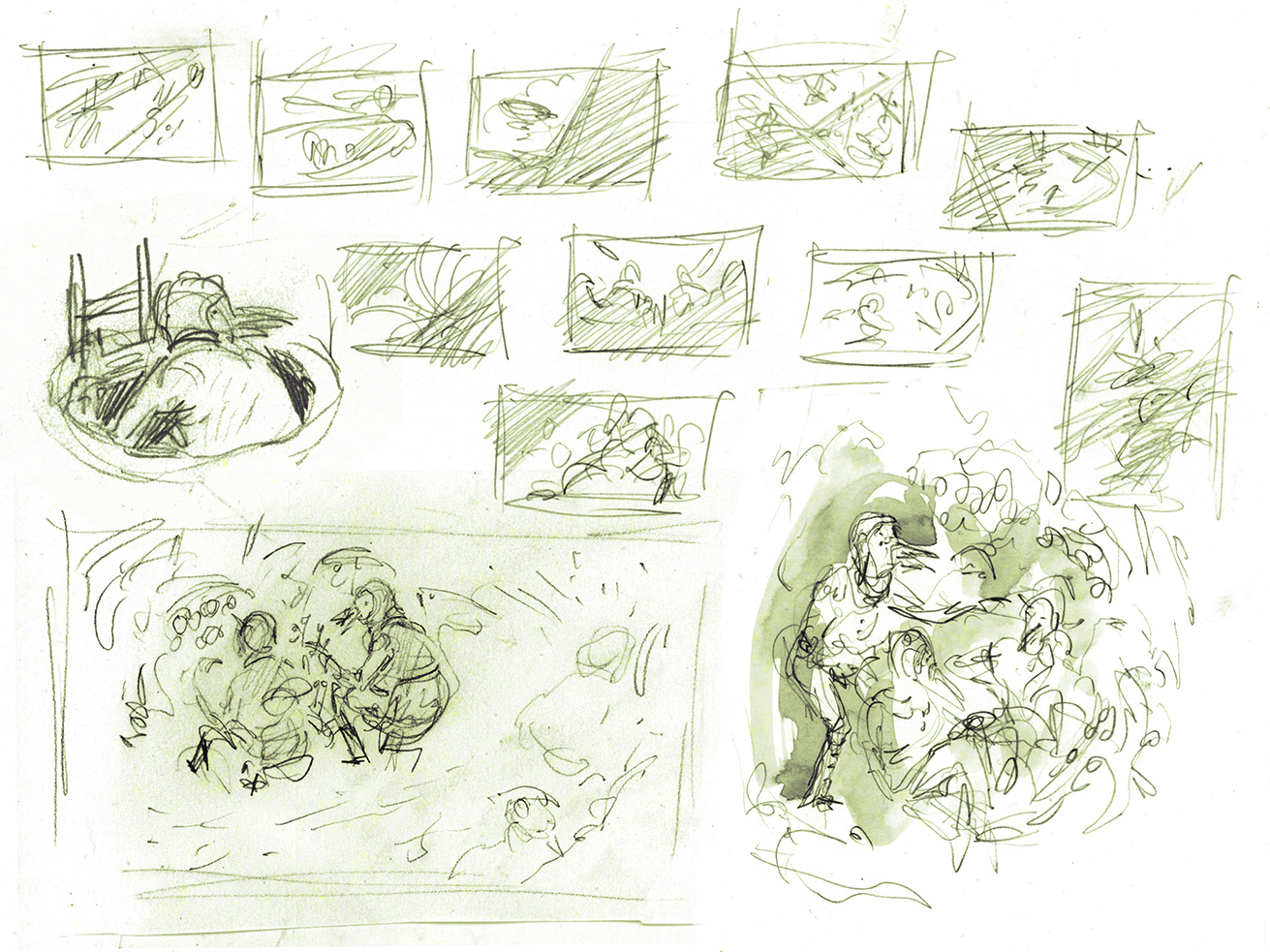
I always start with lots of super-rough thumbnails on cheap paper, usually just printer paper. It’s important to not be precious at this stage: the goal is to jot down as many ideas as possible and see what sticks. I try not to spend more than
02. Develop it further
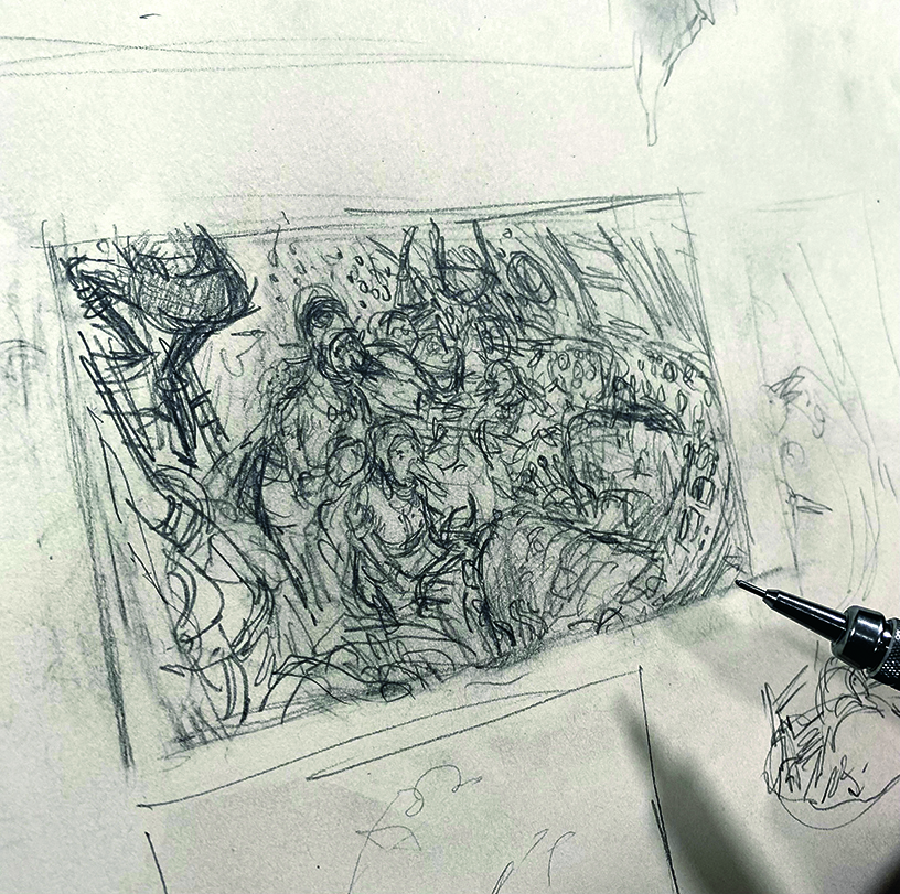
After selecting a few thumbnails I like, I draw something a little larger – but still only a couple of inches high. I bring in story elements and really start thinking about character placement and the rough value structure. I blend and erase until I’m satisfied, still not being too precious with the drawing.
03. Create the final sketch
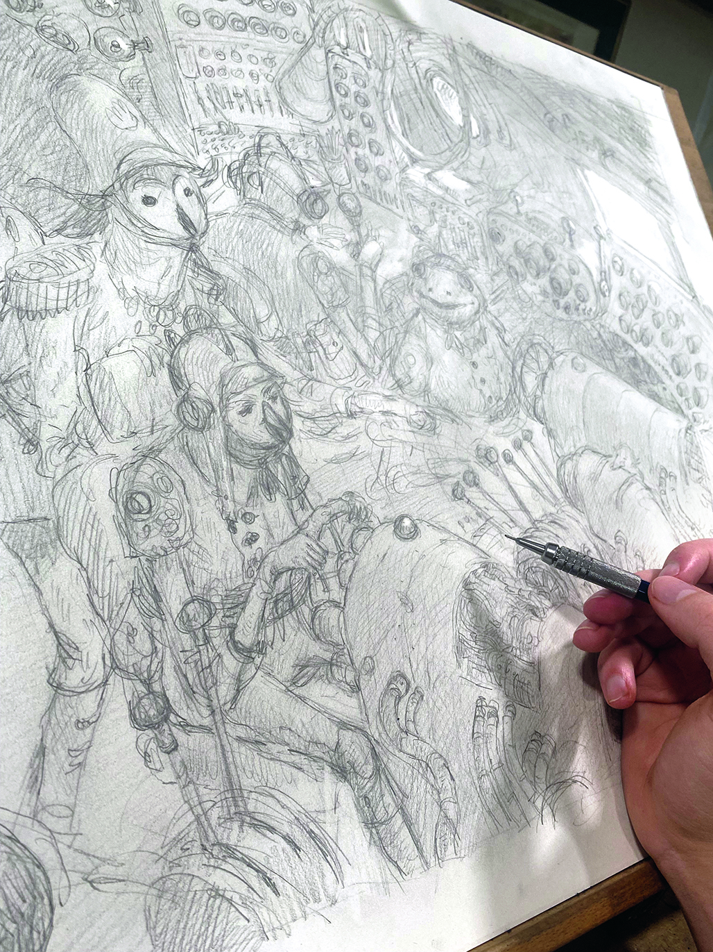
Once I’m satisfied with the previous drawing, I translate it to full-size paper – 18x24 inches in this case. I have a rough idea of the proportions, so I mark the important points and build from there. Here is where I really get into the details and think about specifics.
04. Experiment in Procreate
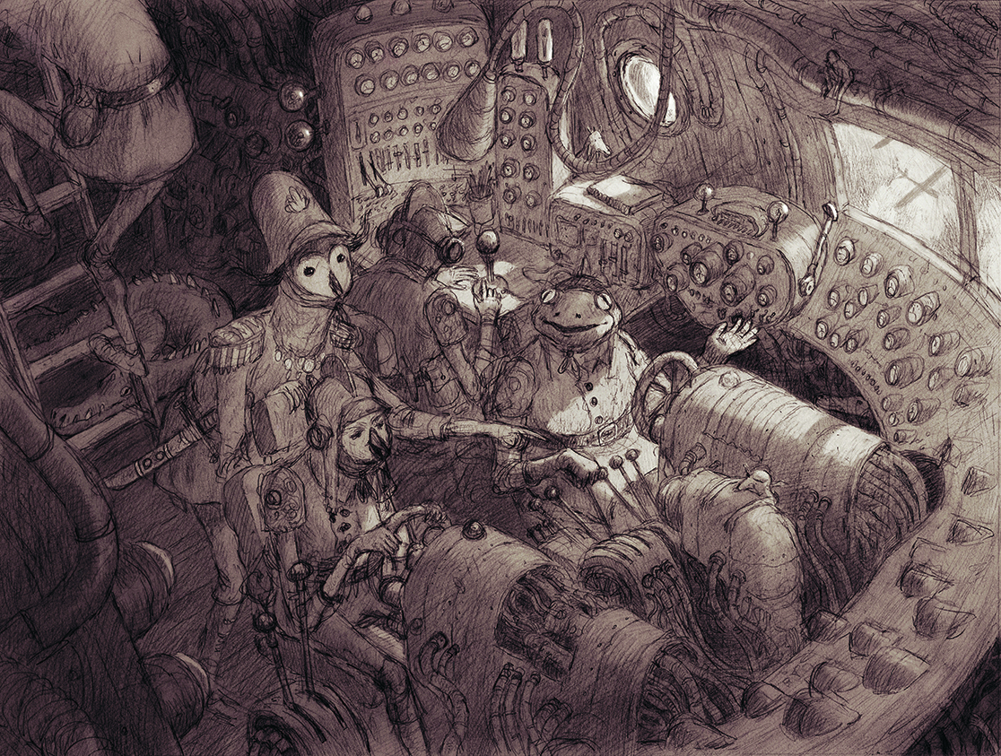
I scan the sketch and bring it into Procreate to start playing around with values and lighting. This is the time to experiment and plan out highlights and silhouettes, as well as getting an idea of the final colour. I also take this moment to flip the sketch horizontally: this helps me check the proportions and composition.
05. Prepare the paper
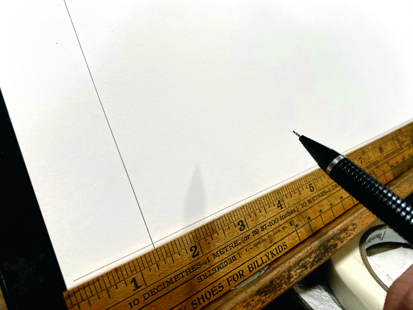
I attach the sketch to the back of 18x24-inch Bristol paper with two or three pieces of tape, so that I can lift and check the art underneath for reference. I personally do not tape the edges of my work, because then I tend to hesitate as I draw near the tape, creating a noticeable change in texture.
06. Transfer the sketch
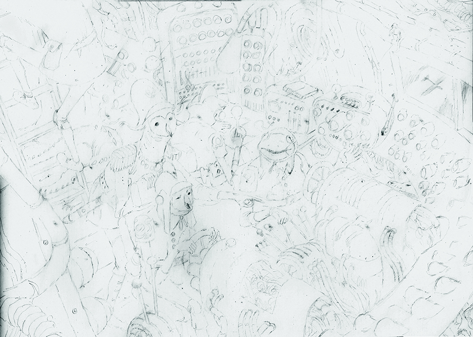
Using a light board, I lightly trace the main outlines of my sketch. The lines don’t need to be perfect, and every detail doesn’t have to be transferred; it just needs to be enough to indicate placement. When I am done, I scrub the trace lines with soft paper towels to make them even lighter.
07. Smart small
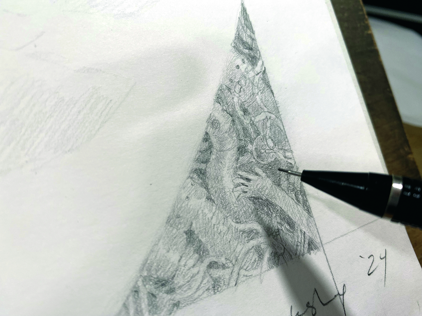
I like to begin by focusing on small areas. In this case, I began on one of the instrument panels, then started rotating through different elements. I find I get overwhelmed if I try to address the whole drawing at once, so I think it’s important to go about the drawing with a strategy.
08. Hands off!
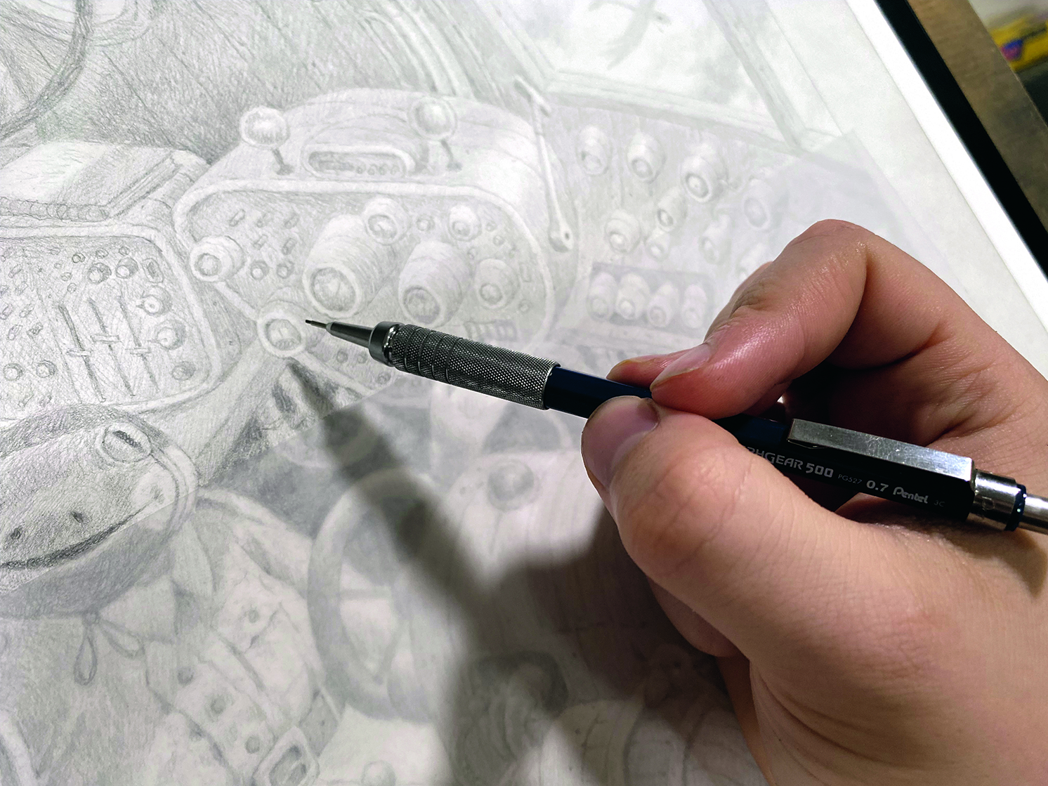
Left on the paper, the natural oils of the skin can create headaches when it’s time to blend or erase. To combat this, I always wash my hands and use a sheet of tracing paper to rest my wrist on, and I only handle the piece by the white borders.
09. Start rendering
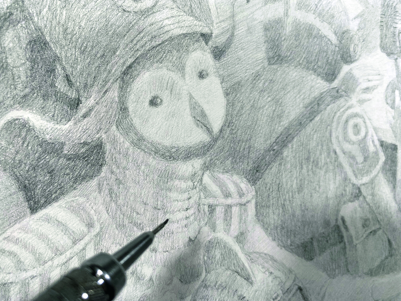
Rendering is my favourite part of the process; it’s almost meditative. It’s here that I put on music or an audiobook, and relax a bit. I utilise cross-hatching to build up my darks. I hear some people complain about the shiny quality of graphite, but I find that building up in layers reduces that dreaded lustre significantly.
10. Soften with blending
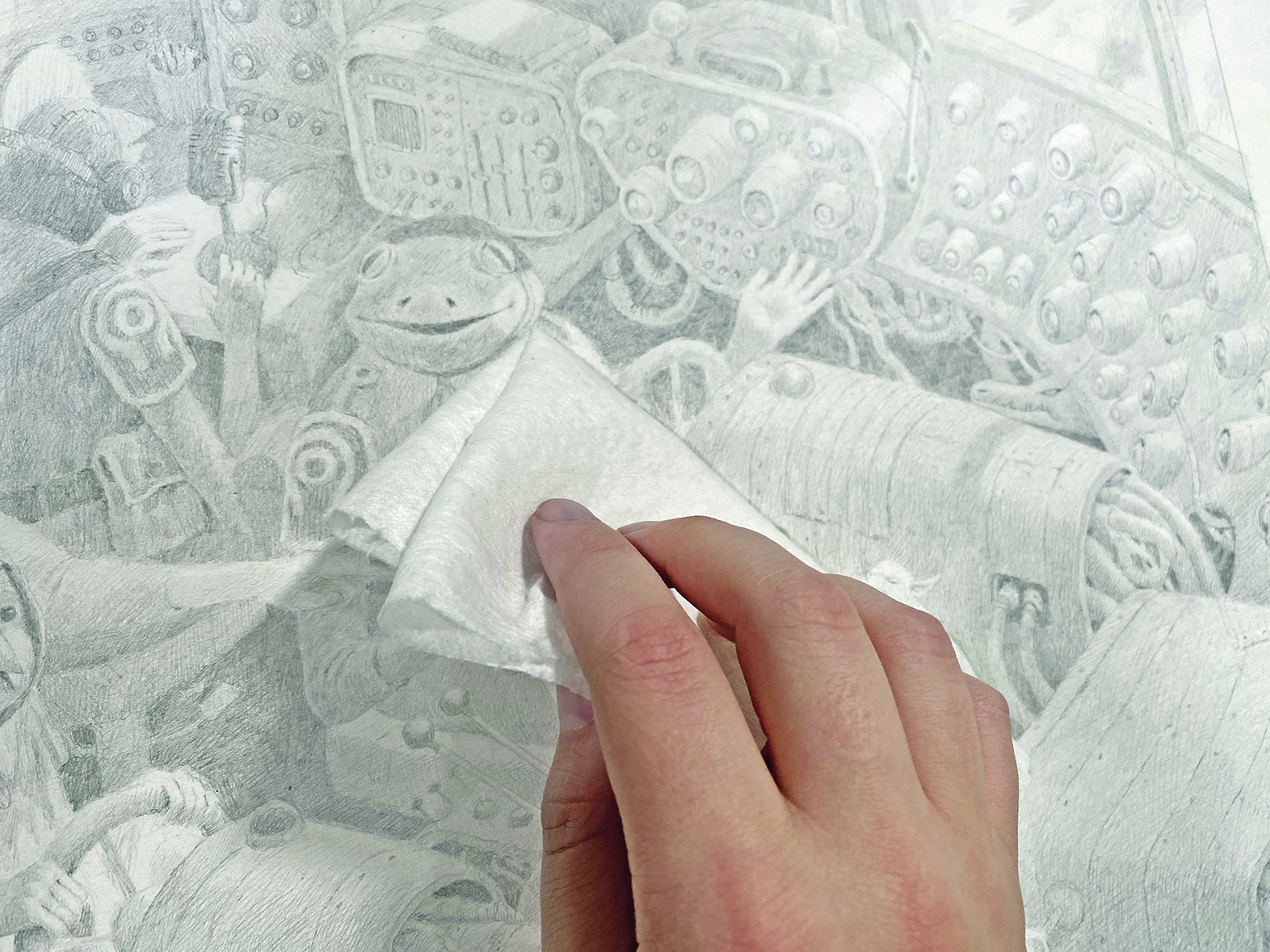
When I feel there is a good amount of rendered elements, I take a folded sheet of soft paper towel and lightly scrub the entire piece. This softens the lines and helps me to develop the values. A large soft paint brush will also do the trick. I then go in and add another layer of hatching.
11. Add highlights
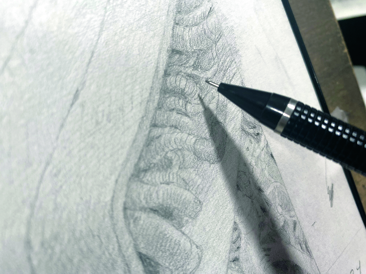
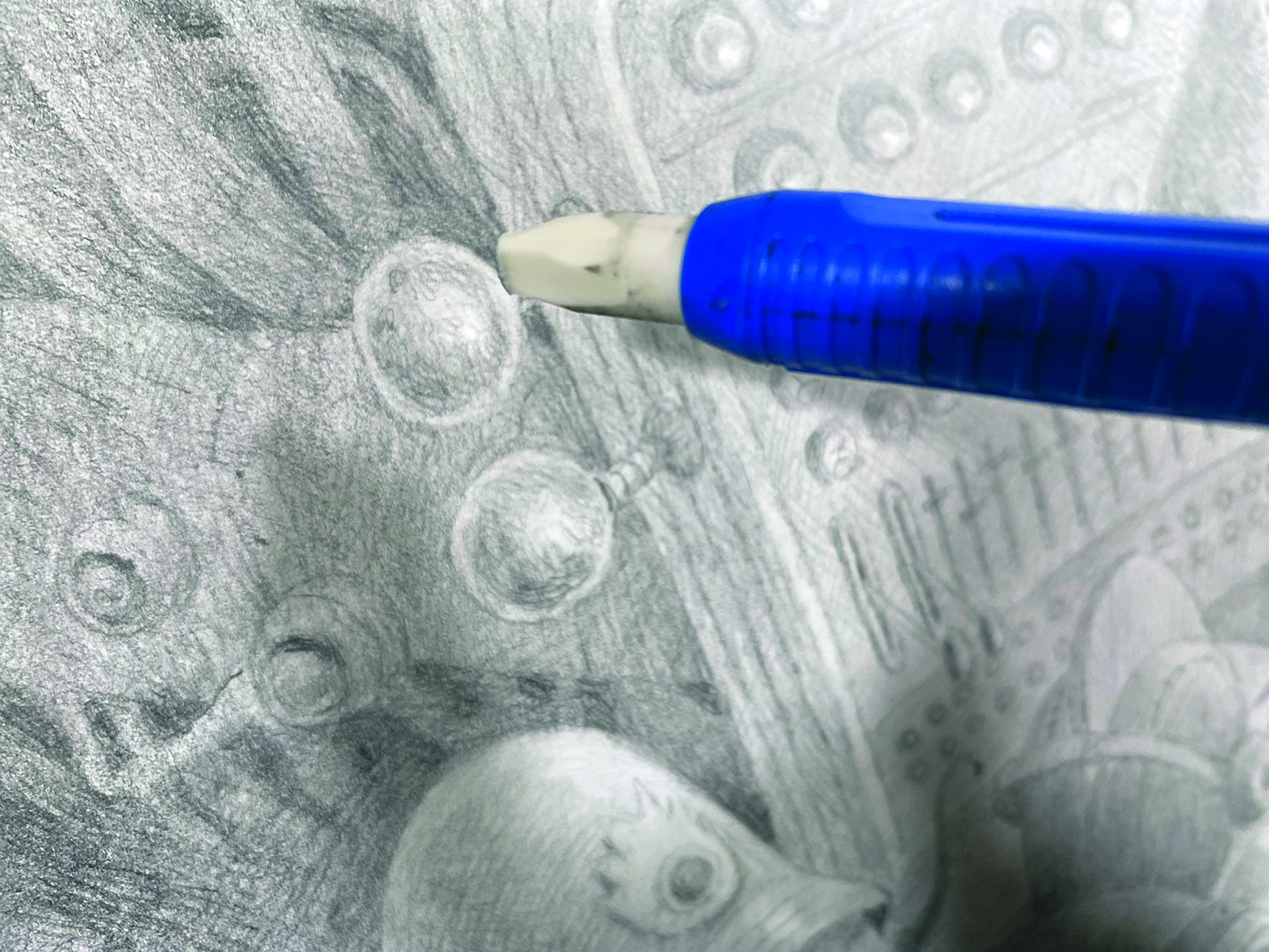
Using a mechanical eraser, I add in sharp highlights to any reflective surfaces. I use a blade to shape the eraser to a fine point. For a softer glow effect, I will also use a kneadable eraser, although I personally find kneadable erasers a little unpredictable, so I use them sparingly.
12. Add final touches
My final lines are spent developing hatch marks and darkening some values, and double-checking my shadows. I’m often asked how I know when I’m done. For me, it’s when my marks stop making a real, noticeable difference. Once the goal of the piece is met, it’s time to stop.
13. Bring it to the scanner
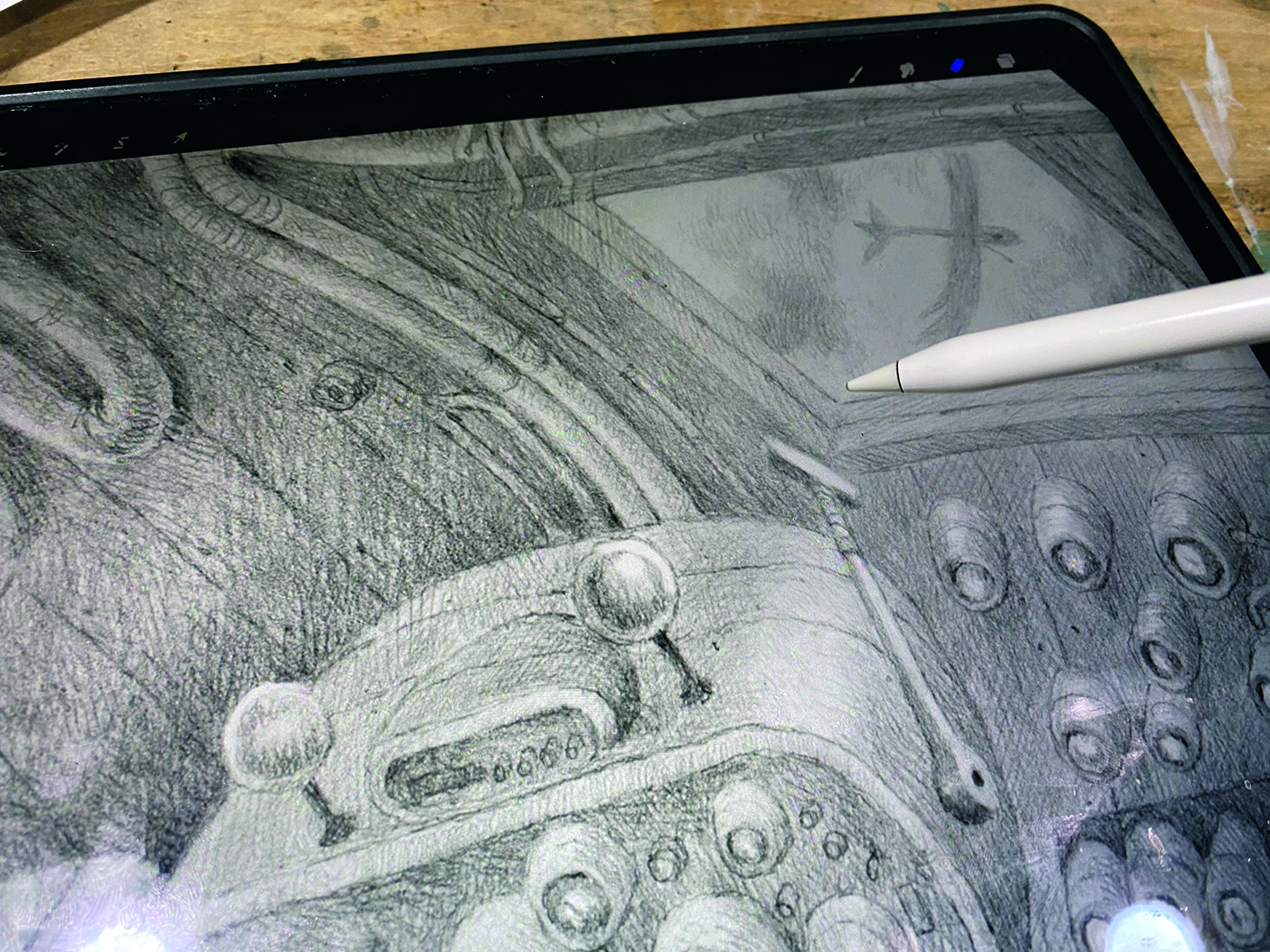
I scan the piece at 400dpi in black and white. The paper is quite large, so I have to scan it in sections and stitch it back together in Procreate. Then, I go in and address accidental imperfections, like stray marks and eraser shavings. I try to prevent these by lightly brushing off both the paper and the scanning bed.
14. Adjust lights and darks
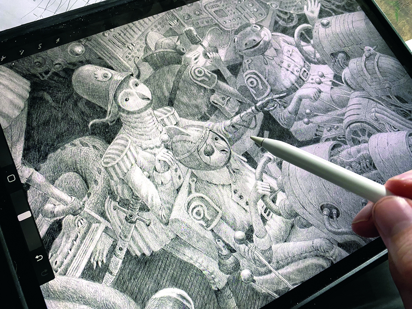
I go in and reinforce the values and contrast. I want the hatch marks to be visible, so I will often use black in the Overlay blend mode to help bring them out. I also add a slight glow effect to the windows and highlights, using a low-opacity layer of white.
15. Add an aged effect
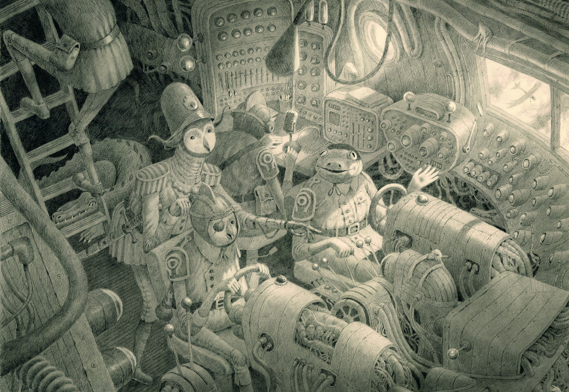
I like giving my work an aged look. A hobby of mine is collecting paper from different centuries, so I bring in a scanned file from my archive and overlay it onto my drawing using the Multiply blend mode. Then I call it done. The added benefit of working on paper is that you have a physical piece to sell!
This content originally appeared in ImagineFX magazine, the world's leading digital art and fantasy art magazine. ImagineFX is on sale in the UK, Europe, United States, Canada, Australia and more. Limited numbers of ImagineFX print editions are available for delivery from our online store (the shipping costs are included in all prices).
Get the Creative Bloq Newsletter
Daily design news, reviews, how-tos and more, as picked by the editors.

Thank you for reading 5 articles this month* Join now for unlimited access
Enjoy your first month for just £1 / $1 / €1
*Read 5 free articles per month without a subscription

Join now for unlimited access
Try first month for just £1 / $1 / €1

Nik Henderson is a children’s book illustrator and an occasional vis dev artist. He studied illustration at SCAD and is represented by The CAT Agency.
