8 great examples of geometric art in book design
Geometric shapes and patterns are making a comeback on covers, as these examples show.
Geometric art has a long and noble history, being especially important in the ancient Greek and Islamic art traditions. More recently, geometric forms were also central to what's been dubbed the 'golden age of graphic design', led by designers like Paul Rand during the 1950s-1970s.
This was an era dominated by abstract and minimalist approaches to design, in which geometric patterns were commonly seen adorning the covers of best-selling books. Some of the most memorable examples feature in this recent motion design project by Henning M Lederer:
As such projects highlight, geometric influences in cover design continue to inspire illustrators and designers to this very day. So in this post we bring together some of our favourite recent examples of geometric art on book jackets to inspire your own projects. Let us know if we missed your favourites in the comments below!
01. Tender is the Night by F. Scott Fitzgerald

Coralie Bickford-Smith is a senior cover designer at Penguin Books who makes great use of geometric art in her cover designs. We particularly love this beautiful monochrome creation, for a redux of F Scott Fitzgerald’s fourth and final novel. You can see more of Bickford-Smith’s covers here.
02. Drugs 2.0 by Mike Power
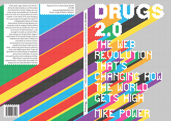
'Drugs 2.0 - The Web Revolution That's Changing How The World Gets High' is a book by Mike Power examining how the internet has changed the way drugs are produced, bought and sold in the 21st century. Combining the look of geometric art with the aesthetic of the 1980s dot-matrix, its sumptuous cover design is the work of Melvin Galapon, with art direction by Michael Salu.
03. Geometrophilia by Kapitza
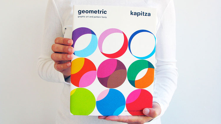
Kapitza is a multi-disciplinary design studio run by two sisters, Nicole and Petra Kapitza, who share a passion for print, pattern, nature, minimalism and colour. They're well known for their love of geometric design, having launched their own geometric pattern app, as well as this coffee table book. Its stunning cover design proudly announces its contents – namely 264 coloured and black and white geometric patterns to salivate over at your leisure.
04. Wigs on the Green by Nancy Mitford

Geometric art can, if you're not careful, quickly start to look samey. So New York artist Lourdes Sanchez decided to take a different tack when commissioned by Penguin to create covers for new editions of Nancy Mitford's books – using watered-down paints to soften the look. You can see more of Sanchez's work here.
Get the Creative Bloq Newsletter
Daily design news, reviews, how-tos and more, as picked by the editors.
05. Adaptive Web Design by Aaron Gustafson

Even though she doesn't usually do book illustration, web and graphic designer Veerle Pieters created this eye-catching image for Aaron Gustafson's seminal book, Adaptive Web Design. After initially experimenting with a purely geometric approach, she eventually settled on this beautifully stylised chameleon to more accurately convey the concept behind the book. Read her explanation of how she created the design here.
06. Metamorphosis by Franz Kafka
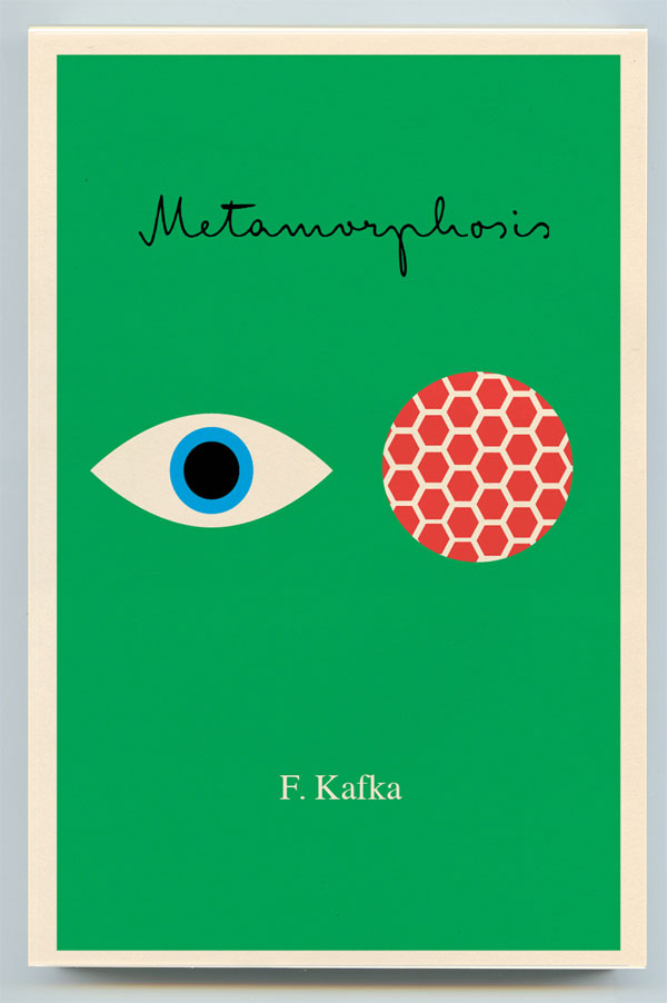
For a series of reprints of Kafka novels, artist Peter Mendelsund centred his simple, geometric cover designs around the concept of eyes. "I find eyes, taken in the singular, create intimacy, and in the plural instill paranoia," he explained. "This seemed a good combo for Kafka, who is so very adept at the portrayal of the individual, as well as the portrayal of the persecution of the individual." You can view the full collection here.
07. The Three Musketeers by Alexandre Dumas

Talk about reductionist... This ultra-stark cover art for classic swashbuckling novel The Three Musketeers was the work of Greek designer Ioannis Fetanis. It formed part of Recovering the Classics, a crowdsourced collection of new covers for stories in the public domain, which were distributed to libraries and schools across America as part of a White House initiative.
08. Voices in the Night by Steven Millhauser
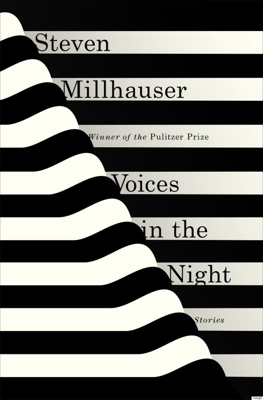
Janet Hansen designed this marvellously stripped-back cover for the iconic American storyteller's 2015 novel. A designer at Alfred A. Knopf, a division of Penguin Random House, her cover art often makes dramatic use of simple geometric shapes: you can see more of her work here.

Thank you for reading 5 articles this month* Join now for unlimited access
Enjoy your first month for just £1 / $1 / €1
*Read 5 free articles per month without a subscription

Join now for unlimited access
Try first month for just £1 / $1 / €1

The Creative Bloq team is made up of a group of art and design enthusiasts, and has changed and evolved since Creative Bloq began back in 2012. The current website team consists of eight full-time members of staff: Editor Georgia Coggan, Deputy Editor Rosie Hilder, Ecommerce Editor Beren Neale, Senior News Editor Daniel Piper, Editor, Digital Art and 3D Ian Dean, Tech Reviews Editor Erlingur Einarsson, Ecommerce Writer Beth Nicholls and Staff Writer Natalie Fear, as well as a roster of freelancers from around the world. The ImagineFX magazine team also pitch in, ensuring that content from leading digital art publication ImagineFX is represented on Creative Bloq.
