When offered the opportunity, I jumped at the chance to speak to an animator who has worked on, and continues to create for, some of horror's most-loved films and TV shows. Rick Catizone has been working in stop-motion animation (still championed by Aardman Animations) for more than 50 years, and has seen it all.
Rick filmed the animated the iconic end sequence for the original Night of the Living Dead, he was directing animator on the feature films Creepshow and Creepshow 2, he created the classic 'finger-drumming' animation of Ash's crawling hand sequences for Evil Dead 2 and, he says, "just a few years ago, I also created the Creep animation for the first season of my old pal Greg Nicotero's Creepshow TV series for Shudder". Quite the record in film, and you can read about in his new book The Art of Rick Catizone and Anivision Studio.
So, what first drew Rick to the life of animating the undead? Ray Harryhausen was a huge influence on a young Rick, who thought he wanted to become a comic book artist until in 1962 Famous Monsters of Filmland published a three part article on Ray Harryhausen, and it all changed.
"It had almost no information specific technique other than it was stop-motion. But for the first time, they ran photos of Ray holding one of the models from Mighty Joe Young," exclaims Rick, saying: "Wow, what a shot of adrenaline as I began to grasp that my favourite films were created by using wonderfully made puppets. I was 16, and that changed my trajectory and I began building very crude puppets and animating them."
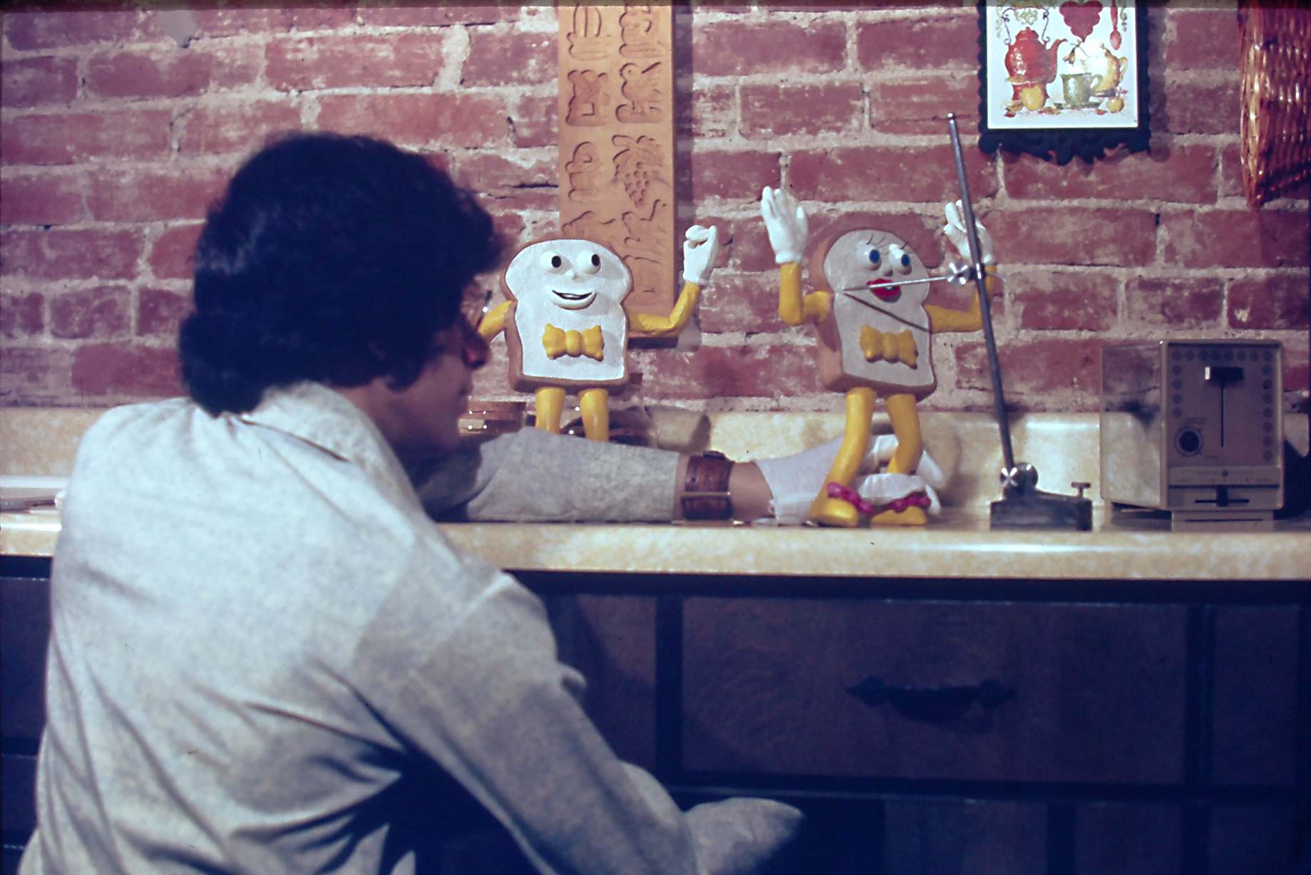
Rick recalls spending most nights in the last two years of high school teaching himself puppet building, effects and learning the principles of animation. This was a different time, when tutorials weren't a click away on YouTube.
"There weren’t any books on stop-motion. In fact there weren’t any books on doing comic book art either (other than my studying the actual comics)," he says. "But the Walter Foster series did have some books on hand drawn animation and I studied those a lot. I managed to get an interview with a company called The Animators, here in Pittsburgh. The only animation house outside of New York and Los Angeles that I ever heard of back then."
He reflects: "What are the odds there would be an animation studio where I lived? They saw my work and hired me about three months later. I was just one year our of high school, so I was very fortunate."
Get the Creative Bloq Newsletter
Daily design news, reviews, how-tos and more, as picked by the editors.
Rick Catizone: early influences
Ray Harryhausen was a big influence early on says Rick, who explains why this stop-motion animator behind The 7th Voyage of Sinbad and Jason and the Argonauts. He tells me: "Ray’s work of bringing fantasy or monster characters to life had a tangible weight, presence, and reality that I didn’t find in other films (or other methodologies such as mechanicals). And in his films the interaction between creatures and people was really well executed. You believe both were right there in the same space, which of course heightens the threat and the enjoyment."
You can gauge for yourself by taking a look at Ray Harryhausen's sketchbook, but Rick also says the work of animator Jim Danforth was an influence on his younger self. He admired the "exceptionally smooth movement" in the animator's work that "had a beauty and fluidity" to it.
Ray’s work of bringing fantasy or monster characters to life had a tangible weight, presence, and reality that I didn’t find in other films
Rick Catizone, animator
He continues: "His armature work was eye-opening and really helped me be more creative in learning that part of the craft as well. I was fortunate to become friends with both of them, and also the late David Allen, whose film The Primevals has just been released".
Beyond these three animators Rick lists the influence of the classic comic and fantasy artists that should be on everyone's lists, including Jack Kirby, Frank Frazetta, Joe Kubert and Alex Raymond.
When reflecting on his own animation style, Rick says he "has to laugh a bit" as most of his steady work came from commercials where a personal style isn't pushed aside in favour of the client's needs. But he does reflect on his work on Creepshow 2, a film that enabled him "the opportunity to design most of the characters, as well as animate them" and in this case in particular Rick was able to create a feature-quality on a low budget, something he's proud of.
Rick Catizone: Evil Dead 2 & developing a technique
Over the course of his career in animation Rick has made use of techniques and materials to bring his creatures to life on screen, including traditional 2D animation, hand drawn, stop-motion, and computer animation. "I like all three," he says.
He tells me the idea was always to use whatever was appropriate to get the effect he wanted, depending on the medium he was working in. For example he explains one process was using hard wax., which was pioneered by American designer, sculptor and artist Wah Chang, and adapted for use on Evil Dead 2 for creating head replacements.
Rick explains: "I created a series of wax heads so Henrietta could change from possessed Henrietta to demon-Henrietta. For the more cartoony commercials, I would make a set of heads with different mouth shapes so they could 'speak'.
"While one is animating the puppet, you place the proper head on the proper frame. Of course, everything must be registered in animation so nothing moves unless I make it move. I used a piece of solid square rod stock soldered into the neck joint. When the heads are cast, a piece of hollow square tubing is cast inside the head so it can be slipped on or off to make the character change. The mould for the heads had a matching piece of stock of course so everything matches up. But one of the beauties of stop-motion is that the process itself hasn’t really changed."
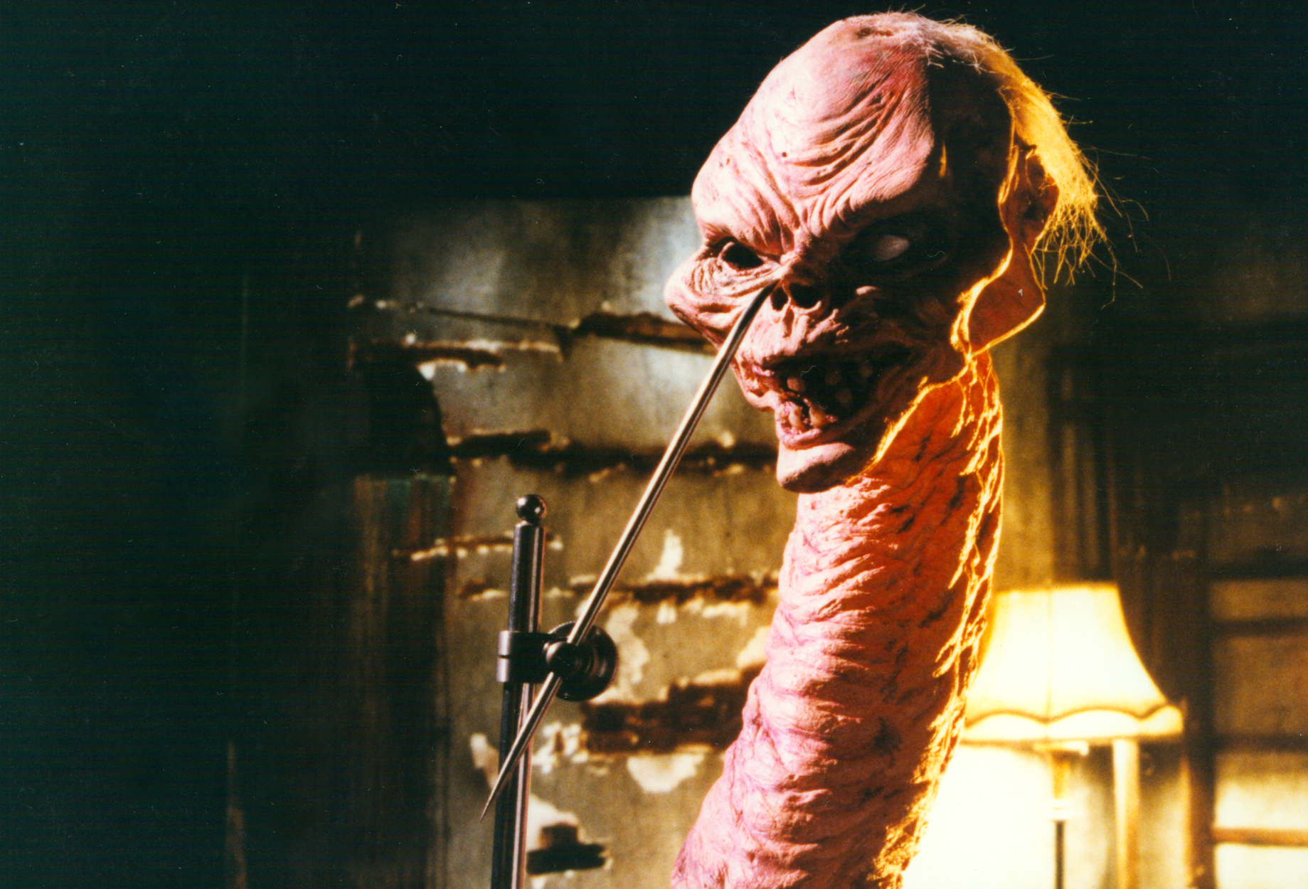
Instead of working on film Rick would capture the images with a digital camera, use animation software to assemble it, and a compositing program to add a hint of motion blur. This is all a means to an end, as Rick says: "Really, it’s the animator and his puppet (or 'model' if you prefer), and the animator’s acting and vision about what would have the most impact and then execute it."
He explains: "Unlike traditional hand drawn animation and computer animation, it is a straight-ahead performance and so it takes a bit of discipline. In the other methodologies you can pose your character on the frames you want for your timing and then work on the tween stages. Also, you can tweak that forever. Not so with stop-motion because of its straight-ahead nature."
Adding: "If there is a problem within the shot, you have to redo the shot. Of course, that’s most eliminated today because we can play back our recorded frames as we go before we commit the next frame, and even then you can go back and delete it and continue onward. In the 'old days' you couldn’t be sure everything went as expected until the film came back from the lab."
Rick Catizone: Evil Dead 2 & armatures
While on commercials Rick would design and animate, when it came to Evil Dead 2 he didn't design the look of the characters, and Mike Trcic sculpted Henrietta. But Rick did design and machine the armatures for the Hand and Henrietta puppets. Ash's severed hand and its scurrying animation has become a firm fan-favourite.
"I started out just doing the animated crawling hand, but then that expanded to other things," recalls Rick. "I had already designed and machined a hand armature based on a cast Tom Savini had made for some test shots for Creepshow. It turned out they didn’t have the budget and went another direction for that effect. But when Mike got on the crew of Evil Dead 2, he showed Sam Raimi the tests of my hand and they called me."
He adds: "I did have to make a couple new joints in the fingers because the actor’s hand they moulded had a smaller hand than mine. They had shot a scene of the live hand (in makeup) drumming its fingers on the table. He was pretty set on liking that and hoping I could get the same type of timing. So, I counted the number of frames for every upstroke and downstroke for every finger, and then tried to duplicate it. He was happy.
"The Henrietta shots had two different puppets. I designed and machined the armature for the full puppet. We also had a larger half-scale puppet which was a head and bust. That was the basis for the changing heads I had to make, assisted by Ken Brilliant, for her change… while her neck was growing. I shot that in reverse, slicing off small sections at a time, while incrementally raising her frame-by-frame so her head would remain in frame."
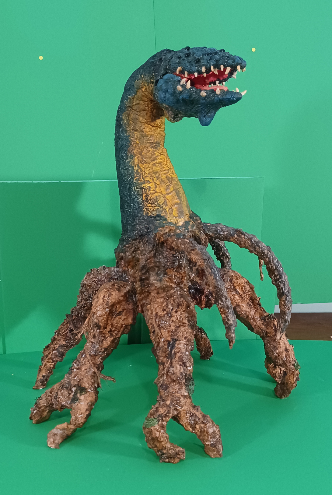
This scene of possessed Henrietta turning into demonic Henrietta was very challenging. "I needed to create about nine different sculptures of a natural-looking head changing shape," recalls Rick as he expands on what happened. "I did the main parts of the transitions for each head and Ken Brilliant helped finish them. Ken also did an unbelievably great job of painting all them to match. If they didn’t, the colours and areas would be popping around during the replacement of each head."
Rick says the second challenge came from the shoot itself, noting how he needed to incrementally adjust the height of the little 'stage' so the face stayed in frame while he sliced off a piece of neck on each frame. Rick explains: "To do that of course, I had to have one neck with wire inside that I could snip away and one fully armature neck, painted to match."
He adds: "I also had to advance the rear-screen projection of the footage of a tilt-up on the actual set, which was back in North Carolina. After many hours of shooting, I went to unload the camera and send that shot out, only to find there had been a camera jam, and it would need to be redone."
The next day Rick begins again but this time in reverse, adding the pieces of neck back on and glueing them in place. "As I pushed a piece of copper wire up through the neck so I could animate it, I was now lowering the stage an increment at a time. When the neck was fully grown, I drew an indication of the exact pose and placement in the frame, took out the wire armatured neck, replaced it with the machined armatured neck, and finished it swaying from side to side. And somewhere within that shot, used the replacement heads so her face changed. I don’t think one can spot the change of necks."
Rick Catizone: Night of the Living Dead
A simple yet iconic animated sequence for Rick was the final credit sequence he made for Night of the Living Dead. It was George Romero’s idea, "and I think a great one" reflects Rick.
Explaining the thought process behind the footage, he says: "The movie is well-known by now. But at the time it was very eerie. The first really big jolt in the ending is when Barbara’s brother comes back. The second is when the hero gets killed after surviving the zombies. And the third is when time freezes.
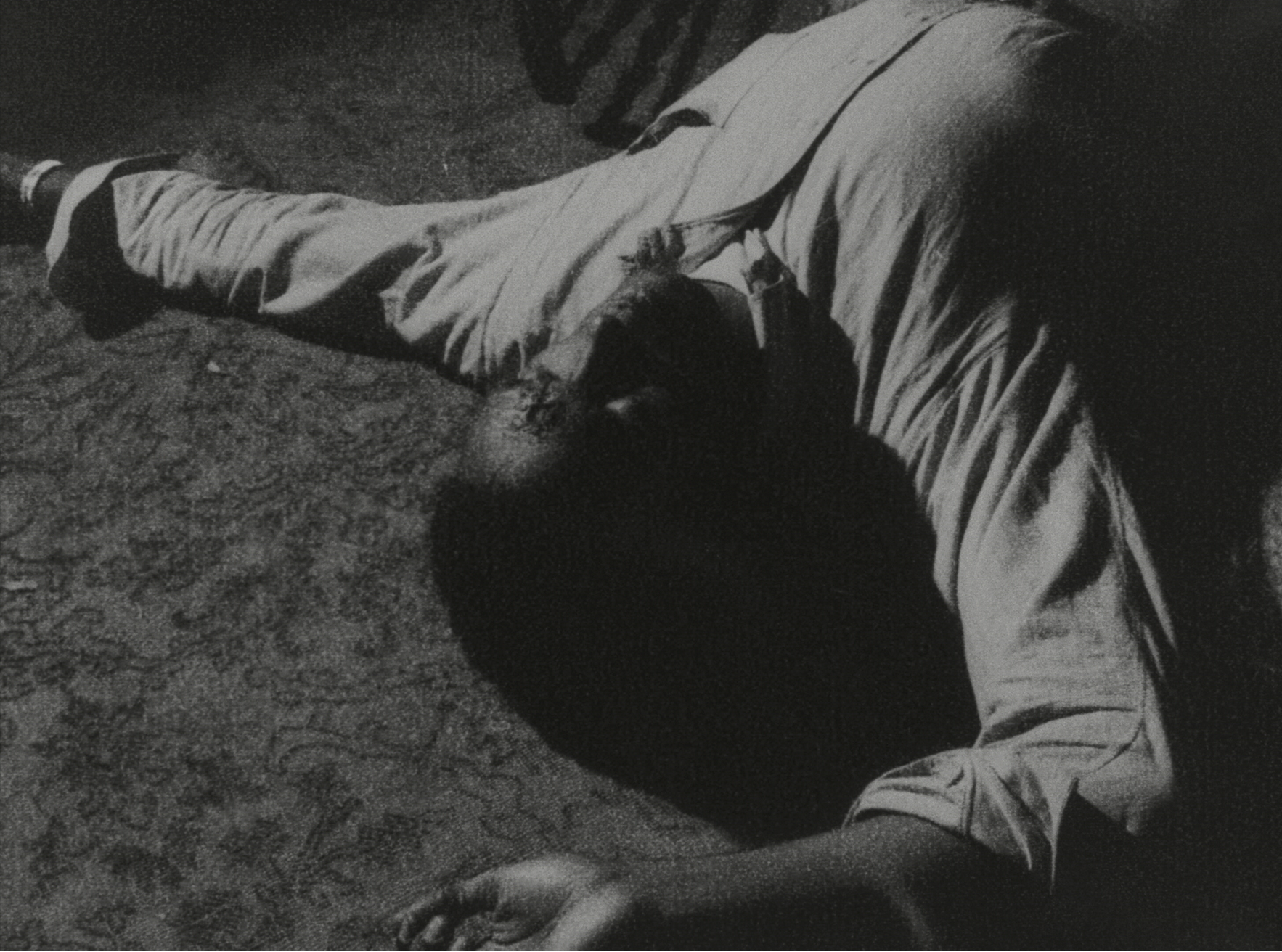
"I rationalise it that we identify with the hero, and when he dies his time (life in motion here) stops. So we see frozen moments of them piling up zombies and getting ready to light them up. Then when the match is struck, we are back in the 'live' world, which will continue onward.
"The whole sequence was filmed a frame-at-a-time on our Oxberry animation stand, pre-calculating the amount of movement in three directions necessary to start and stop exactly where George wanted."
Rick Catizone: creating for Creepshow
Both Creepshow and Creepshow 2 movies were an homage to the old EC Comics, and the intro sequence would feature art and pages from the classic horror comic Rick says his involvement was likely due to the impossible shot the film's creators wanted - which involved tossing a comic and have it twirl and land on the exact page they needed.
"So Mike Gornick - director of photography and longtime friend - called me to come and look at all the footage they shot, and ultimately they decided since it was a comic book, and art, why not use animation. I believe the same thinking happened with the Creep. Plus, in animation he could fly back from the window and save the cost of a $20,000 crane shot."
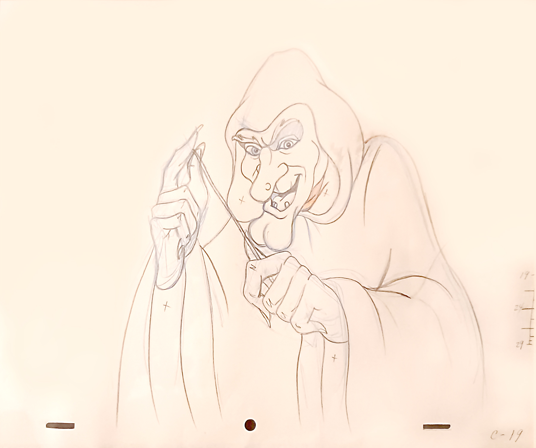
For Creepshow 2, Mike was now the director, but he was tasked with making the follow-up on a third of the budget that had been spent on Creepshow. The solution was to reduce the number of stories featured and to increase the reliance on animation.
Rick says this turned into ten minutes of animation, and tells me he did as much of the work as he could, including the timed shots, he made rough layouts of a storyboard, oversaw production of the animation, and did all the key animation on the Creep.
"On Creepshow 2, I worked closely with Mike Gornick in one sense, and in another he allowed me and my crew a great deal of freedom. That came from our long years of friendship and working together," says Rick. "He trusted me to deliver what he needed. That is an incredible compliment that I treasure. Of course, he was away for a large chunk of time directing on various locations, but he did see stages throughout; Ron Frenz’s storyboards, our character designs, sculptures of main characters, colour suggestions, Phil Wilson’s background treatments, etc. Then followed by animation pencil tests of the scenes for his approval, and then final scenes."
He adds: "I also did some of the scenes with the postmaster, the flying demons, and a couple of the giant Venus flytrap scenes. I designed most of the characters, doing quick maquette sculpture studies for the Creep, Rhino, Sparky, Mr. Haig, etc. And while they were done from some preliminary drawings, after doing the sculptures I nailed down model sheets for most of the main characters."
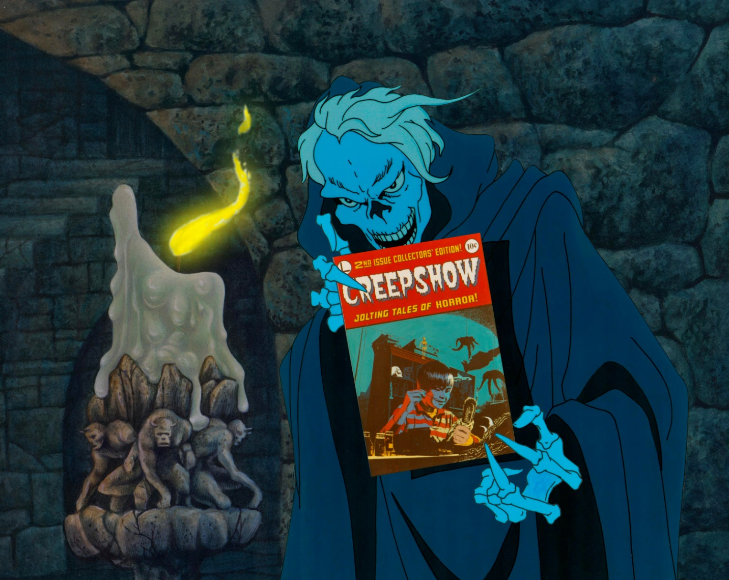
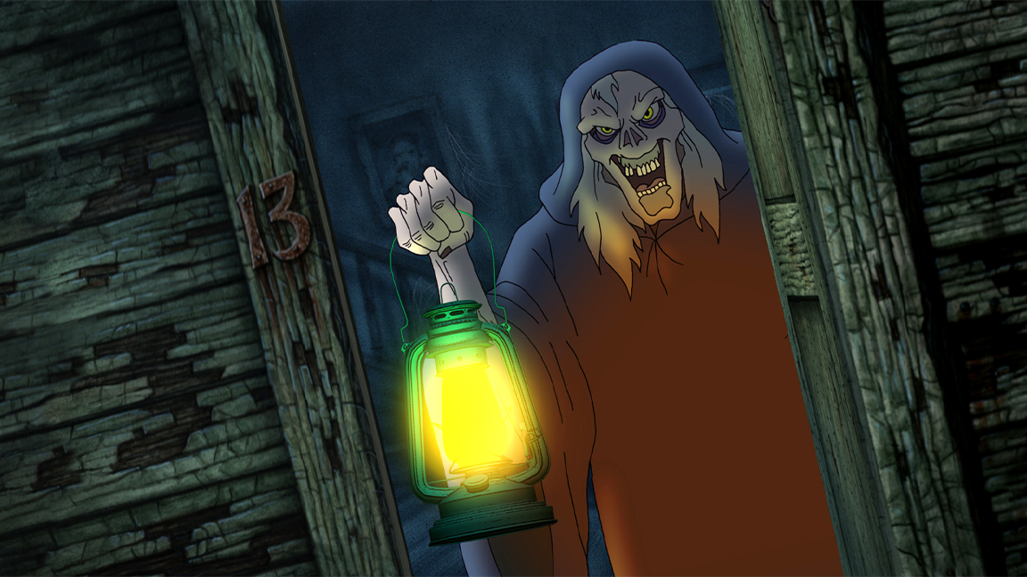
Returning to the Creepshow franchise for Greg Nicotero’s Creepshow TV series, Rick adopted new software and techniques to bring the Creep back for a new audience. The animator tells me how he was interested in using the Creep's lantern as a way to gesture.
He explains the process: "I animated the Creep traditionally on paper, and had it inked on paper, and scanned that into a Digicel Flipbook for painting. I took the images into Project messiah 3D animation software and animated a CG lamp to match the hand-drawn Creep’s movements.
"The lamp images were rendered separately and run through a Photoshop filter to make them appear more like drawings. All of these images were taken into Blackmagic Fusion where I did all the compositing and shadows, as well as the moving light effect 'from the lamp' on the Creep’s body.
"The last part was to make an animated spline matte to remove the top of the handle of the lamp (since it is composited in front of the Creep), so that it appeared to be inside his grasp no matter how he moved. This was all set up as a multi-plane environment so the camera could truck into the doorway and get the perspective effect on the house, interior, Creep, etc."
Rick Catizone: career advice
On reflection, Rick says he's "proud" that he was "able to even do it at all". He taught himself how to animate, learned from friends and colleagues, and he's not done yet. While he's sad to see not enough stop-motion animation is being created - though he urges everyone to watch Del Toro's Pinocchio - the idea of giving up in this art form isn't one that sits well.
"If one is really passionate about it, start creating your own pieces of animation," says Rick. "Start with simple things and see if you even like doing it. I found at 16 that when my first footage came back that I was thrilled at seeing these toys come to life. Even if one doesn’t make a full-time career of it, it can certainly be an enjoyable hobby like anything else."
His advice for getting started? "Start with very short things, even just little motion exercises like making a character jump and walk,: he says. "And don’t get caught up in needing 'professional' equipment. I was told I was first hired because Bob said he knew that if I could do what I did without any professional equipment, that I could create some great stuff with their Master Series Oxberry."
Finally, he adds: "If I would have waited until I had a 'real' armature, or rear-projection unit or camera, I never would have gotten anything done, and wouldn’t have had a career. You start with what you have and find a way."
Visit Rick Catizone's website for more news and insights into stop-motion animation. I also recently interviewed Aardman Animations' Clara Cornish about her career in animation. I'd recommend reading our guide to the best 2D animation software too.

Thank you for reading 5 articles this month* Join now for unlimited access
Enjoy your first month for just £1 / $1 / €1
*Read 5 free articles per month without a subscription

Join now for unlimited access
Try first month for just £1 / $1 / €1

Ian Dean is Editor, Digital Arts & 3D at Creative Bloq, and the former editor of many leading magazines. These titles included ImagineFX, 3D World and video game titles Play and Official PlayStation Magazine. Ian launched Xbox magazine X360 and edited PlayStation World. For Creative Bloq, Ian combines his experiences to bring the latest news on digital art, VFX and video games and tech, and in his spare time he doodles in Procreate, ArtRage, and Rebelle while finding time to play Xbox and PS5.
