One to watch: talented Young Gun Adi Goodrich
The award-winning set designer on making clients nervous and why ugly hands make beautiful things.
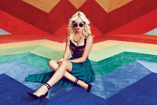
Hear the words 'set design' and you might imagine someone working at a theatre or a Hollywood studio, creating a backdrop for actors to work against. But set design is increasingly important within advertising and branding, and there's no finer exponent than LA-based set designer and art director Adi Goodrich.
Her punchy work is brimming with optimism and verve; her trademark style characterised by strong, bright colours. It's an approach that's landed her jobs with big-name clients including Wieden+Kennedy, Target, Apple, Adult Swim, Pizza Hut and Toyota, but she also takes pains to balance that with smaller, niche projects. We chatted to her to find out more...
Where does your love of strong, bright colours come from?
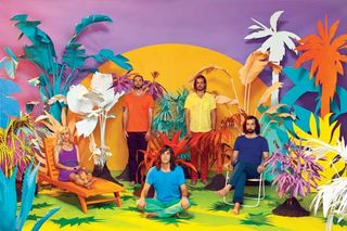
I believe there is a subconscious energy hidden in imagery. So I try to instil optimism into the work from the very beginning. I work with people who are positive and can tell a good joke. I treat my crew well and push to always have a good time. If the energy is there from the start, it will exist in the final image.
You've said that you "aim at making something that makes people nervous". How nervous do you make your clients?
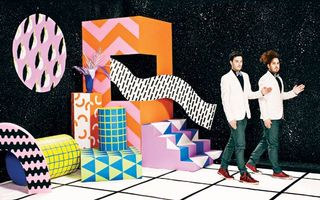
Well, I hope I don't make my clients nervous. But I do try to push the designs pretty far. My aim is to always make the creative team feel confident about the work I'm making for them.
So when I'm pushing for something that they weren't expecting, I often need to sell the designs with a strong argument. So I write a lot, and creatively explain my intention.
Where does your passion for handcrafting original materials and objects stem from?
It stems from my family, for sure. My grandfather was a cotton-picker in Tennessee who worked with his hands and my father was a woodworker. I soon learned that a certain pride goes with being able to say, "Oh, yeah, I made that." That's the pride I can say I have now.
I once saw a plaster cast of Picasso's hand in Spain. It was thick and ugly; prompting me to write in my sketchbook: "Ugly hands make beautiful things."
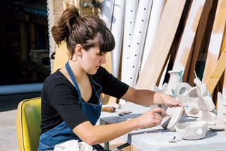
When I look down and my hands are covered in paint and cuts, I think about the men in my life who had these gnarly hands too, and it makes me feel like I'm doing something right.
If you can make something by hand, that means it's original. If I can make original things, the work I do will stand out. That's why it's important to hand-make my sets. It makes my work hard to duplicate.
Was set design and art direction always your ambition?
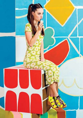
Not at all! I went to school at The School of the Art Institute of Chicago. The BFA degree had no majors or minors, so I hopped around in multiple departments: Painting & Drawing, Architectural Preservation, Printmaking, Art History, Animation. There was a lot to explore.
But when I graduated, I thought: "Why didn't I focus a bit more? Now I have a Jack of All Trades degree, that won't get me much work." Soon after graduating I ended up getting a random day-job for Barneys New York, assisting a window dresser for a day in Chicago. That's when I knew this was exactly what I wanted to do.
What did you love about your window dressing experience?
It seemed to merge multiple worlds: fashion, set design, graphic design. I went on to work in window display for two years: first in New York, then Los Angeles. In the evenings I started making movies with my new-found friends in LA. I'd never thought about filmmaking or set design, but all of a sudden my building skills were useful.
How had you learned to build?
My father was a builder. He ran his own antique store as well as an architectural restoration business. I actually quit high school to work with him full time. We probably re-finished every hardwood floor in our town's Main Street.
So, getting back to set design…
Eventually I quit the window display job. Working in retail wasn't really my cup of tea. I hated dealing with boring mums asking me if a sweater was on sale or hearing 16-year-old girls gossiping in the mall. So I resigned from my job and began hustling small gigs here and there.
I worked under a production designer for about a year and he passed off some of the smaller jobs he didn't want. Then I met LA photographer Stephanie Gonot. She introduced me to JUCO, a photo team made up of Julia Galdo and Cody Cloud, and we started making these colourful worlds together. I love it.
Could you walk through a recent project?
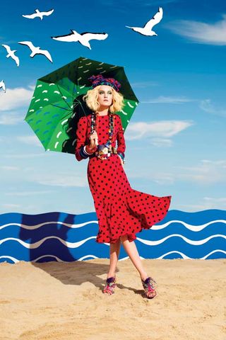
Sure! Let's look at Cote D'Azur with JUCO for Schön. The first part of the process is sitting down with the photographers and talking about what we're excited about.
We pass imagery back and forth between each other for a few days until something sticks. In this case it was 1930s travel posters. The graphic nature and print quality is what we honed in on for the overall design.
Next, I sat down for a few days and made a library of hand painted patterns we would work with. JUCO came to my studio and we decided on a colour palette that echoed the print process of these travel posters. Because it was a no-budget job, Julia, Cody and I hand painted all the props ourselves.
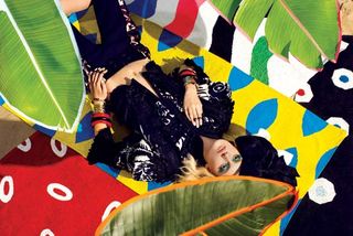
We thought about the interesting juxtaposition that would happen by painting real objects. You get a graphic flatness while still having machine-made shapes. With real sand, the images get even more strange.
Lastly, we brought all of the set pieces to a studio and shot like crazy for 15 hours. While shooting, we had the travel posters next to us to remind us about the stacked compositions that we were inspired by and tried to recreate these compositions photographically.
How do you see your career evolving?
I won't do set design forever. I'm open to letting the work guide me into wherever it will. I do think I'd like to make more permanent pieces. I think about interior design a lot and possibly opening a studio with someone else to do this.
I aim to make a broad range of work: personal projects, art projects, writing projects. I just came out with a zine that I'll self-publish every month called 'Research Practices in Making Shapes in Spaces'. It's a stream-of-conscious publication talking about the exercises I do to stay inspired.
Words: Tom May
Photography: Nathaniel Wood
This interview first appeared in Computer Arts 235: Branding Secrets, a special issue exclusively revealing the brand strategy secrets at the world's biggest agencies. You can pick up a copy of CA 235 here.
Liked this? You'll love these...
- 7 steps for maintaining your work-life balance
- How to become an art director
- Great examples of doodle art

Thank you for reading 5 articles this month* Join now for unlimited access
Enjoy your first month for just £1 / $1 / €1
*Read 5 free articles per month without a subscription

Join now for unlimited access
Try first month for just £1 / $1 / €1
Get the Creative Bloq Newsletter
Daily design news, reviews, how-tos and more, as picked by the editors.
The Creative Bloq team is made up of a group of design fans, and has changed and evolved since Creative Bloq began back in 2012. The current website team consists of eight full-time members of staff: Editor Georgia Coggan, Deputy Editor Rosie Hilder, Ecommerce Editor Beren Neale, Senior News Editor Daniel Piper, Editor, Digital Art and 3D Ian Dean, Tech Reviews Editor Erlingur Einarsson and Ecommerce Writer Beth Nicholls and Staff Writer Natalie Fear, as well as a roster of freelancers from around the world. The 3D World and ImagineFX magazine teams also pitch in, ensuring that content from 3D World and ImagineFX is represented on Creative Bloq.
