10 ways to master art direction with a conceptual brief
Justin Carroll of 3circlestudio.com walks through art-directing a digital marketing campaign for a sci-fi movie, from initial concept to final delivery.
Word: Justin Carroll
Ridley Scott's 1979 film, Alien, has been a foundational work of inspiration in my career. From Scott's visionary directing to HR Giger's surreal creature design, every frame screams creativity. The way it invokes intense emotion in the viewer, its originality in art direction and its immense success are all things I aspire to within my own work as director and designer.
When I was a kid my Mom used to take me to a video rental store at the end of our street. The only format available at the time was VHS. I walked each aisle slowly, studying each horror film's cover art addicted to the exciting emotions they stirred in me. The cover for Alien was particularly frightening, but in an unusual way. It wasn't obvious like the art for Return of the Living Dead or Evil Dead 2 - it made my imagination run wild with what could be inside that egg, things far scarier than they could reveal.
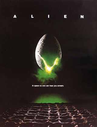
I pulled the dust jacket down off the shelf and took it over to my Mom. She displayed her distaste not for its art, but because she knew something I didn't. She'd seen the film in the theater shortly after its release and said her stomach hurt for two weeks after. That was all it took - I had to see it, I had to know what she was talking about.
Earlier this year Ridley Scott released Prometheus, a long-awaited new film set in the Alien universe. I was so excited for the film and by its interactive marketing that it got me thinking - what if Alien was being released for the first time this year and what if I were in charge of the interactive marketing, what would I do?
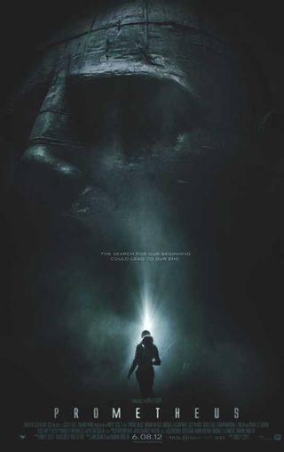
Exploring a conceptual idea like this is a great exercise in creativity. When designers ask me how they can sharpen their skills one of the things I encourage them to do is conceptual redesign for brands they're passionate about.
And so I'm practising what I preach. Throughout this exercise I'll share how I came up with an idea, how it served as the foundation for my art direction and how composition communicates a message with design and interaction. I sincerely hope you enjoy reading about it as much as I enjoyed working through it.
Get the Creative Bloq Newsletter
Daily design news, reviews, how-tos and more, as picked by the editors.
01. Preface
It must first be noted that this exercise takes place in a vacuum. In other words, I'm dreaming up the client's objectives in marketing, what Fox and Ridley Scott might have wanted to achieve within their budget. In reality, and like the start of any great project, I would've first talked with them and learned about their goals.
I'd then use that information in a process of research and discovery to determine what the best possible ideas were to successfully help them achieve those goals. Since that option was obviously not available to me I've used the trailer and other major marketing elements as clues to piece together a theory as to what they might have wanted to do if interactive marketing had existed at the time.
02. Creative direction
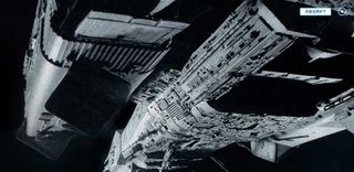
Most of Alien takes place onboard Nostromo, a commercial towing spaceship. The ship's computer is called MU/TH/UR 6000 (referred to as Mother), an artificially intelligent program much like Apple iOS's Siri that accepts audible commands and keyboard input.
Mother is present throughout the film, making her something of a flat character. The concept I would pitch would be that we center the entire campaign around this idea that fans will learn about and experience the film before its release by interacting with Mother through the central command terminal that is the official website.
Press content
Standard EPK (electronic press kit) content like video and photos would be readily available for consumption, but Mother would retain hidden content that fans must either hack, win or share their way to. The result of all social games, microsites, mobile applications and networking would converge in the disclosure of new commands.
Fans would either speak or type these commands into the official website and gain access to (unlock) hidden content leading up to the release of the film. As new commands are discovered they're logged and stored in Mother's public help directory for future reference.
03. Art direction
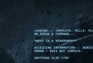
As I worked through this exercise I couldn't help but fantasise about all the ways I could execute ideas under my creative direction like a text-based game, secret Weyland documents and crew member blogs.
But for the brevity of this exercise I've limited the execution of art direction to the official website, the pinnacle of the creative direction and the cornerstone of all elements within the campaign.
Cryptic marketing
It's clear from the poster design and trailer that the studio didn't want to give anything away. In fact, it's one of the most cryptic marketing efforts I've seen.
Whatever they do show in the trailer happens so fast that people couldn't possibly know exactly what they just saw (which was the infamous facehugger leaping out of its egg and onto Kane's visor).
Tranquil tone
One of the things you'll notice throughout my compositions is that I never go beyond the commercial marketing. Rather than making the site a mashup of all the creature design we've come to know and love about Alien I had to pretend as if the fans had never seen those things; that their relationship with the film hadn't yet been established.
With that in mind I wanted the tone of the site to be exactly the same as the first half of the film; quiet, almost tranquil and sterile, but also dark, ominous and suspenseful.
Desaturated colours
The desaturated, cold, blue colour grading across all imagery communicates despair. This runs parallel to aspects of the film like the vastness of space, an empty spaceship and an uninhabitable planet not to mention Ripley, the lone survivor of an onboard massacre, left to square-off against a killer alien.
I avoided clear photography in favor of more cryptic shots with strong shadows and contrast to communicate mystery and the unknown. The same thing can be seen with cinematography in the exploration sequences on LV-426 and in most action sequences onboard Nostromo especially those that take place in the ductwork.
Ultimately I wanted fans to fear what they didn't know just like I did as a kid in the video store.
04. Homepage
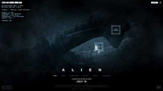
The site experience opens on a desolate scene of an alien spaceship (The Derelict) in what looks to be a dust storm. This ship is revealed in the trailer, but not this clear; a big reveal for the fans. The photo has been treated with dust and debris.
Mother is going through a boot sequence in the upper left-hand corner of the page. After loading she detects the planet and prints some more information to the screen. Analog-style buttons appear randomly across the screen... The highlighted button is the rollover state for "Watch Trailer".
Establishing tone
A button for "prompt" is isolated in the upper right-hand corner. What does it mean? Mother asks if the user would like to continue.
Right away the tone is established for the entire experience. Fans are exposed to something new yet cryptic while some type of operating system seems to be guiding them along and asking them to interact.
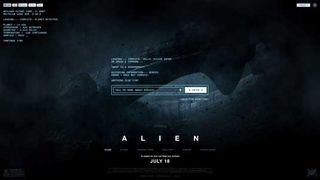
Fans can click the "prompt" button at any time to hide the button navigation and reveal a command prompt input field across the centre of the screen.
To unlock content the user must input commands. An audio icon suggests that they're able to speak as well as type commands. In fact, some content can only be accessed by speaking them into the site.
05. The story
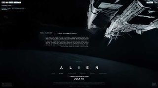
Here we see Nostromo descending upon a planet. Is it Earth? Maybe it's the planet from the homepage (LV-426).
Analog-style animation and sound design give way to analog typography describing the synopsis of the film. From a layout perspective it hangs in the vast expanse of space, as desperate as the situation for the characters in the film.
Although sometimes subtle, these choices seek to paint a picture and invoke emotion - the "art" in art direction.
06. Characters
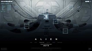
The characters are introduced in their most peaceful state. I imagine the hum in the room and the soft hiss of air-breaks as they release their grip on the glass lids.
Again, Mother gives us more information about the crew. An additional button navigation is presented across the screen in a random pattern. Rollovers allow fans to put a face with a name.
The detailed eye will notice that Ash has been in hypersleep less than any other member by almost a full day. What was he doing up, alone?
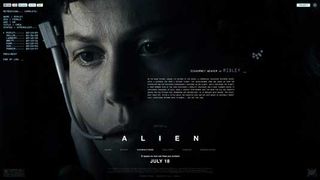
This is a great example of choosing more cryptic photos of leading characters rather than straight-on action shots. Again, I'm painting a picture and hoping to invoke emotions of mystery and intrigue.
Who is Ripley? Mother gives us some detailed information, but could she tell us more?
07. Gallery
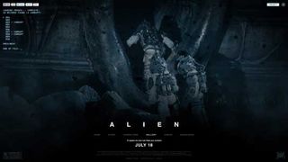
Mother shows us how many records have been found in her system. A a text-based navigation is printed to the screen for fans to paginate through the full-screen images from the EPK.
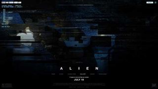
This is what one of the corrupt images might look like. I imagine there might be some type of hashtag fans could tweet to fix every pixel in this image and finally reveal it; one way I could use social networking to have the fans work together while also showing their followers that something interesting is happening with the film.
08. Video
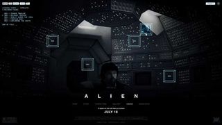
Here we see where the inspiration for the analog button navigation comes from, the array of buttons and lights that line the walls of the ship's command center.
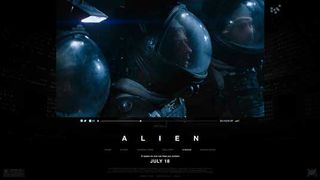
Video is played in an overlay and the background dims.
09. Downloads
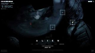
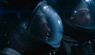
What is he looking down into? If you look closely you can barely make out the pattern in the reflection of his visor.
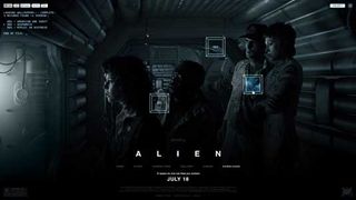
This frame is almost too obvious as to what I'm communicating - the crew looks perplexed as they stare through a pane of glass separating them from a room inside. What's in there, what are they studying?
10. Conclusion
If anything is taken away from this exercise I'd like it to be that ideas are first and style second.
I can think of a hundred powerful matte paintings or composites I could've done for this site such as ones focusing on the alien creature itself, but they'd also be a hundred failed pieces of art under this creative direction. They would've missed the mark completely in that they reveal far too much about the film and that would go directly against the commercial marketing. Basically, no matter how awesome they were they would've failed.
Passion for brands
I love what I do - I love interactive, ideas, art, creativity and technology. And I love being passionate about brands I believe in. Thanks for taking the time to read this and allowing me to geek out on one of my all-time favorite films.
Hopefully you've enjoyed my work and it's given you some insight as to how I approach the direction and design for the official website of a major motion picture.
For more on design and sci-fi, read:
- 30 best designs in sci-fi movies
- Star Wars art: Ralph McQuarrie
- How Gavin Rothery created the iconic design for Moon
- The 5 greatest Dalek designs of all time
Justin Carroll is a multi-award-winning interactive art director, designer and developer who partners with clients and agencies to create websites, ad media and interactive online experiences. Clients include Activision, Bandai, Disney, Marvel, Namco, National Geographic, Paramount Pictures, Square Enix, Universal and Warner Bros.

Thank you for reading 5 articles this month* Join now for unlimited access
Enjoy your first month for just £1 / $1 / €1
*Read 5 free articles per month without a subscription

Join now for unlimited access
Try first month for just £1 / $1 / €1
The Creative Bloq team is made up of a group of design fans, and has changed and evolved since Creative Bloq began back in 2012. The current website team consists of eight full-time members of staff: Editor Georgia Coggan, Deputy Editor Rosie Hilder, Ecommerce Editor Beren Neale, Senior News Editor Daniel Piper, Editor, Digital Art and 3D Ian Dean, Tech Reviews Editor Erlingur Einarsson, Ecommerce Writer Beth Nicholls and Staff Writer Natalie Fear, as well as a roster of freelancers from around the world. The ImagineFX magazine team also pitch in, ensuring that content from leading digital art publication ImagineFX is represented on Creative Bloq.
