Design an iOS interface
Román Jusdado reveals how to design iOS user interface elements using the Layer Styles feature in Photoshop.
- Software: Photoshop CS3 or later
- Project time: 6-7 hours
- What you'll learn: Prepare a moodboard, use vector and Layer Styles, Create realistic UI elements
As a designer and user of interfaces, I’ve always liked apps that look great. The better the balance between functionality and aesthetics, the better the experience for the user. Over the following steps we’re going to look at skeuomorphic design: we’re going to make elements of a radio app appear more lifelike using different methods in Photoshop, to help the user better identify each function of the app.
The main functions of the radio app that we’re going to look at here are the ‘browser’, which enables users to browse through different radio stations; and the ‘player’. I’ve modelled my design here on a physical radio – particularly in the colours I’ve used, the shapes and some of the details like the buttons and wooden border. Once you’ve mastered the various techniques for making your apps more lifelike, you can experiment with different methods to get the aesthetic you want.
- Discover the best iPhone apps for designers.
Step 01
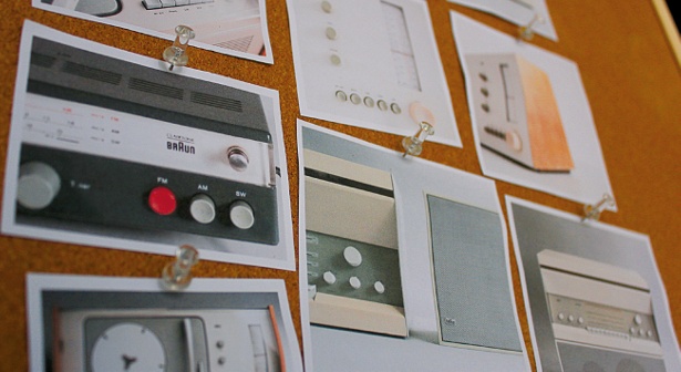
First, look for inspiration. Create a moodboard to play around with ideas - print it out and keep looking at it, absorbing all the details to inspire you for the project.
Step 02
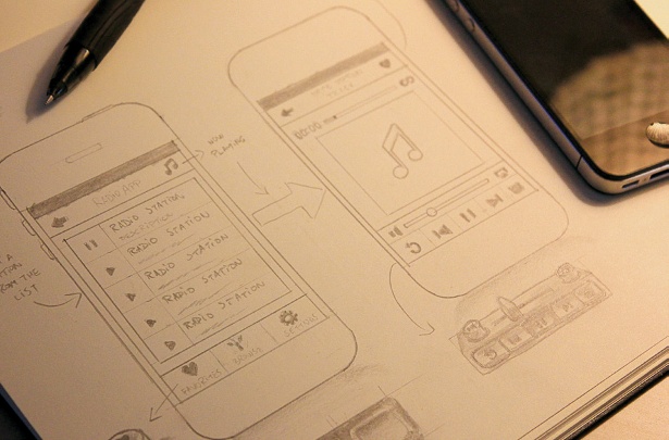
Next, start developing your main ideas by sketching them out. Try to focus on the function of the app. Don’t draw in too many details at this stage - they’ll distract you from the practical side of it. Your main objective is to make the application easy to use.
Step 03
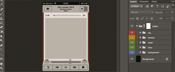
In Photoshop, set the canvas at 640x960px (iPhone 4/4S) or 640x1136px (iPhone 5) and, using guides, divide the screen into four areas for the top header, the content, the player at the bottom and the background. Using the Rectangle tool, rough out your interface. Create a button in the top header section using four rounded rectangles on four different layers, stacked on top of each other.

Step 04
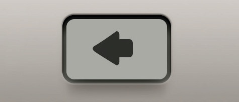
On your bottom button layer go to Layer>Layer Style>Inner Shadow. Set the blend mode to Linear Burn, opacity to 75% and chose a grey colour, then select Bevel & Emboss and set the style to Emboss. For the layer above, add an Outer Glow at 40%, with a Linear Burn blend mode set to grey, with 5% spread and 16px size. Add a grey drop shadow at 10%, choose Linear Burn, set the distance to 10px and size to 2px.
Step 05
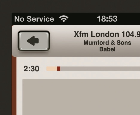
Choose the Rectangle Marquee tool, setting the feather to 10px. Select the very top layer and add a Clipping Mask (use the arrow in the Layers panel). Then go to Blending Options (using the arrow in the Layers panel again) and check the ‘Layer Mask Hides Effects’ box in the Advanced Blending section.
Step 06
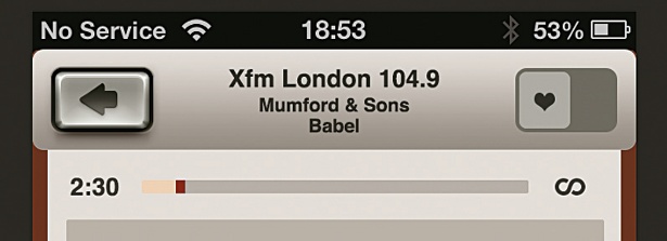
On the second from top layer, add a Bevel & Emboss Layer Style, set the technique to Chisel Hard, the size to 10px and select Rolling Slope from the Gloss Contour options. Then add an Inner Glow at 70%, Linear Burn, choose a grey colour and set the size to 3px.
Get the Creative Bloq Newsletter
Daily design news, reviews, how-tos and more, as picked by the editors.
Step 07
Make the very top layer smaller than the rest: this will add to the 3D effect. Select Bevel & Emboss, set the size to 50px, angle to 90º and altitude to 70 degrees. Add a Gradient Overlay at 10% with a Linear Burn blend mode, and a white to black gradient at 90 degrees with a Linear Burn blend mode. Draw an icon to sit on top (an arrow here).
Step 08
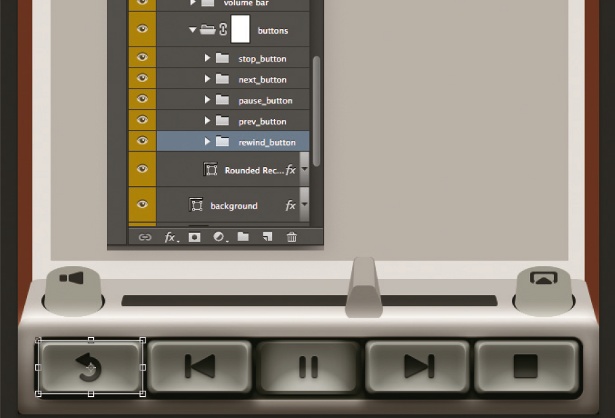
Duplicate your button to create any other buttons that you want to add (including different icons on the top layer). Next, create the border of your interface and give it all a bit of polish.
Step 09
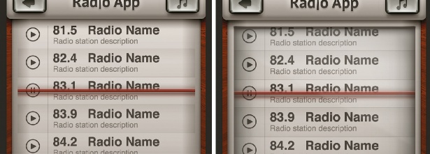
For the list of radio stations, draw a rectangle shape to cover the main content area, setting the fill to 0%. Add a Bevel & Emboss, with an Outer Bevel style and size of 2px, then add an Inner Shadow at 75% with a Normal blend mode, in black, with a distance of 7px and size of 10px. Add an Inner Glow at 20%, with a Normal blend mode, black colour and 90px size.
Step 10
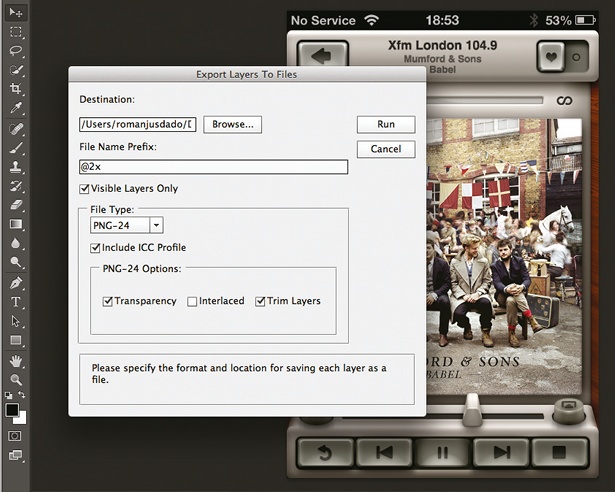
Export the separate parts of your interface by converting each element in different layers to Smart Objects. Name them and, finally, go to File>Scripts>Export Layers To Files.
Liked this? Read these!
- How to make an app
- Create a perfect mood board with these pro tips
- The ultimate guide to designing the best logos
- Download the best free fonts
- The best free web fonts for designers

Thank you for reading 5 articles this month* Join now for unlimited access
Enjoy your first month for just £1 / $1 / €1
*Read 5 free articles per month without a subscription

Join now for unlimited access
Try first month for just £1 / $1 / €1

The Creative Bloq team is made up of a group of art and design enthusiasts, and has changed and evolved since Creative Bloq began back in 2012. The current website team consists of eight full-time members of staff: Editor Georgia Coggan, Deputy Editor Rosie Hilder, Ecommerce Editor Beren Neale, Senior News Editor Daniel Piper, Editor, Digital Art and 3D Ian Dean, Tech Reviews Editor Erlingur Einarsson, Ecommerce Writer Beth Nicholls and Staff Writer Natalie Fear, as well as a roster of freelancers from around the world. The ImagineFX magazine team also pitch in, ensuring that content from leading digital art publication ImagineFX is represented on Creative Bloq.
