Concept Apple Music design puts personalisation first
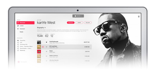
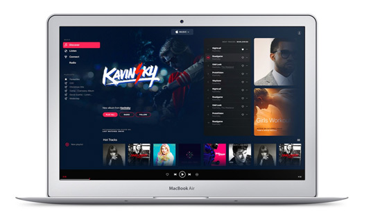
Tom Koszyk was unimpressed with Apple Music's design and UX, so he created this concept upgrade.
Apple has a history of revolutionising how we enjoy music, with the iPod and iTunes ushering in a new digital era. However, the technology giant seems to have dropped the ball with its latest musical endeavour, Apple Music.
Introduced at the end of June 2015, Apple Music is the music streaming service from Apple Inc. Considering that up until this point Apple has successfully remodelled music, it's all the more surprising that Apple Music has been met with a frustrated reaction from designers.
Many criticised the platform's usability and lack of personalisation options. Enter Tom Koszyk, a senior web designer at GOG.com who had had enough.
Koszyk went back to basics, working from the ground up to develop a core loop for Apple Music. In his opinion, Koszyk descirbed a streaming service as a 'never-ending process of discovery' and built his platform around this idea.

Starting out with the most important change, Koszyk created clear and consistent navigation. This meant easy to understand naming and the ability to navigate back at any time. A left aligned menu was given priority, which created a visible space for playlists.

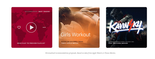
Next up was personalisation. For a service that's all about tailored playlists and tastes, personalisation is a logical design choice. As a big fan of custom layouts, Koszyk made sure that his version of Apple Music would deliver it. 'It's so easy, and it can add so much value,' says Koszyk.

Despite being powered by awesome algorithms, Apple Music is underperforming when it comes to custom playlists. 'It's so 2010,' says Koszyk. To this end, he proposes that data from your iPhone and iWatch is integrated to create a musical ecosystem you don't need to make yourself.
Along with other tweaks, such as splitting up music and discovery navigation, as well as smoothing out playlist creation and improving social options, Koszyk's design is a polished prototype that brings Apple Music closer to Spotify's standards.
Liked this? Read these!

Thank you for reading 5 articles this month* Join now for unlimited access
Enjoy your first month for just £1 / $1 / €1
*Read 5 free articles per month without a subscription

Join now for unlimited access
Try first month for just £1 / $1 / €1
Get the Creative Bloq Newsletter
Daily design news, reviews, how-tos and more, as picked by the editors.

Dom Carter is a freelance writer who specialises in art and design. Formerly a staff writer for Creative Bloq, his work has also appeared on Creative Boom and in the pages of ImagineFX, Computer Arts, 3D World, and .net. He has been a D&AD New Blood judge, and has a particular interest in picture books.
