Mac OS graphic designer Susan Kare on icon design
She created everything from the Trash Can to the Happy Mac symbol - and became a bit of a design icon herself.
There's one designer whose work you've probably spend more of your life staring at than any other... and you may not even know her name. Well let us enlighten you: the person responsible for creating the most iconic graphic elements of the Mac operating system, including the Trash Can, the command key, Lasso, the Grabber, the Paint Bucket, the Happy/Sad Mac and more, is Susan Kare.
Currently leading Susan Kare Design, a digital design practice in San Francisco, and Kare Prints (giclee prints of some of her favourite icons), she's also the brains behind font families such as Chicago, Monaco and Geneva, and has designed thousands of icons for a range of global brands. Most recently, she's collaborated with our sister title MacFormat to create a special icon for their 20th anniversary celebrations. We caught up with Susan and chatted about the glory days of Apple and the secrets of a good icon...

Early days at Apple
In the early 1980s, Kare, then a recent graduate, landed a job at pioneering computer company Apple. Originally hired to design user interface graphics and fonts, she went on to become a creative director there. "It was a great experience working on a new device as part of a team, with many creative colleagues that I admired," she recalls.

"I really enjoyed working with Steve Jobs, both at Apple and then later at NeXT [the company founded in 1985 by Steve Jobs after he'd been forced out of Apple]. He cared so much about every detail, was interested in design and graphics, and challenged you to do your best work."
Steve Jobs cared so
The groundbreaking nature of their work, though, didn't really sink in until later. "Generally I just focused on the design task at hand from one day to the next," she explains. "I am very grateful and appreciative that some images I designed almost 30 years ago are still in use."

Designers of computer graphics had fewer pixels to work with then, but that wasn't a problem - in fact, it was a challenge she relished. "Every design job has constraints (as opposed to fine art)," she explains. "And solving the problem while taking those into consideration is the challenge and the fun. In fact, limited screen real estate is a particular interest of mine - trying to make something clear in 16 x 16 pixels."
Computing for 'the rest of us'
Out of all the iconic Mac OS designs she's responsible for, Kare reserves her fondest memories for the Happy Mac symbol. "When I see it, it reminds me of the group effort of trying to make a computer 'for the rest of us'" she explains, referring explicitly to "a non-technical audience that included myself".
She's not 100 per cent happy with all of her creations, though. There's less sentimental attachment, for example, for every single character in Chicago. "I don't love the X in the font," she admits. "There just aren't enough dots for a good alternative with no jagged lines."

On the whole, though, her creations have become both ubiquitous and iconic, and Kare has a straightforward explanation for their success. "I believe that symbols that are simple - not too many extraneous details - and meaningful can have a long life span," she says.
Advice for icon designers
So what advice does Kare have for those hoping to follow in her footsteps and create successful, lasting icon designs? Here are four fundamentals that should get you on the right track.
01. Not one solution, but many
Kare believes it's important to recognise what icon design is for. "Icon design is problem-solving, and it's not an exact science," she stresses. "There are always multiple solutions. We try first to think hard about each concept, and how it might be communicated using a variety of metaphors.
02. Offer a range of options
How should you present an icon design to a client? "We like to present clients with a range of options for each icon, and don't shy away from a little warmth or humour when it's appropriate," she says. "It's always great to see placeholder icons, because sometimes there are great ideas that just need visual refinement."

03. Don't obsess over tools
Software may evolve, but that doesn't alter the basic task in hand, explains Kare. "Although software tools and resolutions have changed over the years, the basic process remains the same."
04. Some icons are easier than others
Not all icons are easy to create, Kare stresses. "Icons that lend themselves to a concrete subject - such as a piece of paper to represent 'document' - are easier to make visual than abstract concepts - such as 'undo" or 'save'," she explains. "Sometimes it is tempting to use an illustration for an icon (of a printer, or external hard disk, etc), but often these less metaphorical solutions can become dated."
The future... and back to the past
Despite the challenges, Kare still has a passion for icon design, three decades after she shaped the visual future of the Mac OS. "I just love to design," she enthuses. "We especially enjoy working on icons and logos, and we're also collaborating on some accessories that feature icons."
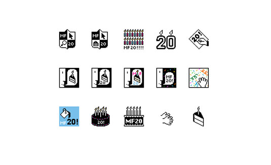
But although she's thoroughly future facing, she did recently get a chance to indulge in some Mac notstalgia, when MacFormat magazine asked her to create a special logo for their 20th anniversary issue. Playing on her original icon designs for the Mac operating system, Kare came up with a range of possibilities for the magazine, which she's exclusively shared with Creative Bloq below:
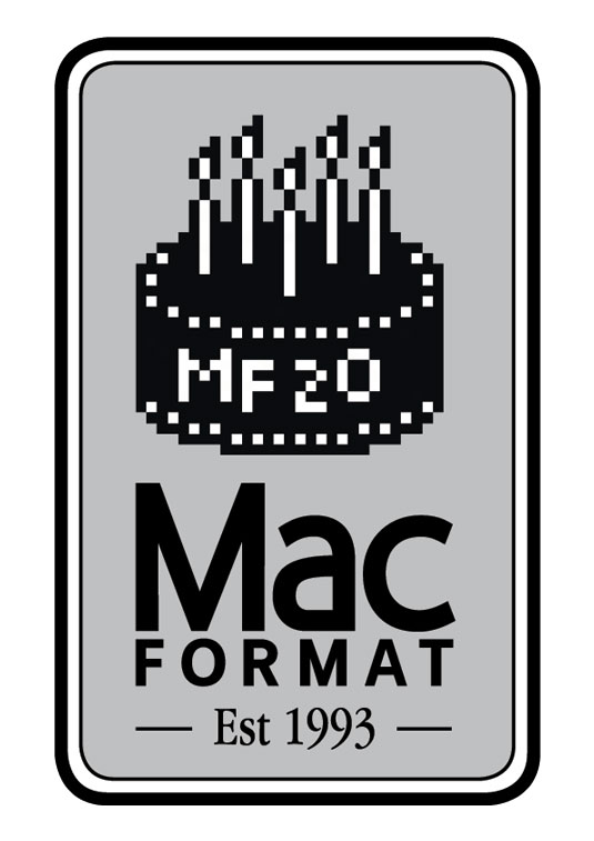
Here, though, is the final design the MacFormat team settled upon, which they used on the cover of their special anniversary edition and throughout the magazine:
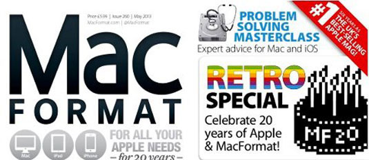
"This was a great project because one-bit graphics are close to my heart, and the subject was celebratory," Kare smiles. "We enjoyed working with editor Christopher Phin and art editor Alex Thomas to explore various birthday concepts blended with old school Macintosh imagery."
A final word of advice
Editor Christoper Phin returns the compliment: "Susan Kare has been a hero of mine for years," he says. "Not least because when I was studying design at art school, she gave me a piece of icon design advice that has stuck with me ever since. It doesn't matter if the feature an icon represents is immediately and intuitively obvious; what matters is that once you've made the link in your head - once you've learned what an icon does - some quality of the icon makes that link unbreakable."
So Phin was excited when she agreed to create an icon especially for MacFormat's 20th birthday. "Having decided that we wanted to emphasize the retro nature of our anniversary by producing a 1-bit icon, we came up with some ideas for the brief, and Susan came back with some terrific ideas," he explains. "One of my very favourites, that we ultimately didn't use, was this one of the iconic dialog box face with a slice of cake. It reeks of Kare design; bags of character, a light, human, even humorous touch, and it completely evoked the age.
"Ultimately, though, we thought that the cake with MF20 (we're encouraging people to tell their stories and share pictures hashtagged with #mf20) was a stronger image on its own. We asked Susan to do some tweaks, creating a white version of the cake, but once we'd put it into the 'cartouche' design with our logo and date of establishment (set in Apple Garamond), actually her original instinct to make the cake black proved to be bang on."
Get a free issue of MacFormat!
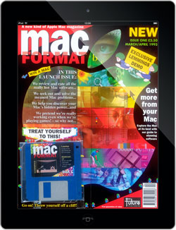
MacFormat is the UK's best-selling print and iPad magazine for the Mac user, showing you how to make the most of your Mac, OS X and all the creative things you can do with it. Download the free iOS app and you can get an issue for free, enhanced with audio and video, if you take out a trial subscription (new subscribers only). So what are you waiting for?

Thank you for reading 5 articles this month* Join now for unlimited access
Enjoy your first month for just £1 / $1 / €1
*Read 5 free articles per month without a subscription

Join now for unlimited access
Try first month for just £1 / $1 / €1
Get the Creative Bloq Newsletter
Daily design news, reviews, how-tos and more, as picked by the editors.

The Creative Bloq team is made up of a group of design fans, and has changed and evolved since Creative Bloq began back in 2012. The current website team consists of eight full-time members of staff: Editor Georgia Coggan, Deputy Editor Rosie Hilder, Ecommerce Editor Beren Neale, Senior News Editor Daniel Piper, Editor, Digital Art and 3D Ian Dean, Tech Reviews Editor Erlingur Einarsson, Ecommerce Writer Beth Nicholls and Staff Writer Natalie Fear, as well as a roster of freelancers from around the world. The ImagineFX magazine team also pitch in, ensuring that content from leading digital art publication ImagineFX is represented on Creative Bloq.
