7 concepts show what the iPhone 6 could've been
These designers created a range of design concepts before this week's announcement - are they better than the real deal? You decide.
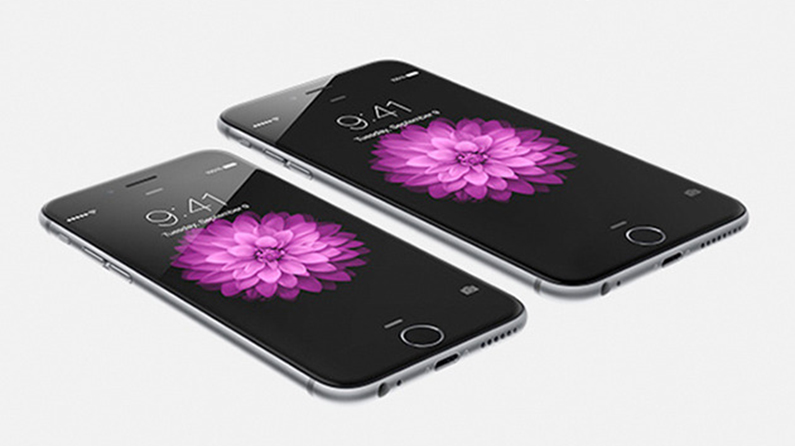
This week saw the announcement of the all new iPhone 6. Causing the internet to erupt and the ultimate excitement for Apple fans, there's two models on offer – the iPhone 6 and the iPhone 6 Plus.
In the weeks and months prior to the new iPhones' announcement, designers around the world had been creating concepts based on the numerous leaks and rumours, or just how they would like the 6 to look and behave.
Rendering skills
Now, we know that concept designers don't have the same restrictions and comprehensive briefs that Apple's team led by Jony Ive work with – but that does not make concepts irrelevant. For better or worse, design concepts of existing products let some talented people show off their imagination, rendering skills, and more, and some are incredibly detailed and impressive.
Here, we take a look at some of the most interesting concept designs to come out. If after reading this, you simply can't wait for the iPhone 6 to be released – or it's a little pricey for you – you can enter our Epic iPhone 6 Giveaway.
01. Johnny Plaid
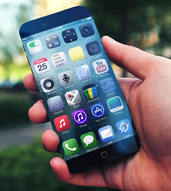
Created back in 2013, Los Angeles based designer Johnny Plaid showcased his vision for the all-new iPhone 6. "I set out to increase not only the height of the display, but the width as well while still following Apple's design and usability requirements," he explains. This concept would make movie watchers very happy indeed.
02. Moyano and Aichino
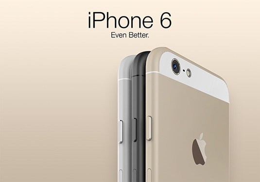
Based on the iPhone 6 rumours back in June, Argentinian designers Tomas Moyano and Nicolás Aichino came up with this sleek concept design. "The iPhone has always been crafted down to the micron," they explain. "Besides the beautiful aluminium housing, sapphire crystals now protect the front to an unmatched level."
03. Iskander Utebayev
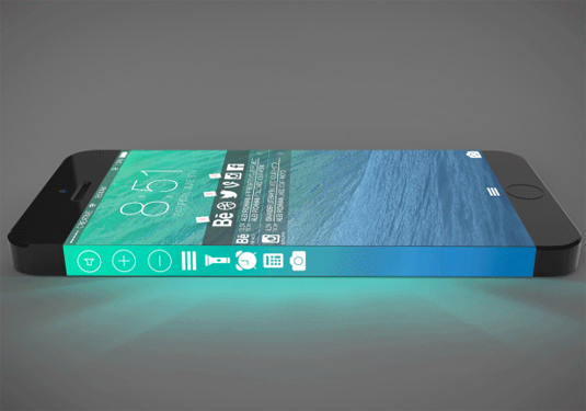
Instead of just expanding the screen to the edges, Kazakhstan based designer Iskander Utebayev has gone one step further and increased the width to spill over onto the side of the phone – something that Samsung has made a reality with its incredible new Galaxy Note Edge. Featuring action icons on the side, it might prove problematic for user experience; however, it's certainly a nice looking concept!
Get the Creative Bloq Newsletter
Daily design news, reviews, how-tos and more, as picked by the editors.
04. Madureira
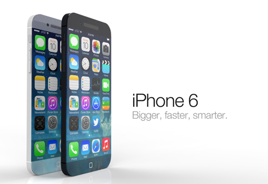
Much like the previous iPhone concepts, this one features an edge-to-edge retina display. There's also a new iSight camera that comes with 12 megapixels, with video recording taken in 2K at 120fps. The phone itself is thinner, with the bottom and top of the screen adapting to light conditions so you can see your wallpaper at all times.
05. AMD Creation
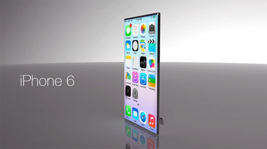
Flat and incredibly thin, this iPhone 6 design takes the screen to new levels. Covering the entire device with the retina display could make for a difficult user experience. Without much grip, you could easily press functions accidentally. However, it looks great and the sim card port at the side is a great little aspect.
06. Ran Anvi
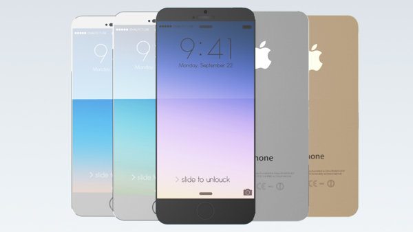
The thickness of the new iPhone 6 seems to be a priority for pretty much every single one of these concept designs. This one from designer Ran Anvi puts it at the forefront of the design, with some nice aesthetics on the outside to entice the new customers. It looks great but it would be interesting to see what else this concept could offer.
07. Dennis Abban

This concept design is probably going to upset quite a few Apple fanboys. Here, the new iPhone 6 takes inspiration from Android devices with an ultra thin aesthetic of 6mm, a 24 megapixel camera and dual charging system – oh, and it's 'running' Android's latest KitKat OS instead of iOS 8. Okaaaay... There's also a claim of 72 hours battery life which is where it firmly enters the realms of fantasy!
Do you think any of these iPhone 6 concept designs are better than the real deal? Let us know in the comments box below!

Thank you for reading 5 articles this month* Join now for unlimited access
Enjoy your first month for just £1 / $1 / €1
*Read 5 free articles per month without a subscription

Join now for unlimited access
Try first month for just £1 / $1 / €1

Sammy Maine was a founding member of the Creative Bloq team way back in the early 2010s, working as a Commissioning Editor. Her interests cover graphic design in music and film, illustration and animation. Since departing, Sammy has written for The Guardian, VICE, The Independent & Metro, and currently co-edits the quarterly music journal Gold Flake Paint.
