Project diary: how ustwo created a mobile puzzle game
Blip Blup is a fiendish cross-platform puzzle game from design studio ustwo. Here its creator, Manesh Mistry, reveals the secrets behind its development.
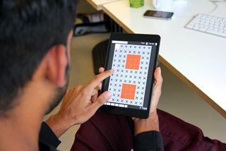
Like many design studios, ustwo gives its staff the opportunity to work on personal projects, with the aim of turning them into something tangible. In Blip Blup’s case the brief for the designers was to come up with something inspired by a personal passion.
The design brief
"As a studio that specialises in interactive experiences, it’s no surprise that ustwo has some keen gamers on its staff," says Blip Blup creator Manesh Mistry. "For the follow-up to our first large-scale game project, Whale Trail, the studio wanted to try something different – so we were all given the opportunity to take short, one-week sprints inbetween client projects to try to come up with something cool.
"We were told we could work on anything we liked as long as it was interactive, with the proviso that we had to show what we’d created to others in the studio. The best ideas were then taken forward and developed. I’d always expressed my wish to create a game: it’s something I believed I could do well, given the chance.
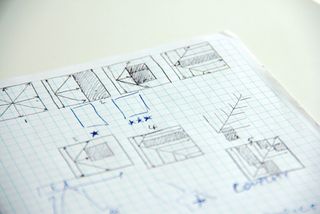
"When I joined the process, I already had an idea at the back of my mind based on my own interest in puzzle games. It didn’t matter to me, in a way, whether you could solve the puzzle or not, just interacting with it needed to be fun. The idea I came up with at the time was an empty screen with a series of black squares on it. If you tapped anywhere on that screen a light would shoot out. It was as if the light was coming out of the tip of your finger.
"In many ways I was trying to make a puzzle game that I would like to play, a game that was about thinking, about taking your time. Blip Blup isn’t about reflexes or how quickly you can react to something. That’s not what the game is meant to be.
"I started with a few simple sketches and then made the first prototype in a cross-platform language called HaXe. Because the reaction to the idea was good, I was allowed to take the prototype further. That’s when I attempted to create the actual puzzles. As the reaction to the next prototype was positive, I was allowed to take the idea into full production with support from the rest of the studio, and all that entails.
Work in progress
"During the production phase, I worked on the app full-time with others joining me from other parts of the company to help out with certain things. In the end, up to eight different people worked on the project, although there were usually only one or two of us at once. We also had a project manager to oversee everything and make sure we hit our deadlines.
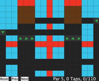
"The app went through a number of different phases of development, but much of the final design ended up being inspired by original prototype. I’m a programmer and developer not a visual designer, so the prototype was super simple. It used block colours and was just really bold.
"We then attempted to design it in the opposite direction, to go skeuomorphic with it, to make game elements look like you could actually touch them. After getting all that in we found that this approach didn’t help with the problem solving, which is what this game is all about. I remember playing one of the particularly hard levels. In the level editor it looked really simple with just prototype colours and was really enjoyable to play.
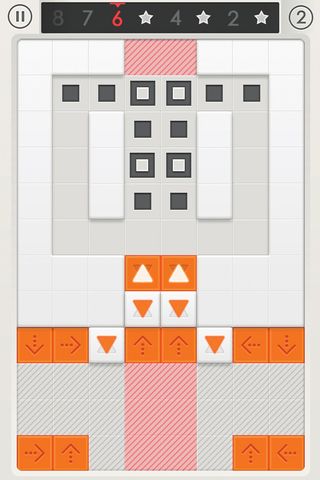
"As soon as I played the same level in the actual game with all the skeuomorphic visuals, I just thought this is impossible; the design was obscuring the puzzle. So, as an exercise, we stripped everything back – not all the way, but somewhere between the two extremes and it worked. I think we achieved the right balance in the end.
"We also spent a lot of time developing the tutorials at the beginning and on the end of game screen between each level. Both went through several iterations. The end of game screen, for example, had a lot of information: it wasn’t until our UX designer suggested I put down every single element on a Post-It note and then rearrange them into a hierarchy that the design solution became clear.
And to conclude...
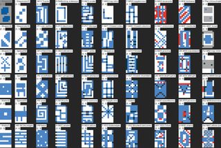
"Since Blip Blup was released on iOS and Android at the end of May, the reception has been almost universally positive. It was also important for me – and for ustwo as a studio – that the game felt human. Every level had been designed by us, not a computer. A lot of thought had gone into it.
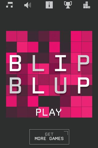
"There’s a misconception that we’re a faceless design studio, that we’re just cashing in, but we’re not. We’re a bunch of gamers who absolutely love games and we were just trying to make something we’d love and that we would want to play. It’s almost like if someone else wants to play it, great. Please do. But first and foremost, it had to be something we were proud of. And I think we achieved that."
Liked this? Read these!
- How to build an app: great tutorialsB
- Best iPad apps for designers
- Best iPhone apps for designers

Thank you for reading 5 articles this month* Join now for unlimited access
Enjoy your first month for just £1 / $1 / €1
*Read 5 free articles per month without a subscription

Join now for unlimited access
Try first month for just £1 / $1 / €1
Get the Creative Bloq Newsletter
Daily design news, reviews, how-tos and more, as picked by the editors.
The Creative Bloq team is made up of a group of design fans, and has changed and evolved since Creative Bloq began back in 2012. The current website team consists of eight full-time members of staff: Editor Georgia Coggan, Deputy Editor Rosie Hilder, Ecommerce Editor Beren Neale, Senior News Editor Daniel Piper, Editor, Digital Art and 3D Ian Dean, Tech Reviews Editor Erlingur Einarsson and Ecommerce Writer Beth Nicholls and Staff Writer Natalie Fear, as well as a roster of freelancers from around the world. The 3D World and ImagineFX magazine teams also pitch in, ensuring that content from 3D World and ImagineFX is represented on Creative Bloq.
