7 app design tips from The Weather Channel
The Weather Channel recently redesigned its app from the ground up. Nikki Santoro shares the experiences and lessons learned.
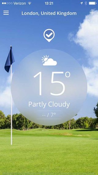
It's all very well reading generic tips on how to design an app - but sometimes its more useful to hear from people who've been at the chalkface. The Weather Channel recently redesigned its Weather Channel app from the ground up, and so we asked Nikki Santoro, vice president of mobile products, to unpack their experiences and share the lessons they learned along the way. Here are seven of them...
01. Usability is central
The number one thing is usability. Usability is timeless - not just for 2014, but for any year and for any product redesign. Consumers need an app that is usable, with a seamless experience.
02. Consistency is key
Another trend we're focused on at The Weather Channel this year is consistency. The mobile user today moves across many devices, between home, work, tablets and phones.
We want their experience with The Weather Channel brand to be a consistent look and feel and set of features, across all screens. Overall, our three pillars revolve around consistency, beauty, and usability.
03. How to incorporate storytelling
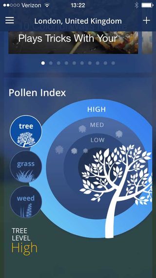
The Weather Channel on TV in the US and weather.com are well known for the capacity to tell compelling stories through content, news and videos. But many people may not know that we incorporate storytelling across our mobile products.
In the recently released iPhone redesign, we added lifestyle modules, which add colour and depth to our weather forecasts. Features like the pollen, airport, and outdoor activity forecasts help consumers understand how the weather will impact their day.
With these new features, we want to tell a story with our weather data so that consumers don't have to extrapolate what to do. We offer the most accurate forecast, but more than that, we offer very actionable information - what can you do with this weather information?
Get the Creative Bloq Newsletter
Daily design news, reviews, how-tos and more, as picked by the editors.
04. How to test your app
User testing is very important but it is important to test products at the right point in the process.
At The Weather Channel we conduct prototype testing before the design is locked down to validate usability and desirability. Then we do live beta testing with internal and external customers. From our beta tests we glean valuable information about real world usage of the app. Then once the product is live, we listen to consumer feedback closely.
Our team works in a very agile environment, so even after launch, we can quickly iterate to address issues that customers are reporting.
05. How to integrate advertising
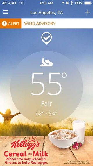
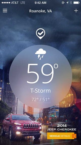
Our new iPhone app was redesigned with both consumers and marketers in mind. We integrated ads into both the home screen and the app's main content feed so they feel more integrated into the overall experience. Weather is still the hero, but we also enable brands to tell their story through the lens of weather.
Along with branded backgrounds on the home screen, the interface is now a clean vertical scroll that gives users immediate access to weather forecasts, video and richer content.
Advertising has been seamlessly integrated into the scroll so marketers are part of the experience as users engage with the content. We've also introduced a variety of native formats that resemble content and truly make marketers part of the weather story in an elegant way.
06. How to deal with an abundance of data
It's easy to overwhelm your user with information. The secret is to understand your customer and tailor the user experience accordingly.
We make sure to compartmentalize information so consumers can easily access the information they are looking for. For example, at certain times of day we know people come to us for specific things. On a weekday morning, it's about what to wear and the morning commute, or on Friday afternoon, it's about the weekend forecast and activity planning.
We also understand that customers process our weather data differently, so we talk to them in different ways. Our 'just the facts, ma'am' customers can go straight to the weather icons and raw weather data, while those who want their forecasts in more descriptive terms, focus on our narratives.
07. How to meet the user's needs
It doesn't matter how pretty or functional your interface is, if it doesn't meet your user's needs, it's pointless.
Testing and being responsive is key to this. Big changes can be hard for customers and it often takes getting used to a new user experience. While sometimes a big change is necessary, such as our move from a tab to a scroll interface on iPhone, but generally smaller changes at more frequent intervals is better for consumers.
Especially with big design changes, it is important to put in visual tips and cues so users can discover new features and functionality more easily. It is critical to find the right balance between providing users with an elegant design and helpful information. And as always, you must listen to customers and be willing to make changes when your customers are having difficulty.
Words: Nikki Santoro
The Weather Channel App for iPhone is free to download from iTunes today and will be rolled out on other mobile operating systems in the future. You can learn more about the new design via this demo video.

Thank you for reading 5 articles this month* Join now for unlimited access
Enjoy your first month for just £1 / $1 / €1
*Read 5 free articles per month without a subscription

Join now for unlimited access
Try first month for just £1 / $1 / €1
The Creative Bloq team is made up of a group of design fans, and has changed and evolved since Creative Bloq began back in 2012. The current website team consists of eight full-time members of staff: Editor Georgia Coggan, Deputy Editor Rosie Hilder, Ecommerce Editor Beren Neale, Senior News Editor Daniel Piper, Editor, Digital Art and 3D Ian Dean, Tech Reviews Editor Erlingur Einarsson and Ecommerce Writer Beth Nicholls and Staff Writer Natalie Fear, as well as a roster of freelancers from around the world. The 3D World and ImagineFX magazine teams also pitch in, ensuring that content from 3D World and ImagineFX is represented on Creative Bloq.
