5 ways to make your app design stand out
Want more visibility in the App Store? Sara Clayton looks at the lessons we can learn from the highly competitive weather app market.
With so much competition on the App Store, how on earth do you make yours stand out? In order to answer that question, it's worth taking a look at what's happening in a specific sector. Let's examine the recent mania for weather apps...
Lately, the App Store has been inundated with user interface-focused weather apps. In a tight market, not all weather apps can succeed. But some new apps have done so by presenting a refreshingly simple and elegant twist on the idea (*including an open-minded approach to profanity - which means the easily offended might not want to scroll down further).
In this article, I'll take a close look at three designers who've managed to make their weather app stand out, how they did it, and what you can learn from them - whatever kind of app you're building...
- Also read: How to build an app: try these great tutorials
01. Simplify to extremes

The reason people want to download apps, as opposed to using the web, is convenience. They want to find out information quickly and easily. So keep looking at your design (and those of rival apps) and asking yourself: how could this be simplified further?
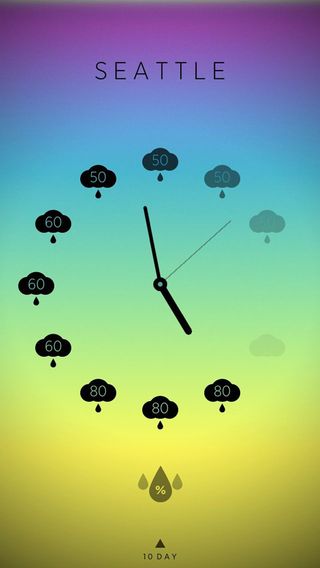
The Climate Clock app shown above is a great example. Ben Wong created it because he was frustrated that his native weather app had no hourly feature. The 'Minimal Hourly World Weather Forecast' was his answer. Designed with elegance and minimalism in mind, Climate Clock it's simply a clock with a symbol, be it a cloud or the sun, for the predicted weather on each hour.
Climate Clock, unlike its more complicated counterparts, doesn’t provide specific details on the weather such humidity or atmospheric pressure. But the app’s ease of use and visual attractiveness more than makes up for the absence of those more intangible weather facts.
02. Design for yourself, not others

One approach to app creation that often bears fruit is to design it for yourself, not others.
Get the Creative Bloq Newsletter
Daily design news, reviews, how-tos and more, as picked by the editors.
Take Tobias van Schneider. When he began to toy around with the idea of a weather app, he did not have his sights set on pitching it to the App Store. "The reason why I designed this app was originally more because I wanted to make fun of all the current weather apps out there, just to check it off my to-do list," Schneider explained.
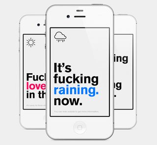
His app, the Authentic Weather app, is minimalistic - and as profane as it gets. This charmingly rude app boasts a symbol of the weather in the top left corner, a pearly white background and large obnoxious Akzidenz Grotesk text telling the user what the weather will be like with a huge dose of the F-word.
Though the Authentic Weather app was just a side project, Schneider was overwhelmed with positive responses. "I never expected people to ask for the real app, even though I knew people would appreciate the humour," said Schneider.
It’s one of the more bawdy weather apps that have been devised so far, but the look of the Authentic Weather app, as well as the lighthearted crowd it caters to, adds to its appeal.
03. Make it super-easy to use
Another approach to standing out in a crowded market is to make your app super-easy to use.
Cesare Rocchi took such an approach, designing his weather app, Breezi, to do as much as possible while working with as little as possible. With bright colours, a chunky white font and an intuitive approach to swiping, Breezi makes the weather truly a breeze to check.
Of course, no one is claiming that it's easy to make your app easy to use. But it's the holy grail of app development that everyone should be aiming for - and if you can pull it off, the world is your oyster...
04. Charge for it
Despite there being so many free apps out there, charging money for your app can actually be a good thing (as long as you can justify it in terms of its superior design, of course). Attaching a price tag will certainly help your app stand out, and it's surprising how many people are willing to pay for a better, aesthetically pleasing user experience.
“A beautiful interface is almost something like a super, disposal version of a cheaper car," says Wong. "People definitely want something that’s fun … you don’t have to take something away from it. It’s 99 cents, so why not?"
05. Target new devices
Despite the success of Breezi, Rocchi still feels apprehensive about the future of weather apps. "There are so many of them," he says. "The weather app as a category is exhausted. Unless new devices come up, I think it's a sort of saturated market."
But technology moves fast (it's only three years since the first iPad was launched) and new devices there certainly will be. Don't think of apps as just something for smartphones...
Wong believes new tech will offer a big opportunities to adapt and extend weather app interfaces. "There’s a big trend in wearable computing," he points out. Google Glasses may still be a prototype but he suggests "Climate Clock would be a great addition to the iWatch. You would always have it there. That would be the future of weather apps that I would like to see."
Words: Sara Clayton
Sara Clayton is a student at the University of Southern California. She is a senior editor at the Daily Trojan and an intern at Mention Mobile, a social mobile gaming startup in Los Angeles. Follow her on Twitter @saraclay15.
Liked this? Read these!
- Create a perfect mood board with these pro tips
- The ultimate guide to designing the best logos
- The best free web fonts for designers
Have you found success in the App Store? Tell us about your experiences in the comments below...

Thank you for reading 5 articles this month* Join now for unlimited access
Enjoy your first month for just £1 / $1 / €1
*Read 5 free articles per month without a subscription

Join now for unlimited access
Try first month for just £1 / $1 / €1
The Creative Bloq team is made up of a group of design fans, and has changed and evolved since Creative Bloq began back in 2012. The current website team consists of eight full-time members of staff: Editor Georgia Coggan, Deputy Editor Rosie Hilder, Ecommerce Editor Beren Neale, Senior News Editor Daniel Piper, Editor, Digital Art and 3D Ian Dean, Tech Reviews Editor Erlingur Einarsson and Ecommerce Writer Beth Nicholls and Staff Writer Natalie Fear, as well as a roster of freelancers from around the world. The 3D World and ImagineFX magazine teams also pitch in, ensuring that content from 3D World and ImagineFX is represented on Creative Bloq.
