The secrets of digital papercraft
Jeremy Kool explains how The Paper Fox, a visually stunning interactive adventure for iOS, was brought to life.
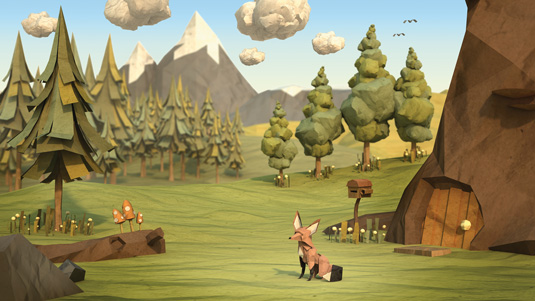
One thing I've always been acutely aware of is stagnation. If I'm working on 3D props and landscapes all day, I spend my off-hours
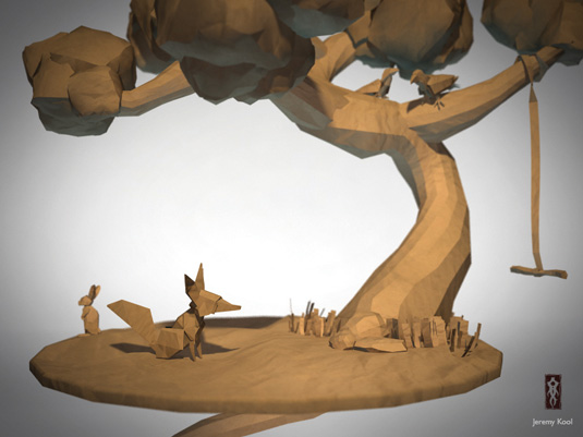
on character projects so that I don't feel I'm over-specialising. Back in 2010, The Paper Fox project started with a personal challenge: to create a CG character that looked as if it was constructed from paper.
I'm not sure why I picked a fox to model: maybe because they have great personalities and easily distinguishing features. I found that the model came together quickly and, with the help of some texturing and added depth of field in the render, it looked halfway convincing.
I finished the piece by making a diorama with a little tree, some birds and rabbits and then put it on my blog and thought nothing more of it.
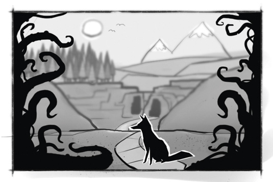
To my surprise, people kept bringing my attention back to it over the course of the next 12 months, telling me they really liked it and wanted to see more.
During this time, my wife gave birth to my son and I changed jobs twice, so my little cardboard fox got put on the back-burner. After the dust had settled, I decided to revisit him and see what I could do to improve to iterate on the piece.
I found creating the characters came very easily
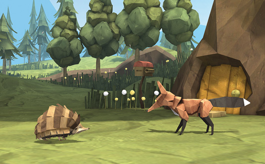
I wanted to see if I could push the style further, so I created a colour palette, remodelled the fox in a T-pose and started creating other animals in the same style.
I found creating the characters came very easily. Most of the challenge was to keep everything simple and maintain interesting proportions. Before I knew it, I had a small collection of paper woodland creatures.
Kicking off in style
At this stage, I started thinking that this could be more than just a folio piece, and tried to think of what I could use these creatures in. As I didn't have any money to pay people to work on it, I wanted to make sure I could keep it to a scope that I could handle as a solo project.
Around that time I had bought an iPad and I learned that there was a burgeoning market for interactive books. How hard could that be, I thought?
I'm lucky to be related to a very talented writer, my sister Amanda. I went to her with the characters and told her my plans for making it into an interactive book. She loved the characters, and as our tastes are similar, we quickly came up with a concept and outline for the story.
I decided to crowdfund the project on Kickstarter, offering a copy of the app in addition to fine art prints of the characters and scenery. This would not only pay for my software but also give me a decent insight into what people thought of the concept.
The crowdfunding was a huge success. The target of $5,000 was reached in less than a week, and I ended up raising just over $105,000. I also received a lot of attention from third parties interested in the project.
After being approached by multiple book and game publishers during and after the crowdfunding, I knew I was thinking too small. If my sister and I were the only ones working on the project, it would be devoid of animation, sound and interactivity - basically it would be a traditional book on iPad, which seemed like it would be a waste of the hard work we had put into it. We needed to think bigger.
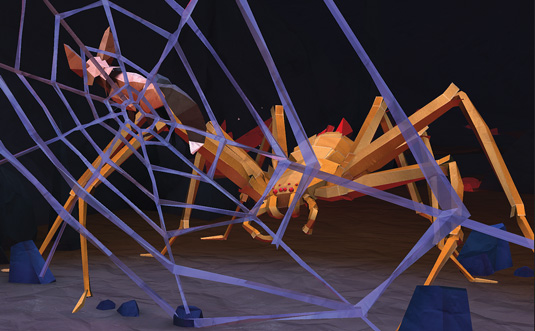
With some sage advice from my friend Joe Tabor, who later became the producer on the project, we created a pitch to Screen Australia to garner more funding. This time we scoped the project to include much more animation, sound and interactivity.
We were lucky enough to get the grant and, at the same time, signed a deal with a fantastic US publisher, Bento Box Interactive. We were off to the races! Now, we just had to make the app. Simple, right?
The first big hurdle was the choice of engine: all the artwork shown in the pitch was pre-rendered, so we needed a solution that could deliver the same level of quality on handheld devices like the iPad. The shader set up for V-Ray wasn't anything earth-shattering, but we were pretty sure that the iOS platform couldn't handle it. Was it even possible to get something looking as good as we wanted?
The first big hurdle was the choice of engine - after hard work, Unity delivered the results we needed
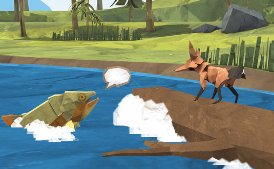
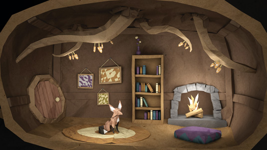
With the help of talented environment artist Stephen Honegger and some hard work, Unity delivered the results we needed. We baked the lighting in the environments, and created a simplified version of the character textures that looked convincingly enough like paper.
Seamless planning
With the characters and first environment modelled, textured and light-baked, our animator Ian Bright set to work on rigging the characters and animating the first scene.
The first scene came together better than expected, with Ian going over and above in the animation department and giving us new sense of confidence on bringing life to the world of The Paper Fox.
That confidence was soon to be rocked as we quickly realised there was a big gap in our overall plan: we had scoped the artwork, storywriting, animation, mini-games, music and sound effects, but we hadn't worked out who would put all these elements together. We needed to actually script the app together.
This being my project, I stepped up to the plate. Nothing drives innovation like necessity, so I started scouring Unity forums for a way I could put this together myself without having to learn how to code. This was certainly the most stressful part of production, because it was the biggest unknown.
At this point I discovered PlayMaker, a great visual scripting plug-in for Unity. It was a complete life-saver for someone with limited code knowledge, or none in my case. I was able to start moving cameras, triggering animation and sound effects and, after two or three weeks, I had a working first scene.
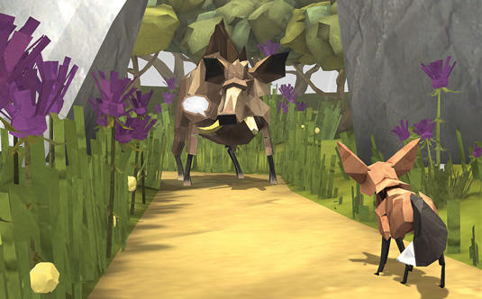
Once all the scenes were assembled, it was a matter of polishing the visuals, adding particles, layering in the UI, music, SFX, voiceover track and finally the mini-games.
After around nine months of full-time production following on from nine months of pre-production, the app was released on the App Store in late April 2013. It's very difficult for me to separate the stress of production from the genuine love I have for the world we've created. There were times when I was working 12 hours a day, seven days a week, which doesn't make for a healthy lifestyle.
That said, I'm extremely proud of The Paper Fox, and think the level of quality can rival projects with larger scopes and much bigger budgets.
And I'm sure that, given some time and (hopefully) mild success, I'll be excited to delve back into the world of The Paper Fox again.
Jeremy Kool is a 3D artist and graphic designer from Melbourne, Australia.
This article orginally appeared in 3D World issue 173.
Liked this? Read these!
- Top free 3D models
- Best 3D movies of 2013
- Blender tutorials: ways to create cool effects

Thank you for reading 5 articles this month* Join now for unlimited access
Enjoy your first month for just £1 / $1 / €1
*Read 5 free articles per month without a subscription

Join now for unlimited access
Try first month for just £1 / $1 / €1
Get the Creative Bloq Newsletter
Daily design news, reviews, how-tos and more, as picked by the editors.

The Creative Bloq team is made up of a group of art and design enthusiasts, and has changed and evolved since Creative Bloq began back in 2012. The current website team consists of eight full-time members of staff: Editor Georgia Coggan, Deputy Editor Rosie Hilder, Ecommerce Editor Beren Neale, Senior News Editor Daniel Piper, Editor, Digital Art and 3D Ian Dean, Tech Reviews Editor Erlingur Einarsson, Ecommerce Writer Beth Nicholls and Staff Writer Natalie Fear, as well as a roster of freelancers from around the world. The ImagineFX magazine team also pitch in, ensuring that content from leading digital art publication ImagineFX is represented on Creative Bloq.
