NET-A-PORTER’s app navigation secrets
Sarah Watson explains how creating a good user experience across multiple devices will keep users coming back.
Sign up to Creative Bloq's daily newsletter, which brings you the latest news and inspiration from the worlds of art, design and technology.
You are now subscribed
Your newsletter sign-up was successful
Want to add more newsletters?
Five times a week
CreativeBloq
Sign up to Creative Bloq's daily newsletter, which brings you the latest news and inspiration from the worlds of art, design and technology.

Once a week
By Design
Sign up to Creative Bloq's daily newsletter, which brings you the latest news and inspiration from the worlds of art, design and technology.
Once a week
State of the Art
Sign up to Creative Bloq's daily newsletter, which brings you the latest news and inspiration from the worlds of art, design and technology.

Seasonal (around events)
Brand Impact Awards
Sign up to Creative Bloq's daily newsletter, which brings you the latest news and inspiration from the worlds of art, design and technology.
There's more to navigation than just hitting a menu button. Great apps are built on systems that help users discover new things and find what they want. If the navigation isn't right, customers are unlikely to return. Even if it's simple in both function and form, what matters is the overall user experience.
At NET-A-PORTER, we've custom-built apps in-house for a variety of purposes and have experimented with a range of navigation options. Experience has taught us that every app is different, so we've outlined several ways - proven and experimental - of improving app navigation to ensure your app is a success.
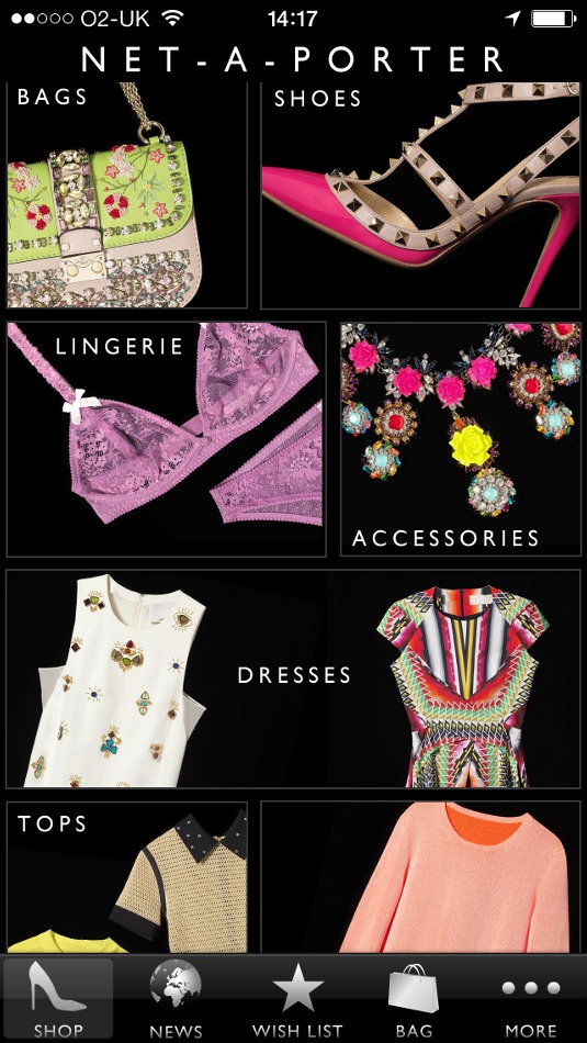
There are various approaches to app navigation, and several popular methods to suit different user behaviours. The first is called tab navigation. This is the most widely-used system and emulates the top navigation bar of a website, giving users a set of individual sections that can be accessed at any point regardless of where they are within the app. Once within a section, the user is encouraged to move within that vertical.
We use this system across all three of The NET-A-PORTER Group mobile shopping apps and always include the options: Shop, Wish List, Shopping bag, More/Account. Browsing sessions on mobile are generally shorter than on tablet, so this method really suits the goal-orientated shopper.
To keep instructions clear, you can help to guide users with familiar icons and signage to get them from place to place. Using icons also helps when producing apps in multiple languages. Images help to reinforce brand image and provide an easy visual reference to follow.
This is crucial. The more interactions that are required, the more likely your customer will lose interest and fail to make a purchase. If a consumer has to adopt a trial-and-error approach to finding something, you haven't achieved your goal and it's unlikely they will achieve theirs. Equally, once a customer has reached their goal, ensure there's scope for continual action. Capitalise on the feelgood factor and entice them to explore with calls to action such as tips or links.
Mobile space-saving
For mobile devices, space-saving solutions can help to make the most of the tiny screen size. For example, the navigation disappears when browsing products on the NET-A-PORTER shopping app and reappears when you scroll back up.
Sign up to Creative Bloq's daily newsletter, which brings you the latest news and inspiration from the worlds of art, design and technology.
Browsing sessions on tablet devices tend to be longer and user activity spikes in the evening when customers are more likely to be stationary. As a result, we've adapted navigation for tablets to provide a free-flowing experience. For instance, on THE OUTNET app for iPad, we split the homescreen into sections that display category options and new products 'Just In'. This creates a virtual shop window enticing the user to browse. The category options update over time to emulate what the user has viewed most recently within the app. Surfacing deeper categories and showcasing different products encourages the user to explore the app and find more things that interest them.
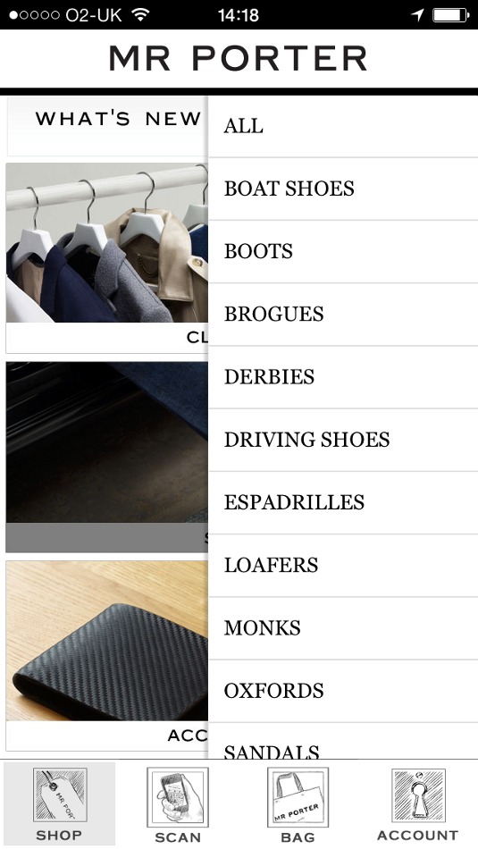
Apps need to be designed with the device in mind and navigating apps should come as second nature to the user. For instance, the NET-A-PORTER app for iPhone features the tab bar navigation on the bottom part of the screen (as expected), whereas for Android it was moved to the top to cater for that device's particular user behaviour.
Be original
Mobile apps, unlike websites, don't have to run a web page style system, so there's opportunity to be original. Take the MR PORTER TUX app; it's a magazine, but not as you know it. The user can be 'driven' around in style following the video interludes, or they can choose to fast track to specific areas of the app using the map feature. Alternatively, they can just swipe the screen and away they go.
The secret ingredient here is in discovery. It's OK to have flashy functionality but it must be intuitive, easy to navigate and importantly, with an app of this type, fun to use.
Words: Sarah Watson
Sarah Watson is group mobile manager for The NET-A-PORTER Group.
This article originally appeared in .net magazine issue 244.
Liked this? Read these!
- How to build an app: try these great tutorials
- Pro tips for mobile website design
- The best photo apps for iPhone, iPad and Android
Seen some great app navigation? Tell us in the comments!

The Creative Bloq team is made up of a group of art and design enthusiasts, and has changed and evolved since Creative Bloq began back in 2012. The current website team consists of eight full-time members of staff: Editor Georgia Coggan, Deputy Editor Rosie Hilder, Ecommerce Editor Beren Neale, Senior News Editor Daniel Piper, Editor, Digital Art and 3D Ian Dean, Tech Reviews Editor Erlingur Einarsson, Ecommerce Writer Beth Nicholls and Staff Writer Natalie Fear, as well as a roster of freelancers from around the world. The ImagineFX magazine team also pitch in, ensuring that content from leading digital art publication ImagineFX is represented on Creative Bloq.
