Menu app concept is deliciously good
Hunt down your favourite treats with ease with this distinctive on-demand app concept.
When it comes to websites and apps, it appears that a designers work is never done. From Instagram to YouTube, landmark platforms are inspiring designers to creative inventive overhauls, which aim to improve the user experience.
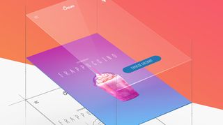
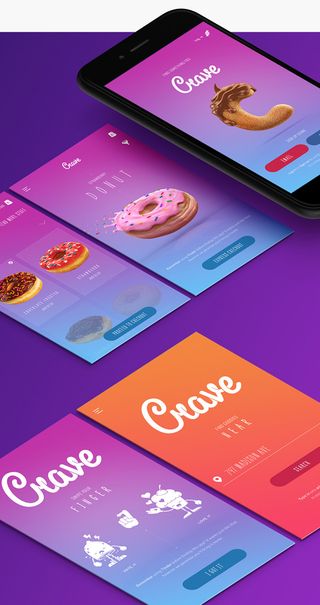
For New York-based interaction designer Rolf Jensen, it was the clunky controls and poor layout of menu apps that needed fixing. "I’ve always felt that current on-demand food and beverage apps lack visuals of the products themselves while browsing the menu," he explains.
"In some cases they are strictly user-generated, which often results in bad exposure of the product, and makes it difficult to get an idea of what the menu item authentically looks like," he adds. It was these issues which prompted him to create his own menu app, Crave.
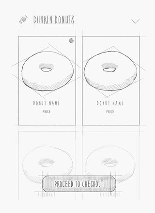
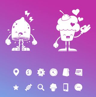
With its deliciously stylised images and icons, straightforward swipe controls and a soft colour scheme, this app's concept art is a feast for the eyes. Browse the images below to get a taste of how the Crave app would look.



Liked this? Read these!

Thank you for reading 5 articles this month* Join now for unlimited access
Enjoy your first month for just £1 / $1 / €1
*Read 5 free articles per month without a subscription

Join now for unlimited access
Try first month for just £1 / $1 / €1
Get the Creative Bloq Newsletter
Daily design news, reviews, how-tos and more, as picked by the editors.
Dom Carter is a freelance writer who specialises in art and design. Formerly a staff writer for Creative Bloq, his work has also appeared on Creative Boom and in the pages of ImagineFX, Computer Arts, 3D World, and .net. He has been a D&AD New Blood judge, and has a particular interest in picture books.

